
Making it modular-ish would be soooooo nice! It’s kinda sad having such a nice background but it’s hidden by all this clutter ^^
1 Like
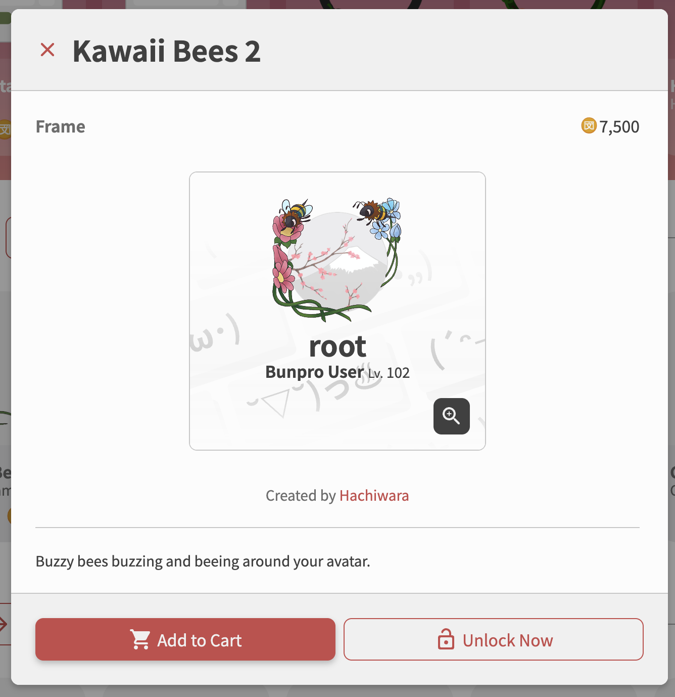
Is it possible to see the artist credit somewhere?
If not maybe credit that should be added. It could be put in the item description?
Some of the profile themes are so adorable and I think sharing who designed them is good for the artist community. Transparency for art assets can be really important with the flooding of ai art in our current word.
6 Likes
That is wonderful!
2 Likes
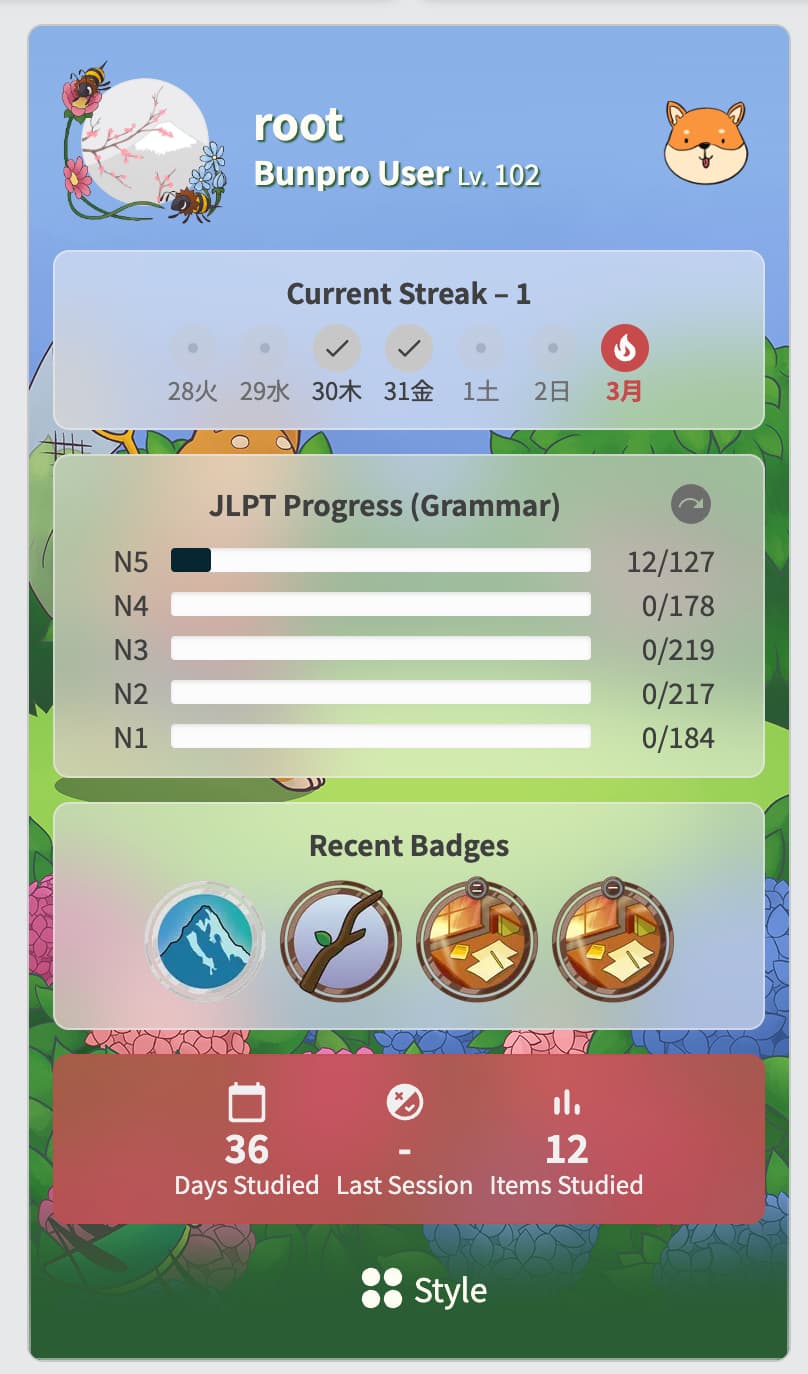
Do I have to somehow active the Progress Bar Backgrounds? Since the announcement I haven’t seen one, and it got me thinking
1 Like
You have to “Equip” it after buying it, which is kind of easy to forget to do.
But it should display once you have it equipped!
1 Like
What about a bunpro iOS app? I would like to get my new colors while doing reviews on my phone.
3 Likes
We are working on them!
We will be adding mock tests firsts, and then the UI update in 2-3 weeks after!
Cheers!
2 Likes
Weren’t many of the color themes a normal setting before that is now hidden behind a sort-of paywall?
2 Likes
Can we have “caps” at the beginning of the bar that’s just stationary and then there’s another “cap” at the end?
The snake cap with it’s tongue sticking out makes me want a frog at the start and then the progress bar is its tongue and there’s a bug at the end. It’s an extra layer of motivation to make sure the little froggy get it’s snack! 


5 Likes
11 Likes
FABULOUS!!! 
Thank you!
5 Likes
love this idea! definitely will note this for the next batch of progress bars  so stay tuned
7 Likes
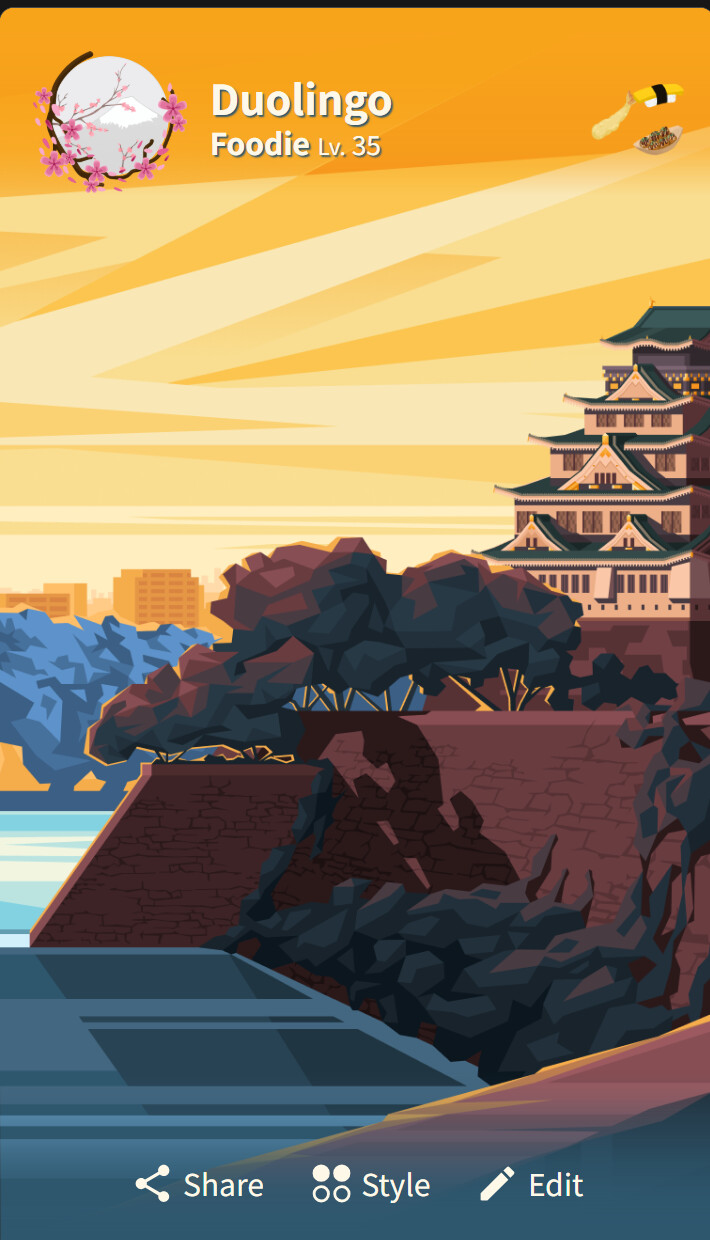
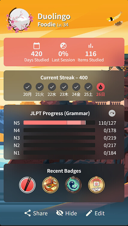
Hi! Thank you for making the bunpro experience into something more fun and aesthetic!
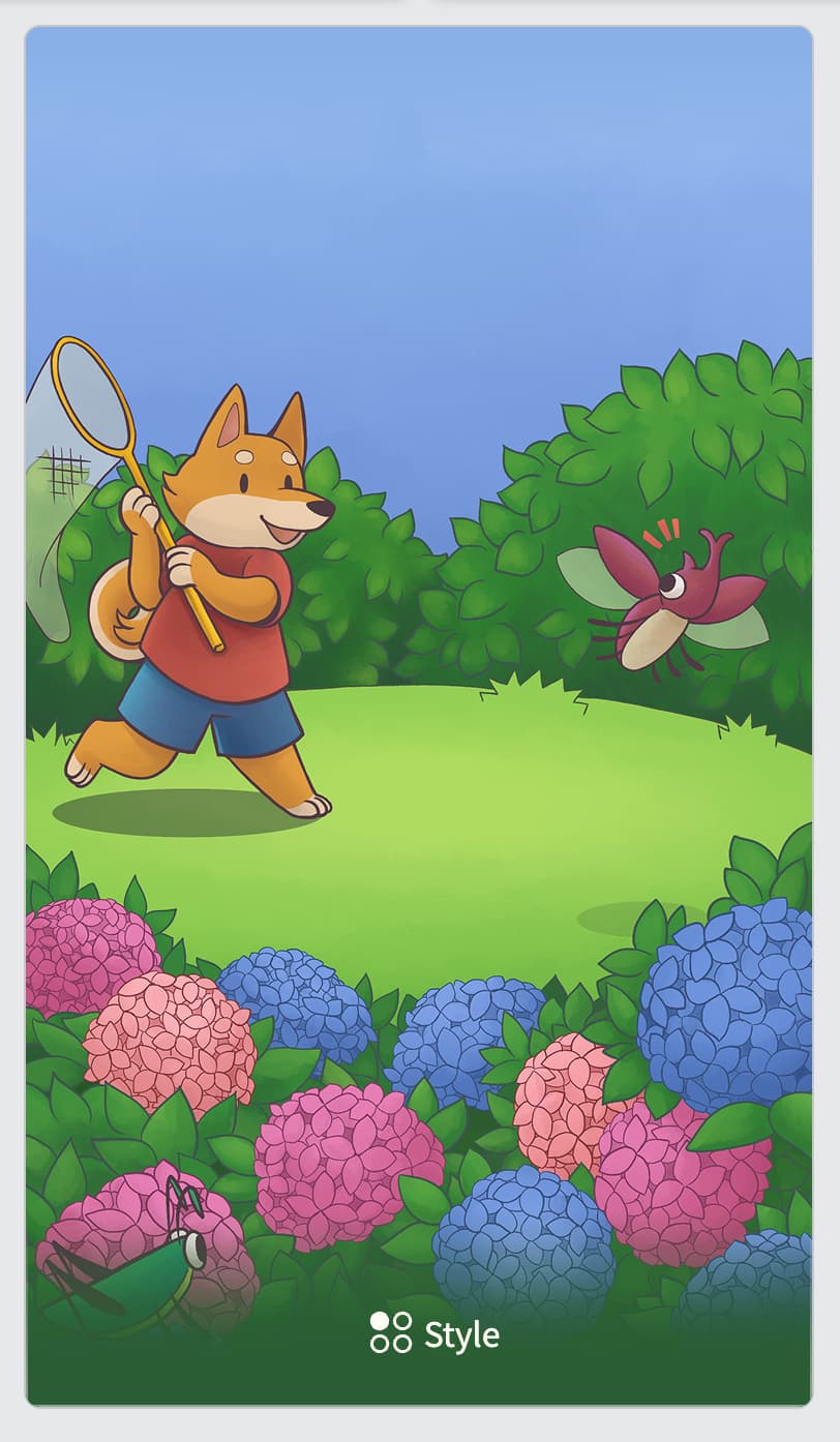
Since the official release of the shop, I’ve been wondering if there should/could be a way to somehow temporarily equip the items before purchase to try them out - but I ended up choosing to rely on the ‘preview’ function when choosing my profile theme.
Problem is that the preview is useless and downright confusing in some cases ^^’’
For example, the size and placement of the avatar and other boxes in profile cards differ on the profile page vs the dashboard page, and so the full effect of the theme looks completely different in preview in the shop (since it only shows how the versiom on the profile page would look like, if I’m not mistaken) from how it all ended up presenting when on the dashboard.
I know it’s a bit nitpicky but due to all of the above I ended up disappointed with my purchase with no way to return the item and no way to see it ‘as it would’ve been in practice’ before the purchase T^T The element placement was just unfortunate haha. But it makes me unwilling to buy more profile cards and other items since I could end up in the same situation again? Bit bummed, but I thought I’d share my thoughts here, maybe something could be improved with how the previews work?
On that note, is there any way to refund the latest b-shop purchase that I’ve maybe missed somewhere - or could I ask for a manual refund this time? Would be very grateful for any help because I take my aesthetic-adventures seriously >…<
2 Likes
The item was a Profile Card item (Theme/Pin/Frame)?
We’re discussing this internally at the moment!
If you DM me the item name I can refund it for you~
2 Likes
Yes, the issue I’ve noticed is with the items filed under “profile themes”. Since they present ever so slightly differently depending on the placement of the avatar and boxes on various pages, the preview feels a bit flawed, but just in that regard!
It’d be nice to either see a possible preview of how the theme would look on a dashboard vs a profile- or to maybe leave things as they are but add a simple indication that the theme may look different from the preview due to yadayada. Looking back on it, it’s obvious to me now, but I’m thinking that other folks could also end up surprised with their themes, given that the preview only shows one of the ways they can look- and it’s very easy to go broke with all the cute items that exist, so every point counts ;>
Anyway, thank you for looking into this, and thank you for indulging my request! I’ll dm you now 
1 Like
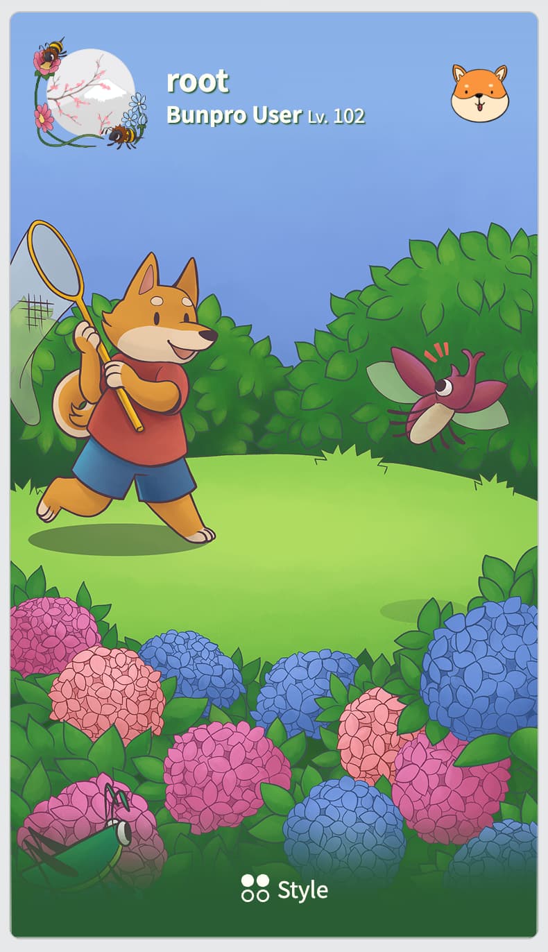
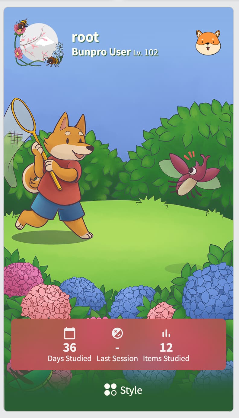
Dunno if I mentioned this to you somewhere else, but we’ve updated the Profile Theme preview window!
Now gives a lot more detail on how the theme will look in the 2 different locations (Profile and Dashboard)
1 Like
Amazing addition to the shop, thank you for making it real!
I went and tested it out - overall it works great! My only small feedback is: my usual viewport is 408px in width (i’m on a mobile browser), and the palette icon seems to be hidden in that size. I’m not sure if it was intended to be that way? When i turn on the desktop mode, the width becomes 980px - and then the palette icon appears correctly, and it’s possible to see the different previews 
1 Like
Ahhh yes that is kind of on purpose.
That drawer is too slim to also show the state for Dashboard 
1 Like