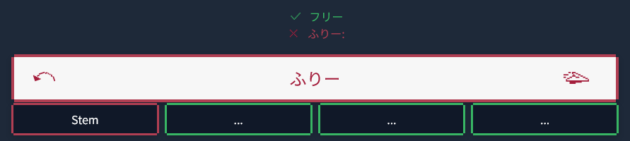
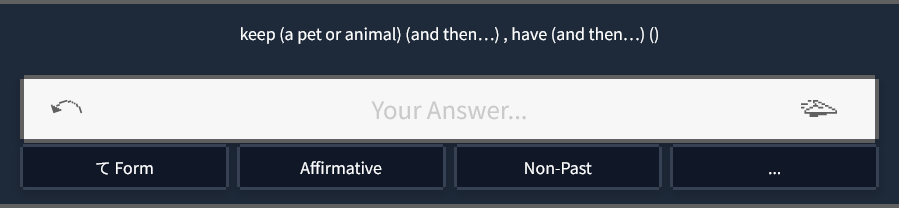
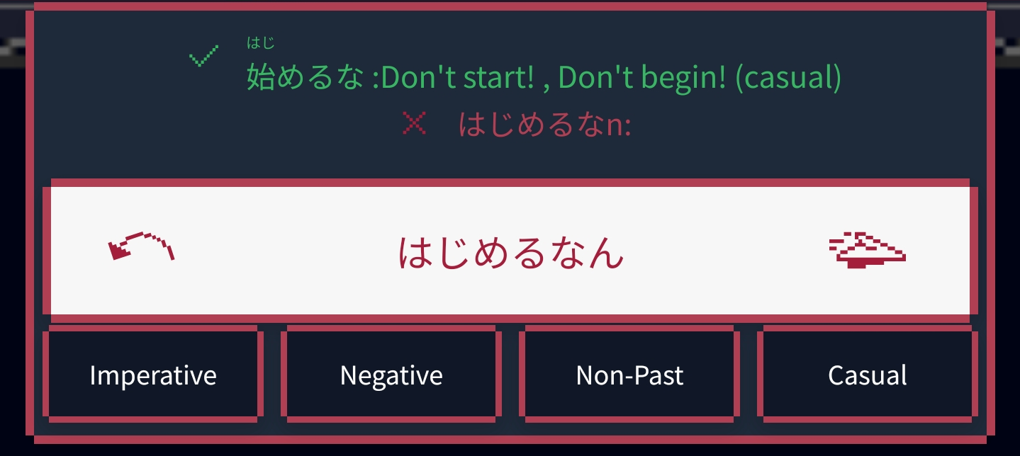
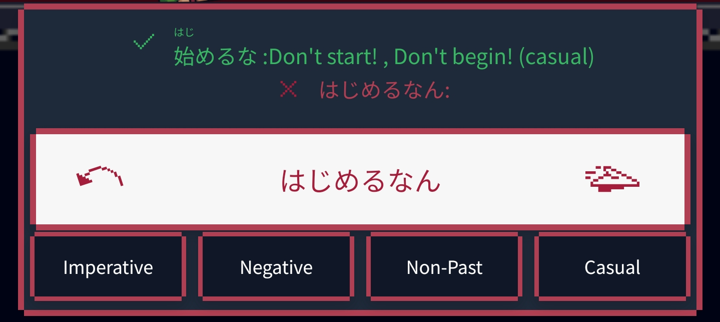
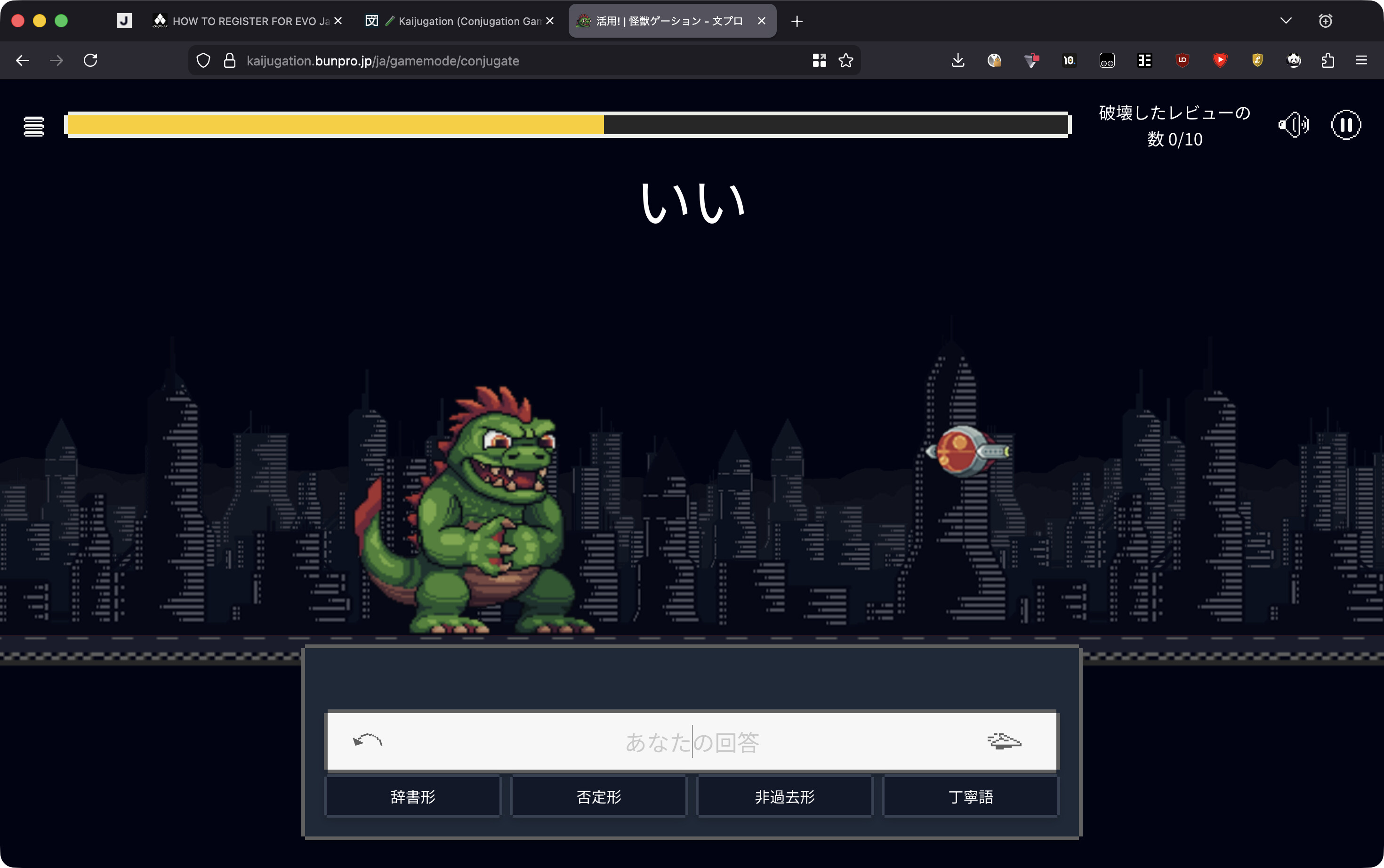
Firstly and it goes without saying, the conjugation game is an excellent feature and is in a great working state already! However, I would like a compact mode or similar so that information doesn’t require gymnastics jumping from top of screen - to the bottom, left to right, then back to the text entry bar.
The Word, Translation and Conjugation Instructions (Not sure what you’ve referred to it as, in this case it’s the for eg, ‘Volitional, Affirmative, Non-Past, Casual’ boxes) - Each one of these items are held within differing design surrounds and text sizes, and in a game where thinking quickly is the goal, I feel there’s a road block at least for myself with an interruption in flow down the page every exercise.
Design wise it does look visually appealing at the moment, but I do feel it’s form of function in this way. If it were up to me, or even having alternate view modes, i’d love to see the text elements all brought together into the same visual space and design for quick and easier understanding of what the prompting requires me to do.

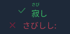
 also typing n results in ん, while im used to typing nn for that. so i get a bunch of mistakes because i get んん instead ^^