Wow these are looking great! Love the Light mode Dusk!
My wife will love the Mulberry theme also 

Wow these are looking great! Love the Light mode Dusk!
My wife will love the Mulberry theme also 
Ooh! I like the Seafoam and Mulberry themes! I might alternate to see which I like more: I’m using dark mode Mulberry for now.
The fox theme was a joke! I promise!
The bunny theme is totally serious though 
That looks really nice. Could we maybe get a percentage indicator on the bar too ?
I love the Mulberry (dark) theme!
It reminded me of kindergarten when my family was living a few years in Chicago when I was a wee kid, and one of my rare yet distinct memories during those years that wasn’t captured on camera was that one time in school, we had to choose two colours of peanut butter (or some edible jelly/spread) to mix on our crackers or bread.
What I recall was choosing pink and purple and feeling quite disappointed that the resulting mix wasn’t a great change compared to those who chose red and yellow, for example. 
素敵ですね! Light Mulberry for sure!
(ところで、I saw the kanji for ‘mulberry’, 桑, the again-and-again-and-again tree. Would it be possible to use it in the settings? I see it would break the 片仮名 naming of the new themes, though, just had to ask  )
)
質問が一つだけあります: when will this be available for the mobile app?
Mulberry (dark), because I love pink!!! (Thank you for the colors!!!)
I used to use the Blue one, now I will be testing Seafoam.
I just think the Verdant one should be called Avocado 
It is a very nice combination indeed, but it reminded us a bit too much of a certain Crabigator.
We don’t have a specific date for this, but it is coming soon!
That’s true … maybe some people Wanit; Kanit still be considered as a possibility? 
Are there plans on opening the theme engine for custom themes? I’d make myself a Nord option
Hi there, the colors are nice and I like the separators on the Progression Bar but their placement confuses me.
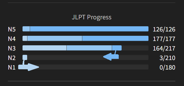
The light bar will grow (to a maximum of 210 for N2 or 217 for N3) from left to right. Which makes sense. But then within a bar (164 for N3 atm for me for example), the higher level are on the right and will then grow from the maximum to the minimum? Which means from right to the left?
I feel there’s like two arrow pushing in contradictary trajectories. Because ultimately it means you progress first from left to right until its maximum then you try to progress from right to left because you want to make it ‘higher rank’. However since I don’t have everything maxed out, it makes a little bit of zig-zag in terms of reading between Nx.
Obviously not a big issue since the point is more doing my grammar correctly than caring in itself about those littles bars but the reading is confusing. Making it all going from left to right (as it was before the update) makes the reading more even.
That’s my tidbit, if there’s a more logical reason of doing it that way or if I just misunderstood it, I’ll happily follow it.
Cheers.
I like the bar separators 
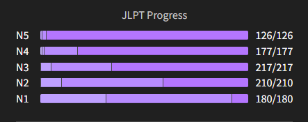
I was going to comment on this too. I agree that the colors should “progress” towards the right side, not to the left.
Both of you are absolutely right, this was an oversight on my part! I’ll see that it is fixed, thank you for your feedback! 
The bar separators are far less aesthetically pleasing and don’t look anywhere near as pro as the the previous soft rounded look imho. Are they necessary given you can hover over to pull up the exact numbers?
More of a compliment to how smooth they looked before than a criticism!
Just regarding this, I noticed you can find a graph which suits on the “Profile” page:
For comparison with the graph on the dashboard:
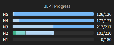
I think the readability is much better now with the bar separators. Previously, it wasn’t easy to see what area I could hover over, especially for my N5 and N4 as shown below.
Before:
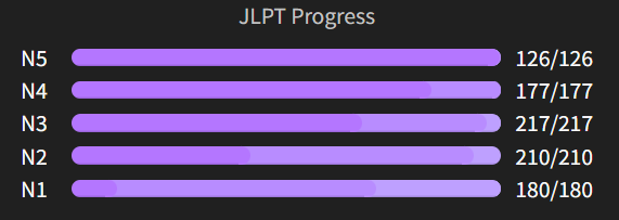
After:
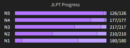
The separators look great! I’ve been using the “Green” style now. Bunpro continues to kick ass 