8/29 Update - MORE Color Improvements: Better Contrast, New Themes and More!

:exclamation: Heads-up: This post is a follow up from our previous color update!

Hello again!

Earlier this month we launched a site-wide color update that focused on:

  • Improving contrast and readability
  • Getting us closer to WCAG compliance
  • Adding more customization, which resulted in Green and Purple accents. (Unbeknownst to us it was the awakening of Purple Bunpro. :joy: )

Since then we’ve made many adjustments to this update after listening to user feedback, helping us get closer to those 3 main goals. Read on to find out more!


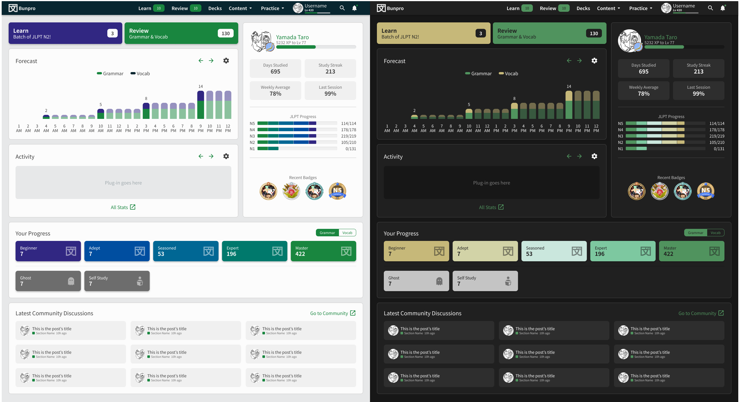
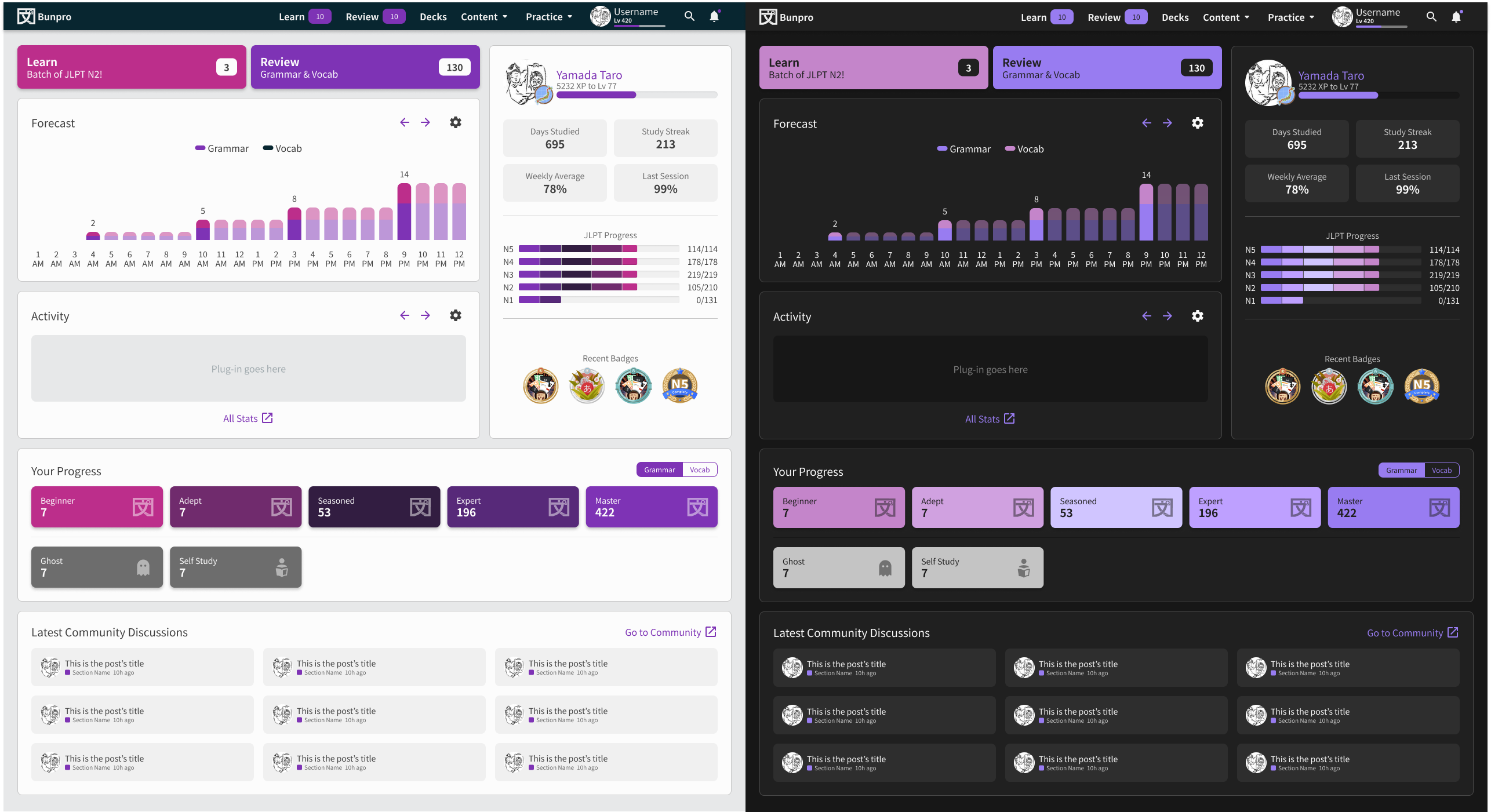
Less stark Dark Theme accents

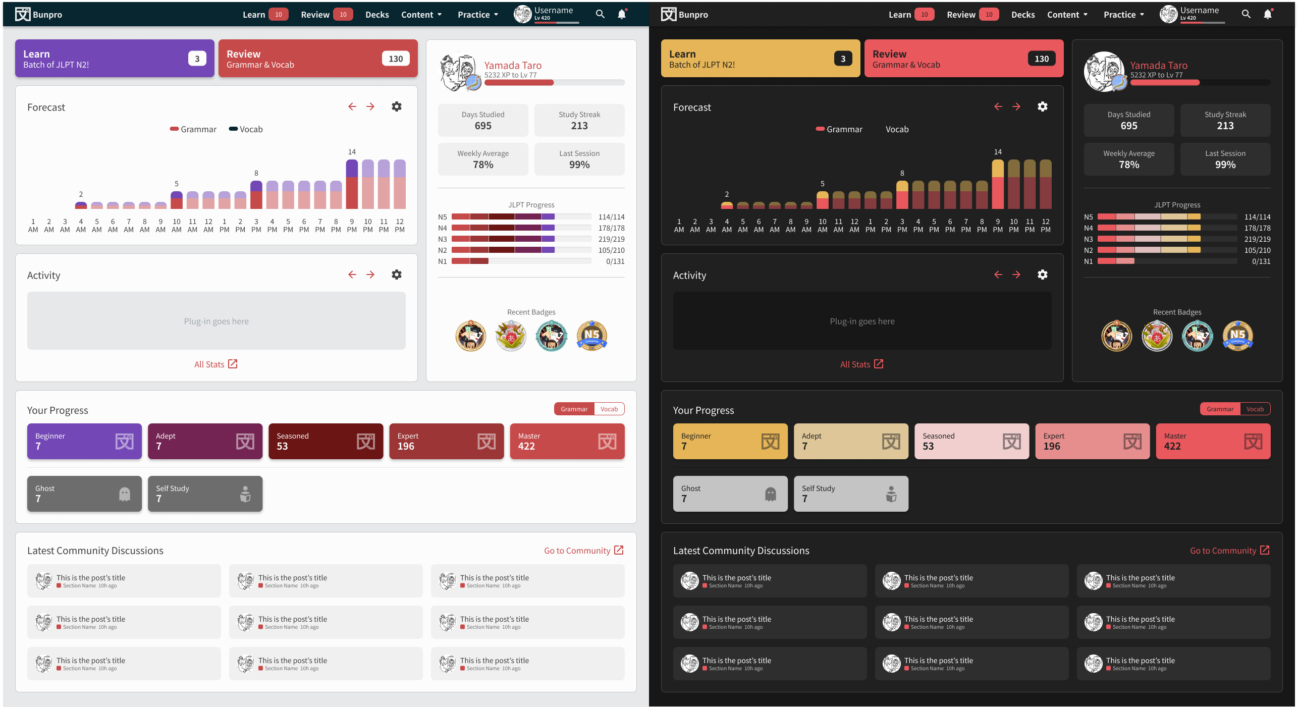
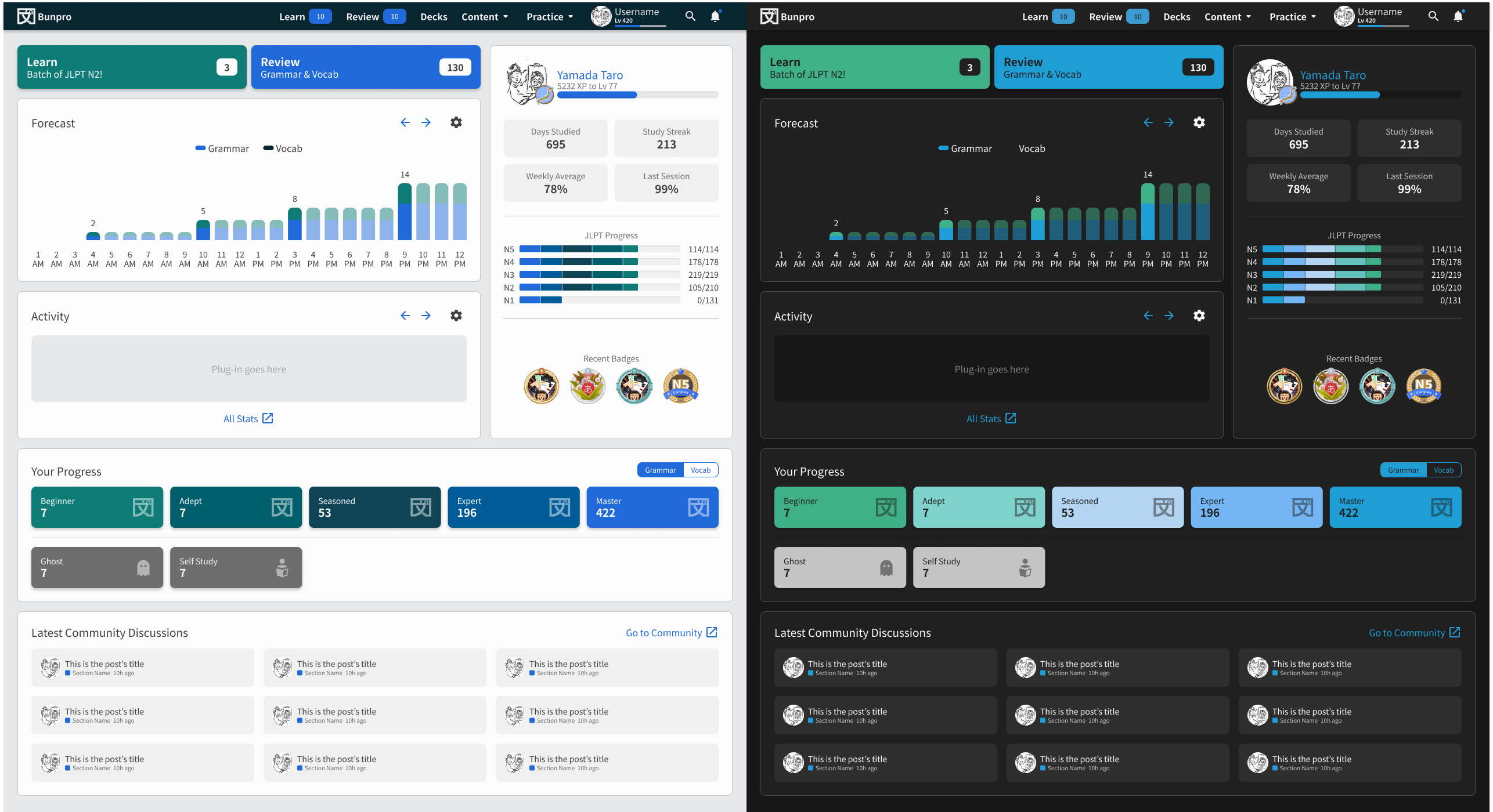
One common feedback we saw was that the contrast for Dark Mode was too stark or too strong, to the point of being uncomfortable for some. To fix this, we reduced the maximum brightness value of all Dark Mode colors.

Before:

After:

Please take a look and let us know if the new contrast level is easier on your eyes!


Increased SRS Levels Contrast, Added More Themes!

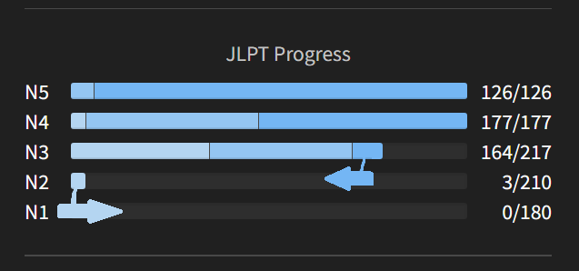
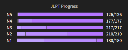
Another request we got was being able to tell at a glance SRS levels from each other more easily, especially in Dark Mode. After analyzing the issue, we settled on these two fixes:

  • Add separators to the Dashboard’s JLPT Progress widget
    This works similarly to the new border you see around our UI elements, it’s just a sliver of contrast that goes a long way.

  • Add a hue shift to our level gradient to increase overall contrast
    Now each accent has an increased contrast alternative through hue shift. This resulted in 4 new themes:

See the changes!

Dusk (Duotone Red)

Seafoam (Duotone Blue)

Verdant (Duotone Green)

Mulberry (Duotone Purple)

Mini FAQ:

Why make new themes and not just update the original ones?

We believe that Customization is a core principle of Bunpro, and some people prefer a more refined or minimal aesthetic for their experience without that much color. So we thought it was best to just offer them alongside the originals.

Why is there no Yellow or Orange at all on Light Mode?

Yellow content on a Light background is a combination that fundamentally yields poor contrast. We want to make Bunpro more accessible for everyone, so we scrapped yellow on all instances of Light mode in favor of better WCAG compliance. Orange presents a similar challenge, though not as bad, it still wasn’t ideal.

How many possible Theme Combinations are out there now?

16! Knock yourselves out!

Will the old themes make a come back?

Sadly, they won’t. They had fundamental contrast issues that keep us from delivering an accessible experience. In the same logic as using Yellow, we won’t offer them.

Does this mean Bunpro is 100% WCAG Compliant now?

No. It’s definitely better than before, but we still have many edge cases and combinations that need fixing.

Can I have a dragon/possum/animal theme?

Maybe. (ಠ ∩ಠ)
If enough people ask for it we might consider it.


Theme Selector

With all of these new options, we thought it was the perfect time to update the experience of selecting your theme! It’s accessible from both your Styling Settings and from within Reviews’ Styling Menu. It now offers a preview to make it easier to choose your theme!

theme selector

While it was available since before this update, we’ve made it clearer that you can use a Device Sync to have Bunpro match your device’s theme! This means that if you have a setting on your phone/computer that switches themes automatically, Bunpro will follow suit.


And that’s it!

We believe that this update really brings us closer to a more accessible and customizable Bunpro for everyone. As always, we truly thank and appreciate everyone who has reached out with feedback or has gone out of their way to share an idea for an improvement. We really do read everything. :eyes:

Thank you for reading this far, and remember to do your reviews!

37 Likes

aaaaaaaaaaaaaaaaaaaaaaaaaaaaanyways, super curious to hear from everyone what accents you’ll be using going forward! i think i’ll be sticking with Dusk, makes me feel like i’m at a campfire roasting marshmallows. :camping:

9 Likes

I was using Red on Dark Mode up until now, but I’m gonna give Dusk a whirl because I like the yellowy/orange and red combo.

3 Likes

I like seafoam! :ocean:

My only problem is that green looks like “correct” or something good to aim for, so I would wish either for a different color or to switch the order from green->blue to blue->green on just the SRS progress chart and counters for Beginner->Master.

Actually, I’m thinking purple->blue could be really nice :thinking:

5 Likes

Wow these are looking great! Love the Light mode Dusk!

My wife will love the Mulberry theme also :smiley:

4 Likes

Ooh! I like the Seafoam and Mulberry themes! I might alternate to see which I like more: I’m using dark mode Mulberry for now.

The fox theme was a joke! I promise!

6 Likes

The bunny theme is totally serious though :rabbit:

6 Likes

That looks really nice. Could we maybe get a percentage indicator on the bar too ?

4 Likes

I love the Mulberry (dark) theme!

It reminded me of kindergarten when my family was living a few years in Chicago when I was a wee kid, and one of my rare yet distinct memories during those years that wasn’t captured on camera was that one time in school, we had to choose two colours of peanut butter (or some edible jelly/spread) to mix on our crackers or bread.

What I recall was choosing pink and purple and feeling quite disappointed that the resulting mix wasn’t a great change compared to those who chose red and yellow, for example. :sweat_smile:

3 Likes

素敵ですね! Light Mulberry for sure!
(ところで、I saw the kanji for ‘mulberry’, , the again-and-again-and-again tree. Would it be possible to use it in the settings? I see it would break the 片仮名 naming of the new themes, though, just had to ask :bowing_man:t2:)

質問が一つだけあります: when will this be available for the mobile app?

4 Likes

Mulberry (dark), because I love pink!!! (Thank you for the colors!!!)

3 Likes

I used to use the Blue one, now I will be testing Seafoam.

I just think the Verdant one should be called Avocado :joy:

4 Likes

It is a very nice combination indeed, but it reminded us a bit too much of a certain Crabigator.

4 Likes

We don’t have a specific date for this, but it is coming soon!

3 Likes

That’s true … maybe some people Wanit; Kanit still be considered as a possibility? :laughing:

2 Likes

Are there plans on opening the theme engine for custom themes? I’d make myself a Nord option

2 Likes

Hi there, the colors are nice and I like the separators on the Progression Bar but their placement confuses me.

image

The light bar will grow (to a maximum of 210 for N2 or 217 for N3) from left to right. Which makes sense. But then within a bar (164 for N3 atm for me for example), the higher level are on the right and will then grow from the maximum to the minimum? Which means from right to the left?

I feel there’s like two arrow pushing in contradictary trajectories. Because ultimately it means you progress first from left to right until its maximum then you try to progress from right to left because you want to make it ‘higher rank’. However since I don’t have everything maxed out, it makes a little bit of zig-zag in terms of reading between Nx.

Obviously not a big issue since the point is more doing my grammar correctly than caring in itself about those littles bars but the reading is confusing. Making it all going from left to right (as it was before the update) makes the reading more even.

That’s my tidbit, if there’s a more logical reason of doing it that way or if I just misunderstood it, I’ll happily follow it.

Cheers.

4 Likes

I like the bar separators :+1:

image

I was going to comment on this too. I agree that the colors should “progress” towards the right side, not to the left.

4 Likes

@Blues @Redglare

Both of you are absolutely right, this was an oversight on my part! I’ll see that it is fixed, thank you for your feedback! :bowing_man:

4 Likes

The bar separators are far less aesthetically pleasing and don’t look anywhere near as pro as the the previous soft rounded look imho. Are they necessary given you can hover over to pull up the exact numbers?

More of a compliment to how smooth they looked before than a criticism!

4 Likes