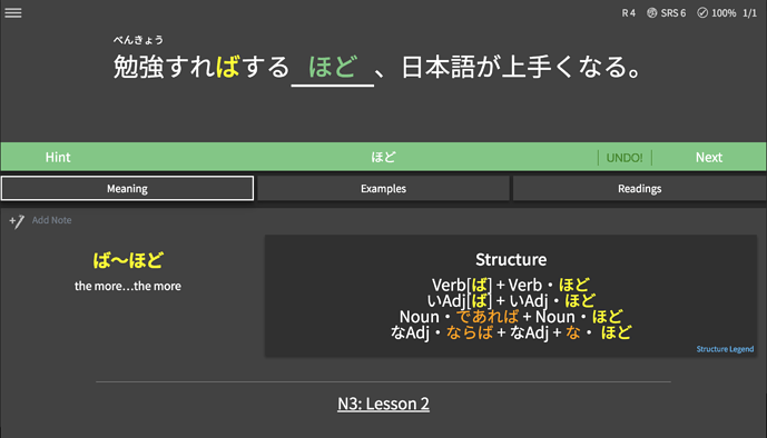
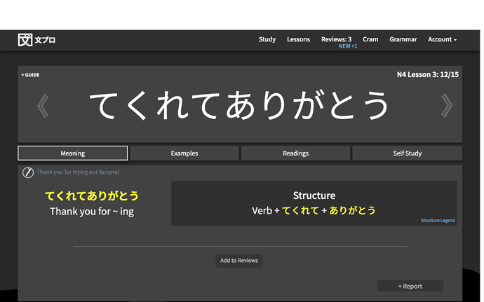
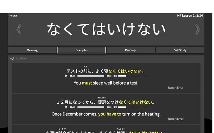
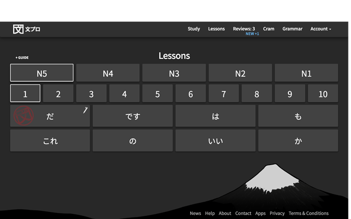
@Nihonmir, @seanblue, @doutatsu, @Liras348, @Aghork, @starlightk7, @matrus Thank you all for your patience! A modern dark theme is now available. Please let us know what you think. Cheers!
4 Likes
I just noticed the little Mt Fuji and that is super adorable x3
2 Likes
I love it so far. 
2 Likes
I still think this new design is a little boring and flat. A few notes:
- Since the design is so flat, everything blends together. I think it needs to pop a little more.
- Even with the new UI, I think the pale green during reviews is lacking. I think the sharper green from the classic dark would still be better.
- On the various pages, the unlearned, hover unlearned, and learned color schemes are too similar.
3 Likes


