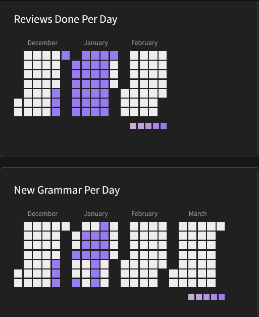
So, I was wondering if it is somehow possible to set the ranges for how the squares should be colored in the heatmaps manually, because they look pretty monochrom for me 
Sorry this isn’t answering your question, I was just curious how you got to that screen? That looks really useful!
Interesting idea. Definitely be useful I think especially for those normally with numbers above the highest color. Like if 30 is my avg per day, I’d set the highest to 45+ and lowest color to 5-. Or if im no longer currently working on a deck and my avg is much lower. If this includes vocab deck reviews id have to set max color at like 300+ 
I can see it working well for the grammar added heatmap when different people see a different “load” burden for different numbers. Someone used to 2 batches a day might each color to increment at +1 for example with max color at 5+
Another idea might be an option to have separate heatmaps for grammar and vocab 
i posted about this a while back. This was my idea:
for the stats page reviews per day, could you make it so that rather than having the colors be strictly decided on whether you did something like >20 reviews for the brightest or <5 for the darkest, it is more responsive to you specifically. right now, my heatmap has all the same color for every single day even though the number of reviews ive done has varied drastically
a way to improve this could be something like this.
- You look at the maximum number of reviews that you have ever done, which in my case is 265 reviews
- Divide it by 5. 265/5 = 53
- my idea of how this could work would be that any days with less than or equal to 53 would be the darkest color, than 54 through 106 would be the second darkest, 107-159 would be the middle color, 160-212 would be the second brightest color, and 213-265 would be the brightest color.
thats just my idea to make the review heatmap a little less samey though you guys can do whatever you want if you want to change it
It looks like the plugin support a very robust set of options for managing how the scale is represented. I think it’s “just” a matter of tweaking the usage of the plugin here so that the min/max values in the user’s dataset is used to calibrate the min/max. Right now the legend is based on the static thresholds 5,10,15,20.
Quite possibly something the team is very well aware of and lives in a backlog of other enhancements.


