
Can the rest of the menu please be displayed when using portrait mode on an iPad so its no linger hidden behind the additional menu toggle on the left?
The items are shown in for example in cram or decks, so it’s not a space issue.

1 Like
My review button only has grammar, but I learn vocab all the time.
2 Likes
Not a huge fan of how the forecast now tells me what my total reviews will be at certain hour instead of saying how many more reviews I will have added at that time.
Ah nevermind I see there is a toggle. Very nice, options always make me happy!
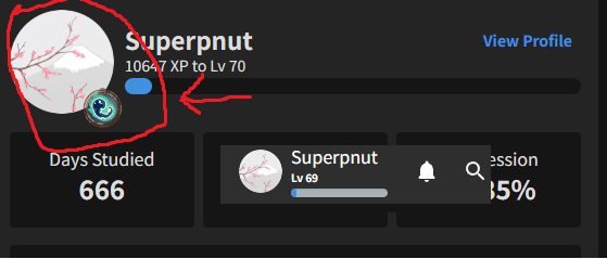
But I would prefer if my picked badge was still shown by my profile icon thingy.
I liked my little ghost mascot :))
4 Likes
I also have this same problem now.
1 Like
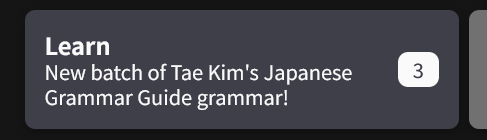
If you are using one of the Paths this becomes your default learn button. If you switch to using Decks like this Tae Kim one Tae Kim's Japanese Grammar Guide - Japanese Grammar Explained | Bunpro, you can then also set a secondary deck of your choice (maybe vocab) and both will be available to you on the learn button. Hope that helps!
3 Likes
Hi there! Have you got any browser extensions enabled or anything like that?
Seems like the font styles are maybe being overwritten?
Are you able to also maybe try on a different browser?
Possibly an early bug: The old page shows today’s reviews (Aug. 7th) as shown on top in the picture, whereas the 2.0 page only shows yesterday, Aug. 6th, as the latest.

Also as additional feedback I agree with a previous poster that I’d like the ability to choose a badge to display. it makes it feel a bit more special.
Edit: The graph updated correctly now, so perhaps it just took a moment to update.
2 Likes
Added this to the to-do list!
Thanks for the feedback and sorry I didn’t respond about it sooner 
Well that was an unfortunately timed outage… 
Thanks for all the feedback everyone, and big apologies for the inconvenience!
Details on the outage
We theorise outage was caused by some inefficient database queries on the new dashboard, coupled with the timing of everybody in America waking up and starting their reviews. This caused the server to hit a congestion threshold that then caused the whole site to crash.
We actually launched the Dashboard yesterday morning (Japan time – this was night time US time), and had no issues until the nighttime (when we were all going to bed  )
)
To all that gave UX/UI feedback related to the Dashboard, I’ve made a note on it and will get cracking! Cheers!
@Chigun @Superpnut @humin @eefara
6 Likes
idk if there is some technical reason why this isnt implemented, but i think it would be nice to not have a limit on how far we can look forward on the review forecast and activity chart (right now it is just 24 hrs for the hourly forecast, two weeks for the daily forecast, a month for activity chart)
i often find myself especially wishing that i could see 48 hours ahead on the hourly forecast, but if there is some reason for this limitation i understand
5 Likes
@Sean well if you happen to be taking requests…
I little toggle gear that lets people pick if they want N vocab deck x/y finished shown would be something I’d like.
I mean everything else can show vocab…so I mean…
2 Likes
Not experiencing any slowdowns here. I am on Opera. A lot of good improvements
2 Likes
Hi!
Could we have a nice button (wheel)
on this part too? (top right)
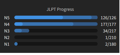
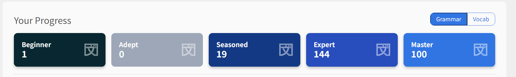
When starting bunpro each day, i’m focusing on the vocabulary right now.
So i would like “Your progress” to show “vocab” by default instead of grammar…
It would be a toggle:
Default view:
- Grammar
- Vocabulary
and the user chooses between them.
2 Likes
Good suggestion! We’re going to mimic the functionality of the Forecast toggle so that whatever you set it to, it remains across future sessions. This way there’s no need for a wheel toggle or anything like that and clears up the dashboard a bit. Would that still work for you?
3 Likes
 Dashboard 2.0 – Post Release Updates #1
We just pushed the Color Update (post coming very soon), so was able to implement some new things/fixes!
More coming on it’s way~
 Features
- Persist the ‘Show Grammar/Vocab’ SRS-Progress setting between visits to the site
- Thanks for pointing this out @Orock45!
- Hovering on the SRS Progress tiles now shows you the SRS intervals
- E.g. hovering over Beginner will show “SRS Interval – 4, 8, 24 hours”
- @airbus29 – not exactly what you envisioned but it’s a start!
 Fixes
Fixes
- Stop using
structuredClonemethod inside of Dashboard- We were using a relatively new browser feature that was causing a bunch of users problems on older versions of browsers
- This has been replaced by an equivalent method supported by older browsers
- @rtcmanga
- Made it so that the Dashboard won’t refresh every 60 seconds / on alt-tab and tab back in
- This was to reduce load on the server
- I will need to do some careful thinking about what data we reload periodically – where it is worth it, and where it’s not
 Fix To-do List
- When de-selecting vocab for the Forecast and Activity displays, the Vocab item on the legend either doesn’t disappear or only partially disappears
- Changing to hourly from daily when there’s no reviews for that day removes all interactivity from the forecast element
- Add personalized chosen badge to User summary
That’s all folks!
Keep those bugs ‘n’ opinions coming!
8 Likes
Thank you for the update!
Recent badges are still unsorted instead of being sorted by unlocking date. I believe it was reported earlier, just to make sure that it’s in your to-do list too 
2 Likes
It looks like you guys have revamped the profile page a bit, but the badge page looks odd now because you have broken some of them into sections, but the sections push everything to the right

Instead of lining up properly, now there’s a bunch of newlines with a single badge on it. I think it you should just put the subtitle for each section on its own line instead of pushing the badges over
3 Likes
Not sure if this is due to the recent Dashboard update; I just saw this when logging in this morning. The home page looks way zoomed out, as does the login page. Can confirm I’m on my usual laptop and zoom level.
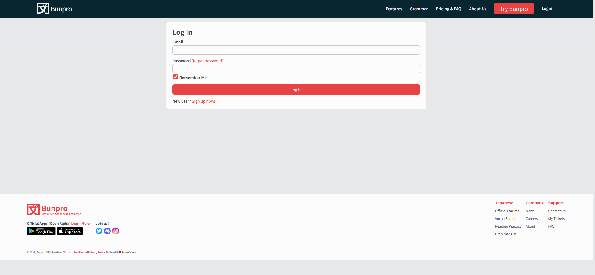
Dunno how easy it is to tell via screenshot, but the top banner particularly and the login page in general are way smaller than they used to be; they’re verging on unreadable, at least for me.
Also, might as well take this opportunity: is there any chance the Remember Me checkbox could be changed to default to unchecked? If you want to stay logged in it’s a single check you make and never again, but if you don’t want your computer to remember you, it’s an extra click every single time you log in. Just gets annoying after a while I find.
3 Likes
I’ve been having an issue recently (possibly starting around when the slowdown thing was happening) where the Activity chart does not update automatically anymore. Nor does it even update after I complete a Review session (this is certainly unexpected!). Instead, I have to refresh the page for it to update. Using latest Firefox on Windows.
3 Likes