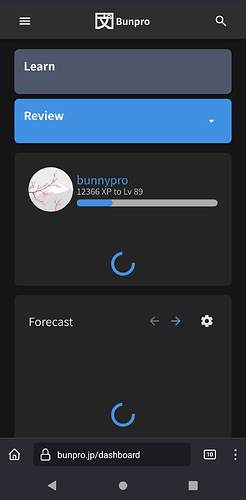
Dashboard 2.0 Released!
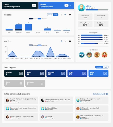
This feature update includes some TLC to the Dashboard screen, as well as a move to the new, faster, ‘2.0’ system.
Note for Beta testers:
If you have already been following the Dashboard 2.0 Beta and its threads, you can probably skip this post, as it mainly just announces the new features of the Dashboard 2.0 Beta again
 Purpose
Much like the Reviews system, the Dashboard is a Bunpro feature that most users will use every single day, thus integrating it with the new front-end system we’ve been working on was a priority.
This new system is designed and coded from scratch and is significantly faster.
The page load speed and page transition time from other pages onto new Dashboard is now instant and should hopefully make the the Bunpro Loop™ of going between the Dashboard/Review/Summary pages feel a lot smoother.
 Quicklinks
‘Quicklinks’ is the name we’ve given to the main Review/Learn buttons in the top left hand side of the Dashboard.
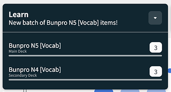
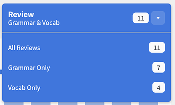
We have switched to having a dropdown buttons on the Dashboard in the following cases:
- If you have Split Reviews active in Settings, you will now get the Reviews dropdown
- If you have two Decks active (Primary and Secondary), you will get the Learn dropdown
NOTE that the clicking the left-hand-side of the button will perform the same action as it normally would, will clicking/tapping the right-hand-side of the button will open the dropdown.
If you fit neither of these cases, you will get the same display as usual:
Also a quick note – the reason why we implemented the change to the Reviews button was to accommodate a future planned Decks overhaul!
 Hotkeys
Added hotkeys to the Learn/Reviews buttons.
- Press
Lto go to Learn- If multiple Decks active, opens the Decks dropdown – from here, press:
-
1to go to the Primary Deck -
2to go to the Secondary Deck
-
- If multiple Decks active, opens the Decks dropdown – from here, press:
- Press
Rto open the Review dropdown- If Split Reviews is on in Reviews Settings Opens the Reviews dropdown – from here, press:
-
1to go to All Reviews (if has Reviews) -
2to go to Grammar Reviews (if has Reviews) -
3to go to Vocab Reviews (if has Reviews)
-
- If Split Reviews is on in Reviews Settings Opens the Reviews dropdown – from here, press:
 Graphs
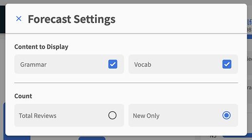
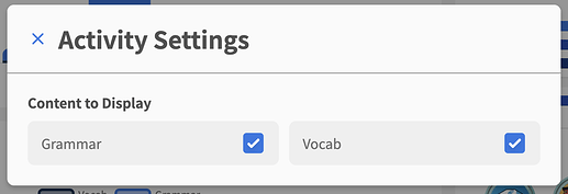
Added graph menus!
Now you can:
- Toggle if you want Grammar/Vocab reviews to display
- Switch between Total Reviews and New Only in the Forecast graph.
All settings changed here will persist between visits to the Dashboard (website only)
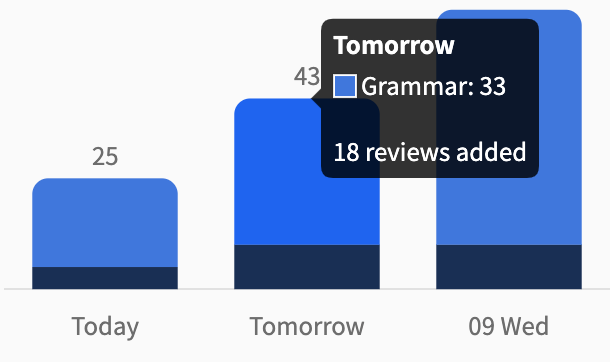
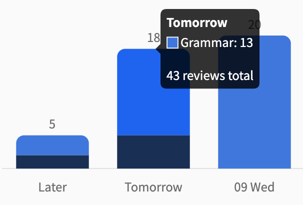
Tooltips for the Forecast graph
Now even if you have Total Reviews or New Only activated for the Forecast graph, you can still see how many new/total reviews there are for a time slot – reducing the need to do the sums in your head.
Time-split
To stop the graphs getting cramped and make them more clickable, we have split the graphs into two distinct periods:
-
Forecast
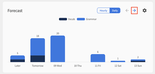
- Daily is now split between first 7 days and last 7 days (total of 14 days)
- Hourly is now split between first 12 hours and last 12 hours (total of 24 hours)
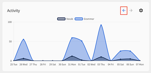
- Activity is now split between previous 2 weeks and the previous 2 weeks before that (total of 28 days)
You can switch between the two time-periods by using the arrows next to the graph titles:
 Redesigns
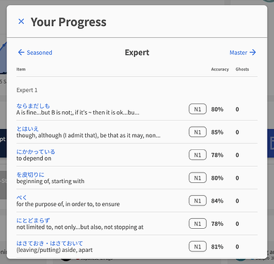
We’ve given both Community and the SRS Progress popouts section a fresh coat of paint!
Looking pretty swanky 
The SRS Progress modal should also feel noticeably faster.
 What will happen to the old Dashboard?
Much like we did with the Reviews 2.0 update, we will transfer the old Dashboard to it’s own URL here (notice the URL prefix ‘/old/’).
This legacy page will not be updated, and will eventually be removed.
 Shoutouts
A big thanks to the users that gave feedback, positive or negative, on Dashboard 2.0. It went through many iterations to get to where it is today, and we couldn’t say thank you enough!
Here are the contributors, in order of appearance:
@S_S @Pablunpro @Herendil @I-k-d @Neon_Kitsune @HotAirGun @Yash @Markapi_Suh @Redglare @indutny @ahewgill @Schuylerca @bunnypro @wct @ThePurpleOrange @JamesBunpro @araigoshi @airbus29 @badcity @pjorge @Megumin @davebp
What’s Next?
With Dashboard published, we’re going to continue to monitor for bugs and other feedback.
We have two fun projects coming up next, so stay tuned! 
We’ll also move onto the next focus of our 2.0-series of overhauls – the Profile pages.
Watch this space!

