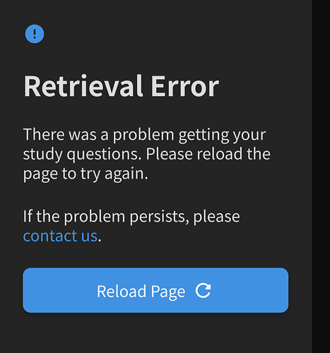
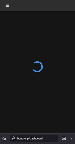
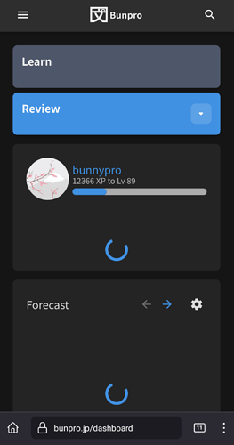
Yeah, thanks for the links. Given it a go, but it seems to be the same situation though, with loading, loading, then:
I’ve got the “old” dashboard now. The new one never loaded…
I will say though, I’ve been having issues loading my reviews since the graphical overhaul happened, just never this bad. Hope it gets fixed fast 
Thank for continuing to work on making the site better, I’m just wondering if there is a timeframe for including vocab in the cram section?
I managed to do a very short review session of about 4 items. I did have a ‘connection issues’ popup near the end, which managed to re-submit okay, and I just ended the session then. (Using Firefox, BTW)
At least if we can get a single review in, then that will maintain our streaks. 
The site will be down for a minute or two. Should be back up shortly. 
I managed to sneak in one ‘learn’ thingy so I could keep my streak lol. I think it counted? but the site was definitely not having a fun time  lmaoo
lmaoo
Seems to have stabilized. I will keep an eye on it today and keep looking into what might be causing the occasional slowdown.
Unfortunately, still seems slow for me and going round and round on screens like these, with no response from the review drop-down arrow:
Still slow for me; I haven’t noticed any change.
No change. Nothing is loading. I’m logged in, but lots of spinning circles.
Site is hosed for me. I cleared the cache in hopes that might help, but nada.

I just get an Application Error
Looks like everything’s up and working for me again; thanks for getting that looked at so quickly @Jake!
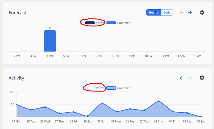
Other feedback: when de-selecting vocab for the Forecast and Activity displays, the Vocab item on the legend either doesn’t disappear or only partially disappears:
@Cycle @emonk @Alpacat @wct @Neon_Kitsune @hexashadow13 @rustx @celi @Slysoft @makeupsomethinglater
Been watching it since we pushed a patch this morning and everything seems to be in working order. Sorry again for the trouble. 
Can the rest of the menu please be displayed when using portrait mode on an iPad so its no linger hidden behind the additional menu toggle on the left?
The items are shown in for example in cram or decks, so it’s not a space issue.
My review button only has grammar, but I learn vocab all the time.

Not a huge fan of how the forecast now tells me what my total reviews will be at certain hour instead of saying how many more reviews I will have added at that time.
Ah nevermind I see there is a toggle. Very nice, options always make me happy!
But I would prefer if my picked badge was still shown by my profile icon thingy.
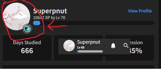
I liked my little ghost mascot :))
I also have this same problem now.
If you are using one of the Paths this becomes your default learn button. If you switch to using Decks like this Tae Kim one Tae Kim's Japanese Grammar Guide - Japanese Grammar Explained | Bunpro, you can then also set a secondary deck of your choice (maybe vocab) and both will be available to you on the learn button. Hope that helps!
Hi there! Have you got any browser extensions enabled or anything like that?
Seems like the font styles are maybe being overwritten?
Are you able to also maybe try on a different browser?

