Feedback - Suggested Improvements/Feature Request

In the structure section of each grammar point, it would be beneficial to provide an example for each category (verb, adjective, and noun) using the same word across all types.

eg grammer 1: から
Verb
飲むから
食べるから
[い]Adjective
高いから
[な]Adjective
静かだから
Noun
車だから

eg grammer 2: ば
Verb
飲めば
たべれば
[い]Adjective
高ければ
[な]Adjective
静かならば
Noun
車ならば

Hi! I’ve got an accessibility request: would it be possible to add an option to reverse the positions of the answer buttons? (in interface quiz settings maybe? I switch hands a lot when doing reviews in public :eyes:)

E.g. for the reveal&grade type:

2 Likes

Here you go. You can add this to tampermonkey or your script-injector of choice. Happy reviewing, @rune !

Ah, thank you~! :blush: Now you’ve inspired me to add on to your work so ima whip up a simple button to toggle the function as well :sparkles: and then i’ll be ready for the cursed public transport :muscle::laughing:

But still- would be fun to hopefully see this implemented officially as well, one day- esp since not everyone loves userscripts ofc :raised_hands:

Edit for the interested?
In case anyone else switches hands frequently and would want the option to swap the buttons back n forth fast, here: pastebin.com/jVxWA8ST
Mainly this adds a button to call on zerobrain’s function (triggers the left-handed mode). It’s only visible when you scroll down a tiny bit so that it’s unobtrusive (at least on mobile) :relieved: To revert back to the right-handed mode, just gta reload the page

1 Like

I find the vocab page title to be too bold:

image

For example, the font weight of the word on the Jisho site looks thinner:

I find the bold characters harder to visually distinguish, not sure if anyone else has thought the same?

Here’s the same title but at font-weight: 400:

image

Hers’s a user script if anyone wants to try it on their end: Make Title Thinner

3 Likes

I find bold characters hard to remember too. I don’t use Bunpro for vocabulary learning so I haven’t noticed here. But I’ve had to modify Anki templates to make the kanji less bold

And I know it’s fairly common because I saw discussions about that in the Migaku Discord

I guess it has to do with how many kanjis are similar to each other and when you are learning them, being able to distinguish them is important. If the text is too bold, the strokes tend to blend with each other which makes it harder to notice the little differences and details

3 Likes

When doing fill-in sentences reviews, I like to keep furigana off. However, sometimes there’s a single word that I’ll forget, and I just want to quickly check the furigana. I then have to take my hand off the keyboard to use the mouse to hover over it. I think it would be convenient if there were a hotkey we could press (either as a toggle or press-and-hold) to see the furigana for the sentence. I ask this because for basically anything else the user might want to do, there are hotkeys, whether it’s spacebar for seeing progressive hints, p for the audio, a for seeing the answer, f for scrolling down to the grammar or vocab point, etc.

I’ve done my own little thing for it (won’t bother spamming script stuff haha), but just something to think about. For me, I’ve done it such that if I tap shift, it just toggles the rt (furigana) opacity for the entire page (and site-wide, such that even when reading grammar points, I can do it all with just the keyboard, as you have already mapped hotkeys for right and left arrow for different pages, etc.). Tapping shift again will re-hide them. So basically just boolean not of opacity with repeat/hold debounce.

I think something like this might be useful for people who keep furigana off but just want to see them quickly for a sentence where they forgot one or something like that but don’t want to take their hands off the keyboard to hover over with the mouse.

Another thing you might want to think about is repeating the sentence below with a different font, such as a handwritten one. I think a cool option for the site would be where you can choose your font from a selection of a few common Japanese fonts (both computerized/printed style and handwritten, and even the option to select multiple fonts). For multiple fonts, there would just be a primary one which would be used for Japanese on the site in general, but the secondary/tertiary+ fonts would just appear as additional fonts on reviews only.

A classic example is 令, in which most default computer fonts render it completely differently from hand-written. Another example are the bamboo marks at the top of 筆, which are different between most computer fonts and how it is written.

Hi,
I’m returning to Bunpro after a break, and this year I used Anki a lot. I noticed one functionality that could be really usefull: be able to configure the work load on each day of the week.
I don’t know if this has already been discussed or not here.
The principle is to be able to choose for each week day “Normal”, “Medium”, or “Minimal”.
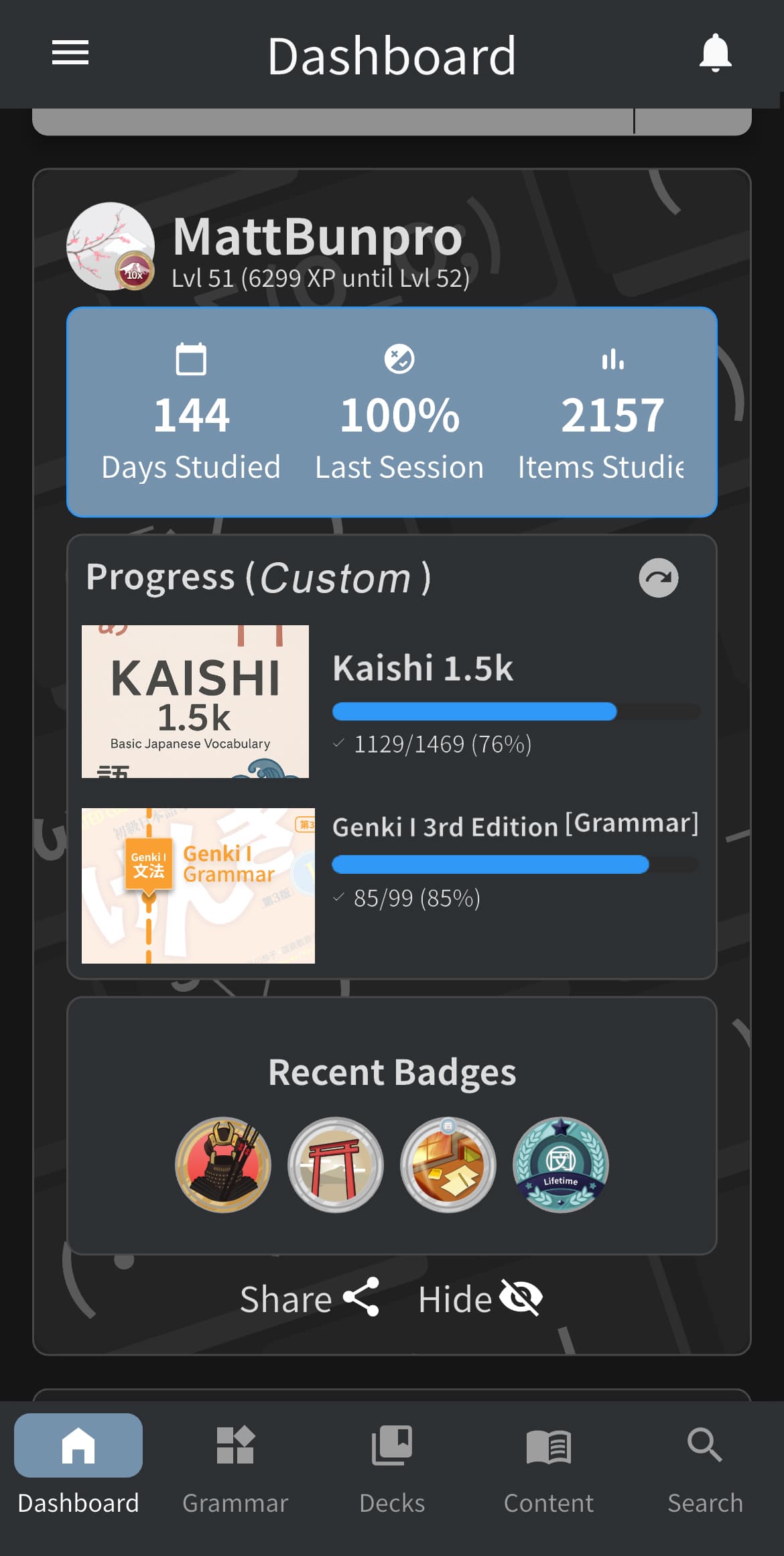
I have a full time job, and other activities, and while I have my learning Japanases routine during the week, on the week end it is slightly harder to stick with. And catch up with the reviews on monday is not the most pleasant experience. I am not a machine, and having some days off without worrying for reviews (I usually do medium on saturday and minimal on sunday), help me reduce the SRS “pressure”, and continue on the long run.

Another suggestion, would be to modify the option for auto opening of the grammar page during review. An option for auto open only when answer is wrong would be nice.

Thanks

There are some Grammar Points that I always confuse with each other. I would like to put them together in one group and learn them separately from my normal Reviews. Is that already possible?

Feature Request

Hey, I bought Bunpro Lifetime Yesterday :slight_smile:

As much as I like the website and appreciate that it’s accessible everywhere, I’m missing notifications on my PC. That’s why I turned the Bunpro website into a desktop app for myself that sends me notifications as soon as reviews are due. This way I can quickly open it, spend 5 minutes doing the reviews, and then continue with whatever I was doing. Otherwise, I end up opening the app in the evening and suddenly there’s a huge number of reviews waiting for me.

I think other users would also appreciate a feature like this.

output

Best regards

2 Likes

On a similar note, I noticed today while doing my reviews that furigana now doesn’t show up when I hover with my mouse, but only when I click on this, which is even less convenient than hovering the mouse. I would be happy for a shortcut to reveal furigana as well.

As far as I can tell, the grammar point させていただけませんか isn’t on bunpro… is it possible that we could have it added? (or if it is here, could someone point me to it?)

2 Likes

You can change the key you want at the bottom (or bind multiple keys). Currently I have it set to “Shift”. FYI this breaks mouse-hover functionality because it just overrides the style directly.Fixed in v.1.1 to preserve mouse-hover functionality. You want to set your default for furigana off, though. I could add in another style to force it in the other direction but prefer to just keep it simple for now!

1 Like

Not as a grammar point as far as i’m aware, but it’s sort of available as a vocab item: させて頂く | Bunpro
I say ‘sort of’ bc it’s not in the question form so might not be what you wanted to add to your reviews :sweat:

Thanks :slight_smile: I would like to practice it as a grammar point if possible!

1 Like

True, would be cool if it got added :raised_hands: (unless it’s already somewhere, n we just can’t see it :laughing:)

2 Likes

Nice suggestion - This one is on our list for consideration already!

(By the way, you may find this thread useful, if you happen to think of any other grammar point suggestions in the future)

1 Like

Thank you!

1 Like