Please let us know about particular features you would like to see and where you think the site can be improved.
Feature Suggestion: Discussion section for each grammar item.
For similar grammar points (example nakute and naide), it would be useful to be given more in depth explanations for differences between the two and have that tested. It can be hard to pick up nuances between similar grammar points as the system is right now, even with the related grammar section that sometimes populates the page.
Also, when using the study function, when I get to the examples section of a grammar point, I often like to figure out the meaning of the sentence first before reading the English translation.
I think it would be very helpful for people like me to be able to toggle the English translations off or hide them and be able to manually reveal them when we’re ready to see what they say. I think any extra practice is super helpful.
Isn’t this already a feature? I have the English translations hidden. It should be in settings.
For similar grammar points (example nakute and naide), it would be useful to be given more in depth explanations for differences between the two and have that tested. It can be hard to pick up nuances between similar grammar points as the system is right now, even with the related grammar section that sometimes populates the page.
We have a couple of different strategies and ideas that we plan on implementing to hopefully solve the issues between almost identical grammar points and we will begin implementing them in the near future.
I think it would be very helpful for people like me to be able to toggle the English translations off or hide them and be able to manually reveal them when we’re ready to see what they say. I think any extra practice is super helpful.
You can use the “Hide English” setting to hide the English translations. 
I think that would be an interesting thing to have! Do you any specific implementation ideas in mind?
Oh boy Christmas came early this year!
Add notes: when I am adding a note it is probably some important information regarding the grammar point. So it would be nice to see the first one or two lines of a note instead of just the pencil icon. Like a preview with just plain text.
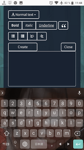
And on phones the edit note screen is quite huge:
Can you reduce the toolbar to just one line with the possibility to slide left and right to see all tools, similar to Evernote:
One fun feature to add would be like a 練習 tab, where you get for example:
N5 - Verb + のが好き + だ
So if you want to practice this, you can read the examples and copy them, which is what I always do and also the reviews.
But I think it would be fun if there was a list of like N5 Verbs/Nouns/Adjectives and maybe a random generator on those. So that you could just hit generate and get some words to create some random phrases in the grammar.
Like for example https://nihongoichiban.com/2011/08/21/list-of-all-verbs-for-the-jlpt-n5/
切る。。。
りんご。。。
りんごをきるのがすき。
I like cutting apples? Haha.
Anyway, just an idea, I think this would facilitate practicing and maybe even improve creativity in people, trying to find good ways to mix some words in the grammar.
Thank you for your suggestion! We have added a temporary scroll for the edit screen so that it does not take up as much space. We will push a more stylized, intuitive edit menu soon. Thank you for your patience. Cheers!
@nyo Very cool idea! We will see if this is something that we can implement in the future. Cheers!
Great, the edit note screen looks much better now on phones.
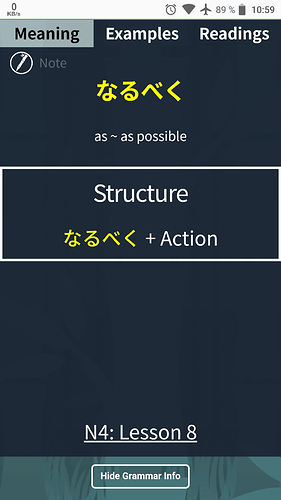
Nevertheless, when clicking on “show grammar info” after typing in an answer I see this screen:
It would be nice to always see the the first line of the note there (plain text) instead of just “Note”. On click on that note the edit screen will be shown.
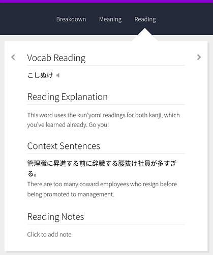
Similar to WaniKani, where the “Reading notes” are always visible and you can edit it on click:
And one small thing: why is there always so much white space between “structure” and the lesson number (see screenshot “N4: Lesson 8”)?
I think adding a Disqus section to each item would be enough. It’s simple, cheap, and works well.
My thought was to put it in lesson and review sessions as well as on the individual grammar point pages, so that if you’re curious about something or would like to share it’s simple to just open up the discussion and post something or read what others have said.
Hi everyone
I have set REVIEW ENGLISH to MINIMAL in settings.
But sometimes, I don’t fully understand review sentence and had to click HINT button to see English translation.
I was wondering if there is any hotkey assigned to turn on/off English translation during review just like hotkey F for show/hide grammar info.
I’m little too lazy about moving my hand from keyboard to mouse 
Can you add the option to upload the kanji characters that we know? I know you have Wanikani API integration but not everybody is using that.
Thanks
space rotates through English, hint, and hide.
Thank you very much!
It would be nice if the discussions linked directly to the Discourse community so everything is in one place.
Great Idea! I want to see this as well.


