
I love how I can click and select multiple items to learn!
2 Likes
Just pushed a few QoL fixes:
- Shift + Click
- To select every item between the previously selected item (standard shift + click behaviour)
- Bunpro icon displays if every item Learned in a Lesson/JLPT Level
- Remember JLPT Level show/hide state between sessions
- Use user’s accent theme for title/outline when hovering on item
- Added translations for other languages
- Change behaviour of collapse/expand-all buttons to only affect inner Lessons
- (the arrow-looking icons in the JLPT Level header)
- Expand All when a JLPT Level is closed will still open it however
- @tbolgercode
- Disable Add to Reviews / Learn buttons if all selected items are already in Reviews
- Disable Mark as Mastered button if all selected items are already Mastered
7 Likes
Hi!
Thank you very much.
Is this something feasible or does it affect basic functionality?
1 Like
You basically just want more columns right?
What screen size is your current screen?
I’ve extended the column count to 4 columns for 1920 x 1080 screens and above!
4 Likes
That’s it, thank you so much! I’m actually working on a 1920x1080, so that’s perfect.
2 Likes
The fade in when hovering over grammar tiles creates a visual illusion that the page is “slow and sluggish” (despite it in reality not being slow), especially when many tiles are moused over (e.g. when moving the mouse quickly)
I made 2 comparisons to show this (current + disabled transitions for “fast”)
(apologies for the low framerate since it’s a gif, but it should still be clear enough)

2 Likes
I will also probably mourn it forever once it’s truly gone. I’ve been trying to use the new page to get used to it, but it keeps annoying me and I end up opening the tab for the old lessons page. Even if it’s left as a hidden tab I could keep bookmarked I’d be happy (hint hint to the devs).
2 Likes
That’s a good point!
I’ll remove the effect
What about it do you find annoying?
They both seem to greatly overlap in terms of functionality and underlying use-cases
Trying to understand users’ undying love for Lessons 
Honestly, a number of things. There is way too much on the screen at once, yet it’s not efficient at all. I don’t use the learn tab at all and have always manually added my grammar points through the lessons page and my vocabulary through the decks. Now when I want to add a grammar point, it feels very messy. I can’t easily cycle through various tabs and select what I want to add. If I want to see an entire set at once I have to zoom out which makes it look even worse. In general, I also don’t understand why there is a need for a search function on the grammar library page when that can be accomplished on the dedicated search page.
Even just looking at them side by side… one is clearly much neater than the other.
5 Likes
I’m seconding the above comment by @lunchbox1. It explains exactly what I couldn’t find the words to explain. I’m also a serial offender of adding grammar points via the lessons page (out of order, to boot) and I find all the scrolling involved in the new library page really annoying. It feels like I can’t get the same clean, easy view.
I used to be a graphic designer, specifically I did a lot of UX design, and I don’t think I would have designed it this way if it was going to outright replace the lessons page. I would have tried to incorporate the old lessons view by adding an option to view the library either in hierarchical mode (ala lessons) or in library mode (the new way), perhaps even with a toggle embedded on the page itself (or it could be a profile option, but this risks new users missing it). This gives the user a lot more control over how they want to see the grammar, and would nullify my complaints completely.
IMO, in UX, whenever you change something that is going to change (even a tiny bit) a user’s workflow within your app, you need to tread carefully, because everyone has a mode of operation that they’re used to. I was a proponent at my company of not changing an existing feature unless it was so inefficient that it was causing problems, or it was genuinely broken, unless we were overhauling everything at once (as in, the entire app). (Obviously, adding new features was fine). Whether that was the right move or not I’m not sure, but I do know that whenever we changed something fairly unnecessary too much, the complaints rolled in. This was pretty much nullified as soon as we started giving users a choice about how they wanted to use things, as long as it was reasonable to provide that choice.
If changes were so big that we were rolling out a refresh of how the whole app worked, it was usually for reasons that were critical enough that the annoyed backlash was the least of our concerns, or because everything had become dated and leaving it that way would have affected retention and onboarding.
Btw, this is coming from someone who genuinely really likes most of Bunpro’s UX, and thinks it’s fairly stellar.
3 Likes
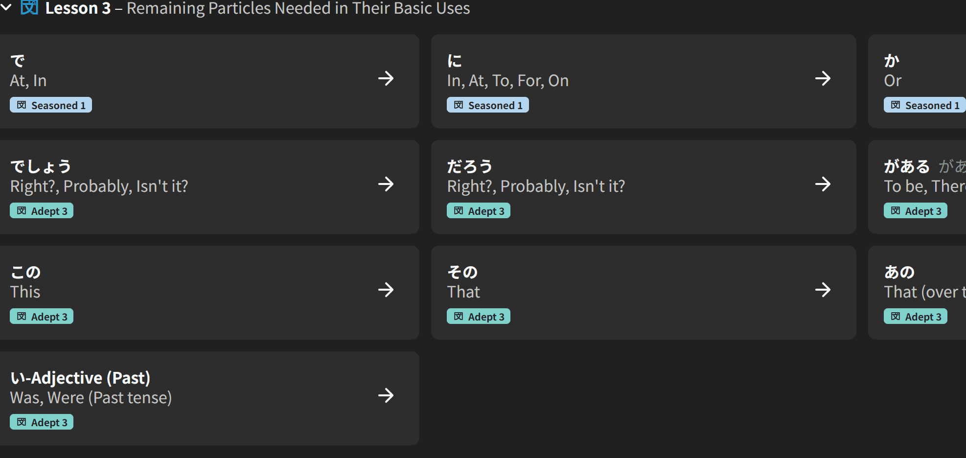
While I am liking the redesign for the most part, I’ve noticed that learning grammar points out of order results in things looking very uneven, as a result of the added icon for SRS level making learned and unlearned grammar points have different thicknesses. An example:
1 Like
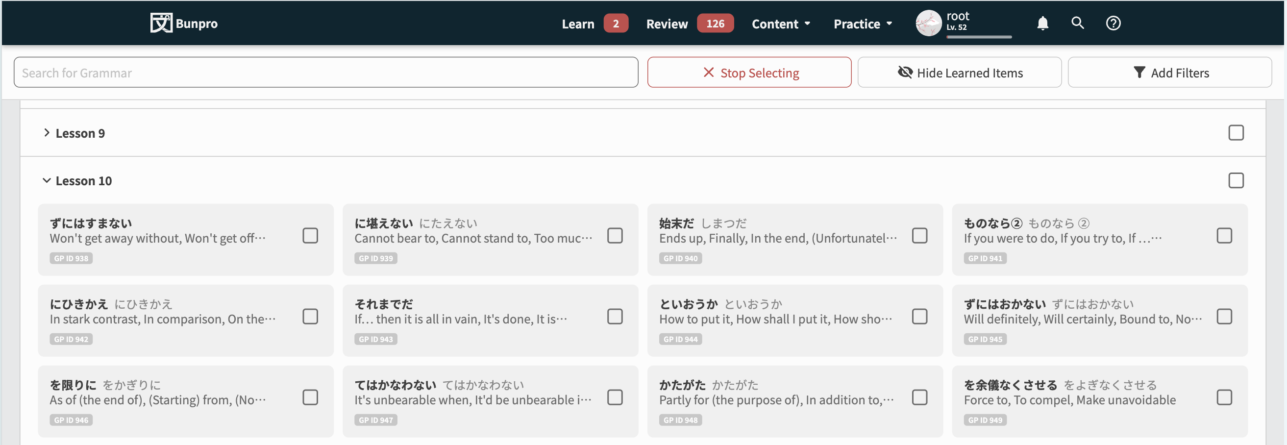
Another Update (29th Jan)
- Reduce button count in the Item-Select bar at the bottom of the page. Place Progress-related actions in its own tooltip
- Replace the → arrows on the Grammar/Vocab list-items with an “individual action” tooltip – much like the Search feature
- Re-style how Note/Bookmarks appear next to the title – place them instead as pips at the bottom with all the other details
- Align the checkbox vertically a bit better
- Add Item-Select system to Search
- Increase speed of hover animations
- Fixed uneven shaping of items when mixed progress
Lesson-page Lovers
@Pablunpro @lunchbox1 @SudoNymm
We’re discussing this internally at the moment.
We’ll try to come up with a solution that makes everyone happy
6 Likes
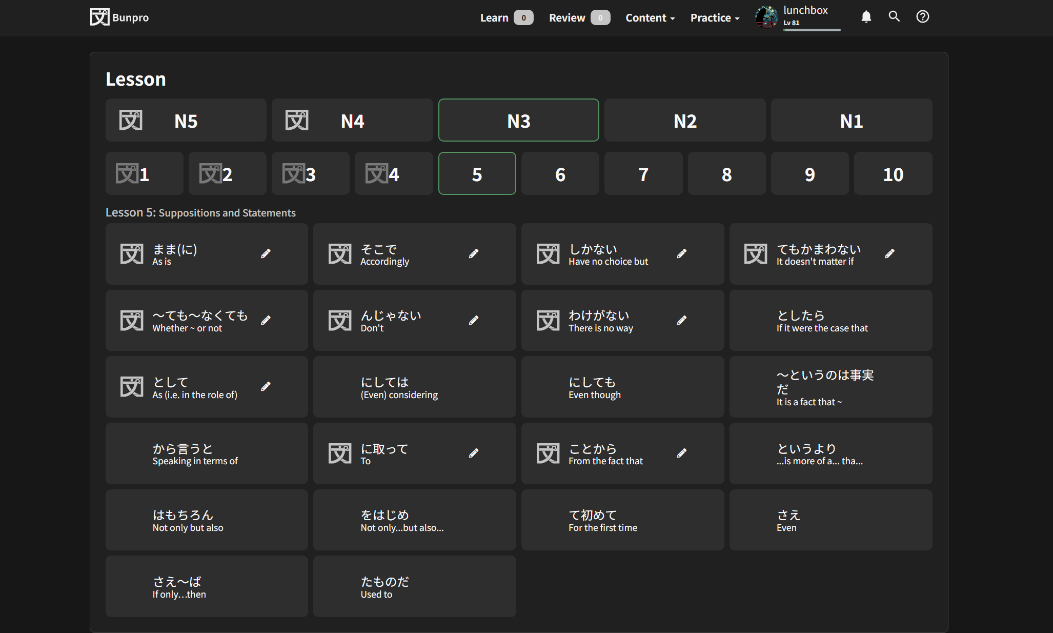
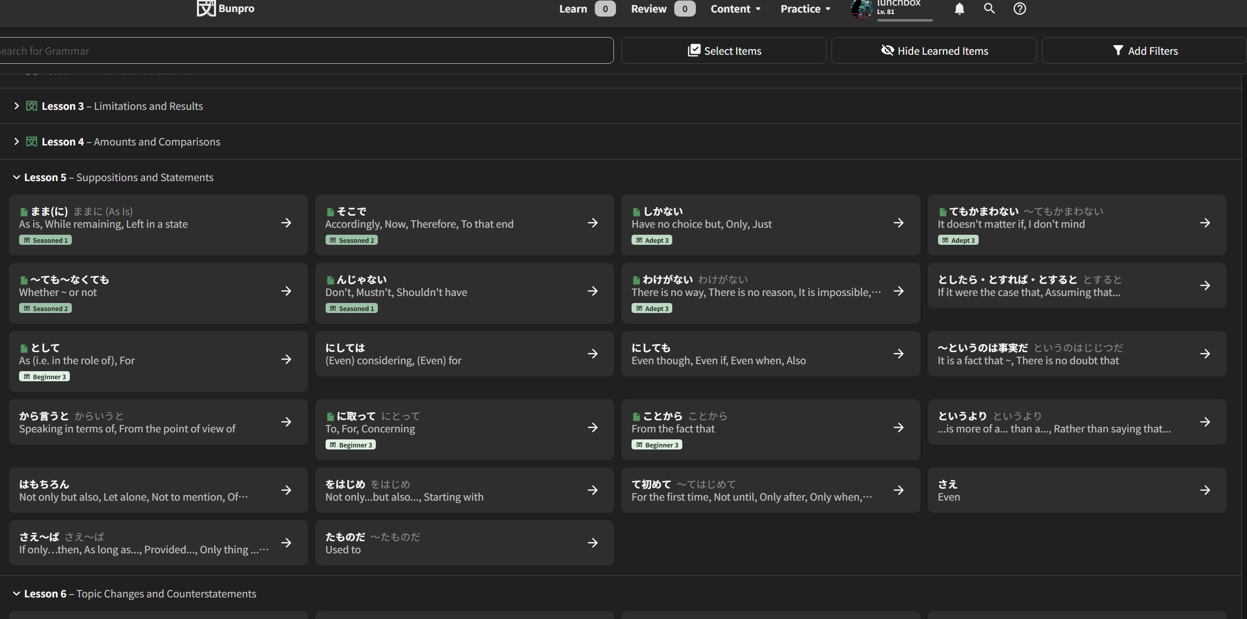
Another Update (20th Feb)
@Pablunpro @lunchbox1 @SudoNymm
For all the Lesson-lovers, there is a new button in the top right of the page that toggles between the old “List” view and…

The new “Grid” view!

It’s basically the old Lessons page, but with the Search feature, and the Hide Learned Items + Add Filters stuff intact.
It will remember your opened/closed states for both views independantly, as well as your last-opened views.
Please try it out and let me know your thoughts!
Also a minor thing, but we changed the background color of this nugget in the bottom so that it stands out more:

10 Likes
Seems to work perfectly fine!
僕にとって完璧ですよ。
本当にお疲れ様でした!嬉しいですよ。
5 Likes
I noticed you cannot search / query by the Lesson’s subtitle, which are usually in English and are handy when you can’t remember the exact Japanese expressions.
Or perhaps you can, but it’s incredibly inconsistent.
Try to find “way” and you don’t get the ように N4 lesson which has a subtitle which should match the search string:
So that, In order to, In such a way that
Same thing happens with “afford”, which shows 0 results, despite it being mentioned in several of the わけには。。。 grammar points.
“More” shows an N2 lesson even though it’s included in several previous lessons, etc.
Not sure if this was the right topic to mention this issue, since the new Library module seems to have been released for everyone as of today.
2 Likes
Good catch, and thanks for the mention!
I’ll get this fixed in the next few days.
Yes we silently released it out of Beta a few days ago.
1 Like
Non-JLPT Lesson 2 should be subtitled as 関西弁 or moved to its own section.
1 Like
Good idea!
I’ve added a description for that lesson~