Hi all!
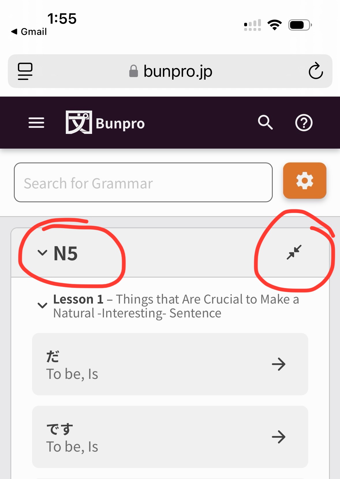
Gonna keep this post short – we’ve released a Beta for the new Grammar Library (previously Grammar Points) to the site now.
As I posted in the Kaijugation thread, you can switch to it permanently through the Beta section of the Account Settings page.
If you just wanna check it out quickly but don’t want to permanently switch to it, you can directly visit this link:
https://bunpro.jp/beta/grammar_points
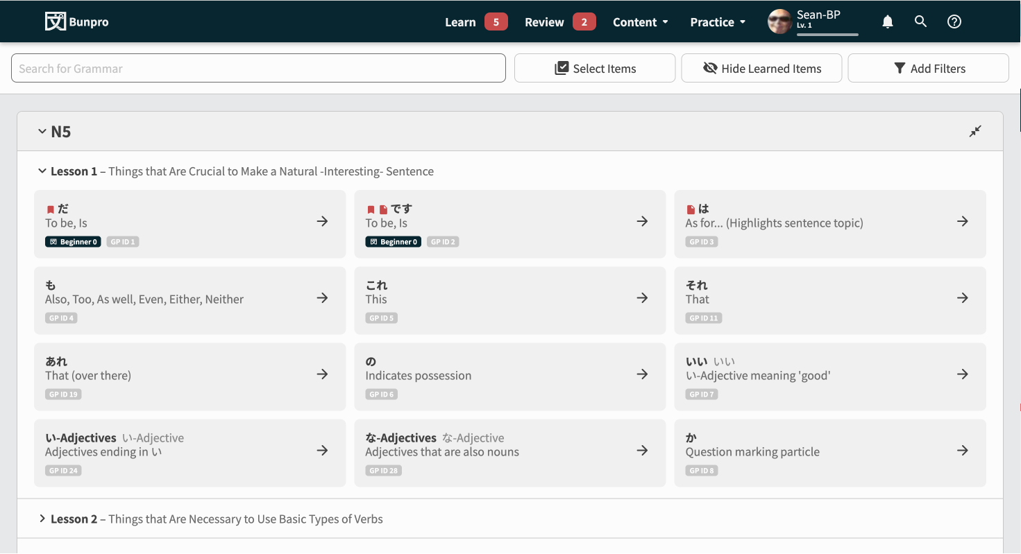
Some Screenshots
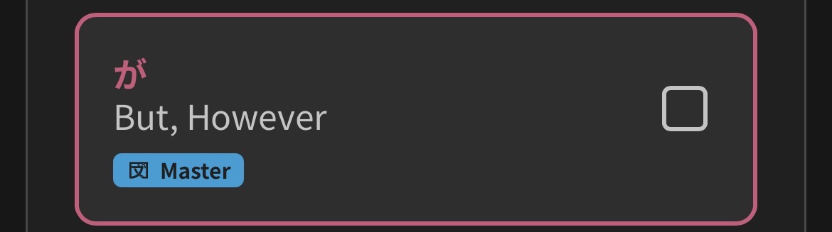
Features
Overall the base experience should just feel a lot cleaner/snappier now.
But we’ve also added:
Tiered collapsible section system
Lessons and whole JLPT Levels can be collapsed to hide information
Lessons will remember between sessions if they’ve been collapsed or not.
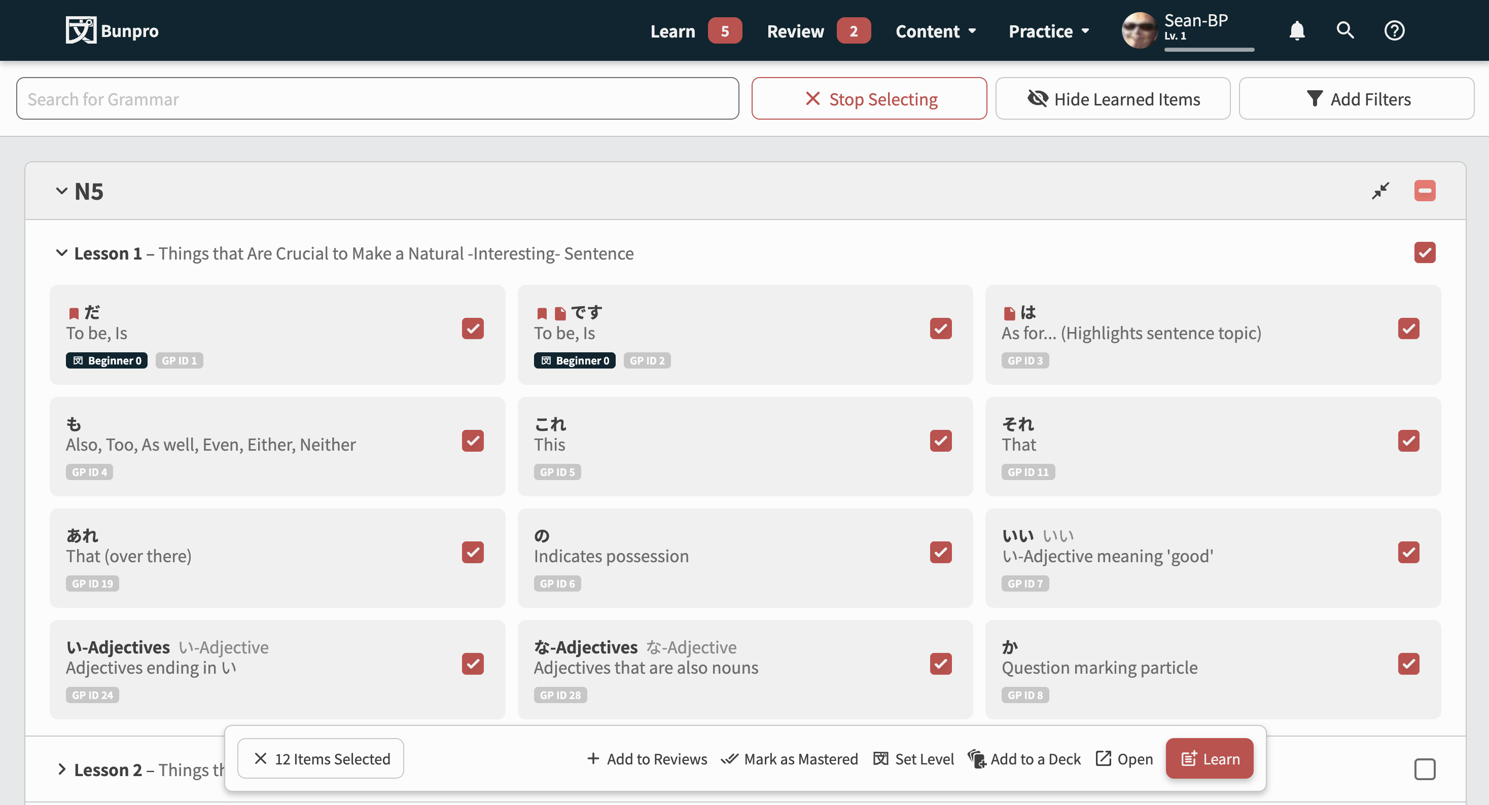
Multi-select + batch action system
As you can see in the second screenshot, we’ve implemented a system that allows mass actions.
This is the biggest feature introduced with this Beta.
You can do the following actions on large amounts of GPs without it crashing/lagging/breaking:
- Add to Reviews
- Mark as Mastered
- Set (SRS) Level (NEW)
- Add to a Deck (NEW)
- Open (NEW)
- Learn
We’re looking for any and all feedback related to how it looks and feels (and of course any creepy crawlies (bugs) that have got into the code).
Please comment below! 
Thanks!
The Bunpro Team