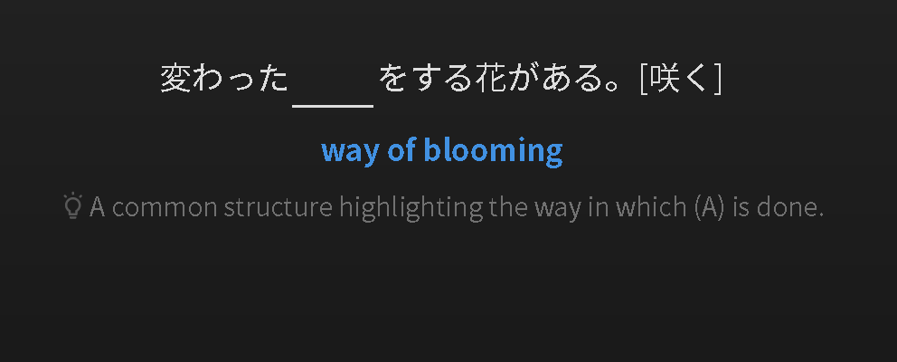
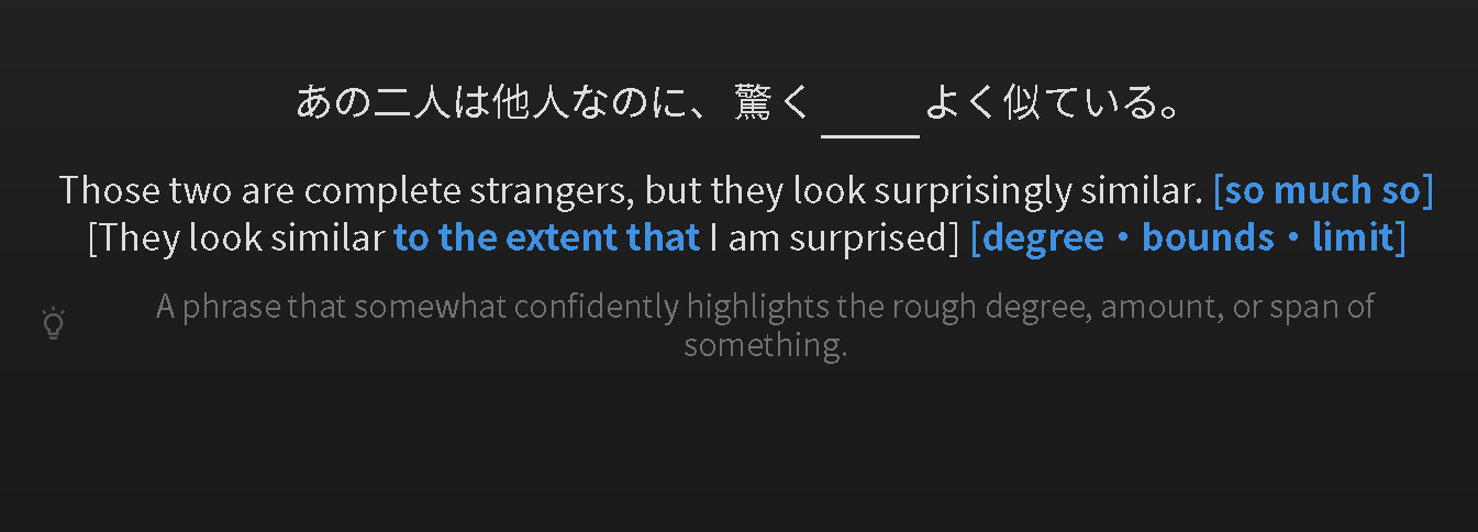
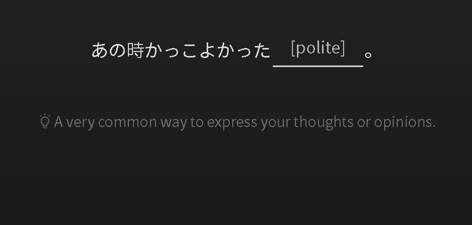
Recently when I was doing my reviews this little lightbulb with a hint appeared. I find this much text on the screen distracted when I’m doing my reviews  I can’t seem to figure out how to make it go away, while still keeping the English translation on the screen (which I do use and want to keep). When I press the space bar I can make everything go away, but I just want to keep the English translation. I’m not sure if I pressed a button or something on accident, but could anyone help me out?
This post might clear up what’s going on if you have not seen it.
ahh, I did not! Actually just used the community profile for the first time to ask this question haha. Thank you so much!
Not sure if this is what you’re looking for but I’ll give it a shot. Hope you won’t mind my browser’s dark mode and other odd personal choices, like lack of highlighted instructions (laziness  ).
).
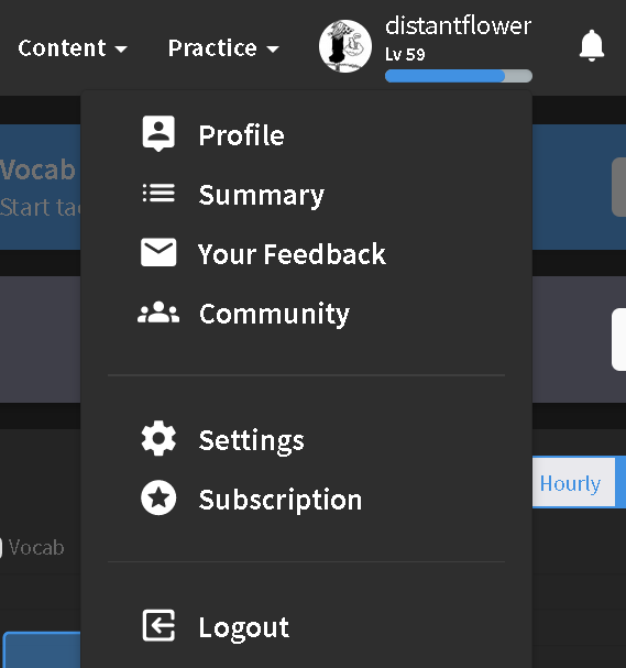
Go to Settings.
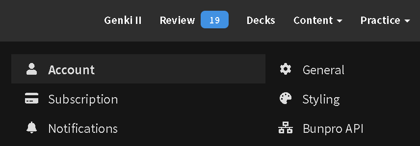
Then go to General.
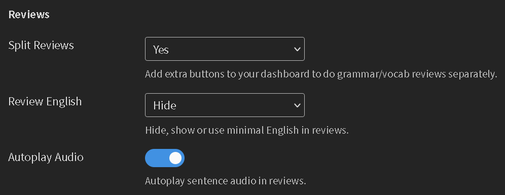
After that, scroll down to Reviews > Review English.
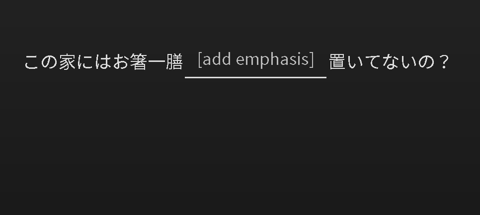
Here’s what it looks like with ‘Hide’.
Here’s with ‘Hint’.
If it’s ‘Show’.
And finally, if Nuance is chosen.
Forgive me for my bad screenshot spam  Hope they will help answer your question about hiding the little lightbulb.
Edit: I just reread your post and noticed that you wanted to still keep the English translation on the screen. Hmm…not sure how to do that now 
For now I could only think of the Hint toggle button on the bottom left of the review, or using Yomichan to select and translate words you don’t understand, but it might be annoying to do so for each review.
I don’t think there’s a way to do it within BunPro itself. If you’ve got an adblocker or something similar, you can block just that as it’s a separate element from the English sentence.
For example, in ublock origin you’d want to block " ##.sentence-nuance > .justify-content-center.align-items-center.d-flex > svg ".
Because Tailwind is so ugly and hard to target, you’ve got me thinking I should probably actually add some named classes to components so it’s something like
[ HintLightbulb ] h-24 w-24 inline-block pb-2 align-bottom opacity-70
instead of just the plain ol CSS
Please let us disable the hints. I have to use the app for all my reviews until then :’(
I have the exact same problem. New hints seem to be a bit distracting for me, so an option to hide them would be really helpful. 
It’s most troublesome when reviewing vocab - the “show english” seems to be on by default which isn’t the ideal option for that kind of flashcard.
Hi there! Welcome back to the forums.
Are you able to elaborate on what you mean?
I think what he means is that people want to be able to set a default view on what they see when a review is shown.
At the moment, when you get a review, you get
- Japanese Sentence
- English translation with the “to be” translated English Highlighted
- Hint of the grammar point that is denoted by the lightbulb
This to some people can be too distracting and too much of a hint (cheating yourself to really think of it) and it’s bothersome to have to turn off every time they go to the next grammar review.
Personally I would like to just be presented with the sentence in Japanese, and only show the “to be” translated grammar point in English (without the entire Japanese sentence). This is just for me to improve my reading comprehension though.
So I think it will be great if users can set a default of what they see every time it goes to the next grammar point so they don’t have to toggle the “hint” button a bunch of times to get their desired display settings for every review point.
Maybe I’m misunderstanding you, but from what I understand you can do this by going to settings and changing “Review English” to “Hint”.


