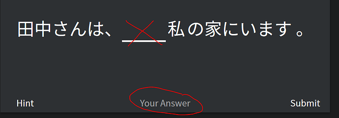
I can't type anything :(

Hi,

When I’m trying to type the answer to a sentence within the sentence, nothing happens. I can’t type anything. :confused:

I’m thinking of signing up but if this happens, there is no point. I’ve changed my keyboard to Hiragana and still nothing :frowning:

Thanks,

Nada

1 Like

Hi, and welcome on Bunpro,

Maybe a silly suggestion, but do you really select the proper place to input your answer? It is not in the sentence itself but below, where “Your Answer” is written (see picture below).

Hope this helps.

2 Likes

Thanks MZa,

Yep, I’ve now figured that out haha. It’s that the cursor was flicking above and I didn’t think that there was a space to put the answer below because it wasn’t clear on some of the questions.

1 Like

It was confusing for me too in the beginning, maybe the interface can be improved or a tutorial or tooltip showed the first time? @Daru

1 Like

Shouldn’t javascript be able to focus on the actual text input even if you click on another element?

1 Like

On the other hand, it would be pretty cool if you could type directly into the sentence. It’s not a big deal, but maybe it would be helpful to some people to visually see their answer within the context of the sentence/question/etc.

1 Like

I’ve been using the website for a while and I still make that mistake lol

It probably happens more often when using the mobile site as your brain instinctively wants to tap on the gap.

You could add an eventlistener on the gap to focus the text box when clicked or tapped, and deactivate it when there’s an answer submitted. It’s probably a minor oversight if I had to guess.

2 Likes

Thanks for the ping, @Megumin !

Hey there @nadakan , and welcome to Bunpro!
If you’ve any other questions please let me know.

That said, yeah, it is a bit confusing, specially because visually, the gap there is easier to notice than the one you’re actually supposed to type into. Sorry for this confusion. :bowing_man:

I’ll make a note of this for when we redesign the Review experience! If you’ve any other impressions or notes please let me know!

2 Likes

Self important, narcissistic answer, but I’d vote against changing the interface; I prefer we don’t have to type within the sentence. I was a WaniKani user before Bunpro, and now I use them both daily in conjunction, so I’ve never made that error - Bunpro’s use pattern kind of mimics WaniKani’s, so it feels really ingrained to simply put the answer at the bottom of the panel and see the result up above.

Well, it’s not like it has to be changed to the other behaviour. It can be allowed to do both, or just make it more obvious you have to type your answer down there instead in the gap.

They will probably ask feedback before changing like they have been doing with all the major changes, so we can make it better between all of us.

This was my main critique as well when I started, I’m so visual haha. With Wanikani it’s not such an issue because the kanji and vocab stand alone without any context around them, but with Bunpro you’re completing a sentence so seeing some context would be a good addition.

Thank you Daru, and everyone else here.

Yes, I’m very visual but also lack what people would call some ‘common sense’.

Bunpro is great so far. :slight_smile:

1 Like