Learn 3.0 – Navigation Evolved
This feature update includes some TLC to the Learn system.
 Purpose
We received a lot of feedback from new users that the old Learn navigation system (with the arrows next to the Grammar/Vocab title and the little 1/3-style progress indicator in the corner) was just not clear enough to convey how a user was meant to use Learn.
We agreed, and thought of a way to make this pretty simple process a lot easier to grasp for new users.
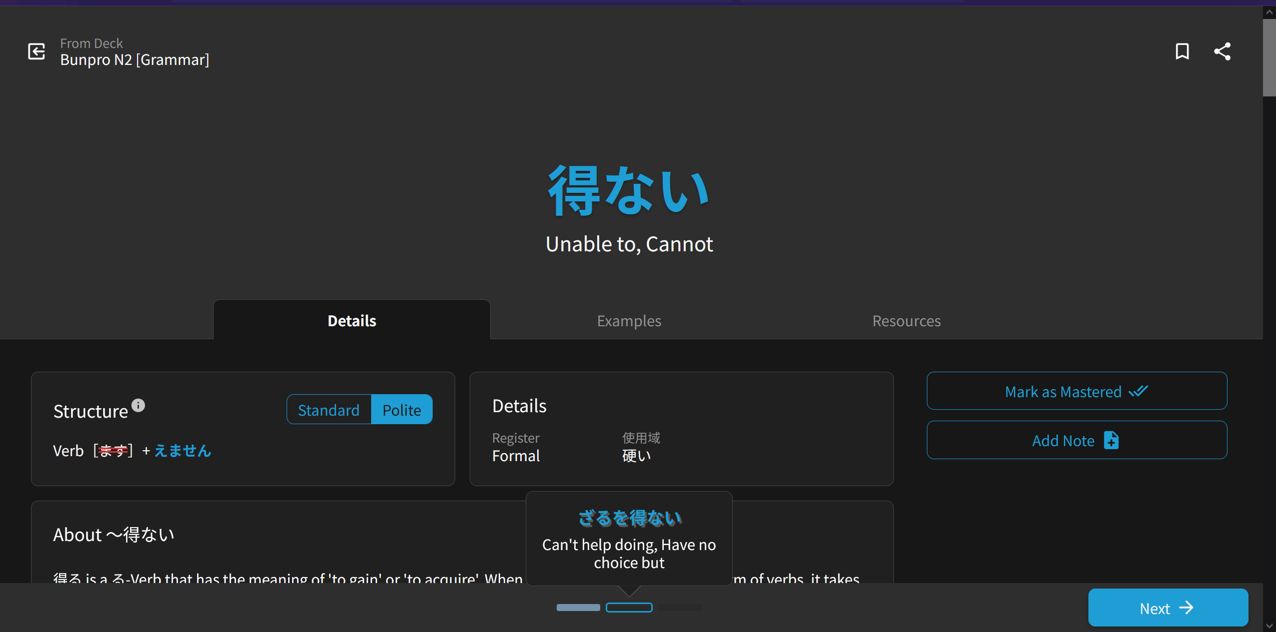
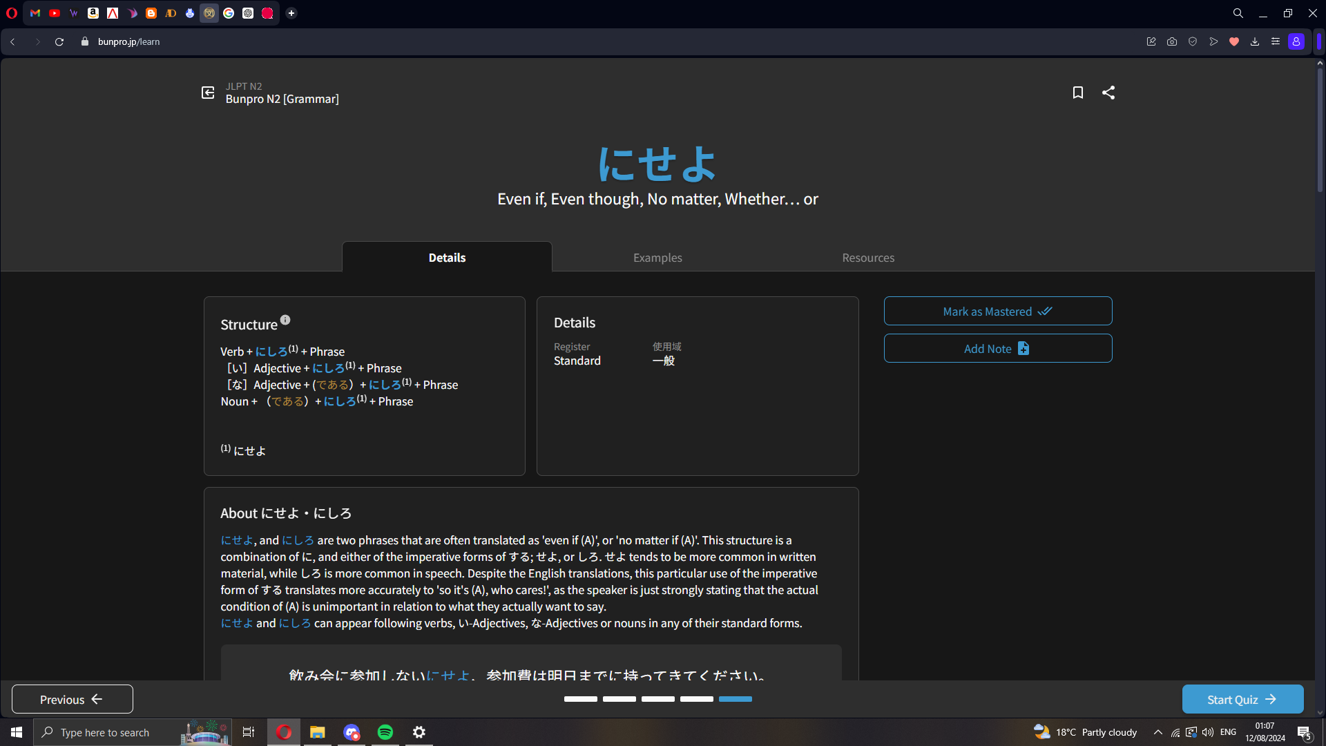
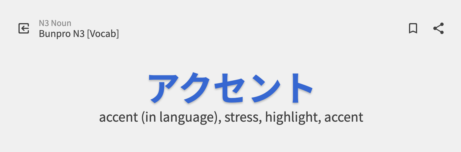
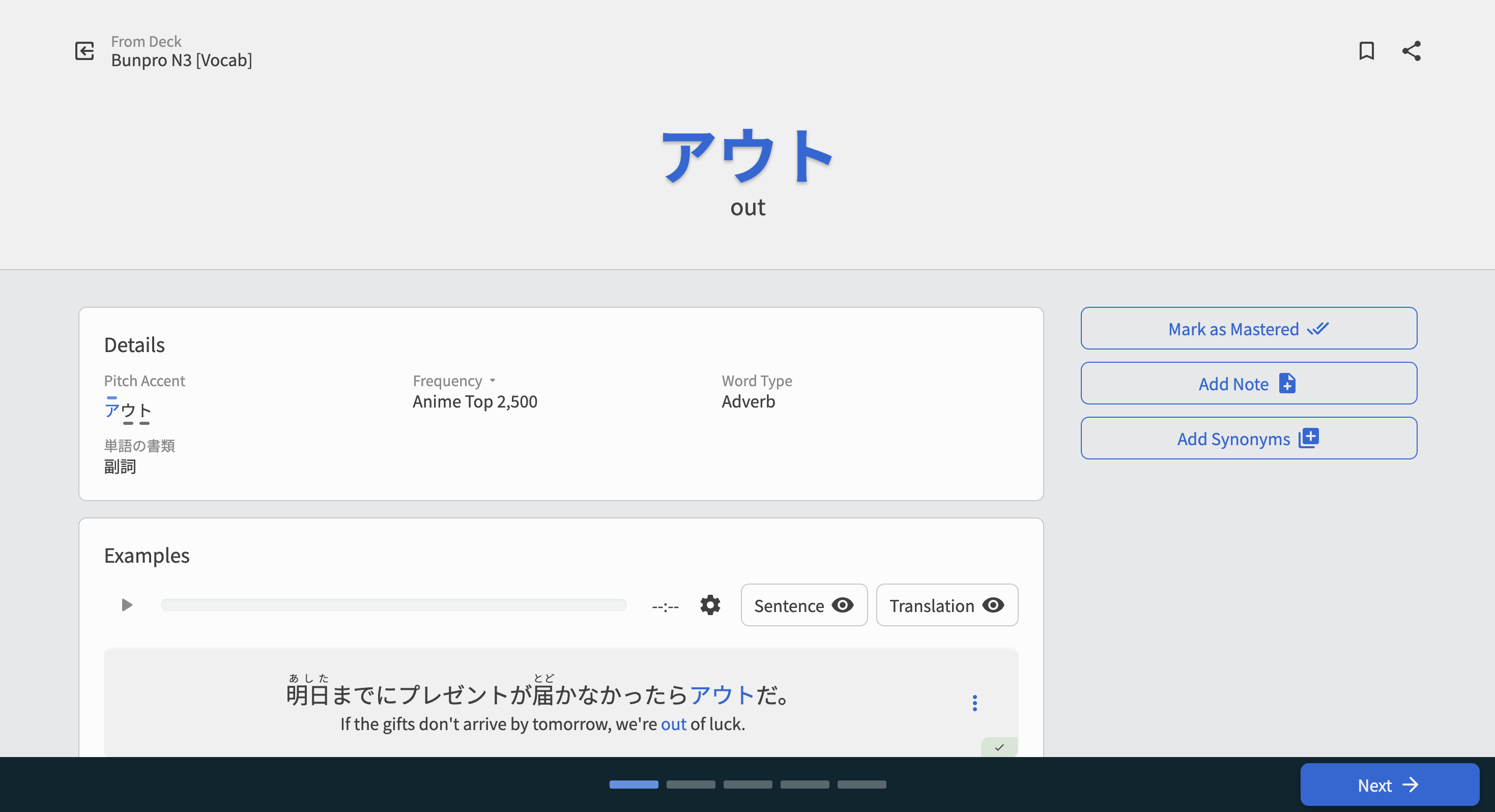
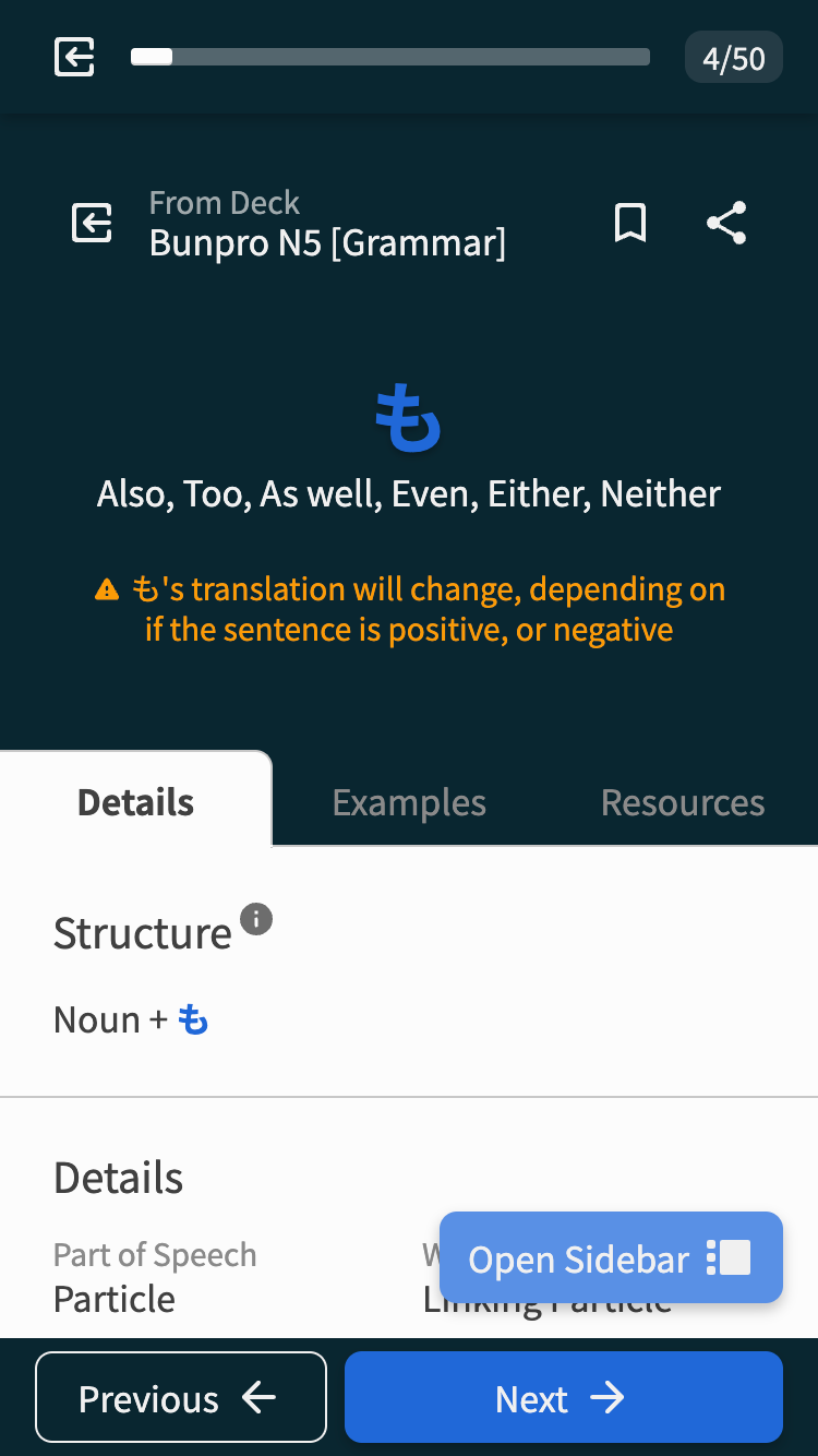
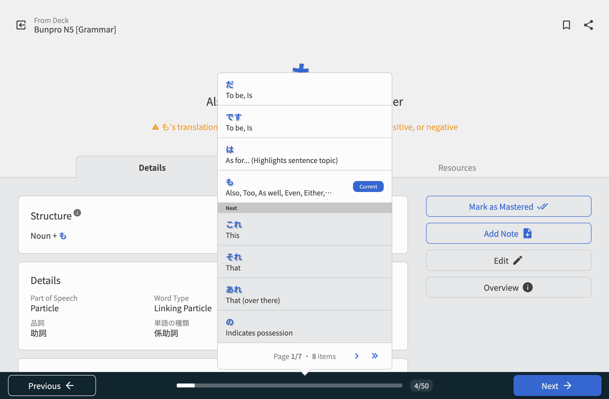
🪜 Progress Display
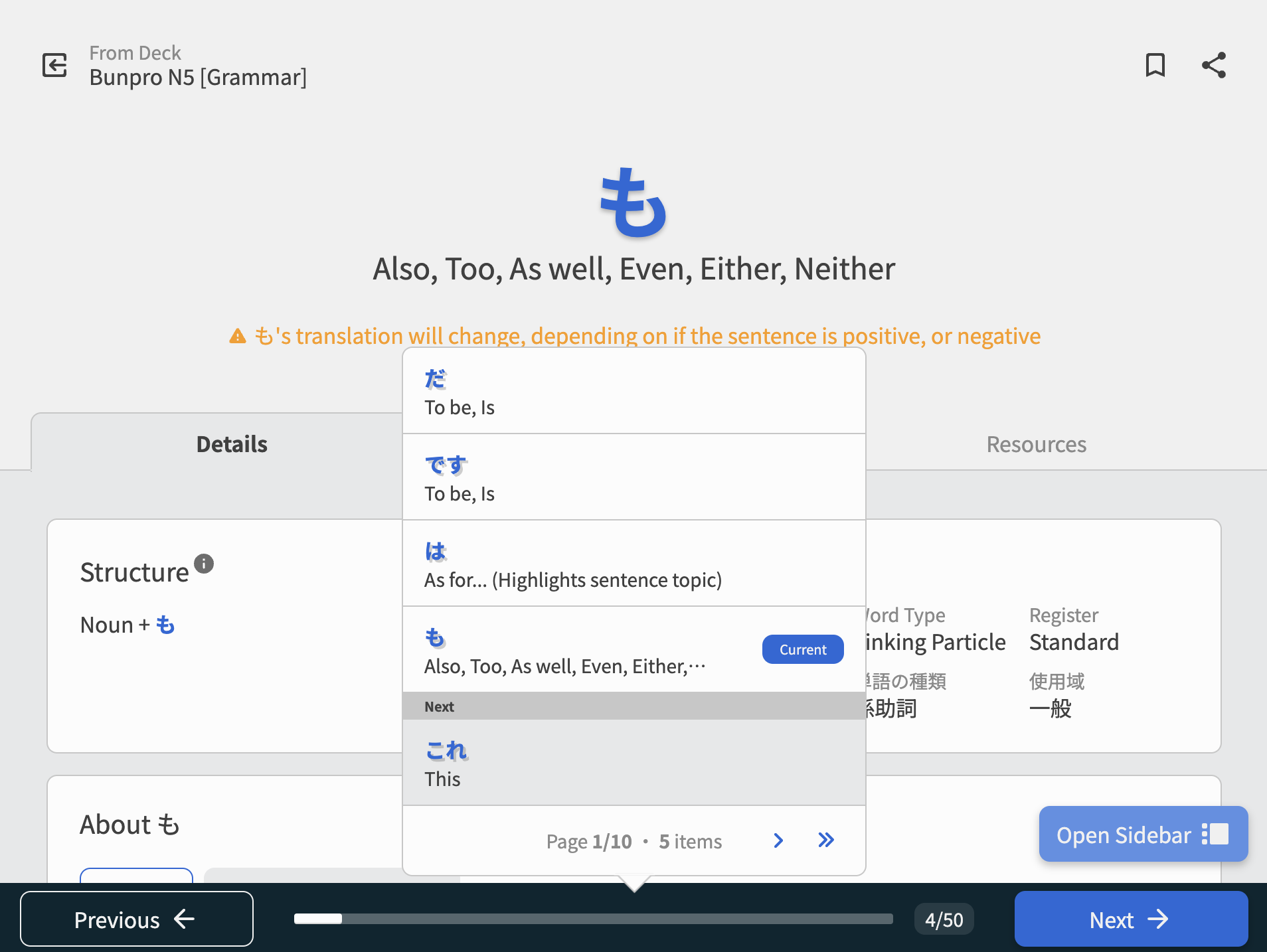
We switched to using a pellet-based system – similar to what’s inside the Dashboard Learn dropdown menu – for smaller sessions, and a progress-bar based system for larger ones (~10+ on smaller screens, ~20+ on larger ones).
We feel that (finally) this system is self explanatory.
Use the Previous / Next buttons to navigate through the items, and click on the pellets/progress bar itself to go directly to items.
Small session:
Large session:
Screenshots of all the possible states
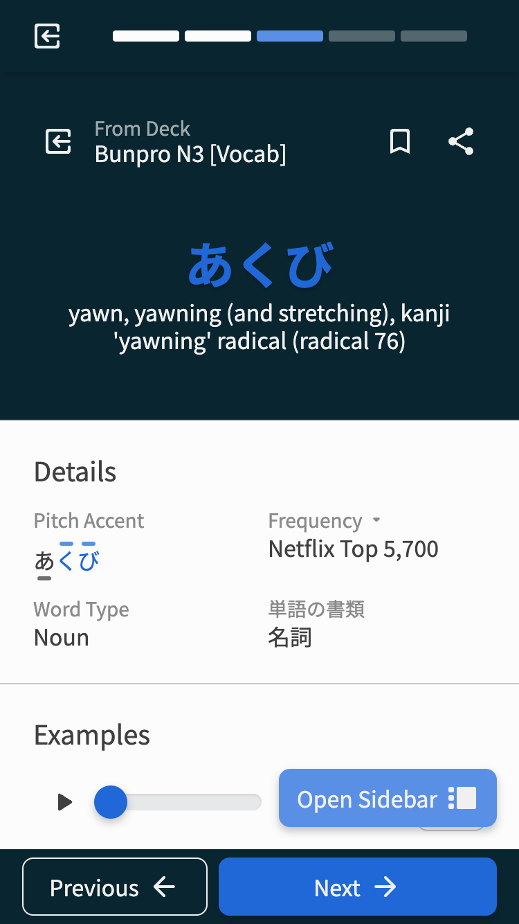
Mobile (small session)
Mobile (large session)
Desktop (small session)

Desktop (large session) /w progress bar clicked
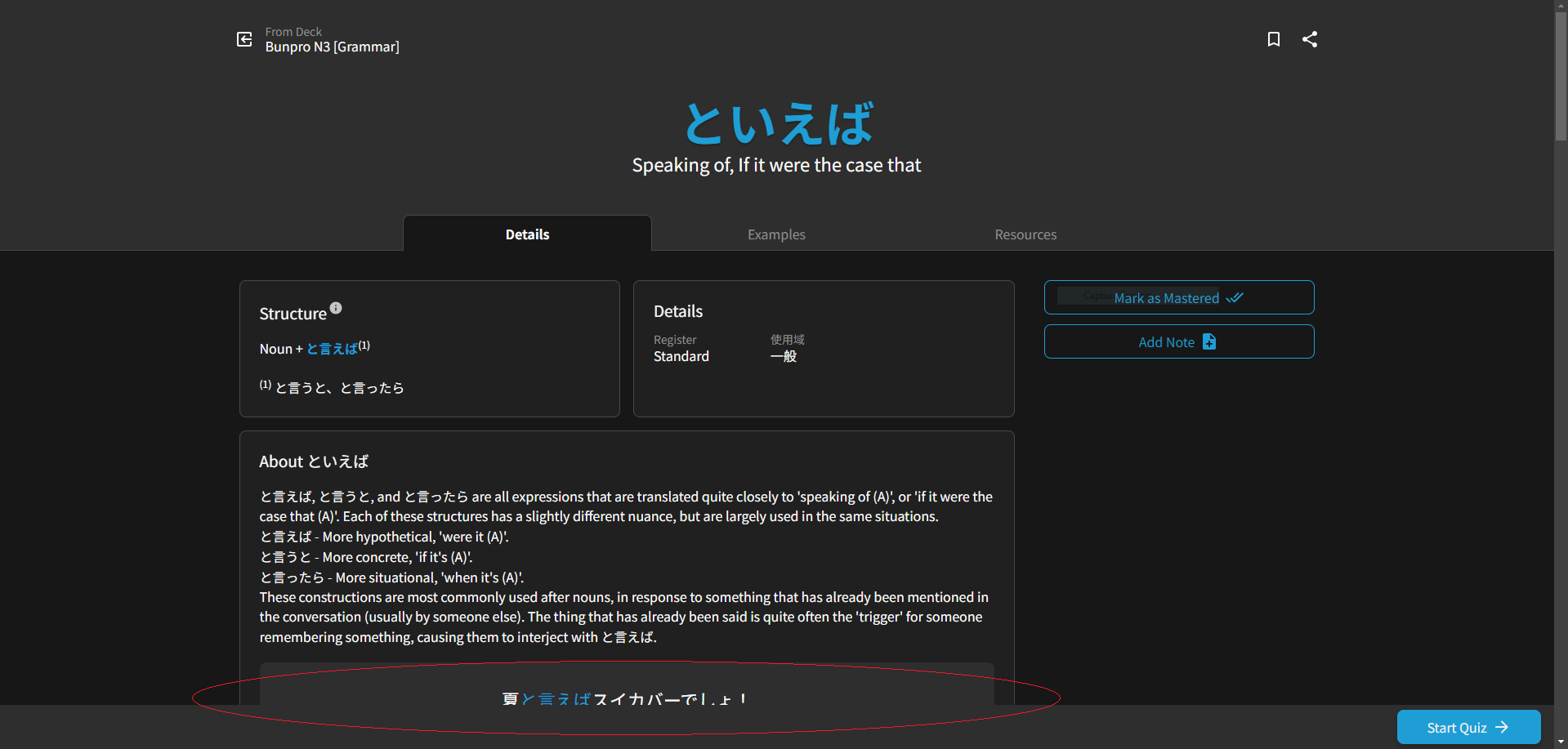
Finally, the Next button changes to Start Quiz, and you quiz the items you just learnt.
 Hotkeys
Hotkeys remain unchanged – use the ← / → keys to progress through the items.
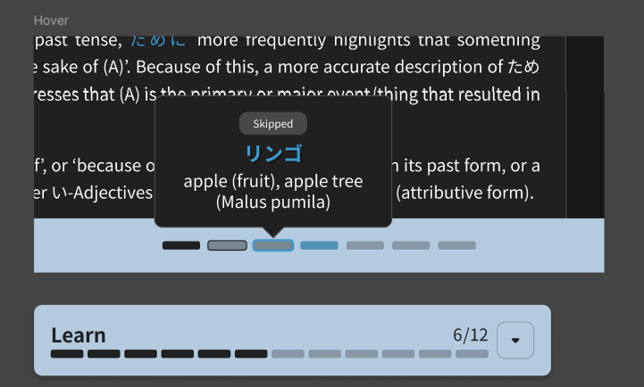
Hitting the → key on the last item will bring up the Quiz Time! popout.
Hitting Enter here will start the quiz.
Just like on the item’s individual pages themselves, you can use the D / E / R hotkeys to access Details / Examples / Resources respectively.
 Removed the Navbar
We made a calculated decision to remove the navbar during your Learn session. This reduces distractions from the item you’re studying, and gives you slightly more vertical space while Learning.
You can return to your homepage using this lil chicken nugget (button) in the top left corner:

 No Beta?
No Beta! We felt this feature was a straight up improvement over the old system, and the technical overhead of managing the two systems at once wasn’t worth the extra time.
That being said…
If you have any feedback or critiques at all, as per usual, leave them below and we’ll try to get to them ASAP.
What’s Next?
With this published, we’re going to continue to monitor for bugs and other feedback.
We have some other, bigger projects coming up next, so stay tuned!
Don’t touch that dial 


 and/or with a note/tooltip like “Click to navigate”, or something along those lines.