Major Update 9/25 - Grammar Foundation Brick by Brick

@mathijsdm thanks a lot for the feedback! We are definitely trying to work out the best way to display popouts, which includes as many grammar points as possible. As する is part of so many other grammar points, I think we will have to really examine how to most effectively display that!

We are super happy to hear that you are enjoying it so far!

5 Likes

Insane!!! Something this big will probably take some time to iron out a few issues along the way (conjugation, etc.) but it’s going to make sentences so much easier for most levels of users. I almost wish I was starting again at N5 to have an even better experience compared to just a little over a year ago!

Header also looks more sleek, still keeping my fingers crossed for a search-bar in the header so I don’t have to open /grammar_points every time I want to search something when I have a question :wink: Still, another unreal update. Great work everyone!

13 Likes

Ohhh, those grammar block highlights are great!
Also liking the casual/formal toggle. It’s nice to see all the variations in one place next to each other, but I guess having them separately does indeed make it a lot neater.

5 Likes

You guys have been on fire lately! :fire:

8 Likes

YESSSSSSSS! This has been one of my #1 feature requests. Thank you Bunpro team :smiley:

6 Likes

Thank you, looking forward to using the new features. :slight_smile:

4 Likes

From a formatting point of view, would it be possible to somehow separate/differentiate the word “Structure” from the rest of the explanation? Perhaps underline it then add a line break? Right now it looks a little cramped; obviously nothing life-ruining LOL but might be a better way to present it I suppose. Also, are there any plans to have a field in the pop-up for custom notes the user has created? No idea if that would even make sense or work, but could save the user a click or two.

4 Likes

Wow, just wow! Do you guys ever leave the office!? Great work! That grammar popup was something I have been waiting for.

4 Likes

@Jake In regards to the tweaked header, can we have consistency between the discourse and bunpro by removing the forced white background?

image

I think it looks better without:

image

removing "background: white;" from .nav .gravatar-img
5 Likes

:eyes: :eyes: :eyes: Oh man I would love that.

10 Likes

I just a use Chrome headline bookmark for https://www.bunpro.jp/grammar_points but I also have BunPro in a Selection Search extension now that they opened URL titles a few months back to open grammar points, though it demands precision of the entry search. A native feature would be great though.

5 Likes

Interesting! One of these days I would like to collaborate with a few users to talk about different things we’re using for studying, whether it’s your bookmarks or anything else. Stuff like this is super useful!

4 Likes

love the grammar popout!

4 Likes

I like the idea here a lot. Testing out the ことができる page in light mode, there’s no difference in style to show what elements have popouts. Some visual indication of clickability would be nice.

Screen Shot 2021-09-26 at 9.04.17 AM

Also, when I click on either element, I just get a loading screen that never loads. BunPro often loads slowly, but almost never more than five seconds. I figure there’s still some maintenance going on here?

2 Likes

I really appreciate the continuous improvement and love this application has been getting. Thanks to the team.

10 Likes

We apologize for the slow loading times! It is a new setup, so there could definitely be a few things to iron out along the way. It could also simply be that the link was not correct for a particular popup, in which case it’s our fault! We have been going through every single new link over the last few days to test accuracy, so hopefully we find all the duds!

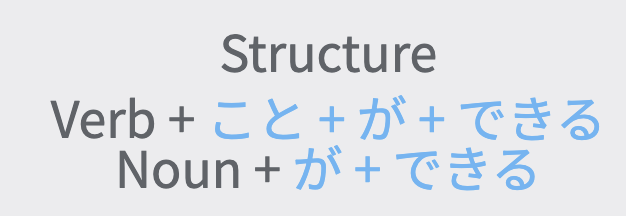
As for the visual indicator, we could possibly do something like this (for the structure pages), but for regular sentences in study, the main objective would be not to show them (at a glance). This is mainly because it would become a visual reminder, and potentially rob you of the opportunity you had to remember/recognize the grammar point yourself (strengthening your recall for the future).

1 Like

Just something I noticed with the new layout:

image

It’s obvious that there’s plenty of room here to display “Verb[potential],” but it doesn’t :thinking:
(Also, idk why this image is so big here… it’s showing up larger than the original snip I did)

1 Like

I have often wondered why those boxes display very limited information too Kai! I will look into that and see what the consensus is.

(not a development guy myself, so I can’t give any immediate answer on why it’s that way)

Edit - I have an answer! It appears that this is due to the nature of the bricks themselves, and a cropping issue that occurs with them. They are on a list of things that we will be aiming to improve in the near future! In the mean time, we apologize for the inconvenience :sweat:.

1 Like

I love the changes! I’m not see the casual/polite toggle option while doing my reviews and viewing the grammar point being tested after missing it. Sorry I don’t have a screen shot but I noticed this when I missed ている② for example.

1 Like

The grammar popout update was exactly what I was hoping for when I made a feature request back in August! Thank you so much for this addition! :tada:

3 Likes