Major Update 9/25 - Grammar Foundation Brick by Brick

With this update, we have made a big change to how you can study with Bunpro. Grammar points and example sentences now have an element of interactability, connecting them to other grammar points, helping you build a stronger mental map of how everything fits together.

Grammar Structure

Polite/Casual Toggle

The majority of all grammar now have a casual/polite toggle option (when applicable). Casual is shown by default (as this is the most common form used in actual conversation and media). While not a big change, we believe it helps clean up the structure section, making it more readable and will also help increase your exposure to the grammar pattern’s polite form.

Consistency

We have adjusted the way certain conjugations, word types and optional/substitutable structures are displayed. This is mainly a consistency change but also ties into the next change. Instead of overloading you with many different options, we have opted for using a superscript to show all other possible choices.

Grammar Popout

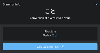
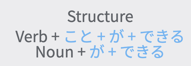
Each building block of grammar in the structure section is now clickable (you can hover to see which ones). in the following image, こと is activated.

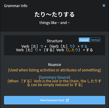
Clicking any one will display the relevant grammar quick view popout. This will give you some core information and a link to that grammar point to quickly see more information.

We believe this will help facilitate a deeper understanding of how grammar builds into other grammar.


The grammar popout when clicking on こと in ことができます

In this instance if you didn’t know why ことis used with a verb and not a noun when expressing an ability to do something, you could click on こと to see that when combined with a verb it converts it into a noun. This is a small step toward showing you how word types change in Japanese, depending on their usage. This approach is aimed toward getting you used to seeing specific changes, without ever needing to formally learn it.


Example Sentences

Grammar Popout
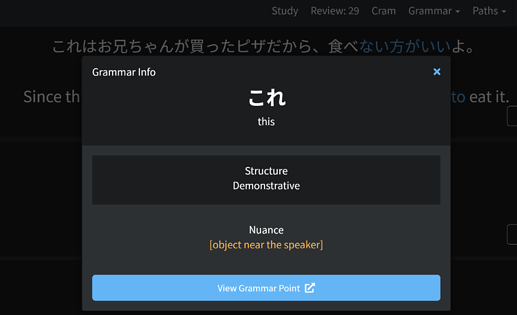
The grammar popout that is available for the structure sections is now also available in example sentences and also during review quizzes.

Our goal here is to make it easier to find the information you need, helping to keep you in your learning flow as much as possible by removing the need to open a new tab and look up the grammar you don’t recognize.

Grammar building blocks within the structure section of the grammar popout can be clicked.

Give it a try! ことができる

Note: This is currently only available for N5 but we will be working on adding it to the rest of the levels in the near future. Feedback would definitely be appreciated, as we are trying to find the most efficient way to highlight certain grammar points, without overloading you with information.

Reading Passages

Reading Passages now have a checkmark to help you visualize which lessons you have completed all of the readings for.

Header

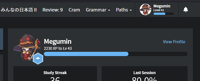
The header has been reverted to more closely match the old header with your username and level progress more easily visible.

As always, we would love to hear any feedback or suggestions you have about these changes.

Happy studying!

101 Likes

Fantastic updates. Thanks for your hard work! :pray:

12 Likes

Here is a short view of how the grammar popouts work!

Grammar popouts1

As always, thanks for studying with us, and we hope this change positively impacts your learning!

32 Likes

Wow! An absolutely amazing update! Especially love the grammar pop-outs in the example sentences!!! It adds an entire level of reinforcement because I have to admit that if I encounter something with a grammar point I’m not 100% on anymore, depending on time I just skip, but now there is no more excuses!

This is probably also a real boon for people not following the BunPro lesson order as I heard people complain about exposure to unfamiliar grammar in other lesson orders.

I just had a bit of a play around for a few minutes with some example sentences in N5 and I feel like the way you all have implemented is the perfect level of usefulness without overloading with information!!! The casual / polite toggle also makes the pop-outs way more friendly to look at / use!

This has to be my favorite update you guys have pushed out yet! Eagerly anticipating it all being rolled out to the other grammar points!!!

The only feedback I can really give (and only if this doesn’t take an incredible amount of behind-the-scenes work, because I can imagine it’s hard to implement) :

For example this sentence on たり~たりする combines the ~たりする and the たい grammar points, but when you click on the pop-out you only get an overview of the ~たりする part.


It’s already an amazing improvement, so please don’t feel like I’m breaking it apart, but IF it is a manageable amount of work I could imagine it is quite a worthwhile addition to be able to see the several grammar points in action in certain conjugations. Again, only if it doesn’t take an insane amount of reworking though!

6 Likes

@mathijsdm thanks a lot for the feedback! We are definitely trying to work out the best way to display popouts, which includes as many grammar points as possible. As する is part of so many other grammar points, I think we will have to really examine how to most effectively display that!

We are super happy to hear that you are enjoying it so far!

5 Likes

Insane!!! Something this big will probably take some time to iron out a few issues along the way (conjugation, etc.) but it’s going to make sentences so much easier for most levels of users. I almost wish I was starting again at N5 to have an even better experience compared to just a little over a year ago!

Header also looks more sleek, still keeping my fingers crossed for a search-bar in the header so I don’t have to open /grammar_points every time I want to search something when I have a question :wink: Still, another unreal update. Great work everyone!

13 Likes

Ohhh, those grammar block highlights are great!
Also liking the casual/formal toggle. It’s nice to see all the variations in one place next to each other, but I guess having them separately does indeed make it a lot neater.

5 Likes

You guys have been on fire lately! :fire:

8 Likes

YESSSSSSSS! This has been one of my #1 feature requests. Thank you Bunpro team :smiley:

6 Likes

Thank you, looking forward to using the new features. :slight_smile:

4 Likes

From a formatting point of view, would it be possible to somehow separate/differentiate the word “Structure” from the rest of the explanation? Perhaps underline it then add a line break? Right now it looks a little cramped; obviously nothing life-ruining LOL but might be a better way to present it I suppose. Also, are there any plans to have a field in the pop-up for custom notes the user has created? No idea if that would even make sense or work, but could save the user a click or two.

4 Likes

Wow, just wow! Do you guys ever leave the office!? Great work! That grammar popup was something I have been waiting for.

4 Likes

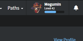
@Jake In regards to the tweaked header, can we have consistency between the discourse and bunpro by removing the forced white background?

image

I think it looks better without:

image

removing "background: white;" from .nav .gravatar-img
5 Likes

:eyes: :eyes: :eyes: Oh man I would love that.

10 Likes

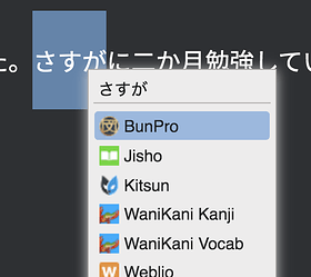
I just a use Chrome headline bookmark for https://www.bunpro.jp/grammar_points but I also have BunPro in a Selection Search extension now that they opened URL titles a few months back to open grammar points, though it demands precision of the entry search. A native feature would be great though.

5 Likes

Interesting! One of these days I would like to collaborate with a few users to talk about different things we’re using for studying, whether it’s your bookmarks or anything else. Stuff like this is super useful!

4 Likes

love the grammar popout!

4 Likes

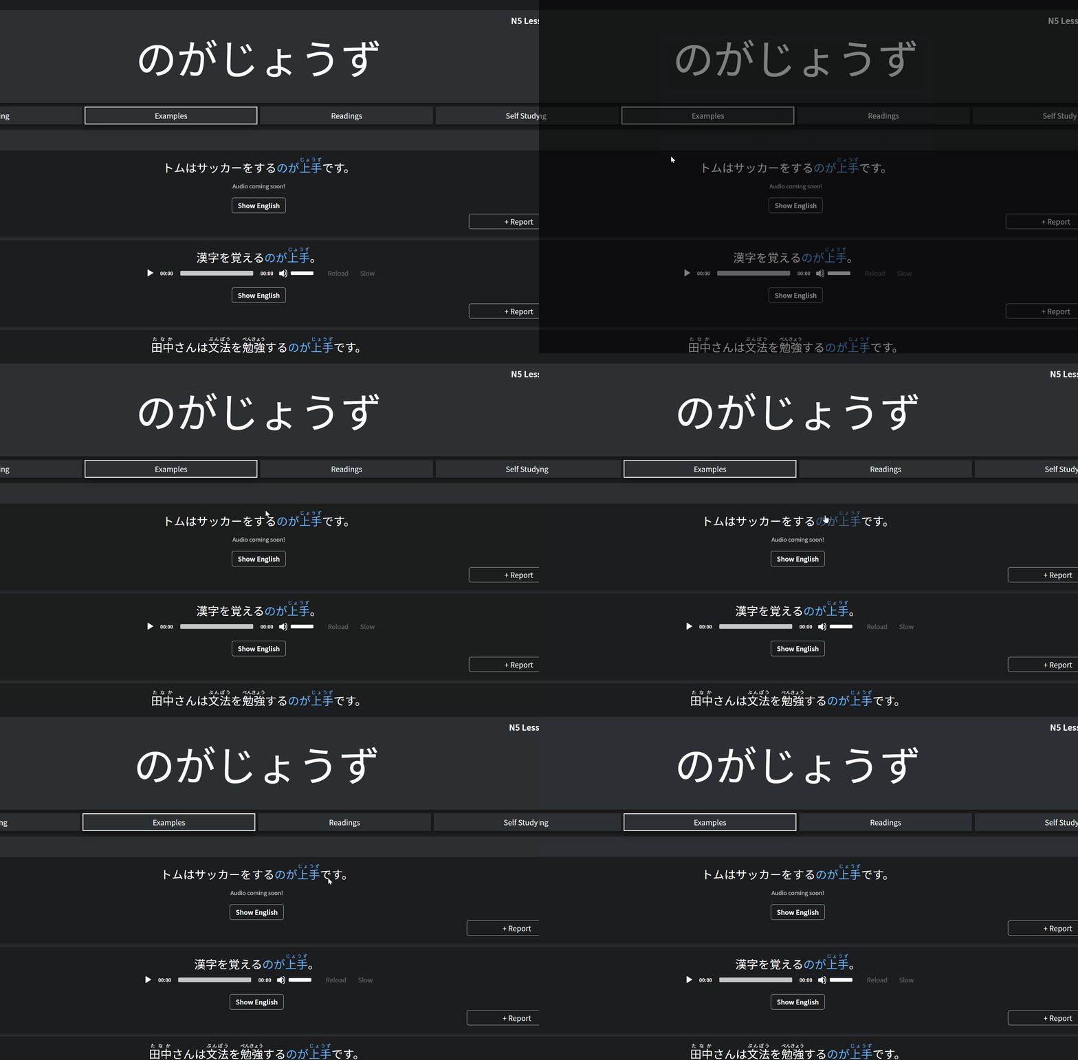
I like the idea here a lot. Testing out the ことができる page in light mode, there’s no difference in style to show what elements have popouts. Some visual indication of clickability would be nice.

Screen Shot 2021-09-26 at 9.04.17 AM

Also, when I click on either element, I just get a loading screen that never loads. BunPro often loads slowly, but almost never more than five seconds. I figure there’s still some maintenance going on here?

2 Likes

I really appreciate the continuous improvement and love this application has been getting. Thanks to the team.

10 Likes

We apologize for the slow loading times! It is a new setup, so there could definitely be a few things to iron out along the way. It could also simply be that the link was not correct for a particular popup, in which case it’s our fault! We have been going through every single new link over the last few days to test accuracy, so hopefully we find all the duds!

As for the visual indicator, we could possibly do something like this (for the structure pages), but for regular sentences in study, the main objective would be not to show them (at a glance). This is mainly because it would become a visual reminder, and potentially rob you of the opportunity you had to remember/recognize the grammar point yourself (strengthening your recall for the future).

1 Like