Major Update - Color Changes [10/27]

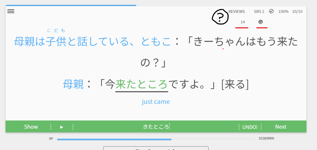
Okay, managed to get a screenshot of both issues! :partying_face:

One with just the icon missing (red underline):

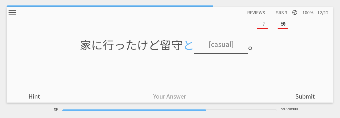
And another with both the icon missing (black circle with ?), and also the second line from some kind of ‘wrap around’ (red underline).

Note: The wrap-around bug only occurred after I had submitted my answer; and, now that I think about it, I think that was also the case the other times I had seen this. [Edit: Was wrong about that, see next post.] Perhaps by answering, some text/content was modified which increased its width, and whatever styling (probably CSS) was too strict on the width of whatever container the text was in, forcing a line-wrapping effect.

[Edit: Hmm, I just noticed that my ‘Correct/Total’ counter in that screenshot had just changed from 9/9 to 10/10, essentially adding two characters of width. Perhaps that was the cause?]

1 Like

Update:
Ah, I just got a screenshot of where the same wrap-around thing occurs even before I answer the question:

It is possible that this first occurred when I hit 10/10, but I just didn’t notice it at that time. I only first noticed it at 12/12. But then I realized that the same wrap-around remained for all my subsequent reviews during that session.

The text for the previous session’s results is slightly too big, at least in Japanese when there’s no recently learned vocab/grammar.

2 Likes

Opening firefox’s dev tools reveals its CDN permission issue:

GET /images/GhostReviewIconPNGBLACK.png HTTP/2
Host: d2o2t59m50yv2e.cloudfront.net

HTTP/2 403 Forbidden
content-type: application/xml
date: Sat, 29 Oct 2022 13:55:20 GMT
server: AmazonS3
x-cache: Error from cloudfront
via: 1.1 02d68f3a4f2a3f8967c5e021dcd7f96a.cloudfront.net (CloudFront)
x-amz-cf-pop: FRA56-P5
x-amz-cf-id: mq4FFYnHVcQi4-BY2g7RDSRd18MOhos_YjLWzQDZWfcxPOavkPVRHA==
X-Firefox-Spdy: h2

I’m in EU if it matters. Tried deleting all bunpro’s data and logging in again - same issue.

3 Likes

Thanks for pointing this out! It has been fixed with the latest patch.
@notasas @wct @Kioshen Thank you for the extra info, it allowed us to figure out the issue and it has been patched.

2 Likes

Update [11/1]

Dashboard Changes

With the latest release, we have adjusted certain colors and made the following changes:

Stats Changes:

The charts on the stats page have been updated to use the accent colors.

image


All in all, the dashboard and stats pages should feel much more cohesive and hopefully easier on the eyes.

Thank you to everyone who gave us feedback on the colors! Please let us know how you feel about these adjustments.

12 Likes

Yay, so glad! Much more pleasing than the random blue, haha. The rounded edges and outlines are super nice too.

無題

6 Likes

Second @severian! The new colours on the charts work great.

Can we plesae look at the option of flipping the axis on the stat page to be weekdays on the side? Visually this flows better between months in my opinion.

Example below:

5 Likes

Much better!

Also thanks for fixing the non-transparent white background on the avatar on the corner!

8 Likes

:+1: 
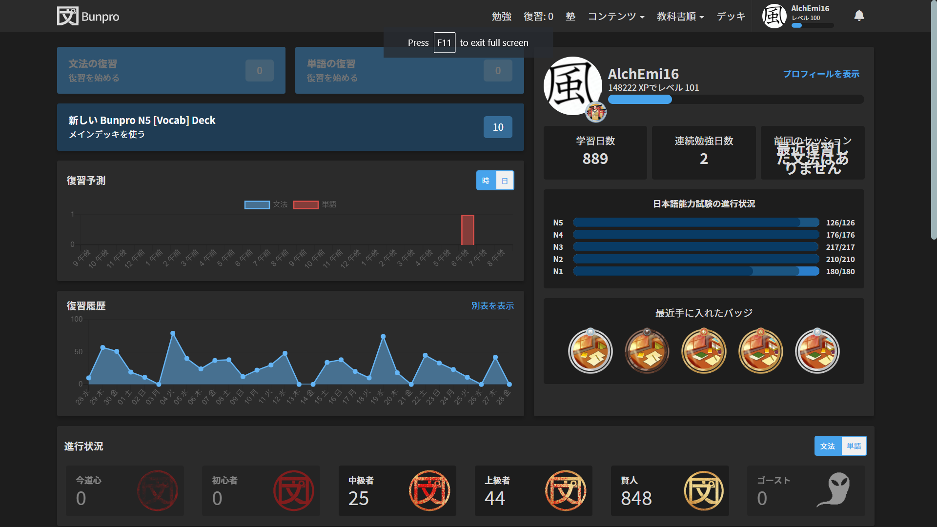
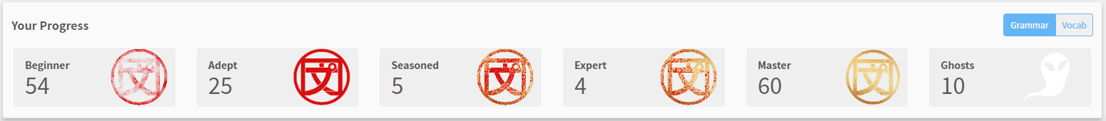
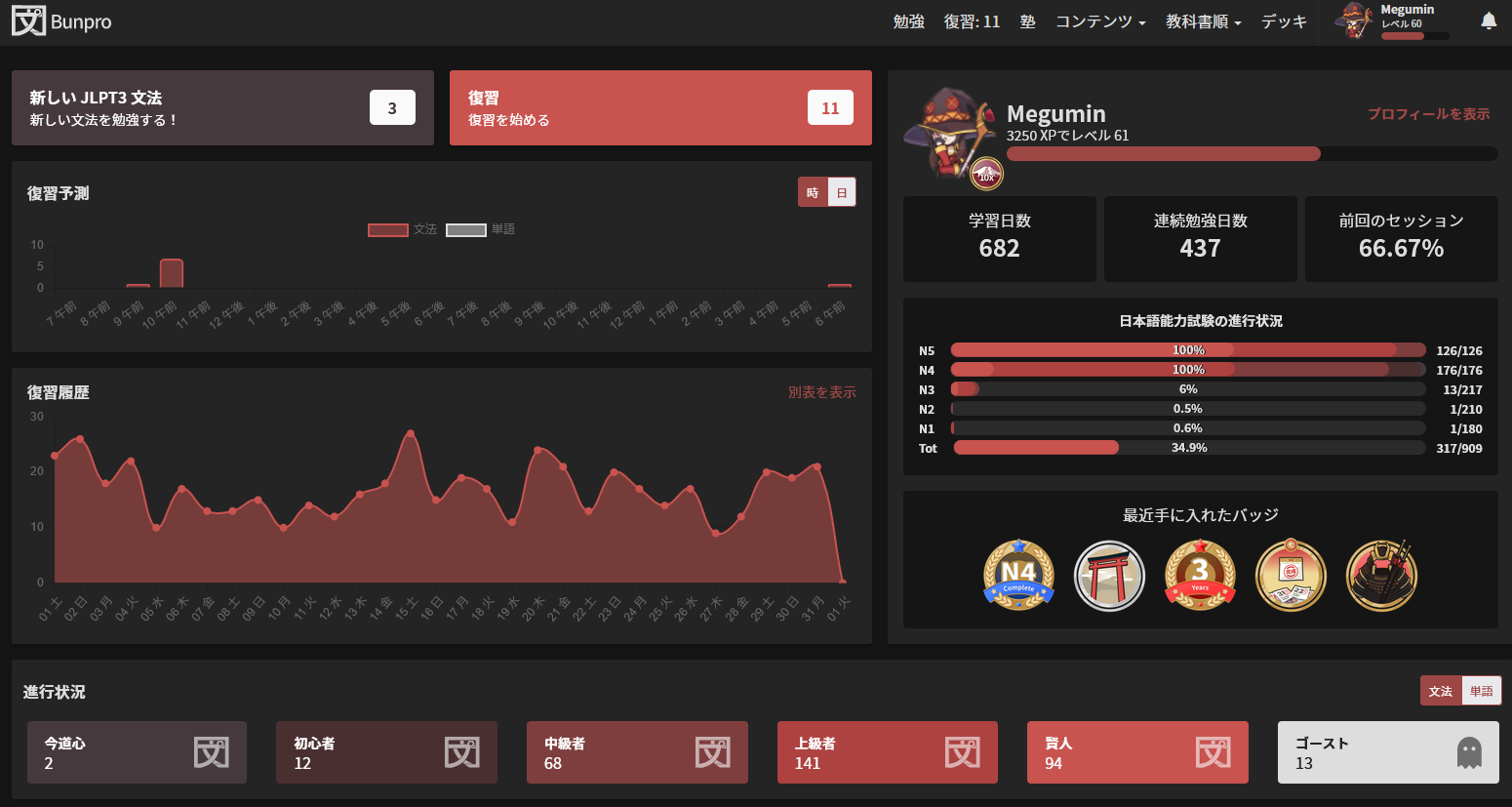
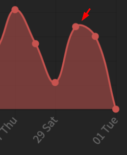
Looking at that screenshot, it almost seems like we build the dark red theme just to go with your avatar… :joy:

9 Likes

Love the new look! Usually I hate it when anything changes, but these changes are great! Thank you!

5 Likes

I like the new ghost icon

image

12 Likes

I like the smoother lines on the graph

image

9 Likes

Minor consistency nitpick: the chart legend seems to be the only UI element on the homepage without rounded corners.

4 Likes

The whole site looks so much nicer now especially with the black and red theme, great job here.

4 Likes

I agree with the others, this new design is very pleasing - great job!

(Very) minor nitpick:
image

The points on the curved charts don’t always align with the peaks, almost as if the chart itself is not quite aligned with the grid.

3 Likes

This is due to the ‘simple’ nature of vector paths (aka splines), which, unless you fuss with them a lot, will only guarantee that the lines pass through the given data points. I mean, it is possible to get them to match up peaks and valleys, but it’s not just as straightforward as saying, “Here are my data points, turn them into a smooth spline curve.” It takes a bit more fiddling than that. Might not be worth the effort.

Perhaps there could be an option somewhere (or a tiny little button on the graph?) to switch from rounded to pointy graphs? It’s a very common sub-feature on such kinds of graphing features on all sorts of apps. That would be easier than working out just-the-right maths to get exact alignment of peaks/valleys with data points.

4 Likes

I like the new color schemes but (and I hate to be the voice of dissent here) I’m not a superfan of the new SRS indicators:

It seems like the most important information in the box is also the smallest part of the box :slight_smile: 
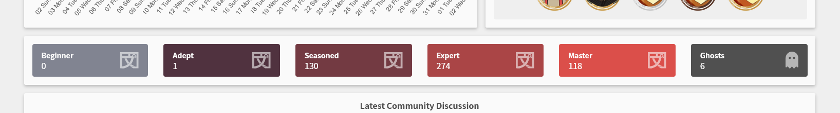
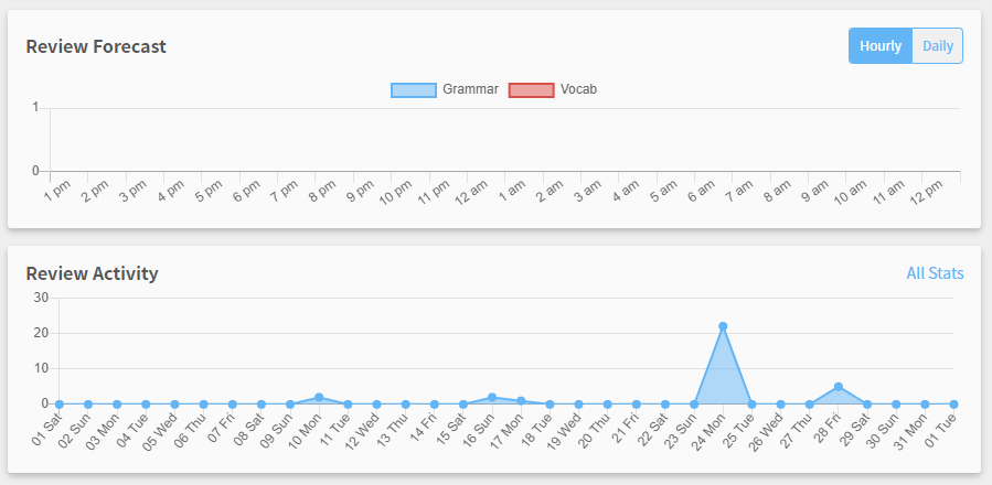
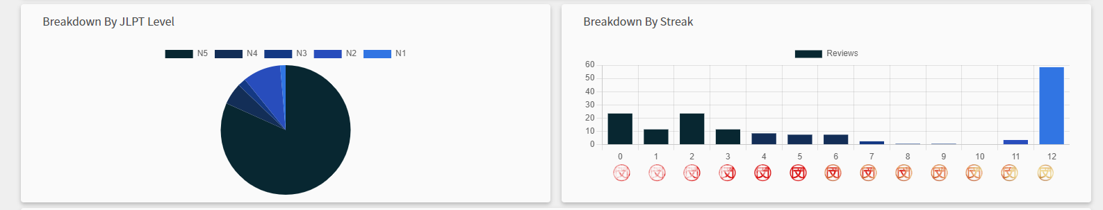
i.e. the number of items in each SRS level.
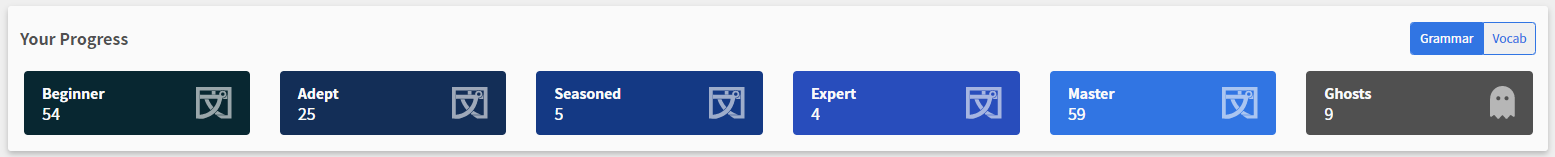
I try to keep my ghost count down and that’s an important indicator for me on the dashboard - now it’s pretty tiny in favor a lot of empty/unused space.

It’s not a huge deal, but maybe that could use a re-design somewhere down the line. I really liked the previous boxes with the big numbers (the numbers are more important than the icons, I would think).

Other than that, I’m really happy you guys are refactoring, re-designing and constantly improving the site. The WaniKani dev team could learn a thing or two from you guys :wink:

7 Likes

I have to say, the colours are really popping, I keep thinking I’ve upgraded my monitors.
It’s making far more of a difference than I anticipated when I read the release notes.

7 Likes

New ghost icon looks like a pacman ghost
Bunpro devs are avid gamers confirmed?
(If they don’t confirm it is likely do to them speed running super metroid or something)

5 Likes