Major Update - Color Changes [10/27]

We have several larger updates we have been working on for a while now that will be going live over the next few months. The first of these is a change to how colors are utilized in Bunpro.

With this update, we’ve turned what was Theme into two separate categories - Theme and Accent . More information can be found below about the differences, as well as what you can look forward to. You can adjust your style settings here: https://bunpro.jp/settings/styling

Theme

  • Going forward, ‘theme’ will only be used to represent either light (modern) or dark (modern-dark) mode.
  • The colors have all been unified with the focus on giving the site a more uniform feel.

Accent

  • There are now two new accents for users to choose between: red and blue
  • Whether you use the light or dark theme, the new accent colors will preserve contrast while making it easier on your eyes, resulting (hopefully!) in a more enjoyable learning experience.
  • The red accent also more closely matches the color of the mobile app.

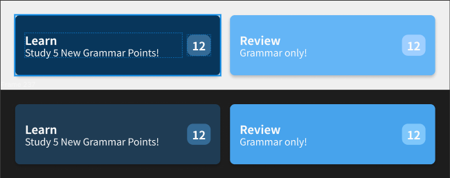
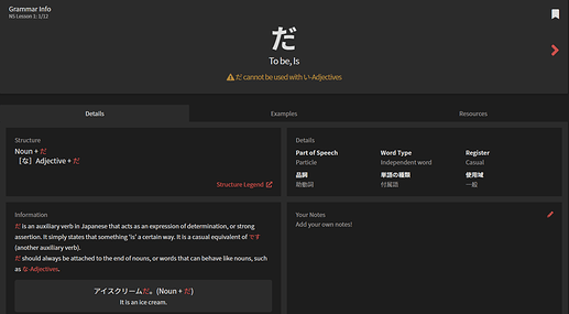
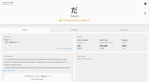
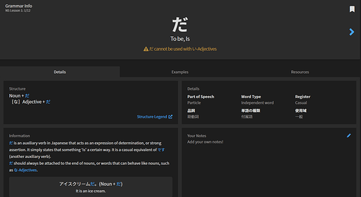
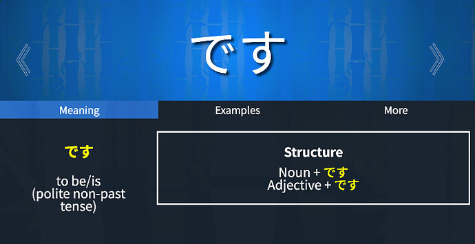
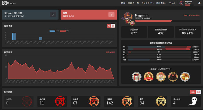
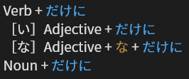
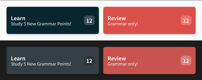
Here are some screenshots to show you the differences:
image
image

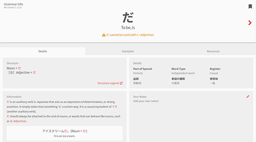
The above are samples of the new style for the dashboard Study and Review tiles. From the top, the themes go light red, dark red, light blue, dark blue. Below are some shots of a Grammar Point page in the same order:


While this change appears to mainly be a small cosmetic adjustment, a lot of work went on behind the scenes to clean up the code base and build a unified UI kit. This has in turn helped us more easily design and implement the changes we are working on at the moment, changes that will drastically improve your experience going forward!

As always, we would love any feedback you have about these changes. We’d also be really curious to hear what combination you all end up deciding on! A big thanks to @Daru for the wonderful palette he whipped up for everyone to use.

49 Likes

Trying out the red theme! Are there plans to bring it over to the forums too? The difference is a little jarring going between Bunpro and the Community side, haha.

Also perhaps the blue could be changed up a little here for the grammar? It’s just about the only blue bit on the page now.

無題

Thanks for the updates yet again!

4 Likes

black + red has me feeling like this

18 Likes

Nice work.
Here’s a throwback to 2017.

17 Likes

I feel like the blue review tile lost some contrast. It’s a bit harder to read the white review count on the light blue background.

5 Likes

I agree with @Haruka
But also giving a dark design option but putting a big bright blue button on it is kinda just…a bit of a strange choice? If it was toned down a hair I think I’d prefer it

4 Likes

Pretty colours.

It fits damn good with my avatar


Also, quick question to @Jake, are we in the content change freeze period seeing there’s a bit more than a month to JLPT ?

4 Likes

I like the fact that the accent can now be chosen separately, but I don’t really like most of the other new colours, they seem a bit too desaturated. (For reference, I’m on Dark/Blue/Color Blind Assitance (because I like blue).) I also like that I will now be able to rant about colours!

Screenshot spam

Some feedback will be on the newer colours, some will be on older things because it’s relevant now anyway. Of course, most of this is subjective and which exact values look good also depend on the screen. I don’t know enough about the colour variance types screens have. This is just with respect to my good 'ol cheapo laptop screen.

I really don’t like the oranges in reviews and lessons; they are so gray!
image
I’m half-tempted to just add filter: saturate(2) contrast(1.05) to my usercontent.css to make them stand out more again:
image

The desaturation is especially jarring with the (in)correct colour being bright still. (Glad a review came in while I was writing this so I could screenshot it.)

Similarly, I feel chosing #dbdbdb for the main text is just a tad bit too dim, which becomes apparant when the text is large, such as the grammar page.


I just like plain #fff more

(While I’m at it, the reviews with the main text colour and orange brightened:)

Next, the dashboard. First of all, I don’t like how close the background, active new grammar and inactive review buttons are in intensity, if you look at the grayscale values you get:
image
I’d just like the new grammar button a lot brighter again, and the inactive buttons more dim.

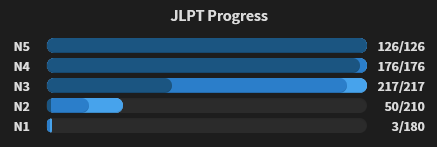
Continuing with brightness, I feel like the colours for the JLPT progress are once again reversed
image
Going from “no knowledge” to “perfect knowledge” on a scale “dark - bright - less bright - dark” is awkward.

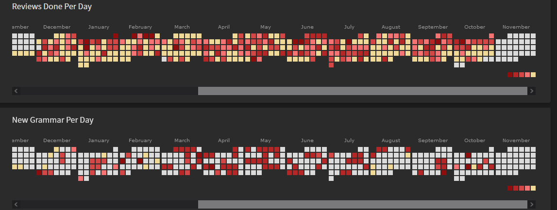
While I’m at it, I’m also going to complain about a similar thing with the statistics page’s heatmaps which has been bugging me for a while, and is finally relevant.


Here the scale of nothing–a lot goes like “light gray - dark red - brighter red - … - bright yellow” where the bright yellow is the closest to gray in the entire scale so reading off is awkward. Even something like regular gray would work better.

Actually, playing around a bit with your beginner, adept, …, master colours and keeping the empty squares black for clear visibility I’d get something like


which seems more readable both if you want to see when you did lots, and if you want to see when you were a slacker.

3 Likes

After this update it seems “this is a ghost review” icon no longer shows up during reviews. FWIW I haven’t ever (or at least recently) changed any theme settings as I don’t really care too much about looks.

1 Like

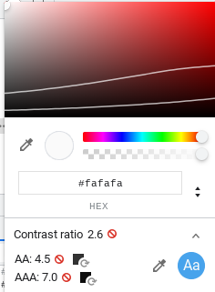
The white on light blue is no longer WCAG AA compliant color contrast ratio. Please review the color contrast across the site and ensure there’s at least a 3.5:1 contrast ratio.

Screenshot 2022-10-27 5.26.45 AM

6 Likes

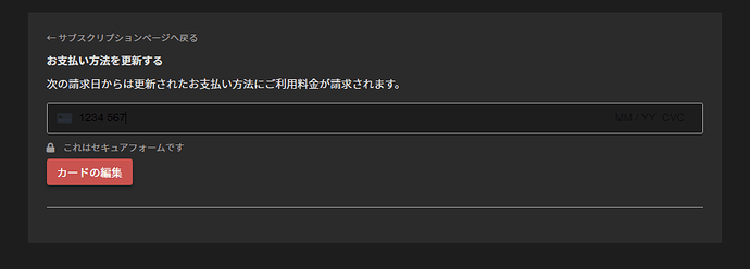
Adding lessons overlaps the text making it impossible to read

image

And another glitch in some forms, making them hard to read:

1 Like

I thought I noticed something different with even the color red Im seeing on my blue accent theme.

Looks great!

3 Likes

For me the contrast makes it easier for me to read in this update. Might not be everybody’s cup of tea but it works for me.

2 Likes

This is beautiful!

1 Like

Ah, refactoring! :heart_eyes_cat: Always a good sign when a development team takes some time to refactor their codebase in order to make the code more flexible for making upcoming improvements.

Great to hear you guys are taking good care of BunPro’s development and maintenance like this. :sunglasses: :+1:

1 Like

Exact same issue here.

@wct I tested this just now and am able to see the ghost review icon. Could you give a little more info about where you aren’t seeing it?

1 Like

Unfortunately just finished all my reviews – for the first time in at least a month! So can’t screenshot. But it’s the little black ghost icon that normally appears in the upper-right quadrant of the screen (on website), near (possibly ‘next to’, but can’t recall exact position without looking at a review screen) the ‘reviews remaining count’, the ‘srs level’, and the ‘successful/total reviews’ count.

Recent reviews (since the colours update) it simply has not appeared, making the ghost reviews look like normal reviews. But I know they are ghost reviews because I have so many ghosts in my review pile, and they are reviews I’ve recently gotten wrong.

Note:

I don’t know if this is related, but a few / several days prior to the colours update, I noticed that sometimes the layout of that upper-right quadrant would get messed up for some of the reviews. Specifically, sometimes some of the counters would have their numbers ‘wrapped around’ to a second line (when normally it’s all on one line), and this sometimes also included the ghost icon also being dropped down to this second line. I’ll give a text schematic of what I mean:

Normally looks something like:

[the ‘G?’ symbols in bold represents where I think the ghost icon usually appears, can’t remember exactly]

What would sometimes happen instead:

[There was more whitespace, but HTML crops it, eh. Just a schematic.]

I didn’t report it because I figured it was probably temporary and would get noticed and fixed pretty quickly on its own. I don’t think it was occurring just prior to the colour update – meaning I think it had been fixed – but I could be misremembering that, and maybe just got used to it and no longer noticed it.

Anyway, I mention it because it was a display/formatting glitch in the same area as the currently missing ghost icon.

BTW, I’m using Firefox latest.

If I see either of these glitches again in my upcoming reviews, I’ll report them with screenshots.

I just did my morning reviews and I also got a ghost review but no icon indicating as such. Also using Firefox (106.0.1).

1 Like