Minor Update "Stats Page & Review Stats" - Jan 15th 2021

Various bug fixes.
Small changes to improve performance.
Visual changes for badges page.

Stats Page
UI and UX improvements
Added:

  • Global review stats average - Compare your accuracy to the global average of all users, per JLPT level.
  • Accuracy over time - A snapshot of accuracy for all daily normal reviews (past 3 months)
  • Average streak over time - A daily snapshot of the average streak of the reviews done during that day (past 3 months)

Review Data
Global Accuracy by streak
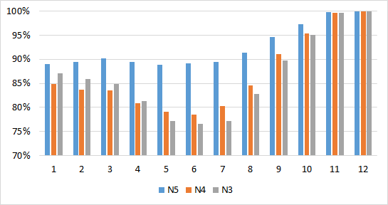
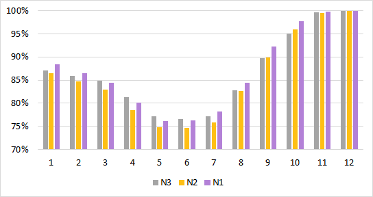
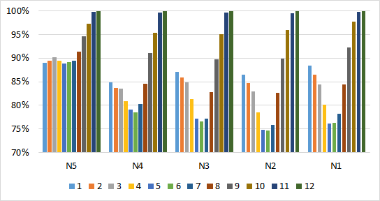
For those curious, data hungry users out there. The following is accuracy broken down by streak for reviews in each JLPT level. There are some interesting patterns in it. I will be analyzing it further as well as looking at accuracy per grammar point and per sentence to see what adjustments could be made.

Please feel free to share your own data interpretations/adjustment suggestions!

N5

1 -> 89.06%
2 -> 89.5%
3 -> 90.12%
4 -> 89.5%
5 -> 88.86%
6 -> 89.17%
7 -> 89.39%
8 -> 91.32%
9 -> 94.56%
10 -> 97.22%
11 -> 99.75%
12 -> 99.98%

N4

1 -> 84.9%
2 -> 83.65%
3 -> 83.48%
4 -> 80.84%
5 -> 79.14%
6 -> 78.47%
7 -> 80.22%
8 -> 84.55%
9 -> 91.13%
10 -> 95.33%
11 -> 99.64%
12 -> 99.98%

N3

1 -> 87.09%
2 -> 85.86%
3 -> 84.87%
4 -> 81.35%
5 -> 77.23%
6 -> 76.55%
7 -> 77.13%
8 -> 82.72%
9 -> 89.73%
10 -> 95.02%
11 -> 99.59%
12 -> 99.99%

N2

1 -> 86.49%
2 -> 84.65%
3 -> 82.93%
4 -> 78.5%
5 -> 74.74%
6 -> 74.63%
7 -> 75.9%
8 -> 82.61%
9 -> 89.92%
10 -> 95.96%
11 -> 99.51%
12 -> 100.0%

N1

1 -> 88.46%
2 -> 86.46%
3 -> 84.4%
4 -> 80.19%
5 -> 76.08%
6 -> 76.31%
7 -> 78.24%
8 -> 84.48%
9 -> 92.29%
10 -> 97.7%
11 -> 99.8%
12 -> 100.0%

10 Likes

hello I like the new data :slight_smile:
I espatially like the globel averenge. I’m 0.01% percent better than the globel averrage ^^in N5. I have yet to reach the other levels so noting to say there^^.
For the other new additions, I can’t really form an opinion because i’ve been only a user for a little over a month so there is not enough data for it to matter.

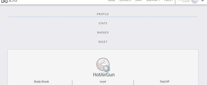
I dont now why but the the tabs( Profile stats badges reset) are arranges verticaly instead of vertically on the profile side( only there). I have to scroll down to see my profile.

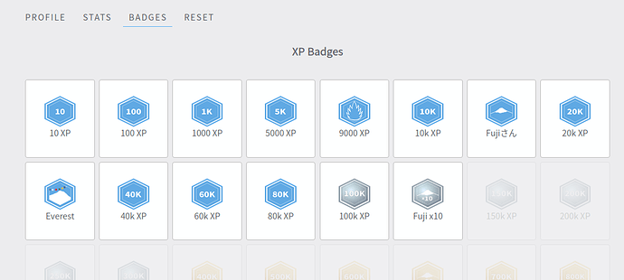
Also this might be a personal opinion but I prefered the original formationg of the badges tab. with them beeing centerd (and bigger?) it lookes less organised but maybe thats only because I’m used to sometimg diffrent.

Something else what has been botterring me is that the review done per day and gramer per day tabs are not showing recent month immediatly. For example: when I open the stats age it shows me july2019- august2020. Wich is not relevant to me because i only joined in december. I only wanted to mention it here because you seem to be working on the stats page ^^

Continue with the good work :slight_smile:

1 Like

This is great! Absolutely love it! :smile_cat:

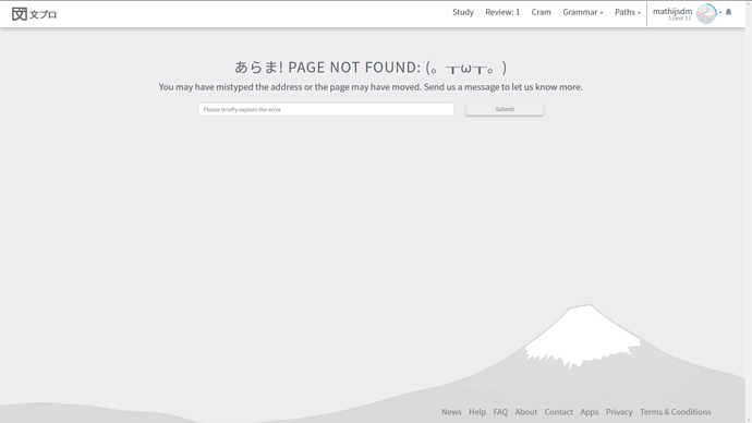
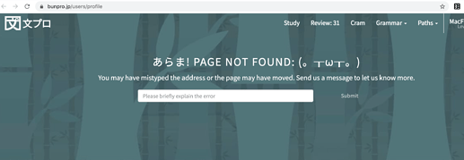
Just one small thing, now if you press “Home” to return to your main bunpro page from the forums you get this message due to the profile page name changes :

1 Like

Did the URL schema change?

I could always access my homepage from “https://www.bunpro.jp/users/USERNAME” and now its an invalid link so all my bookmarks are broken.

1 Like

After this update menu on profile page looks strange

1 Like

And all badges are skewed

I agree. Don’t like at all…

Tab arrangement has been fixed @HotAirGun

@mathijsdm What “Home” button do you mean?

@tedledbetter Looks like the route was removed, I put it back in with a redirect to the profile.

@HotAirGun what device/browser are they showing up like that?

Yay, data! :blush:
Really interesting trends.

To add my two cents of observations:

N5 has significantly higher %'s than the others.
** maybe N5 is easier to remember than the others
** maybe people come to this website with more N5 knowledge
** maybe people use the oops button more in N5

N4-N1 all have a trough at 5, 6, 7.
** This is consistent with my experience that things get harder to remember around there. Also that’s where I end up launching a bunch of ghosts.

As people go past the trough, the marks go towards perfect.
** maybe memory retention is a lot better after getting past the trough
** I’m not sure how 12 is tracked since you can skip to that with “I know this”

Even though the trough gets lower as you go N5->N1, the initial (1,2) marks get higher as you go N5->N1
** maybe this is normal scatter and not a trend
** maybe people get more accustomed to the SRS format as they progress through the N-levels
** maybe there’s less cramming of tons of new grammar per day and more adding new grammar at a very slow pace (and therefore easier to remember)

Conclusions/Suggestions:
** Since the trough exists across all N-levels, that suggests that changing the underlying SRS schedule might help people retain more. Others have suggested changing the timing. I would also suggest more levels, but of course that might be a pain to restructure the entire system or to allocate everyone’s existing status. (Maybe you can add levels by inserting between other levels?)
** The other observations are interesting but not actionable, except maybe to go into a sociology journal. :slight_smile:

Graphs

image
image
image

3 Likes

Ah sorry @Jake , should have specified. This one (currently takes you to https://bunpro.jp/users/profile instead of https://bunpro.jp/user/profile) :

1 Like

Hmm… Maybe replacing that button and some clear design? I didn’t even know it is there, and I had to write address down myself each time.

Is that through an extension?

I have got no extensions other than yomichan and it is not working properly as well.

Chrome browser.

100% on level L12 for N2 and N1 for 100% users and then 99.98% on the others? That is either remarkable on the effectiveness of BunPro or we are just sick of looking at the same grammar point :joy: (cough…override +200)

Close to global average but should probably review more regularly.

1 Like

Although not mentioned in the changelog, the styling of the dropdown menu when using the dark theme has been fixed.

For the “Accuracy over time”, and “Average streak over time” graphs it would be nice if days when no reviews were done are not plotted. I do not think it makes sense that the accuracy for a missed day is 0%.

Edit: The styling was not fixed. The background of dropdown items turns white when you hover over them.

I must be blind because I cannot find that menu anywhere? Is it a discourse extension/addon?

@gyroninja I had wondered on how best to show these two when there are days with no data.
I also wondered about showing these as unconnected 24 hour review snapshots or as one continuous set of data were new data uses new data to adjust and create a new average from the day before.

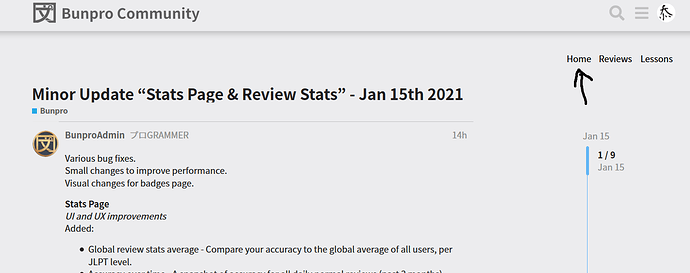
When you’re on the Bunpro Community home page (https://community.bunpro.jp/), it’s at the top right, below the menu bar and above “+New Topic”. There’s 3 links for “Home”, “Review”, “Lessons”.

For days without data I think you should just not have anything plotted. I think it’s fine for your streaks (of doing reviews every day) to be connected.

Firefox 84

No, just press Reviews when you don’t have any.

@mathijsdm @Jake @MacFinch @FredKore

I have fixed it. (Refresh the forums with cache if it doesn’t work for you)
The “home” button on forums now properly links the dashboard.

I hope it helps,
Cheers :blush:

2 Likes