Hey All!
July 8th
Change to the styling of the grammar point writeups:
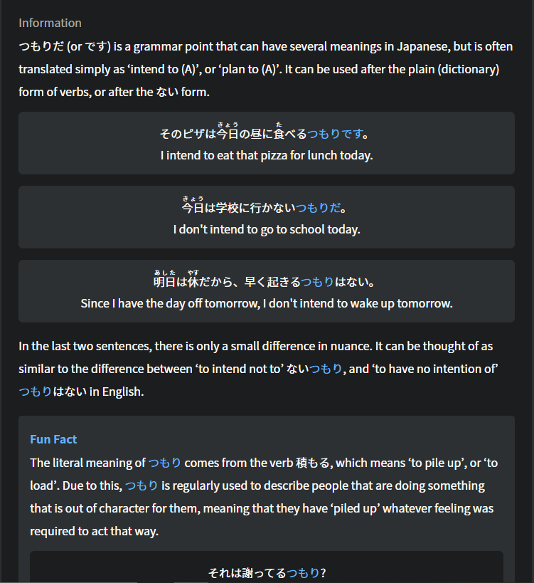
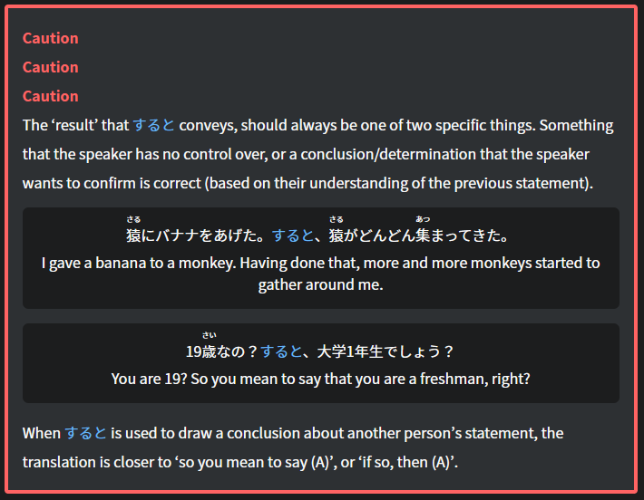
Our main goal with this was to fix the readability issues that the old style had. This version isn’t a finalized version but as we continue improve the site, we will keep looking for opportunities to make the content we have more accessible and readable.
There were a plethora of small bug fixes and adjustments made since the last post as well.
Some of those include:
- over lapping text in reviews (edge case),
- odd hover state on the navbar,
- bug where English sometimes didn’t show when clicking “Show English” on vocab
June 25th
Switching this into more of a small quality of life improvements thread rather than make a new one.
-
Thanks to the suggestion from @Slysoft. Reviews have been changed to come due 1 hour earlier (for >= 24 hour intervals. i.e. 7 days becomes 6 days and 23 hours). This won’t impact your normal study hours but will let you adjust the timing of pesky reviews that are in off hours as you can adjust your reviews forward an hour to get all of your reviews to line up at the time you want.
-
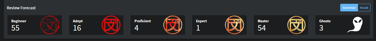
The SRS count tiles on the dashboard have been adjusted as follows:
- Changed naming from SRS 0-2, SRS 3-5 etc to named categories that follow the same breakdown.
- For anyone studying vocab, there is now a Grammar <-> Vocab toggle option so that you get a clearer picture on where each type of review is at. (We have plans to make the SRS tiles clickable to see which vocab/grammar are in each category)
-
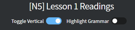
Reading Passage toggle options now look like toggles
-
Fixed styling on the information section for Classic theme(pending release).
June 23rd - Change to Review Rounding
Not really sure if this deserves its own post or not, but we switched the rounding of review timing to be from half hour to full hour rounding.
Previously, reviews were rounded down to the nearest half hour interval :00 or :30.
It was suggested that that be changed and after the team discussed it, we agreed that in the vast majority of cases, full hour rounding is superior.
This change will also help address the issue with review forecast charts being a bit misleading as not all reviews were due at the top of the hour.
As a note, this change won’t impact reviews that have already been scheduled for review.
However, any new reviews or reviews done during your review sessions will be scheduled again in the future using the new hourly rounding format.
As always, thank you for your continued support and suggestions for improvements