
No problem!
I might be a bit slow but how do you acccess that screen?
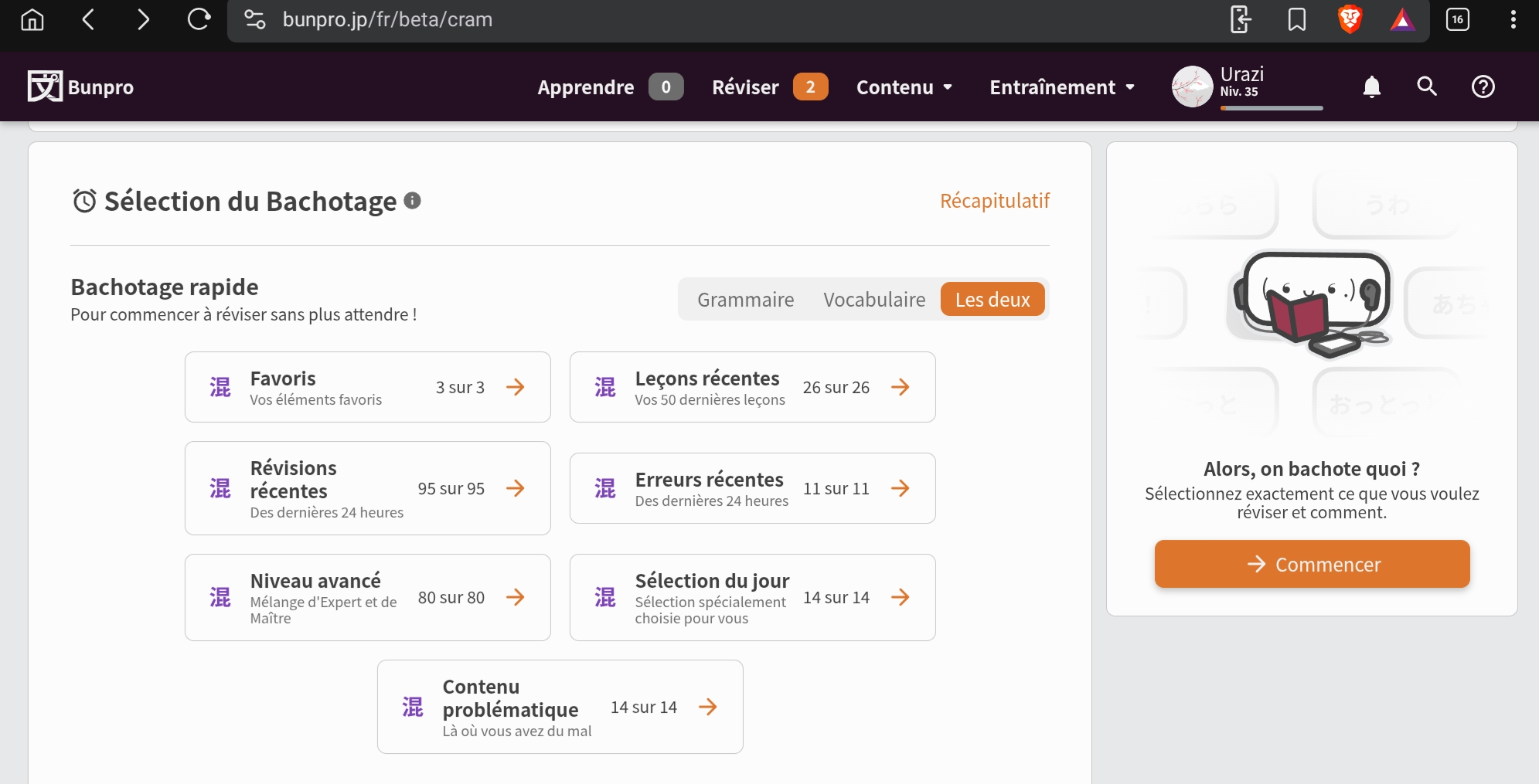
On my side I can only select the content and not the review type when I click on the cram section.
I only have this screen and can’t change the study method, it’s correctly setupped when I do review with fill in for vocab and reading for grammar.
I use my samsung tablet browser by the way.
Edit : I can choose the cram types when I create a session by hand on the right side but not the main 7 that are showned on that screen.
Would love to have the possibility to also choose the cram method for those 
2 Likes
Opened Sessions section should appear once you have at least one pending session pls dm me if it is not behaving that way
Would love to have the possibility to also choose the cram method for those
Will ask about this seems like a good addition to have
4 Likes
seems like it is loading state, could be either slow connection or the BE taking its time to respond
pls let me know in DMs if it is still not loading for you
2 Likes
That one is good, thank you!
I was talking about the main section only having the fill in for now.
Yes please, I will not cram grammar without the lecture mode for now as I still can’t conjugate most of the grammar points or translate them easily
3 Likes
I spent a solid half hour searching their forums and this is the closest crossover episode I could find
https://rabbittalk.com/threads/rabbit-breeds-in-japan.37795/
4 Likes
didnt you join bunpro just 3 months ago? xD
3 Likes
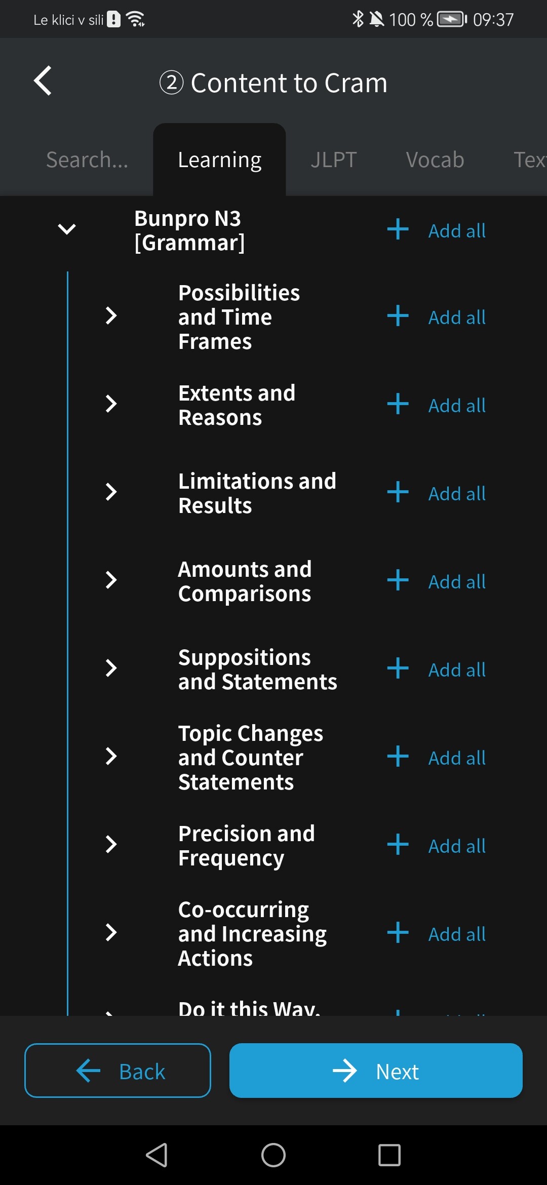
Thank you!!! That’s what i described during survey.
2 Likes
Agree
1 Like
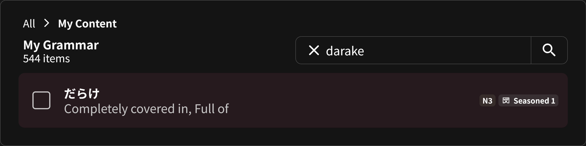
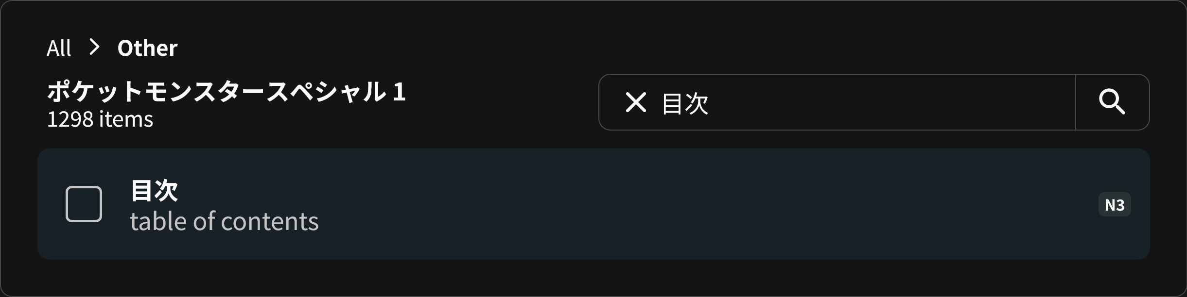
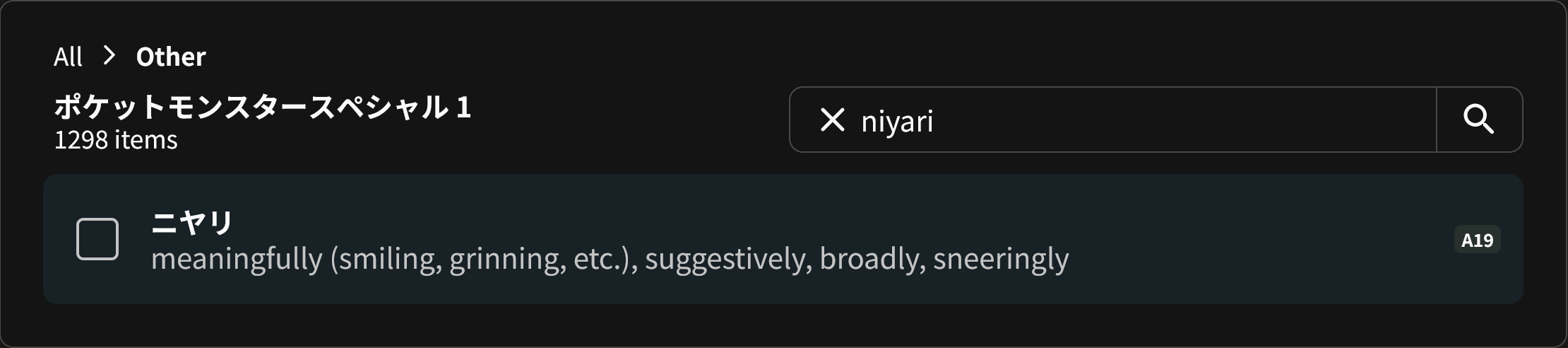
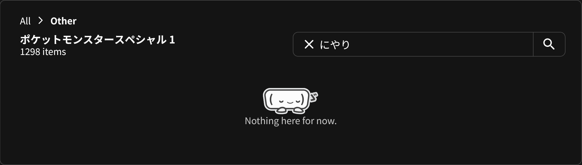
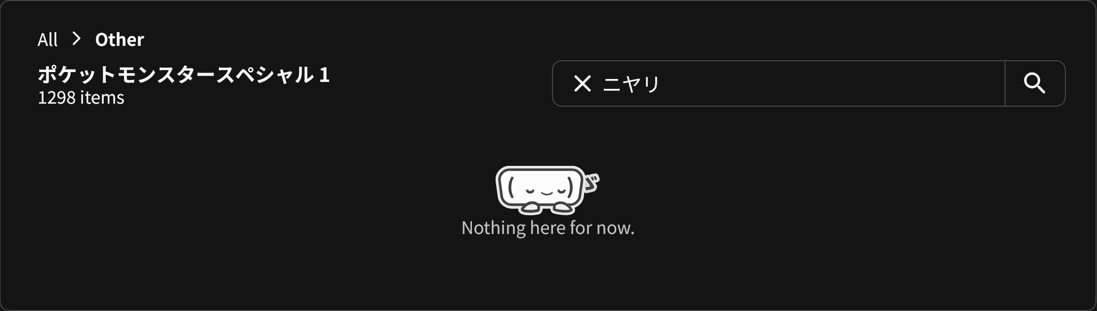
Something else I’ve found, the search has a slightly odd behaviour to it.
If a grammar point uses solely hiragana, I can only find it with romaji:
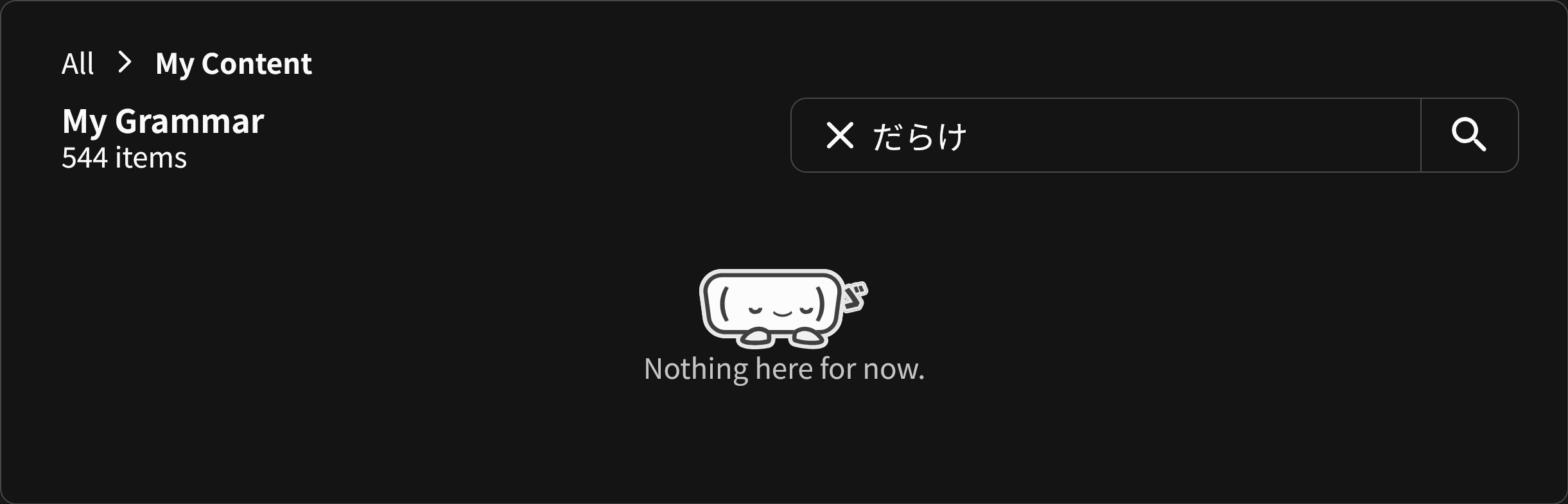
If a grammar point has Kanji in it, I can’t seem to search for it at all:
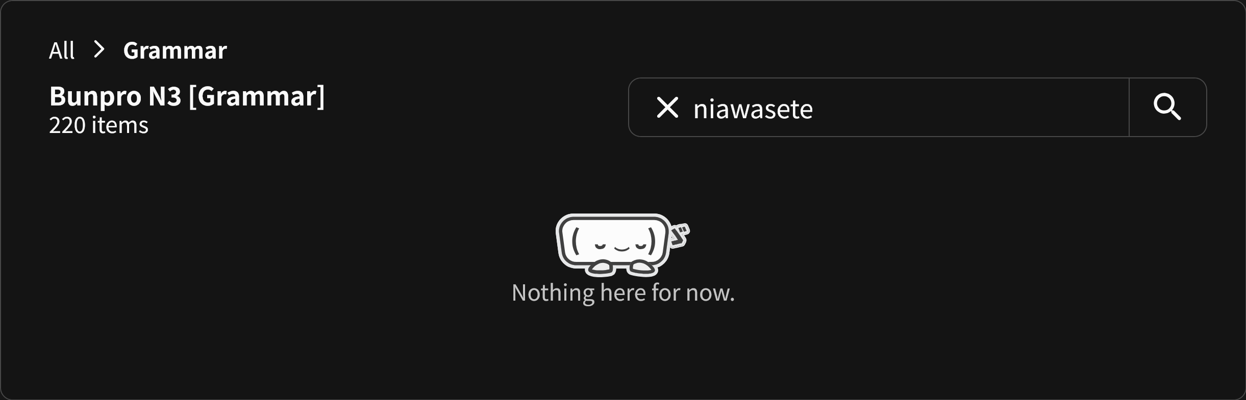
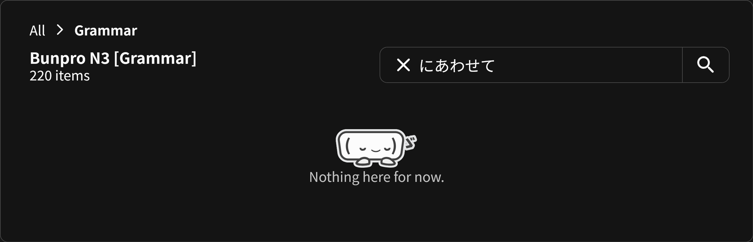
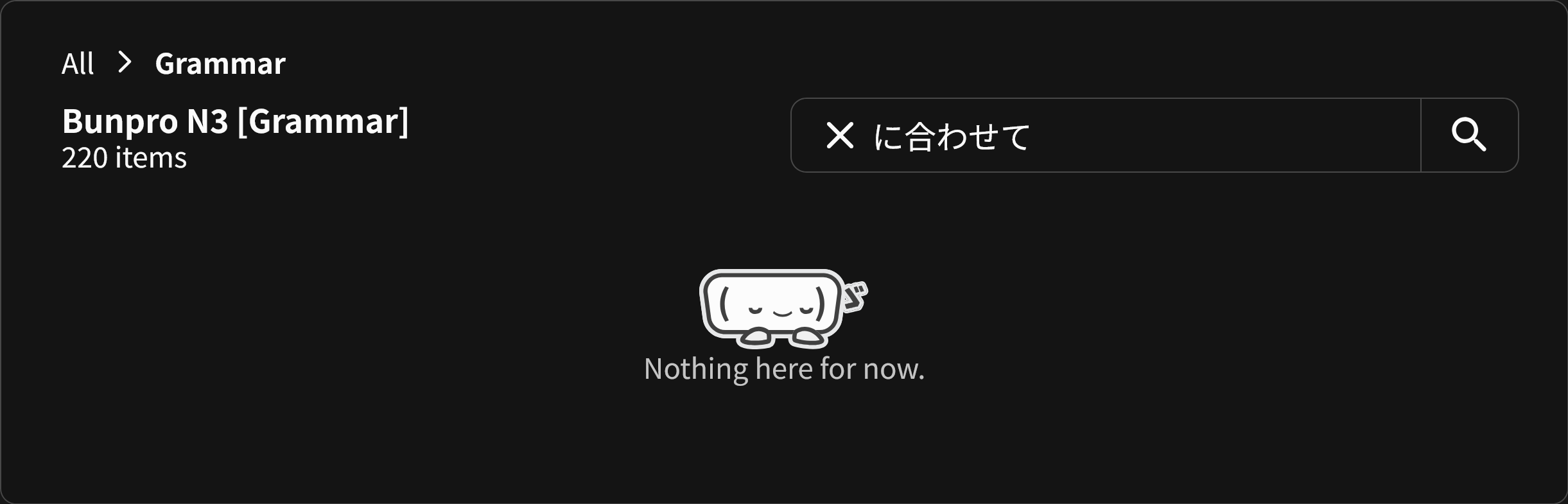
Similar thing with vocab using 目次 as an example:

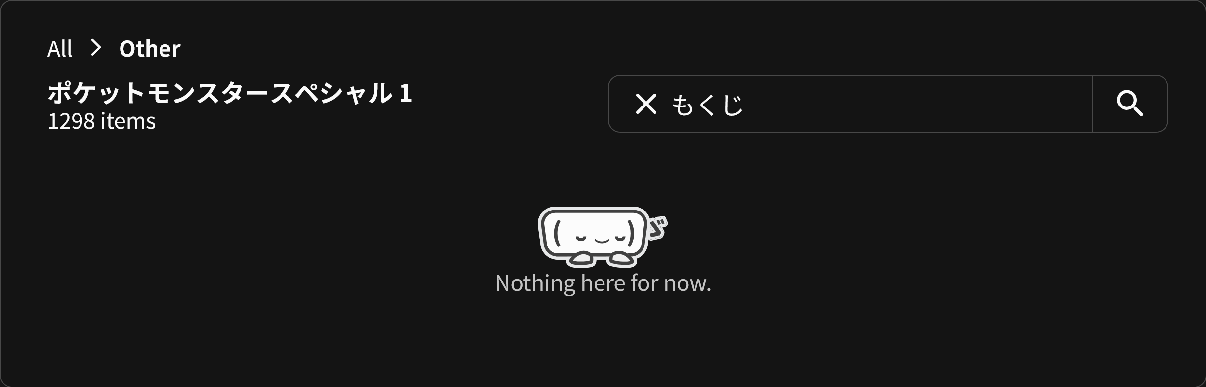
Also in the same deck, for something like ニヤリ I can only find it with romaji (or the translation):
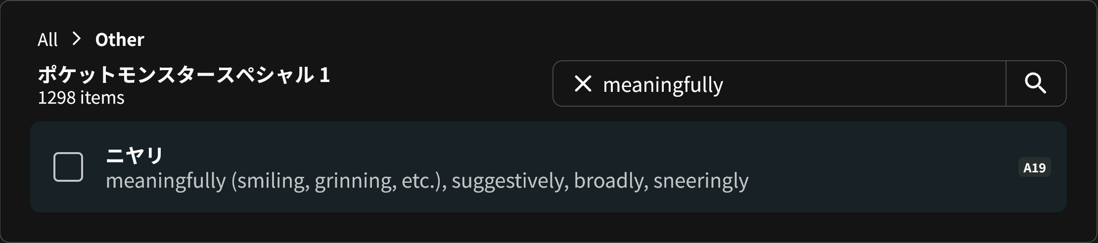
5 Likes
Looks nice but I am missing an option/deck that would allow me to cramm all grammar/vocab I have ghosts for.
Maybe I am missing it but I could not find it under new settings and design.
2 Likes
yea i used the cram feature a lot lol
i got the gram 25 times badge in 2 weeks (not that impresive tho)
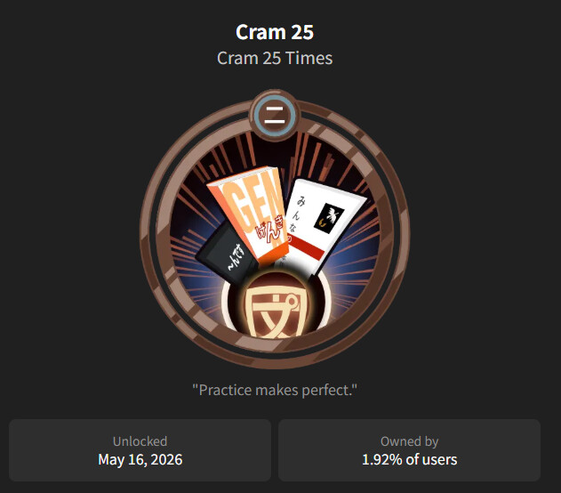
3 Likes
I was deleting stale old sessions from the new interface and now I can’t use cram at all, I’m just met with a type error:
“TypeError: can’t access property “length”, e.crammed_ids_grammar_points is undefined”

3 Likes
I already left feedback and can’t leave it again lol. But just wanted to say, these filter options under My Content are AMAZING
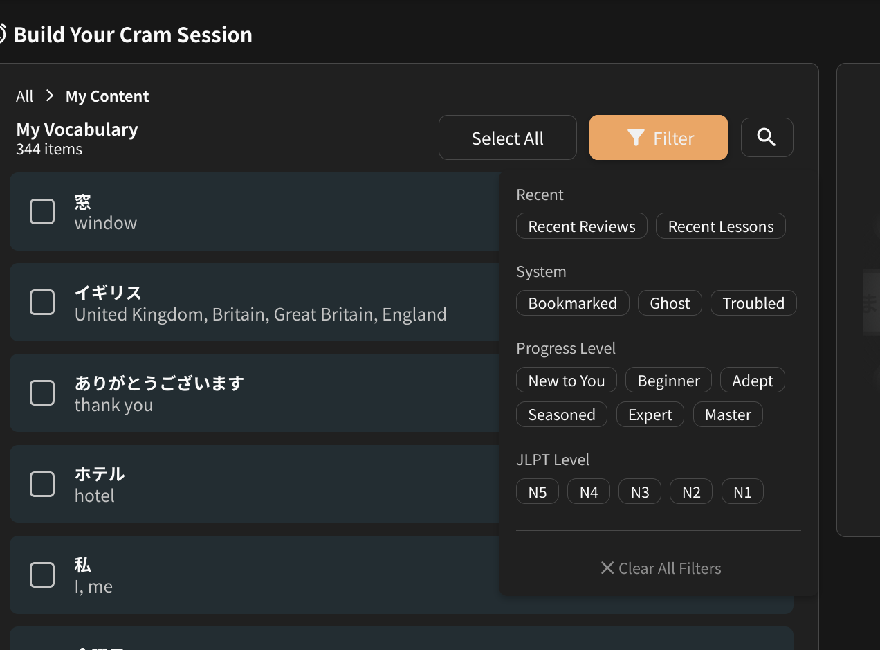
4 Likes

Looks good! To be honest, I didn’t really use the Cram feature much because the old UI gave me the ick (sorry!), but this redesign looks great so I can definitely see myself using it more in the future.
One piece of feedback is around the discoverability of building your own Cram session. I’m getting a bit blind with age, so I often have my Bunpro zoomed in 120-130% to see things better. When I first loaded the Cram screen I was really confused about where and how to do a custom cram section because at a quick scan that info is hidden to the bottom right of the screen:
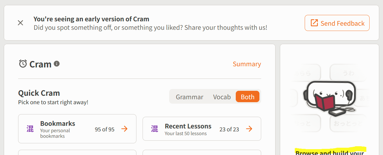
A few things I would suggest to improve visibility/discoverability:
-
If you’re open to moving elements around on the page, personally I would get rid of this separate element all together and just have something called “Custom Cram” as an option under “Quick Cram”, and full width the main section:
-
If the above isn’t an option, I would decrease the size of the image, or even put it under the “Browse and build… Pick exactly… Start” elements, as it’s not really necessary and gets in the way of quickly navigating to the Custom cram feature.
-
I would also make the “Browse and build” text and “Quick Cram” text the same size. Currently, the “Browse and build” is smaller, but I think in terms of information hierarchy both of these features are equal.

Also, found a bug where for some reason if you zoom on the page, the first element is weirdly larger than all the rest? I’m on Firefox, if that helps with debugging.
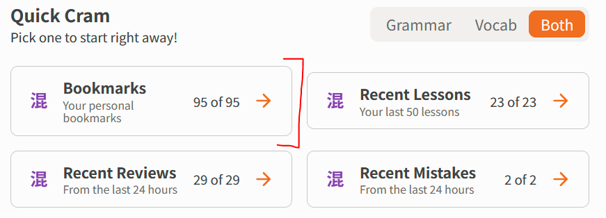
Anyway, thanks to everyone for their work on the redesign! Looking forward to future updates 
3 Likes
Sorry to everyone having this exact error
Got reports on this and basically there was a problem with old legacy cram sessions that caused this error to pop up.
It should be fixed by now thanks to the feedback! Please let us know if it’s still causing any errors on your end o7
3 Likes
Yep, fixed for me, thanks!
2 Likes
Not so much a bug report, but after using the new UI a few times I think having the filters be memorized to what you last set them as would be a nice QOL  Or perhaps as a toggle
2 Likes
This looks really good - the addition of what was incorrect in the last 24/48 hours is really neat as well.
Would it also be possible to add a feature for low accuracy percentages? Say if you’re having a word or grammar point you’re struggling with, you could easily cram them. Perhaps two cut offs at 60% and 50%?
EDIT:
it would also be good if the "My Decks’ could include the subscribed ones you have instead of all of them too 
1 Like