I would like to have access to the android version, please. Thanks
Send me your Google email and I’ll get you sorted out!
I am a fan of having the Bunpro Mallard. When you open the app it greets you with annoying quacks until you clear your reviews and once you are done the duck just stares at you and judges you until you break your streak.
Could I please have access to the Android version as well? Would love to try it out 
My email is the same as on Bunpro but without the “+bunpro” part in the middle. Thanks so much!
Hyped!
I’ll throw myself under the dumb question bus: how do we DM you?
(I should clarify: I see directions about clicking an envelope icon on your profile, but I don’t see that icon when I click through.)
((And as long as I’m adding parentheticals: I’d like to be added to the Android alpha under my alternate email, the gmail account under my profile.))
Ahhhh, that’s what I get for never using the community side of things. 
Thanks for the sanity check!
A few things after playing with it for a bit that I have not seen mention in the roadmap:
-
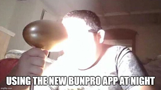
Dark mode (Maybe this count in the Long-term’s Full support for all settings?)
-
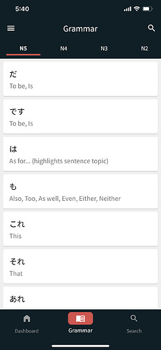
In the grammar browser: a way to tell if the grammar point has been added to reviews on the list without having to enter on the point (maybe even display the SRS level).
- I guess the avatar not displaying is gravatar not being implemented, and being a placeholder for when you implement your own avatar system?
Aside from these small things, looking very promising and excited to see how it evolves!
I really like the app so far. It looks clean and everything feels nice and snappy.
Here are a some thoughts after using the app for a couple of hours:
Bugs
Some minor bugs I encountered:
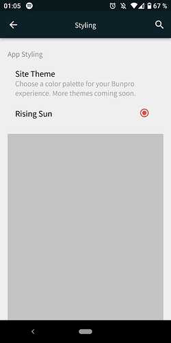
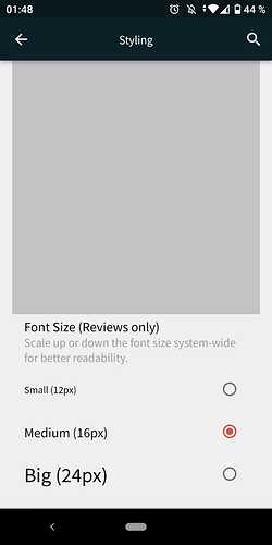
In the settings Tab under Styling, there is a grey box that seems to be infinite when you scroll down. Not sure if there are supposed to be more styles available?
Improvements
I would appreciate:
-
A dark mode
-
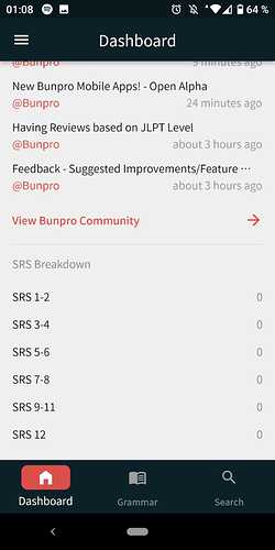
If the SRS Breakdown box would show Ghosts and could be moved above the Community Discussion Box
-
If under the Grammer Tab it would show you which one you have already learned
Also, in the Post is no mention of the Cram feature, so I hope this will also be implemented.
Thanks for reading 
Edit: I am on android version 0.2.0+8
Thanks for the quick and helpful feedback!
- Totally agree on a review indicator on the list of grammar points. Maybe indicators for notes and bookmarks as well?
- Dark mode is a relatively high priority as that is a make or break for many people in terms of using an app.
- The avatar is as you mentioned, just a placeholder as we plan on implementing a non gravatar solution for the avatar.
It would be probably handy to give the Android version when reporting bugs.
Maybe have a diag option where you can copy device info in a screenshot/text or something for when reporting? @Jake
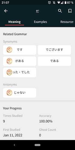
This is how it should look:
Yes I know, I have a tall screen.
app is great so far, in style and speed!
But since I have “fat finger problem,” during reviews I spend most of the time backspacing correcting answers than doing the answers. 
I dont think anki mode is a priority right now, right? I am used to flaming durtles app for WK.
But it will be great for now to do reviews anyway, while away from home and a pc.
Can we have a separate thread for App-related feedback? I think that might be the best for requests and bug reports, no?
I would like to try the new app
@Jake This is awesome. Great work!
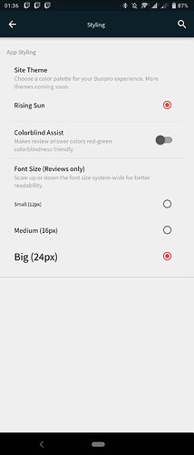
I found a fun bug though. In the app, I set the font size to “large” for reviews, which seemed to work, but when I went back to the website on my computer, ALL of the text including the dashboard was in large font too! When I set it to “small” in the app, the main Dashboard on my computer is also affected and everything is small.
Also, as I was testing this out, I noticed that the changes I made in the settings do not always stick. It was ignoring my changes about half the time, it seemed.
Looking forward to seeing this app develop over time!
Edit: I am using the app on iOS.
I would also like to try the android app! (email is the same as my bunpro account)
Second that
May I get access to the android version please?

