New Content・User Font Sizing・UX Changes

September 3, 2018

New Content:

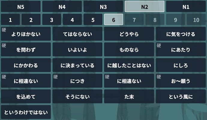
  • N2 Lesson 6 is now live! Over 20 new grammar points!

  • N3 Lesson 7 & Lesson 8 now both have 12 example sentences and 12 review questions!

Font Sizing:

  • Bunpro is now scaleable. Simply change “Font Size” in your user settings. You can select from 12px, 16px, and 20px font sizes.

UX Changes:

  • The Study button now takes you directly to the grammar to be studied.
  • Based upon feedback the community has provided, we have made various small changes to the size/spacing of elements across the site as well as to how some parts of the site work to improve your overall experience.

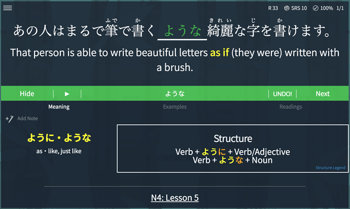
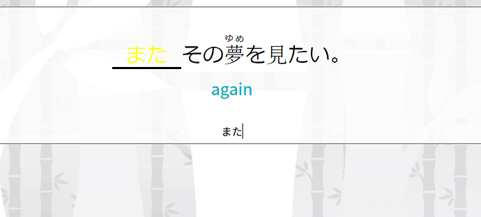
The text you input is now yellow to match the example sentences and so that you can better distinguish the grammar points from the surrounding information.

Your input also changes depending on whether or not you get an answer correct so that you can better visualize your progress.

Please let us know what you think! Cheers!

7 Likes

I noticed you changed the font color to yellow in light mode, can you change it back to black? Or a color that shows up better in light mode?

3 Likes

@Drekksama There is always something that slips through testing. We apologize for the inconvenience and will have a fix for you as soon as possible! Thank you for your patience. Cheers!

1 Like

I also noticed the “F” hotkey no longer brings up ‘grammar’ info after answering a question :confounded:

1 Like

@Drekksama We are unable to replicate this on our end. Can you let us know what browser/OS you are using so that we can pinpoint the problem? We apologize again for the inconvenience! Cheers!

On the profile page, the tally for N2 grammar is still x / 96 - the count needs to be updated to include the new grammar points.

1 Like

Sweet update, keep it up guys

I’m getting the F not bring up the grammar problem as well though

Windows 10 using Chrome Version 68.0.3440.106

Refreshing the page seems to fix it for a while until it happens again

1 Like

@Jake It looks like now the yellow/green/red text that you type in shows up bold. I think it looked better non-bold. It’s too “in your face” when it’s bold like this.

@Jake It’s really nice that the answer turns green when you get it right. However, if you cycle through alternate answers it turns yellow again. Don’t you think keeping it green (or turning it green if it was previously red) would make more sense since they are correct answers?

1 Like

Can you add an option to randomize the font so that we’ll be better equipped to recognize the writing in the wild?

2 Likes