New Progress Bar - Looking Slick!

I like both the Accented Master and Single Tone, though if I had to choose one I would go with the Single Tone. It’s making me think, any chance of an option in the settings to toggle between the two (or more in the future)?

Give us an inch and we ask for a mile am I right?

3 Likes

In prod right now the dark blue for beginner is really really hard to see in dark mode. I’m not sure if its the same blue as what’s shown in the Accented Master and Single Tone but this is the only reason why I chose Alt Scheme. Why not have all three available in the settings hehehe :slight_smile:

6 Likes

I like the accented Master best.
Mostly because it almost unveils a new progress milestone:
Mastering all Grammar Points.
Also Ominpotent-Orange is my favourite Color.

Though red, yellow, orange usually have a bad connotation, so green might be a better choice on that regard. Then again green and red are really bad for color blindness and Orange is complementary to blue, so it makes senses. Just thinking out loud really.

I like the idea of making it customizable / an option.

5 Likes

I like accented Master but the alt scheme is pretty good too and it addresses visibility issues within “Beginner” in Dark Mode from the other schemes

2 Likes

Accented master looks good and probably the one I’d personally use, but for accessibility I’d say the alt scheme is probably better… you could add both though :wink:

2 Likes

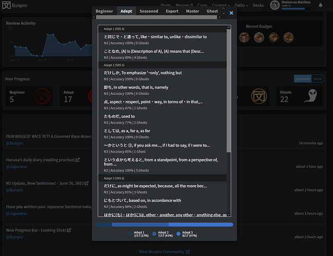
A nice feature would be to be able to mouse over a coloured part of these bars and to click on them so as to reveal what grammar points they are. In this way you could determine “Oh, I have these 6 leeches in N4 I need to work on…” or whatever.
You COULD figure it out by clicking on the new SRS stages at the bottom and scrolling through, manually checking “is this one N4?” but it would be inconvenient particularly if you have a large number of points to check through.

5 Likes

Like others suggested, an option in the settings would be the best! :smiling_face_with_three_hearts:
Otherwise, Alt Scheme is my favorite. (Both beautiful and readable) :art:

1 Like


It does indicate the JLPT level under the name of the point, along with the accuracy and the number of ghosts. But I agree that it would be good to also have that option. Not to mention filters or facets in this screen (n1-5, troubled, 硬, etc). For now, I’m very satisfied though.

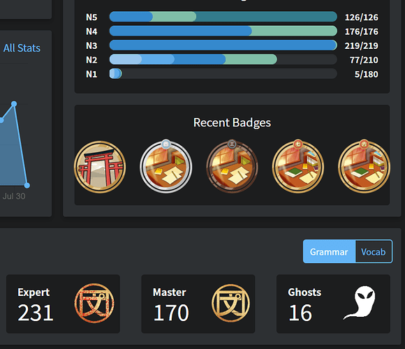
Accented Master – I like the high contrast but the final red is too “angry” compared to the rest of the “cool” blue-ish colors on the rest of the site.

Single Tone – This one seems to match with the rest of the site’s colors. It’s also nice that full “mastery” bars are bright.

Alt Scheme – This one seems like the best contrast without using red, but it seems that having “master” as the darkest color as counterintuitive – it feels like the bar is disappearing as you gain mastery.

5 Likes

Reading the previous reply, I’d like to add another opinion. I actually find the darker tone associated with master degree, and the lighter tone associated with beginner more intuitive.
These considerations seem very subjective…
So again, maybe it would be better (if possible, or later) to give the possibility for everybody to choose the option they find most convenient.
That being said it is already neat and useful, and I really appreciate your hard work! :ok_hand:

1 Like

Hey Harold, did you make that screen grab or is it a feature that already exists?

Already implemented but very likely on beta. Go into your account settings and opt-in. :upside_down_face:

Is it too early to give feedback on the new color scheme? I like it, though the light green and dark blue are clashing a bit, in my opinion. At least I find this one more intuitive in terms of progress. Compared to the other one where the bar for mastered was on top instead of in the back. I retract that, I’m just going to be perpetually confused until the colors make sense xD

One issue: My N1 progress looks like I’ve added all the grammar points.

image

1 Like

There are some bugs with the progressbar change this morning: As you can see, it tells me that 60% (102 items) of the N5 are in master, but nothing else. However, I actually have 170 masters, and it is not displaying the masters I have in N4 and N3. Secondly, I think the order is flipped, I find it most naturally to have the masters to the left, as mentioned earlier in the thread. Also look at the bug in the post above me, where the whole bar is filled even though it should not.

1 Like

For me the green parts of the progress bars do not work well visually with the rest of the layout of the dashboard.