
Thanks for listening to the community as always. I love the way the new progress bars look!
20 Likes
I like it too! It just feels a bit counterintuitive (as in, it took me a minute to figure out and it still feels really weird thinking about it) to me that the highest proficeny is on the right. That way, over time the light blue will grow from right to left, which is the opposite direction that progress bars usually go.
11 Likes
Good point! I think you are right and they should be switched.
12 Likes
I had assumed it was the opposite way. Didn’t hover to check until I saw this comment. So, I agree.
2 Likes
Agreed. It looks great but feels backwards. My first thought was “why are all of my N5 displaying at beginner level after this change?” and then I noticed this thread and your comment.
4 Likes
Depending on your frame of reference, either way could make more intuitive sense.
The way it is now, an individual item moves left to right as it progresses. If you reverse the order so that the bars grow left to right, then each individual item then moves right to left as it progresses.
It’d be best to make the direction of the bars a toggle in the settings.
–
That said, the new bars are great! Nice addition, thanks!
1 Like
Actually, I think my brain naturally expects the darker color to represent the higher level of proficiency, which is probably what threw me off.
9 Likes
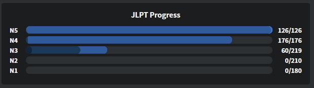
Mine is broken
6 Likes
I really like this!
Also hoping for a future update with more contrasting colours to make it easier to discern for some of us 
4 Likes
![]()
Mine also has a problem where the bar doesnt reach the end
4 Likes
That’s brilliant. But I think if they want to properly show use the rank of each particle we study the devs can always use colors rather than the monochrome setup they have, or reverse the coloring around so the darker color represents high proficiency, as someone said in this thread. In WaniKani, burned items are a charred gray. I already think of my burned Kanji/Vocabulary/Radicals in this sense, so it could help.
5 Likes
You didn’t do the hidden N4 grammar? You poor thing!
5 Likes
Just here to also appreciate the new snazzy progress bars 
3 Likes
@kush It should be fixed now. Please let me know if it isn’t!
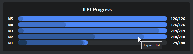
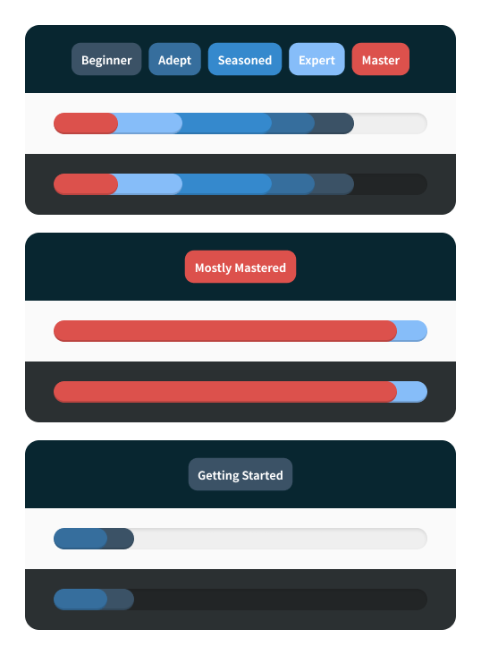
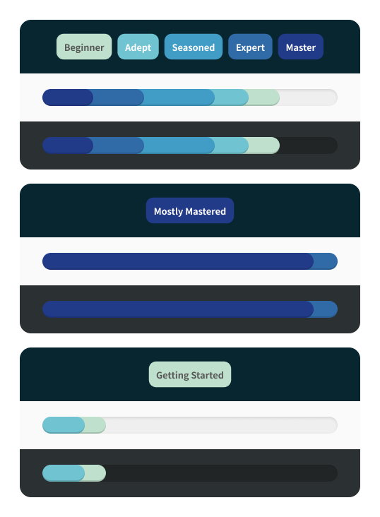
We adjusted the progress bars to have just three stages
Beginner & Adept
Seasoned & Expert
Master
The overarching goal was to give you a bird’s eye view of your SRS progress and just three colors helped us up the contrast between them. You can still hover to get specifics about numbers per SRS rank.
4 Likes
All fixed now 
2 Likes
I absolutely love this update and I hate to add more “I want this!” requests to a feature you guys are already scrambling over, but I would like Beginner, Adept, Seasoned, Expert, and Master to all be separate. The contrast between my familiarity of Seasoned grammar points and Expert grammar points is so wide that it feels inaccurate to do so.
8 Likes
It contradicts the Dashboard (Log in - Japanese Grammar Explained | Bunpro) which lists them the opposite, with ‘Beginner’ first, which might lead to some confusion. (I know I thought it was backwards at first as well, along with the colors being opposite of what I expected.)
I love the update though! Little things like this can make such a difference
2 Likes
I too was blown away when I noticed this.
As others have noticed different colors would be nice, as seeing different shades of blue is not that easily discernable. Maybe even seperating all levels, rather than clumping 2 together.
As for what colors, I would be thinking of a specturm from green to blue to red, from Master to Beginner. Maybe make the colors customizable in the settings.
Absolutely great work nonetheless, you keep cranking up new QoL Changes and Updates unlike any other website 
6 Likes
I echo this sentiment. In my experience “Expert” is “I know this! I might or not get it slightly wrong sometimes but I know this”.
“Seasoned” in my experience is often much more fragile knowledge and items often get demoted to Adept tiers, especially if I’m coming from a break or the example is a bit tricky.
I wouldn’t mind if Expert and Master had each its own color either. I think Master doesn’t even need to be on a blue hue to set it apart since they mark the point an item goes “inactive”.
2 Likes
@faizinmotion @Thom635 @devenu @conan @wippo @HaroldoNVU
Hey all!
We made these 3 test palettes to make way for discussion. What do you all think?
Accented Master
Have a unique color for Master rank items
Single Tone
A contrast-adjusted gradient (different from the one on live right now)
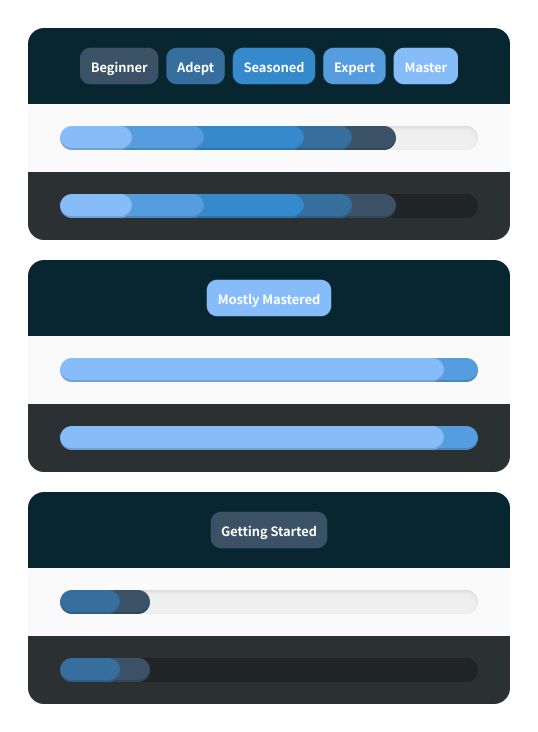
Alt Scheme
Gradient between two colors and tones for contrast
Which one do you think works best?
- Accented Master
- Single Tone
- Alt Scheme
- None of these
0 voters
Looking forward to your answers!
5 Likes