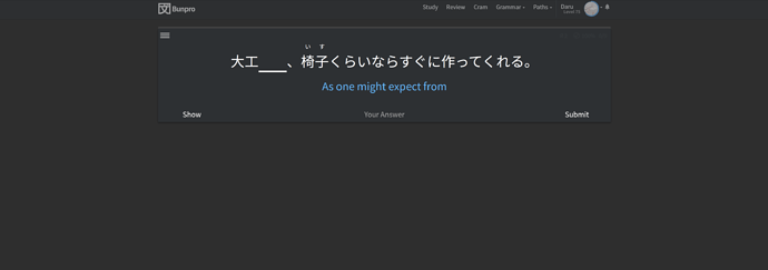
I set the width of the page to 60% out of curiosity (I’m on a 1440p ultrawide) and it doesn’t look half bad. Maybe a special rule for high resolutions could be introduced?
I love the new look too, but I agree it’s a bit squished.
I love it too!! And it seems a lot faster too!
Great update but really squished for me, even with zoom. Also wish I could still use the yellow text personally
Good catch. I am 100% sure it is fixed now
@Elizilla I have added it to the backlog to explore.
@Stormblessed @ic9 @conan @Kyfa Thank you for the honest feedback. I have added a couple extra break points for wide screens. Please let me know if that fixes it or if it still feels too narrow.
Thank you! That looks much better.
Feels and looks great! Was there a reason to leave out the ghost reviews tally from the main page? Still, looks super crisp like OP said, which is weird to say about a web page!
Just did my daily reviews, and overall really loving the update! I do miss seeing 文プロ instead of Bunpro at the top of the screen but that’s really a minor thing. Also curious about ghost reviews like @EdBunpro, considering I was used to seeing them displayed with the srs level counts (since I had the Bunpro+ script).
Better but still seems like it fills 80% only now . Improvement from before though, used to be like 60% on the first update
It looks a lot more professional and easier on the eyes. But now I’m sad that this is how I found out I have yet to hit SRS 12 on any grammar points! 
Just imagine how awesome it’ll look when you do 
On the flip side (I’m in the same boat as you), it makes me realize how far I’ve come in a short time. I started in January and now I’m going through n1 grammar!
New dashboard is awesome!!! Nice work!!
Very fast fix, thank you
Looks great and I appreciate the fixes for wide displays. Takes up a decent amount of screen space now (similar to most websites) without too much text wrapping being necessary. Thank you!


