
Love it. Finished a review and it refreshed to a sweet new look. Great work, love it in dark mode.
Just saw it too, it looks amazing!
Also love this new feature, it finally gives a good sense of progress imo
Also the removal of yellow is somehow more satisfying than I thought it would be 
19 Likes
Thanks for the update!
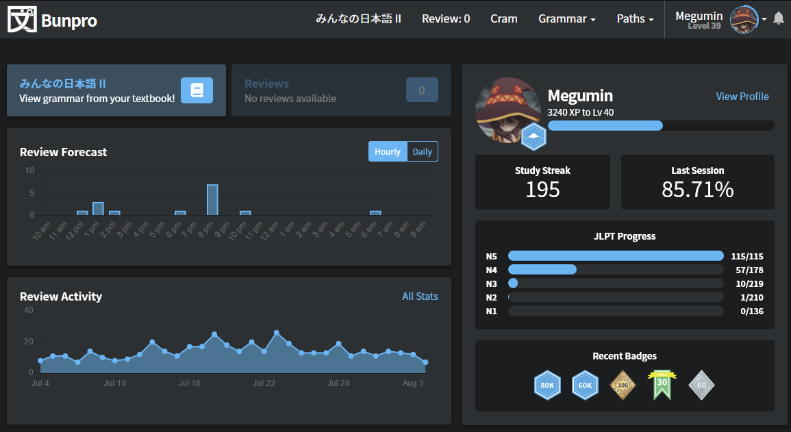
Achievement badge beside an avatar on the profile page is shifted.
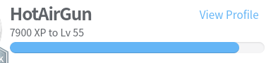
It’s intended to show full score to achieve here? I think it would be better if it shows remained exp to achieve next level.
6 Likes
I agree with showing the remaining exp instead of the total.
New website layout looks nice.
7 Likes
my reaction: oooo that looks nice! nice work ux/design/web team
9 Likes
nearly forgot to do my reviews due to it ! 
4 Likes
Fixed! 
It wouldn’t be a Bunpro release if there wasn’t at least one small bug 
9 Likes
Thank you!
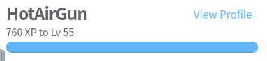
But now the prorgess bar is broken 
3 Likes
No, it’s actually broken for me, it has width 939%:
<div class="progress-bar navbar-xp__progress-bar" role="progressbar" aria-valuenow="939" aria-valuemin="0" aria-valuemax="100" style="width:939%"></div>
And your looks broken too. In the header your progress looks like 33%, but the progress bar shows something like 50%.
4 Likes
I like that the kanji for bunpro in the top left has been replaced by english - I click on this to return to the home screen and before my browser kanji plugin (10ten) would highlight it making it a faff to simply click.
4 Likes
Daddy likes O_O ありがとうございます!!
7 Likes
Ah yes, now that you mention it. I’m a bit farther from levelling up than the bar implies.
5 Likes
I like it! Looks very sleek.
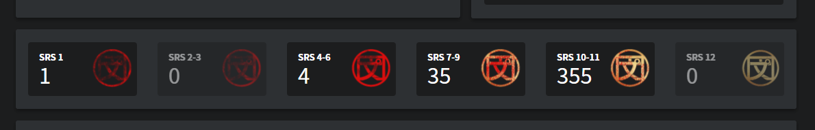
The new section with the various SRS levels is particularly neat, but it’d be even better if you could see which grammar points fall under those categories rather than just their amount - are there any plans to add that?
6 Likes
Absolutely fantastic look, the old design always bothered me.
4 Likes
I mostly like the changes as well but it does feel a bit claustrophobic on a higher resolution. Especially when you have text wrapping like in this screenshot despite having 2/3 of the width being dead space. Would be nice if everything stretched out a bit wider on bigger screens.
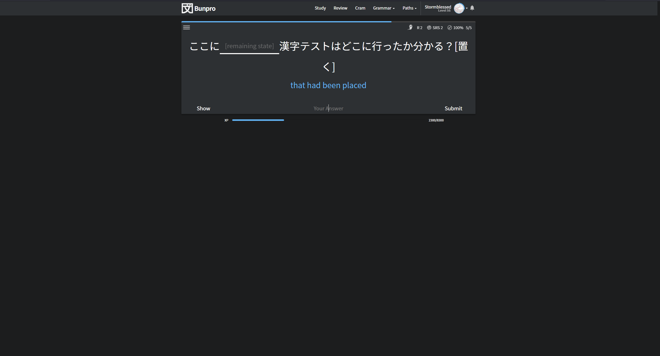
Thanks for the update though! I like the new colour changes during reviews in particular.
12 Likes
are you using a 4k monitor? a quick work around for this would be to just ctrl + scroll wheel up for zoom, should make better use of the screen real state! I know it’s not a permanent fix but oh well
5 Likes
I like the new design but I’m getting the same width problems. Other than that it looks good
3 Likes
No, just 1440p. On 4k or ultrawide it would be even smaller.
It’s not so bad that I have to zoom in. I know mobile friendliness is top of mind for any website these days, but I wanted to bring up that there’s people on big screens too!
3 Likes