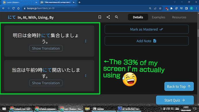
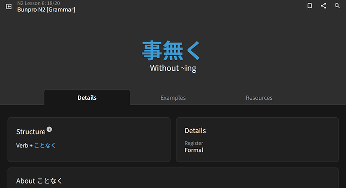
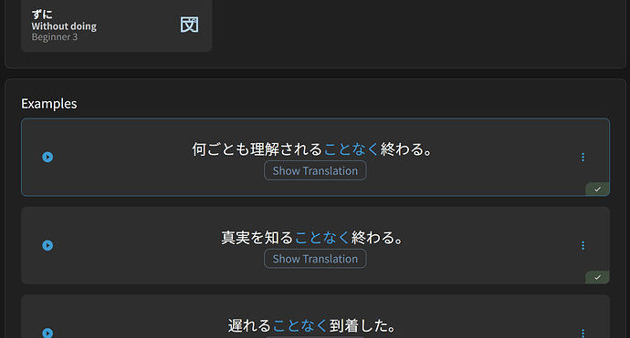
Hello! I figured this could be useful to someone else. This will remove/static all sticky and floating things during lessons, and take out the sidebar to let the lessons breathe.
You will have to scroll back up to scroll back up, and the sidebar will be inaccessible. The “next” and “quiz” floating buttons are also gone but left and right arrow keys still work to hop between grammar points in your batch. Hit the right arrow key on your batch’s last grammar point to trigger the Quiz prompt.
Lessons only. I think reviews are perfect as they are.
(Feb. 2026 update, lol)
div#floating-portal-header,
div#floating-portal-footer{
    position: static !important;

}

div#floating-portal-header header.border-b.border-rim.bg-primary-bg.py-8{
	display: none !important;
}

div#floating-portal-footer{
	display: none !important;
}

aside.sticky,
div.relative header.sticky {
    display: none !important;
}

div.shrink-0.bg-subheader{
 	display: none !important;
}

To me, all those floating and sticky things were starting to get a bit much on a tiny school tablet.
While I personally would appreciate a thingy in the style settings to do it officially, maybe I’m in a small minority and manually pasting some userCSS is good enough?
Though I had to download Brave and find manual installs of the User CSS extensions because the school blocks basically everything including the Chrome web store, so there is a use case for it lol


