Style Updates to Grammar Tiles

Hey there!

Over the last few days, I’ve updated the style of the grammar tiles so that they’re more in line with some of the 2.0 styles.


You can see the new tiles under:

  • Grammar Search (bunpro.jp/grammar_points)
  • Paths (bunpro.jp/paths)
  • Lessons (bunpro.jp/lessons)
  • Bookmarks (bunpro.jp/bookmarks)

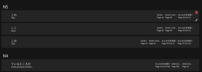
Breakdown of what’s on the tile:

The first thing you might notice is that you no longer have to highlight the tile to see the meaning.

Screenshot 2023-06-02 at 9.11.42

a) Hanko - If you’ve studied the grammar point, the hanko will be red. If you’ve mastered it, the hanko will be gold.

b) Grammar Point - The font will scale a bit based on your screen size. The text is truncated, so if the line is too long, it will cut off and finish with ‘…’

c) Meaning - The font will scale a bit here as well, and it’s truncated.

d) Bookmark Icon - If you’ve bookmarked the grammar point, you’ll see the flag.

e) Formal Tag - Denotes more formal language.

f) Notes Icon - If you have a note for the grammar point, you’ll see the pencil.


Here’s a few screenshots of the tiles with different themes and levels of completion:

Screenshot 2023-06-02 at 9.12.20

Screenshot 2023-06-02 at 9.12.32

Screenshot 2023-06-02 at 9.12.01


39 Likes

It looks good :slight_smile:

3 Likes

Sweet! Thanks for making such an update post, too. Personally, I really enjoy seeing all the progress the BunPro team is making, with little progress updates like this! It’s kinda exciting, actually! :nerd_face::sweat_smile:

3 Likes

Whilst the new UI looks great, it has lost some of the information I found helpful.

Having the JLTP level display on the tiles was useful. I use the grammar search daily for new grammar I encounter but unless it’s N3 (what I’m studying towards) I don’t add it to reviews. It’s not hugely inconvenient but I now need to click inside each one to check the level.

My other use with the old UI is more niche but at Uni I use Tobira and seeing in the search what page it was on in Tobira was super handy too. Now I have to make two extra clicks to see the page.

As a long-time user, I’ve loved so many of the recent changes but this one made things a little less convenient. :sweat_smile:

6 Likes

“Hide studied grammar” doesn‘t work anymore since that update (Safari-based iCab on iPad and Chrome-based Vivaldi on Windows 10, all in the latest version).

The button reacts (i.e. the text switches between hide and show) but nothing is filtered anymore.

1 Like

Hey! Thank you for reaching out. :bowing_man:

I have patched both of the things you mentioned. The JLPT separator is now visible (instead of on the tile) and the textbook page numbers are visible like before.

@Buntebunpou Thanks for pointing that out. I have fixed it :+1:

4 Likes

Thanks! It works, but hiding is horribly slow now. On my 2018 iPad Pro it takes around five seconds without any gui indicator that it does something in the background.

With the old layout I never noticed any waiting time.

Showing all entries is as fast as before. Only hiding is that slow.

1 Like

Amazing! Thank you so much :pray:

2 Likes

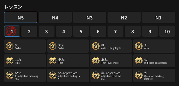
The icons at bunpro.jp/lessons don’t seem to work correctly anymore.

I’ve fully completed all of N5 and N4 and yet there are no icons on the 2-10 buttons and neither on the N5 and N4 buttons. Also, shouldn’t the icon on the 1 button be golden instead of red?

1 Like

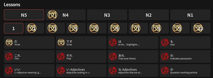
Seems to have some quirks to work out. As you can see, I’ve done all of N5 part 1 but it doesn’t count it (or the rest of N5 which has been done) as completed.

Edit: Also I don’t know why they’re gold icons since other than the two in the picture I’ve set none of the grammar to mastered.

2 Likes

Thanks for the feedback. Could you let me know a little more about what browser/device you are using please?

1 Like

@Chigun I just pushed a patch for the issues with the JLPT level and lesson tile hankos. I believe it should be working correctly now.

3 Likes

I just made a Grammar Search and was really impressed by this update. Really clear layout, nice visual style and presentation. すごいですよ!お疲れ様です!

2 Likes

Yes, that fixed it, thank you!

2 Likes

As I said, iPad Pro from 2018 with current iOS and latest versions of iCab and Safari. Around 5s delay after clicking the button to hide already learned items.

But I also notice a delay on more powerful systems like an Intel NUC with Core i7 with six cores and 32GB ram and a fast M.2 ssd from 2020, it’s around 1,5-2s there I guess.

Before the new layout I never noticed a delay on any device.

I completed N5 and N4 and nearly all of N3. So around 500 boxes have to be hidden by clicking the button.

2 Likes

It seems that since this update the buttons in the dialogue box where you add your own notes to single grammar points are now black on dark grey and practically unreadable. I use the theme “dark”.

2 Likes

Thank you for the extra info! I have adjusted the code a bit. In testing I wasn’t able to fully reproduce the delay but I was able to notice a slight delay and able to reduce it. I believe it should be better now. Please let me know whether it helped or not.

I also updated the buttons on the notes to no longer be black on grey.

2 Likes

Hi there, everything looks good on my end but I have some suggestions, definitely feel free to ignore them lol

  1. Adding hover text to the Bookmark, Formal Tag and Notes Icon. (I personally was confused by what the notes icon meant when I first started using bunpro)
  2. Being able to remove or add a bookmark to a grammar point without clicking into it (you could have a clickable bookmark icon appear when you hover over the grammar point)
  3. Being able to add a grammar point to reviews without clicking into it (would have to be another icon I assume, and only clickable if the grammar point isn’t already in reviews)

Regardless, thanks again for all the updates :smiley:

4 Likes

It’s perfect now, I don’t notice a delay anymore, even on slower devices. Thank you!

1 Like

I’m glad that change fixed it :tada:

3 Likes