
is it possible to show like daily total activity/cards done? right now the only option is to show by vocab/grammar only right?
1 Like
Is this what you’re asking about?
The chart shows each item as its own line, but if you hover over one of the points on the chart, then it gives you a summary with a total at the bottom. There’s not currently a chart to show the total as its own chart though.
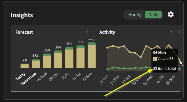
oh yes thats the one, but more of like combining both charts together, so the line graph only shows thte total cards done per day (it doesnt matter to me whether its grammar or vocab)
personally, i much prefer the old style. its not so much that the new display is bad, its how it utilizes my screen real estate - or rather, how it doesn’t as the dashboard already fit inside my screen so the consolidation doesnt let anything more show for me, it just uses less screen space. i’d love to have more control over my home page in what info i wish to display and at what size, but i understand that’s not a simple thing to do.
an actual complaint would be how both insight views are locked to the same timespan, as it always makes at least one of the two useless for my purposes. given this was possible before, the change has made my experience using the site worse.
an hourly activity log of when i did reviews is not a stat i care about. it actively makes it harder for me to tell how much i’ve done that day between scrolling and method of display which seems like the opposite of what the graph is supposed to accomplish. the daily review forecast has the opposite problem again where as far as reviews go most of the time im going to be planning ahead for the next day at most (where hourly is thus significantly more useful).
3 Likes
Hello everyone!
As always, thank you so much for your feedback! Two points I want to address right off the bat:
- Mobile needs to stack vertically, no questions asked. Will be fixing that soon.
- Per-graph controls are needed, will be implemented too.
As for the context on this change: I understand how frustrating it is when you feel things are changing for the sake of changing. It breaks the status quo in an honestly, superflous way. However, this change is to make way into something much bigger we’re cooking.
I don’t want to disclose the details yet, and I can’t give a release date either, but this rearrangement was a necessary step in order to be able to have this big upcoming update. We have plans into allowing Insights to hold more than just two graphs with your progress, which touches on dashboard customizeability.
One thing I’d also like to point out is that this new layout allows us to set the groundwork for a more customizeable dashboard. (Sort and hide cards!) We’re just being careful so as to not dump all of these changes at once.
I personally think that our Dashboard can’t possibly cater to everyone’s Japanese journey in its current state, and this Insights consolidation plus new features coming in directly aim to fix that.
So, think of this as a half step rather than the true final shape. I’m reading this thread closely to make sure that we’re not culling something you as a user need.
25 Likes
Thank you very much for the response!
It’s good to have the extra context, and it’s not all that surprising to know that this is part of a larger scale change/update. I just wanted to make sure and voice concerns to make sure that desired features and functionality don’t get lost in the shuffle.
With the understanding that details and timeline of the larger scale update can’t be disclosed, would it be possible for you to speak to the timeline of implementing per-graph controls? I’m not looking to make you or anyone else commit to a concrete due date, but I’m just trying to get a feel for whether this is a short-term, easy fix or if it has to be rolled in with a larger-scale change that is still pending.
I would also like to mention - I was surprised that there doesn’t seem to be any release notes or changelog where these sorts of changes could potentially be announced and discussed. I understand that documenting every single detail that changes could easily lead to large amounts of overhead, but would such a thing be a sensible suggestion, even if it came in the form of a forum post? I think that would make it easier to maintain open communication and might help a little with those “Have I just lost my mind, or is this thing very different from what I’m used to?” type moments.
Thanks again for the response! I look forward to seeing how the dashboard and interface of Bunpro continues to evolve, and add me to the probably very long list of people who would love to see more customization!
6 Likes
Thanks so much for the update + the team’s hard work! I look forward to seeing what the chefs have been cooking up behind the scenes 
3 Likes
it look spretty cool, you can see the amount of reviews you did by the hour. i feel like this would help be plan their study sessions more or smth like that
Not sure if this was reported already in the bug thread, but seems like the Forecast chart no longer updates properly when in Vacation mode.
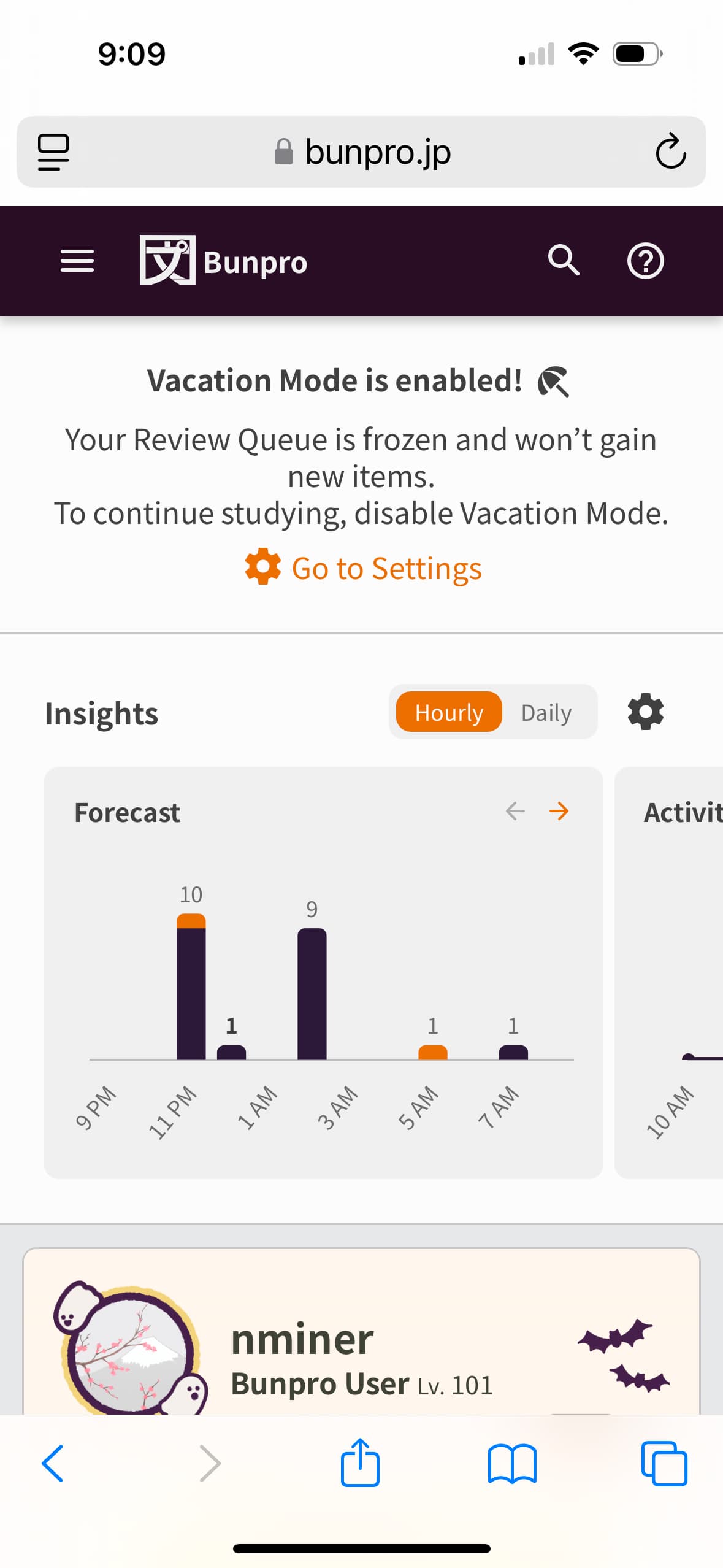
First screenshot was from last night when I first put my account into vacation mode.
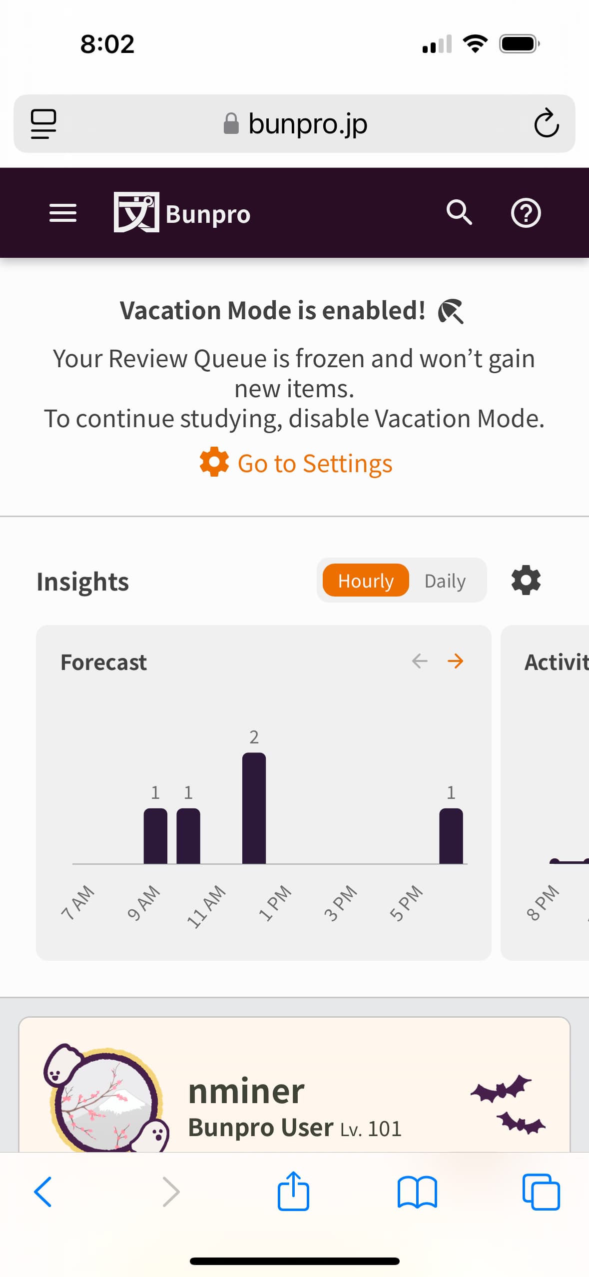
Second screenshot from this morning.
Seems like the Forecast is still progressing even though Vacation mode is activated.
It does seem like Vacation mode itself is still working, which is good!
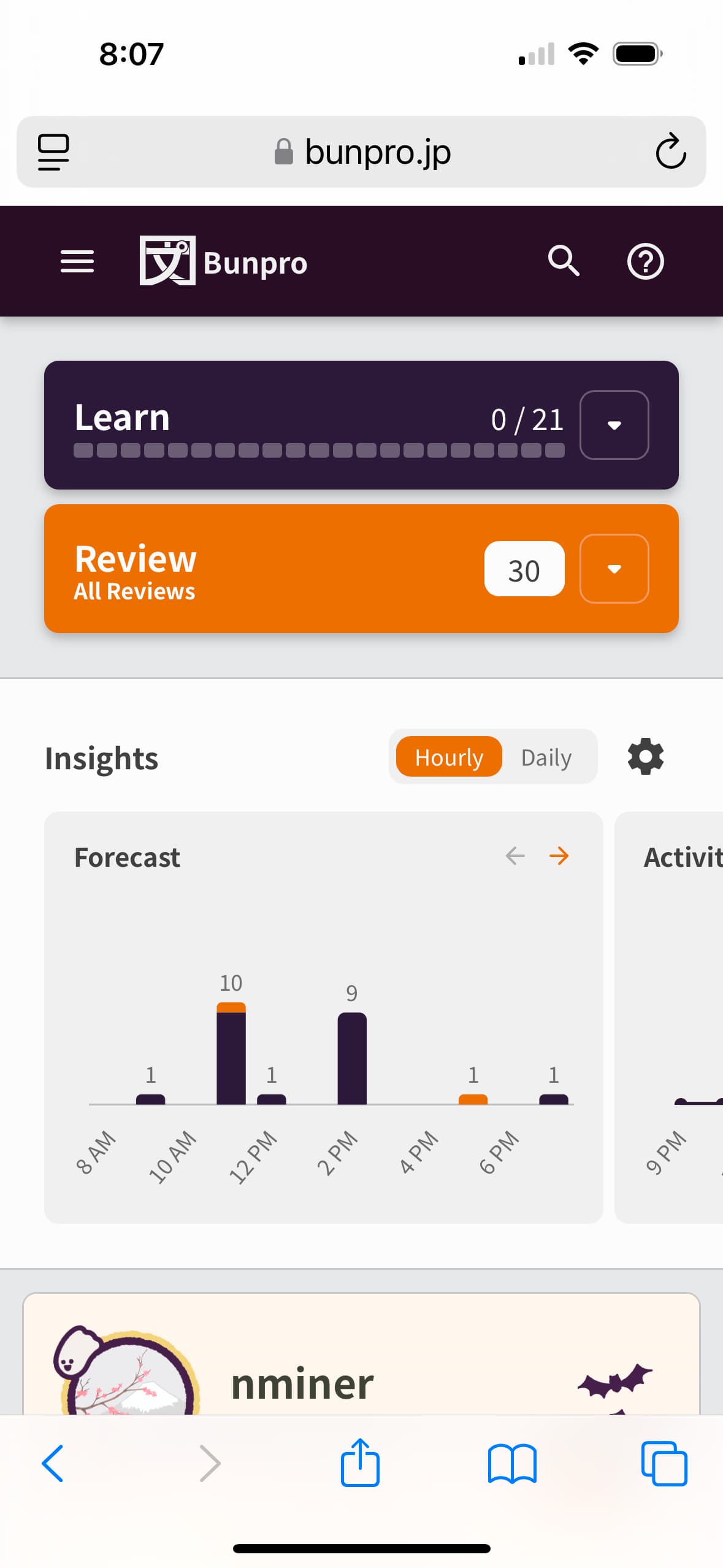
Screenshot this morning after turning Vacation mode off. The chart is now back to what it was when I first enabled Vacation mode, which is also good! So it’s just the period when Vacation mode is turned on that the Forecast seems to be a bit wonky.
2 Likes
Delighted to see the separate controls are back already, thank you!
10 Likes
 Great work
 Indeed, a very pleasant surprise this morning! Thank you so much for turning it around so quickly!
7 Likes
Yes thank you all!
4 Likes
Yes I believe all the mentioned errors/UX issues should be fixed!
Any further feedback is welcome.
Lots of new projects gonna be released in the next few weeks!
Watch that notification bell on the site!
7 Likes
Thanks for actioning on everyone’s feedback so quickly! Going to follow up on one piece of feedback below 
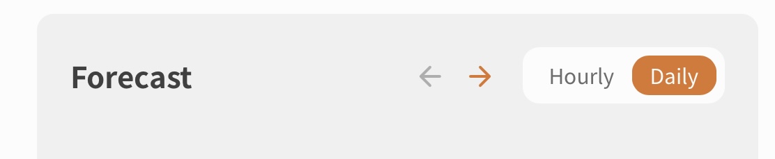
Are there plans to increase the default size of the icons and toggle here? On both mobile (Safari) and web (PC) they’re still very small.
Not sure about mobile, but on PC the two arrow buttons are about 10x10px, whereas other icons on the site are 24x24px. The Hourly/Daily toggle seems to have a height of 19px, while the Grammar/Vocab toggle in the Progress area has a height of 22px.
Ideally, these should be standardised across the site. If the idea is that elements inside the Insight panel are supposed to be smaller because they’re in modular sub-elements, I still think it would be good to bump up the size of icons at least, as currently they are too small and don’t meet minimum size requirements for accessibility.
1 Like
Done!
Updated them to 20px.
Will be out very shortly
1 Like
Amazing, thank you!
1 Like
Another very small presentation issue:
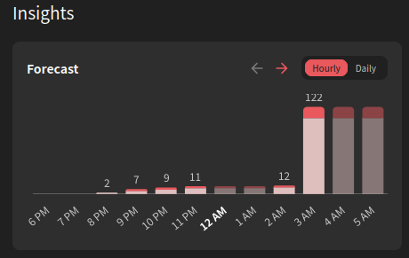
When there’s a large difference between bars, the top edge of the numbers is cropped.
2 Likes
I’m actually encountering the same thing, even without a large disparity in review numbers.
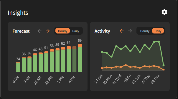
1 Like
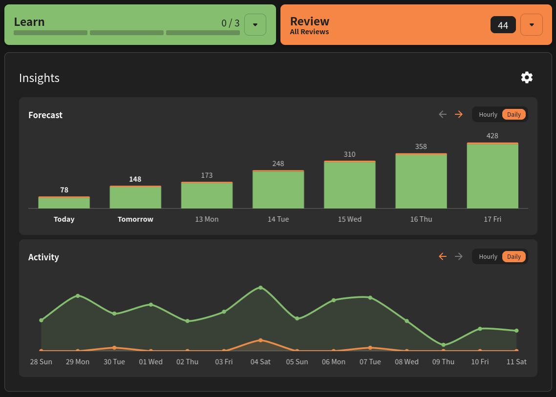
since the new layout is too small on my screen and I can barely hover or click things, I made a user-script to change it back to the old insights layout one on top of the other:
I only tested it on Firefox, I don’t know if it will work on Chrome-based browsers.
// ==UserScript==
// @name         Back To Old Forecast & Activity
// @version      1.0
// @match        https://bunpro.jp/*
// @grant        GM_addStyle
// @run-at       document-idle
// ==/UserScript==

(function () {
    'use strict';

    const css = `
        ul.md\\:grid.md\\:grid-cols-2 {
            display: flex !important;
            flex-direction: column !important;
            width: 100% !important;
        }

        ul.md\\:grid.md\\:grid-cols-2 > li {
            min-width: 100% !important;
            width: 100% !important;
        }

        ul.md\\:grid.md\\:grid-cols-2 > li > article {
            width: 100% !important;
        }

        ul.md\\:grid.md\\:grid-cols-2 canvas {
            width: 100% !important;
        }
    `;

    if (typeof GM_addStyle === 'function') {
        GM_addStyle(css);
    } else {
        const style = document.createElement('style');
        style.textContent = css;
        document.head.appendChild(style);
    }


    const triggerResize = () => window.dispatchEvent(new Event('resize'));
    setTimeout(triggerResize, 300);

    const observer = new MutationObserver(() => {
        const target = document.querySelector('ul.md\\:grid.md\\:grid-cols-2');
        if (target) {
            triggerResize();
        }
    });
    observer.observe(document.body, { childList: true, subtree: true });
})();
result:
4 Likes