The new "Insights" section on the dashboard

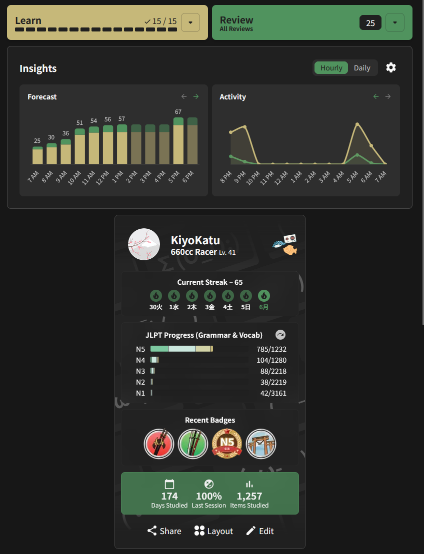
This morning, when I was doing reviews, everything looked completely normal as it always has on the dashboard. But then, after getting home and getting back into reviews before bed, I noticed that the two separate sections that I used to have for the forecast and daily totals have been merged into one.

I want to start this off by making one thing as clear as I can: I don’t hate this, and I don’t intend for this to be a “NEW THING BAD” type thread. Truly, I don’t. Visually, I think this makes for a cleaner interface, and I rather like the consolidation. But I would like to have some extra control over what information is presented, and possibly how.

Mainly, what I’m after is the ability to make separate adjustments two each graph. Previously, I would have the forecast set up to show the hour-by-hour look ahead at what is in store for reviews for the day, and I would used the “activity” line graph to review what I have already done for the week. I really liked this setup, as it provided a nice balance of two separate data points across two different time ranges.

However, I also don’t want to say that my way is right and that this new thing is bad and that I don’t like it. What I would like to ask for is the ability to change these two graphs separately from each other, like they used to, while still maintaining the compact, consolidated card that they’ve been merged into. If I’m being picky, I think it’d be great to be able to actually decide the timeline for each graph as well. On the old version of the graphs, I really wanted the ability to show the entire day of forecast, perhaps at the expense of skinnier bars, instead of the next several hours. I know I can use the arrows to scroll back and forth, but I always really wanted to just see my whole day ahead and be able to easily plan review and lesson timing.

I suspect there are some out there that would like these to be separate once more, so perhaps that could be another level of control. But if I’m able to split the functionality between the two, then I’d be just fine with them merged into one side-by-side card as they are now.

So again, I don’t hate everything about the change, but I would like to respectfully request some additional features to bring a little extra tunability into the design. Thank you for the time, and thank you for continuing to try to improve the experience.

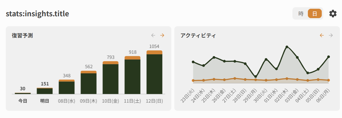
I still had this tab open on my other computer and it hadn’t yet refreshed, so I was able to grab a screenshot of the old setup as it was configured for me before the update:

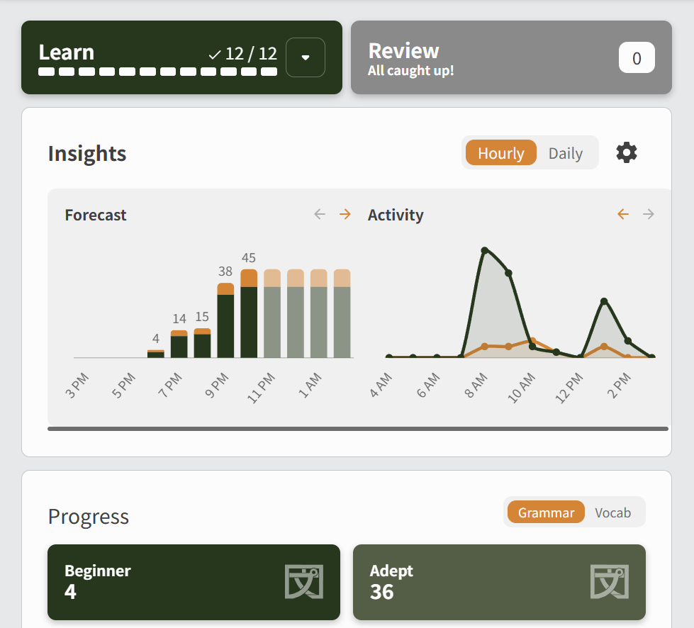
New Style:
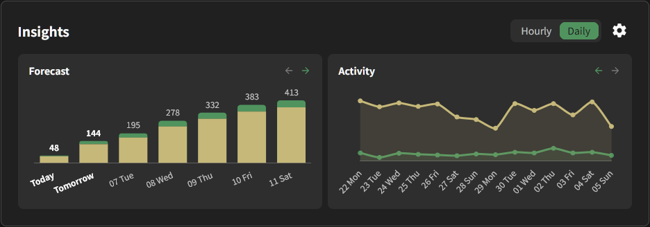
Old Style:
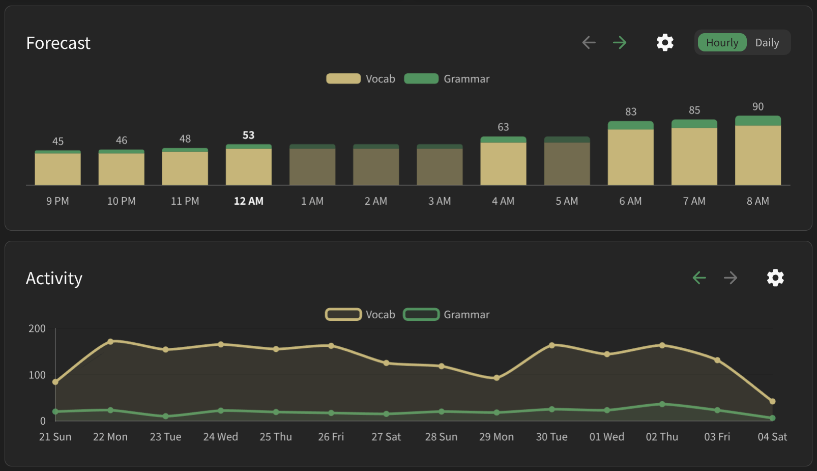
22 Likes

I’m glad to see this thread because I have exactly the same feedback. I always use the forecast on hourly view (because I use it to see when I need to do my reviews to keep them in the chunks I want), and I always want the activity on the daily view because I use it to just keep track of how consistent I’ve been being day-over-day (and hourly activity is too sparse for it to be useful for me, it just shows tiny spikes in a field of 0s).

16 Likes

I agree with both of the above, so no need to elaborate.

Not a fan of the new set up, are we able to get an option to change it back so people can have it either way?

7 Likes

+1 for this, i also liked having forecast on hourly and activity on daily

6 Likes

Yeah, exactly same here. This isn’t a huge issue, but I felt this change as one of those cases when “if it isn’t broken, don’t fix it”. Not sure what the benefit of this change is, and maybe it makes sense in preparation for something else (maybe adding other graphs from the stats like accuracy over time?). But as of now it’s just a little worse for me.

7 Likes

Another super minor thing about the insights section: “Insights” is written in bold while “Progress” and “Latest Community Discussions” are not. I like that it’s more compact, but I feel like there’s a little cleaning-up that needs to happen before I love it

4 Likes

Same, forecast hourly and activity daily please!

3 Likes

I’m also supporting this feedback.

2 Likes

I agree. It’s too smushed now. I liked it better before.

3 Likes

I didnt notice it until this post and i think mine is uh broken
I prefer the old style too fwiw

@Sean pls accept this notification of bug

6 Likes

Fixed! Thanks as always

2 Likes

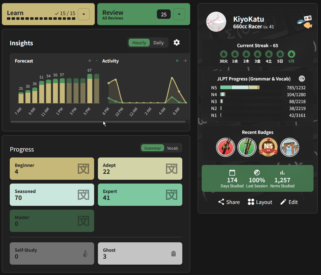
I use vertical tabs so this is what mine looks like:

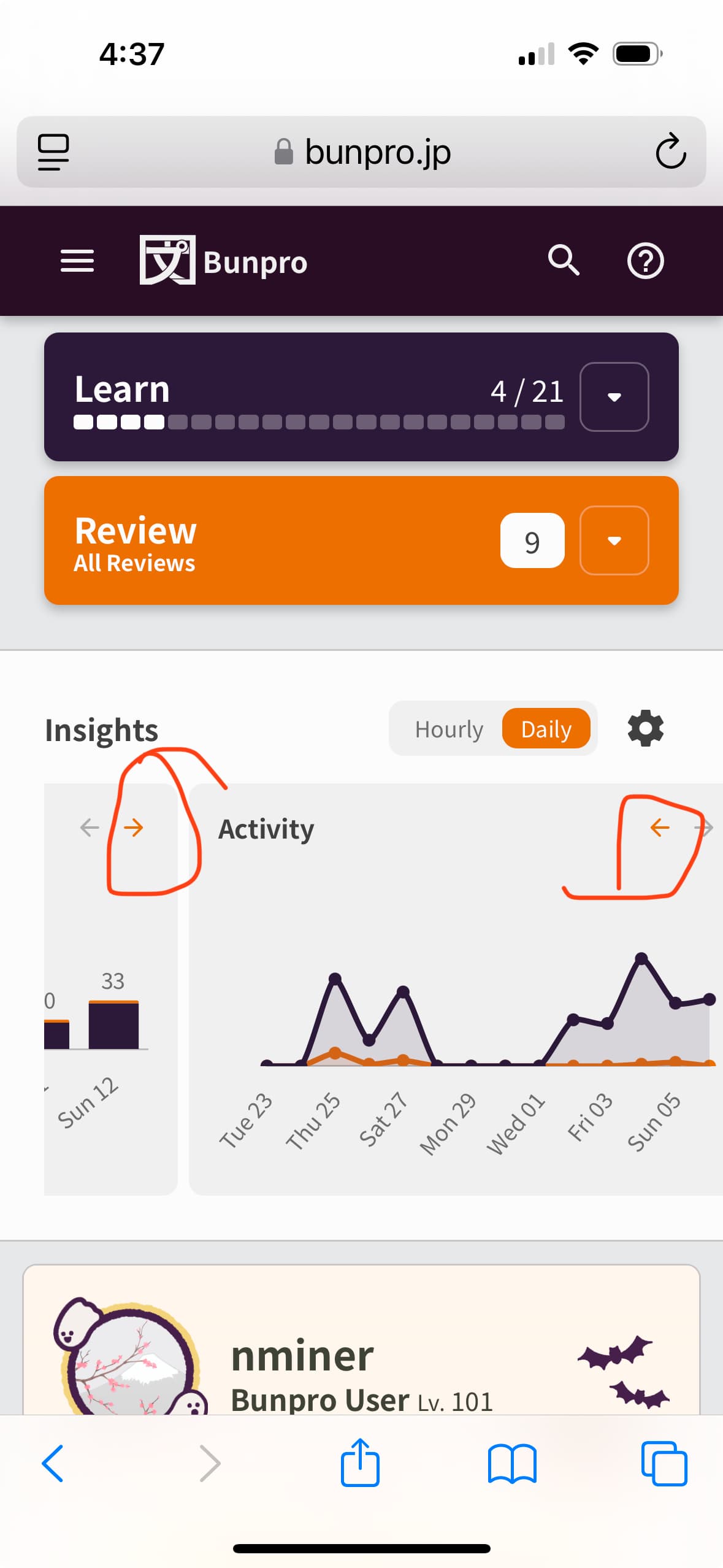
This looks way too smushed on mobile. Now I have to vertically horizontally scroll to view both tables. :upside_down_face:

And while we’re on the topic, can the option be added to change the order the widgets on the homescreen appear in? Before my profile appeared before the insights section but I think last week or so, it suddenly swapped places.

3 Likes

Also going to echo what others have said above and add that on mobile (web), it looks really wonky, like everything has been shrunk. In particular, the two arrows above each graph are minuscule.

(It’s also kind of frowned upon in the UX world to have icons/interactive elements inside sliding/scrolling cards unless those cards become fixed elements.)

5 Likes

I HATE it! It looks smushed. It was fine before, who was asking for this? Classic fixing something that isn’t broken and making it worse

3 Likes

As a desktop user I’m perfectly fine with the changes, but one thing I’ll note is:
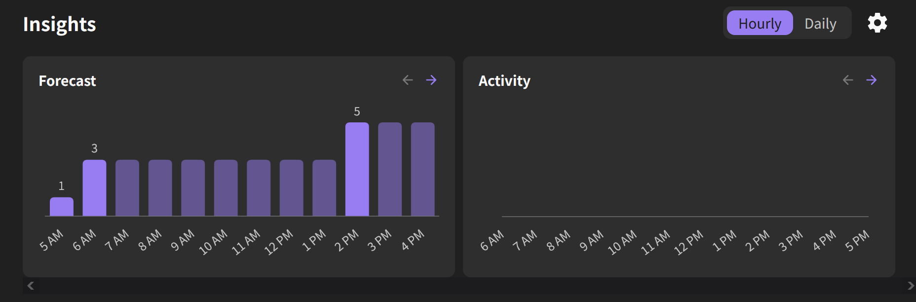
I never really used the “activity” graph, and now that I’ve had the option to untick both grammar and vocab points for it I was hoping it’d disappear altogether… but I just have a blank graph instead :joy_cat:

1 Like

(post deleted by author)

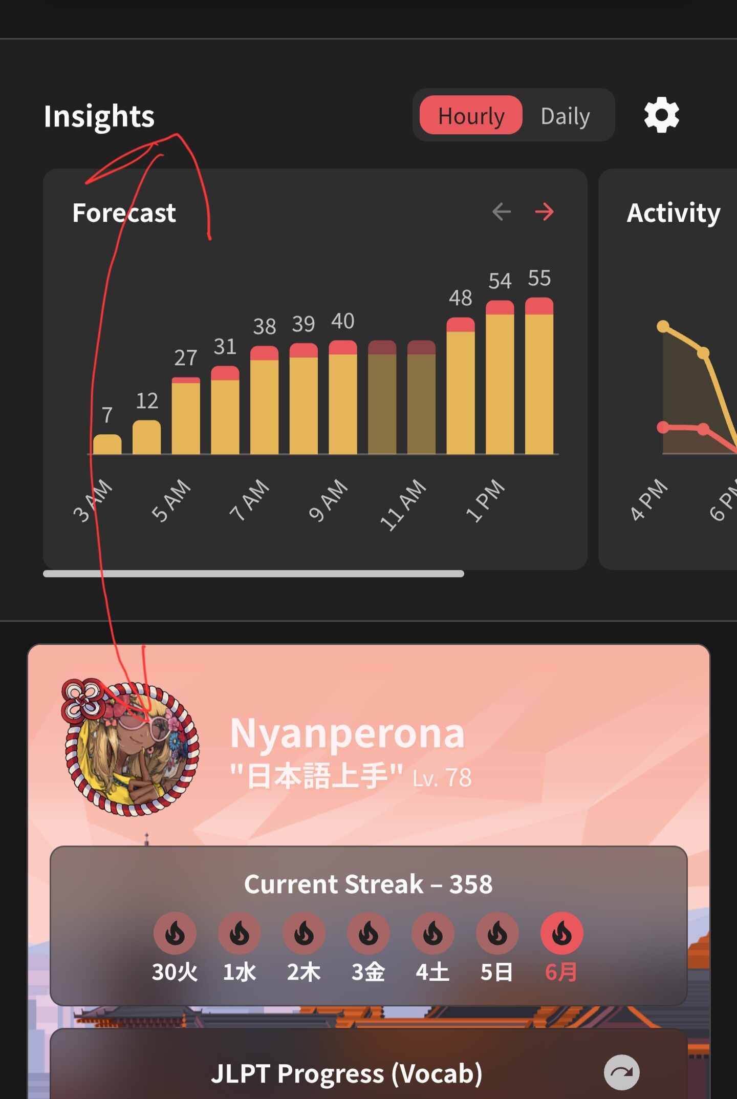
I don’t normally use the website on mobile, and I rarely use the mobile app for that matter. Now that I’m at work though, I also see this occurring on my vertical monitor, not just mobile. It’s to a much lesser degree, but definitely still have some scrolling going on, where I didn’t previously encounter this:

I also see the profile section gets bumped down a notch when the window gets even narrower. I’m using tabs on the side of the browser like others in this thread, but I normally have them autohide since they take up a ton of space on a vertical monitor. Here’s what it looks like when I turn off the auto-hide and have the tabs permanently visible.

just a +1 on not liking this change. i have a 30" screen and now the website hardly makes use of the width. can we have a setting to see it the old way?

1 Like

+1 to OP exactly, that’s my precise use case and request as well. I also request them just being on two separate lines on mobile so there’s no scrolling.

2 Likes