I’m not seeing the “DECK” option in the Bunpro main menu, do I need to enable something (I dont see DECK options under settings either)?
Maybe its just cache…

I’m not seeing the “DECK” option in the Bunpro main menu, do I need to enable something (I dont see DECK options under settings either)?
Maybe its just cache…
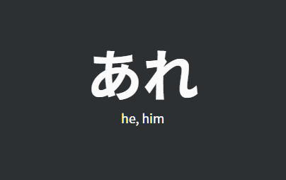
Error: In Genki I you have あれ listed as meaning he/him. Should be that/that thing/that person.

Not sure is it implied that you’ll collect some user answers data about vocab reviews, but now it looks like Bunpro collects only incorrect answers for grammar points. Is it a bug?..
Thanks for the manual input for vocab!
Update is great again. Really nice to be able to type in the meaning.
I like it that the correct meaning is displayed as well as your answer, so you get exposed to all those alternative meanings you didn’t type.
If we can get the same thing for the japanese reading sometime in the future I’ll be overjoyed.
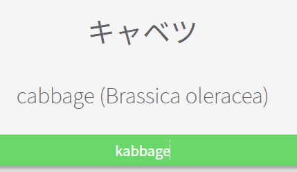
Also I think there should be an indicator if you had a typo in a vocab meaning, similiar to how wanikani does it.
Just to make sure the user spells stuff correctly (because typos can add up if you are not an english native speaker).

The Decks feature is still only beta and is accessible by opting into the Bunpro Beta in the Account settings. 
It’d be nice to see a keyboard shortcut added for the ‘Show English’ button. I like the idea of encouraging users to learn through reading, but I expect I’d still end up using this button regularly to verify my understanding before moving on to the next word.
Thanks. I will wait till is official.
Love the new features! Just curious, what will happen if you WK sync now as new vocab items are added here in the future? Will I just randomly “learn” several hundred more with each batch (I’m level 60 there)?
Holy cow this was fast! Less than a week from feedback to implementation? Do y’all even sleep?? Amazing work again Bunpro Team! Can’t wait to fiddle with this later!
Feature suggestion:
I would appreciate an option to review grammar and vocab separately.
my favorite part of this update is that i got 12 free levels LOL. Its all looking really clean, though i’ll admit that I don’t know why i’d use the N5 deck vs the bunpro path.
is the problem with using word (ios app wont sync if u study word) fixed yet?
Hey Gal, thanks for letting us know about this!
The file that we have all of the vocab information stored in has the correct meaning for this word listed, so we will have to check if there is a step between being in our excel file, and being in a deck that is causing some of the rows to get added incorrectly. It appears that this happened with a couple of words.
Sorry for the inconvenience, we will try to figure out the cause asap so that it doesn’t happen when we add future cards/decks.
Wanted to come back and leave another suggestion after combing through the N5 vocabulary words.
Maybe sometime down the line (certainly wouldn’t be a quick add, I don’t think) there could be some sort of illustrations (maybe even from いらすとや if that’s a real option) for some (not all) vocab words to help add context.
As I passed over ストーブ I realized those who have never encountered a Japanese ストーブ may have a hard time grasping what that actually is, or may unknowingly make the mistake of associating it with the English usage for “gas stove”, commonly referred to as ガス in Japanese.
In no way an urgent feature, just something that crossed my mind that could further set Bunpro above the rest!
I second this.
I tried to learn 10 vocs words on the deck to see how it works. But now it’s added in my review pile with the grammar points. Not that it’s a bad idea but I’d like to only review grammar points (without having to click on review from the deck page) without getting disturbed by some voc words (still mainly using WaniKani for that as well). The feature in itself does seems good though.
@DasHannes Completely open to this suggestion! We just aren’t really sure on how best to handle it in terms of what buttons there should be or where they should go etc. Any thoughts on how to make it work?
This should be fixed now!
@Katzerin Thanks for pointing out the typo! I think you are right, radio buttons would be better but for now we just made toggling one untoggle the other.
@DrNefarius @gasshou We can undo the addition, but we feel that if you did the work and studied the words on WK, you should still be able to get the credit for doing it. As vocab use becomes more widespread, the relative levels among users will normalize. Would a WK sync setting where it adds them but puts them into your review queue at an SRS of 0 work better do you think?
@EyeShield77 The stats have been updated now and should no longer show the vocab stuff in the new grammar or breakdowns. We will update the stats page to show vocab stats in the future.
@HotAirGun We will be collecting user answers for vocab reviews as well and looking at the data we store on the backend.
@Wippo Added a little indicator. Let us know what you think!
@jc04tu You can now use E to trigger the “Show English”
@quadban We will probably keep the wk sync manual for now. An automatic integration will probably be something we add in the future once we actually have all of our vocab added.
Looks like there’s something wrong with the logic behind it.

The SRS input for cram is fixed, thanks.
The onclick on the answer is still not working and additionally the two report buttons are there. Neither are impacting me greatly, just to let you know.
I have several ideas how it could work. One is to change the dropdowns of the main menu to mouseover dropdowns instead of clickable ones, then the feature could be implemented under the review button. There would be the default behavior by the main review button, and 2 optional behaviors by the dropdown. You’d distribute “review all, review vocab, review grammar” and change the default one for the main button somewhere in the settings page (some might prefer grammar only, others might prefer review all as a default).
An alternative is to keep the dropdowns as they are, keep the review button as it it for reviewing all SRS items, and add a “review grammar only” to the grammar dropdown and a “review vocab only” to the “Decks” button. (Decks would become a category like Grammar.
Additional suggestion:
In either case, I’d suggest to break down the review number by grammar and vocab points. For example, with 12 grammar reviews and 20 vocab reviews it may look like this:
“Review: 32 (12+20)”
That will help to plan time for a review session.
From this, there is a 3rd idea for the review button changes: You could have a second line with clickable links right below the “Review” button and list the “newly added grammar”, “grammar reviews”, and “vocab reviews” as 3 categories just with their designated number (use a color code), making each of the numbers clickable for reviewing that category only. The relative position under the review button should be fixed for each category, e.g. in support of colorblind people.