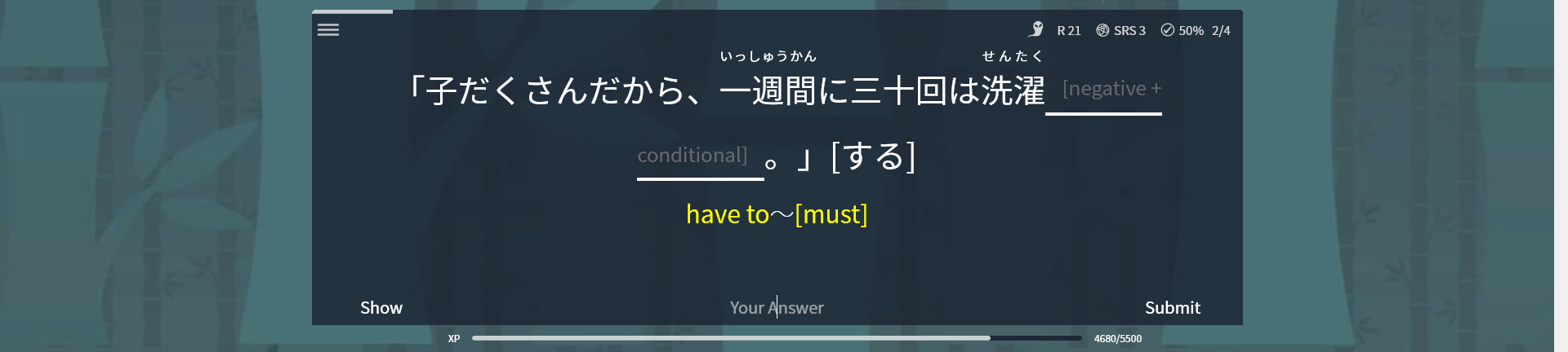
猛暑が続いてうだるような毎日ですが、お元気ですか
Dashboard
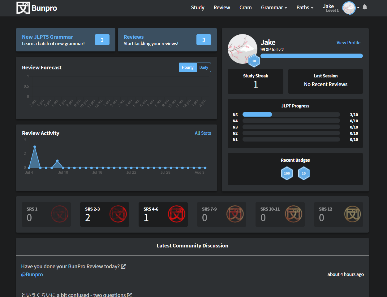
With the summer heat upon us (at least here in Japan), we though we would refresh your grammar studies with some changes to your dashboard.
- Information you care about: The profile box changes and the addition of the SRS level count tiles should give you more and better information about where you are in your studies.
- The start of consistent design: Gone are the 14 different colors previously used with different spacing and alignment. Going forward the new Bunpro styles will be applied to existing parts of the site as well as in new upcoming super secret features.
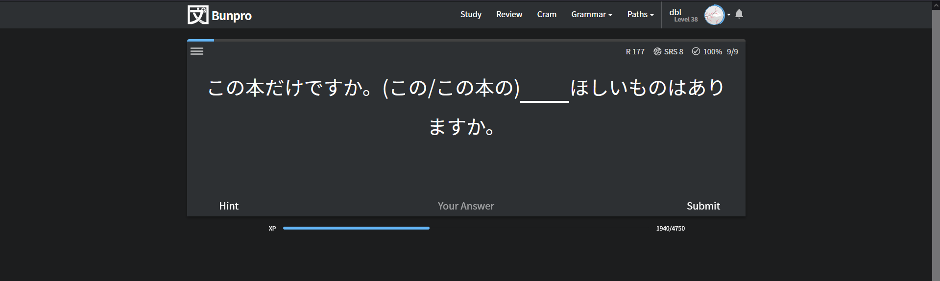
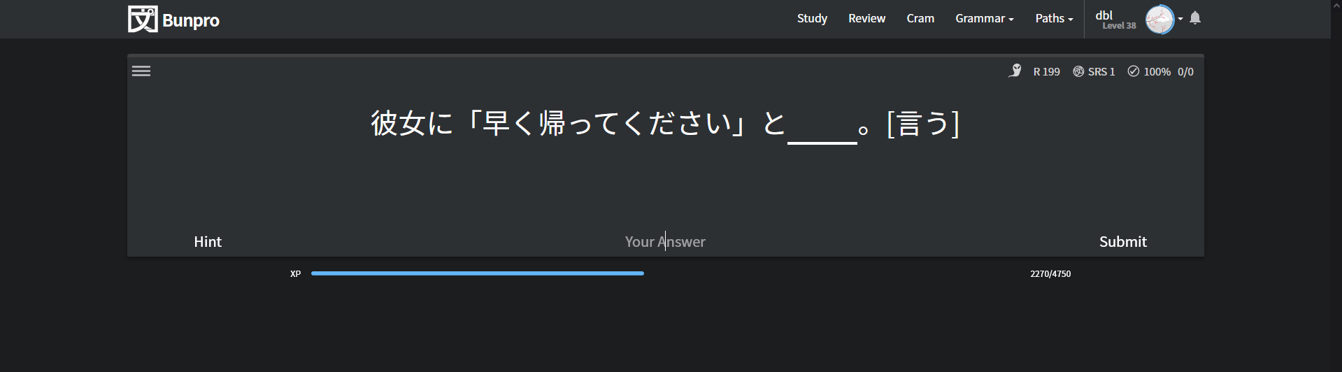
Modern:
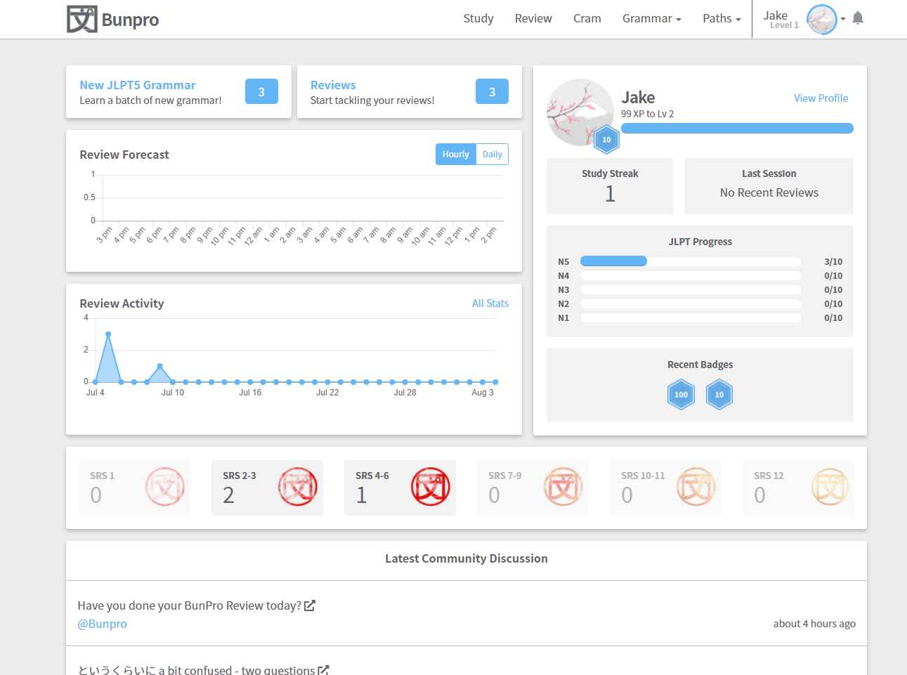
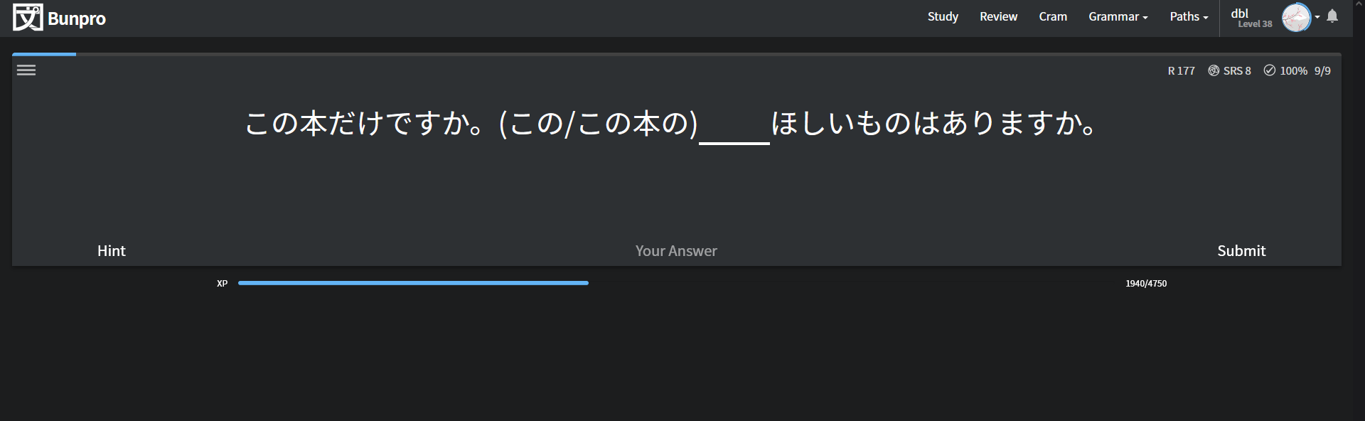
Modern Dark:
We fixed a few bugs, like not showing the Update category in the community links, and some theme issues with the Select grammar bar.
That is all for this week in terms of development updates.
There will however be another batch of audio for 48 new N1 grammar points out by the end of the week!
We will have more feature updates in the coming weeks. Stay tuned 

 . But better this way, as not everyone knows or wants to install a script of a random person.
 .
.