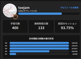
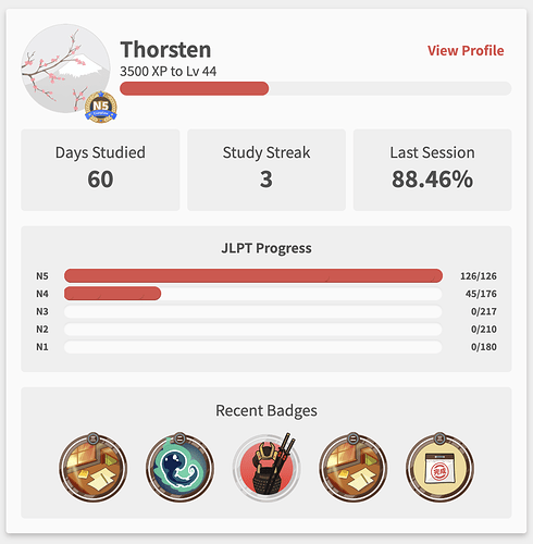
Before, the five bars that show your progress in the jlpt lessons would vary in their shade of blue depending on their srs state, starting at grey and becoming a lighter blue as you progress, if I recall correctly. Unless mine trusty eyes have failed me, the bars now appear to be a uniform color. When did this change, and why?
6 Likes
This should not be the case, seems like a glitch on our end. Nothing was updated to remove this functionality.
I’ve sent this to the devs, thank you for the report!
3 Likes
I think the font size is smaller too, or at least looks different somehow
2 Likes
Hmm, it looks like all the HTML for the individual bars is still there:
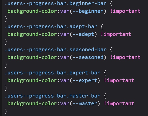
However it doesn’t match the CSS for it anymore:

I noticed that the JLPT Percentage script had also stopped working, so I’m guessing it’s the HTML that changed.
2 Likes
Also, I just started doing reviews and when the xp drop flies up when you get the review correct, it just shows a + with no number, possibly related?
2 Likes
it’s back to normal now for me, idk what changed! all’s well that ends well
1 Like
Hey guys! A fix was just pushed, thank you for the ping!
5 Likes


