Hello,
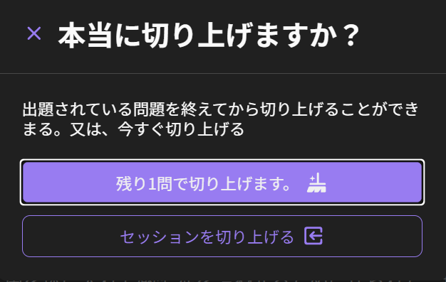
I usually use the website on a PC for Bunpro, end when I want to finish a session, it prompts me whether I would like to wrap it up (which I usually do):

As you can see, the wrap up button is at the top and accented.
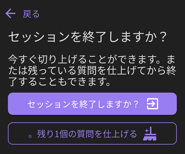
I do, however, find myself doing reviews on the Android app, where this screen looks a little bit different:
Both the position and the accent of the buttons are switched, which causes me to routinely select the wrong one on the mobile app. Would it be possible to make this UI consistent? I don’t particularly care which version stays, as long as only one prevails.
Thanks.

