10/16 Major Update - Grammar/Vocab Page 3.0

:wave: Hello everyone!

How’s your part of the world treating you? :world_map: :earth_asia:

Here at Bunpro we’re very excited to finally release an update we’ve had in the oven for quite a bit - Grammar/Vocab Page 3.0!

What is the Grammar / Vocab Page?

It’s the page that contains all the information related to the content you’re seeing or studying. You typically see it when you click anything that points to a specific Grammar Point or Vocab.

Read on to find out what’s new! :sparkles:


:dart: Update Overview & New Features

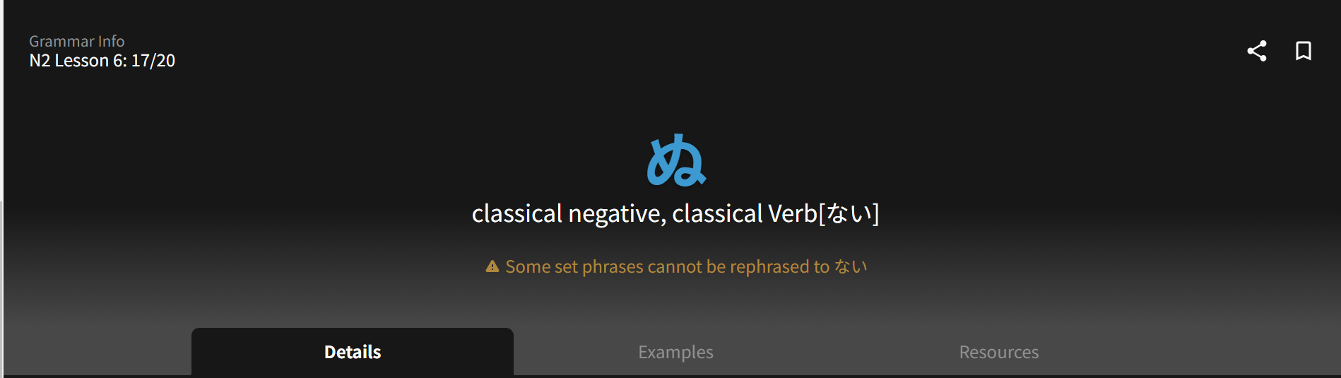
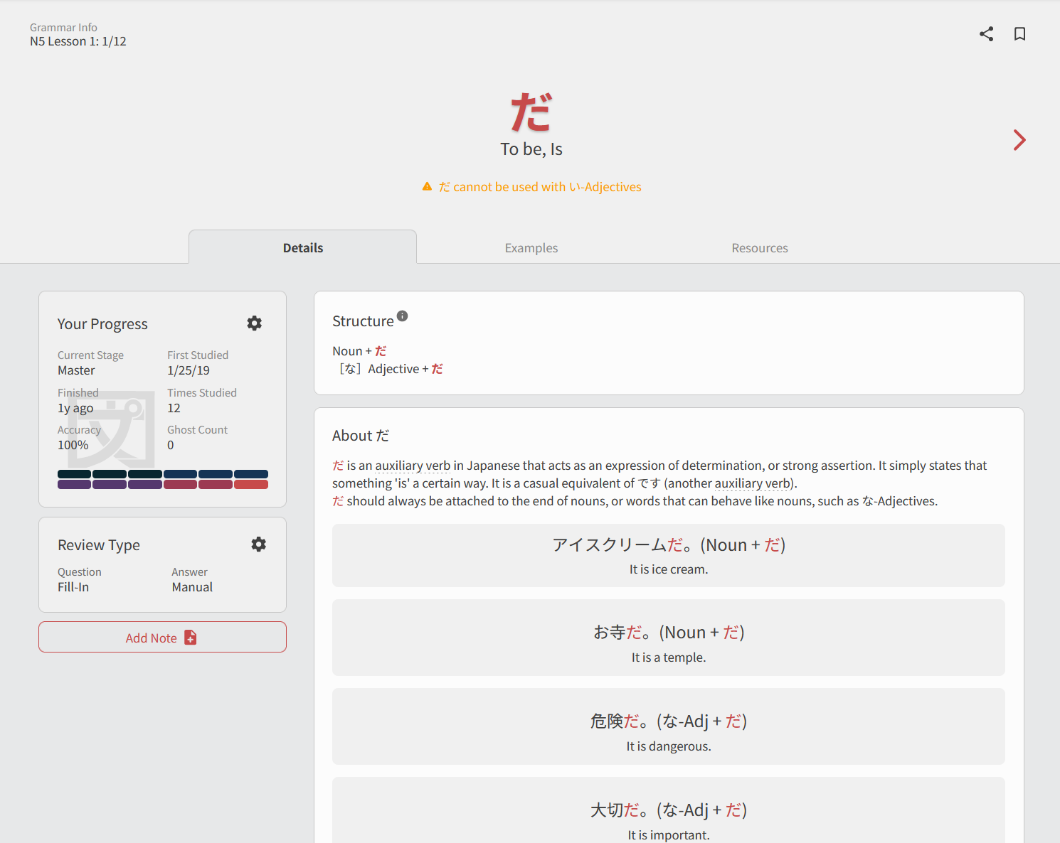
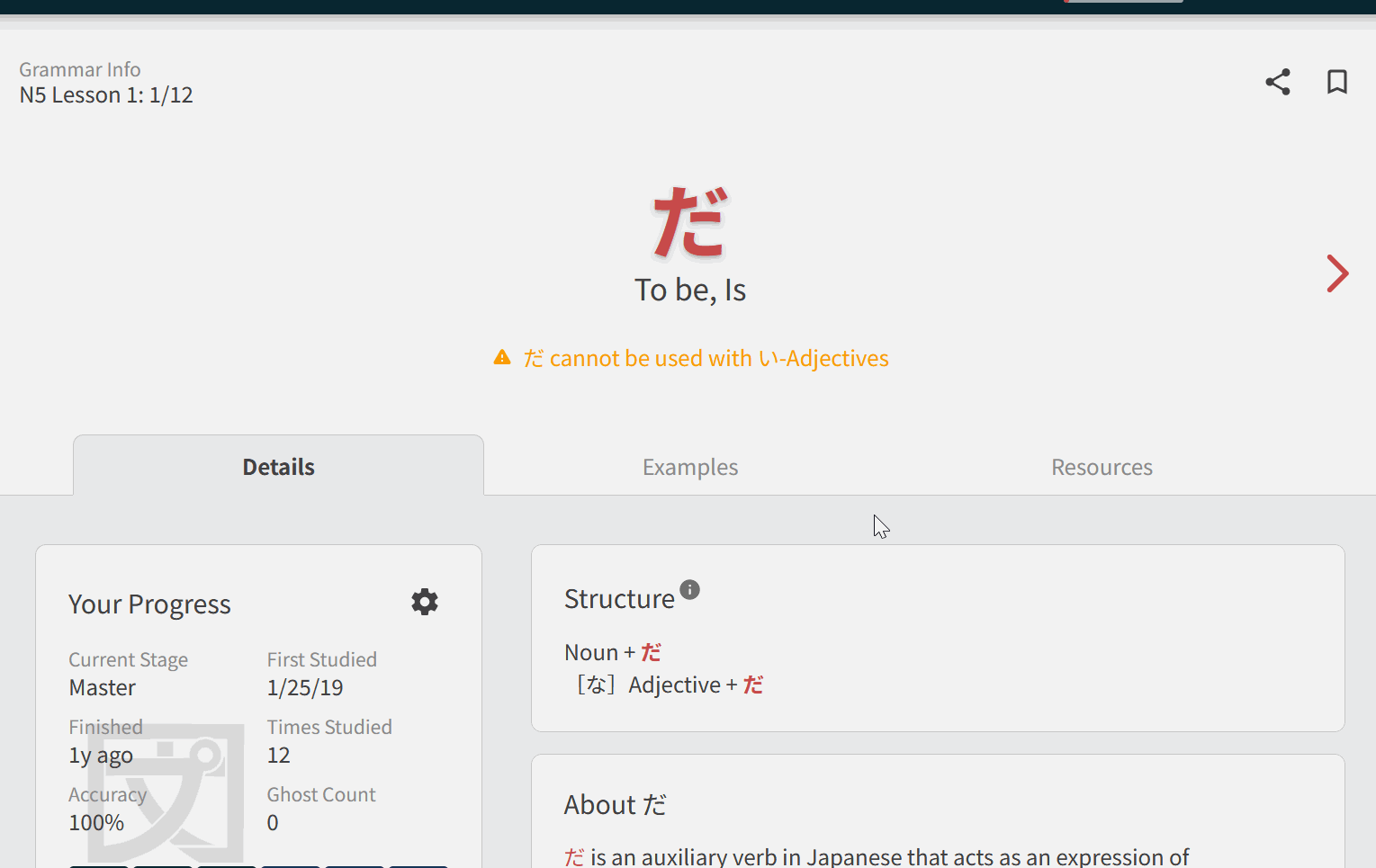
New Single-Page Style

The Grammar/Vocab Page now flows as a single, friction-less page. You can still jump between the different sections like always, but now you can also see everything by simply scrolling.

This design also offers a lot more breathing room to read through the information and clearly defines each section, making for an easier reading experience.

With this new structure we’ve also added new hotkeys!
Use Details Examples and Resources (D, E, R) to navigate the three main sections of the page.

We also changed the position of each section, so now the very first thing you’ll see is the Structure and Write-Up! Details was moved below the Write-Up.

See it in action down below!

Collapsible Header

When scrolling, the main header will now compress into a smaller version so you always know what you’re studying. It also allows you to access the Share and Bookmark features easier!

We believe that this is especially helpful during Reviews, since it keep the information of what you’re studying visible at all times.
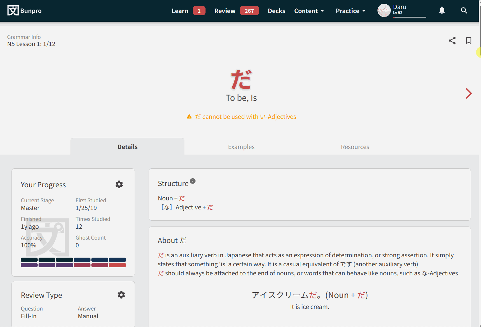
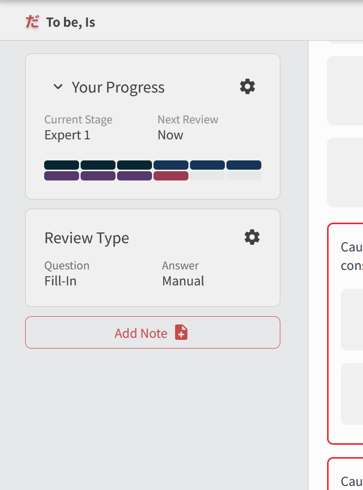
1


The Sidebar

The Your Progress section has evolved into the Sidebar. It will now accompany you as you read through the page, having access to Progress Settings at any time. This is a much more ergonomic way of managing what you’re studying, while also providing feedback on your progress.

2

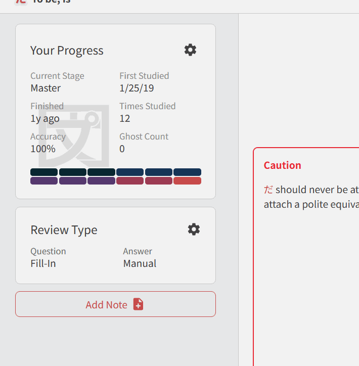
On mobile, it’ll be available as a drawer at the press of a button!


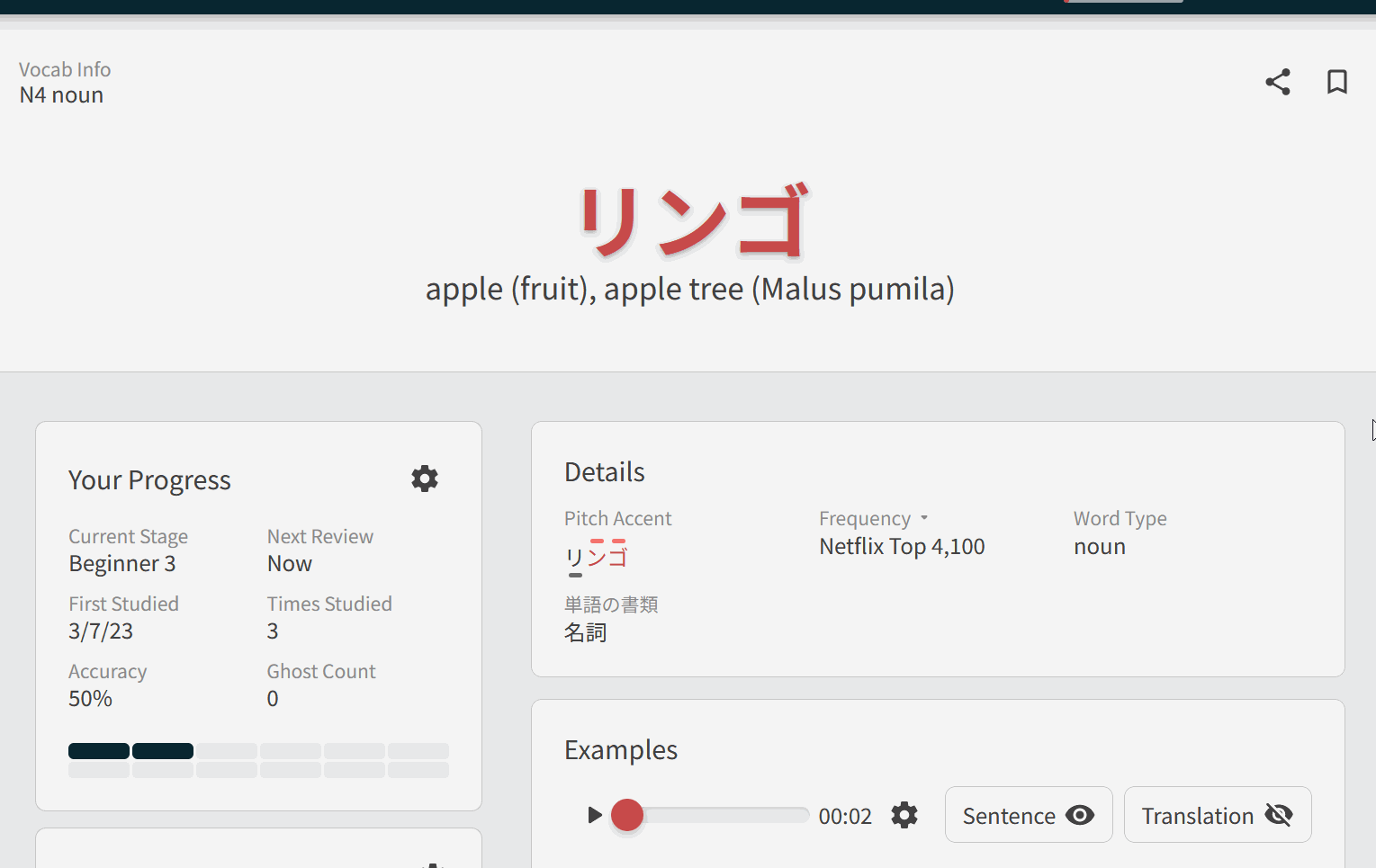
Improved Notes & Synonyms Experience

One complaint we received a lot with the previous design was how much space the Notes field took up. Which was great if you were an avid note-taker, but if you weren’t, it just got in the way.

In Grammar/Vocab 3.0, the Note’s section won’t show up unless you’ve added a note.

If you want to add a note, use Add Note button at the bottom of the Sidebar. It will show up as the first section in the page. This makes them easy to reach during Reviews and your studies!

3

Vocab’s Synonyms will also work this way! The section was also redesigned to take up less space in general.

4


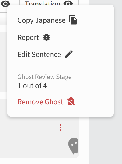
Better Ghost Control

You can now see which sentences have Ghost reviews attached to them, and how far into exorcising them you are. You can also create Ghosts for a sentence if you’d like some extra practice on it.
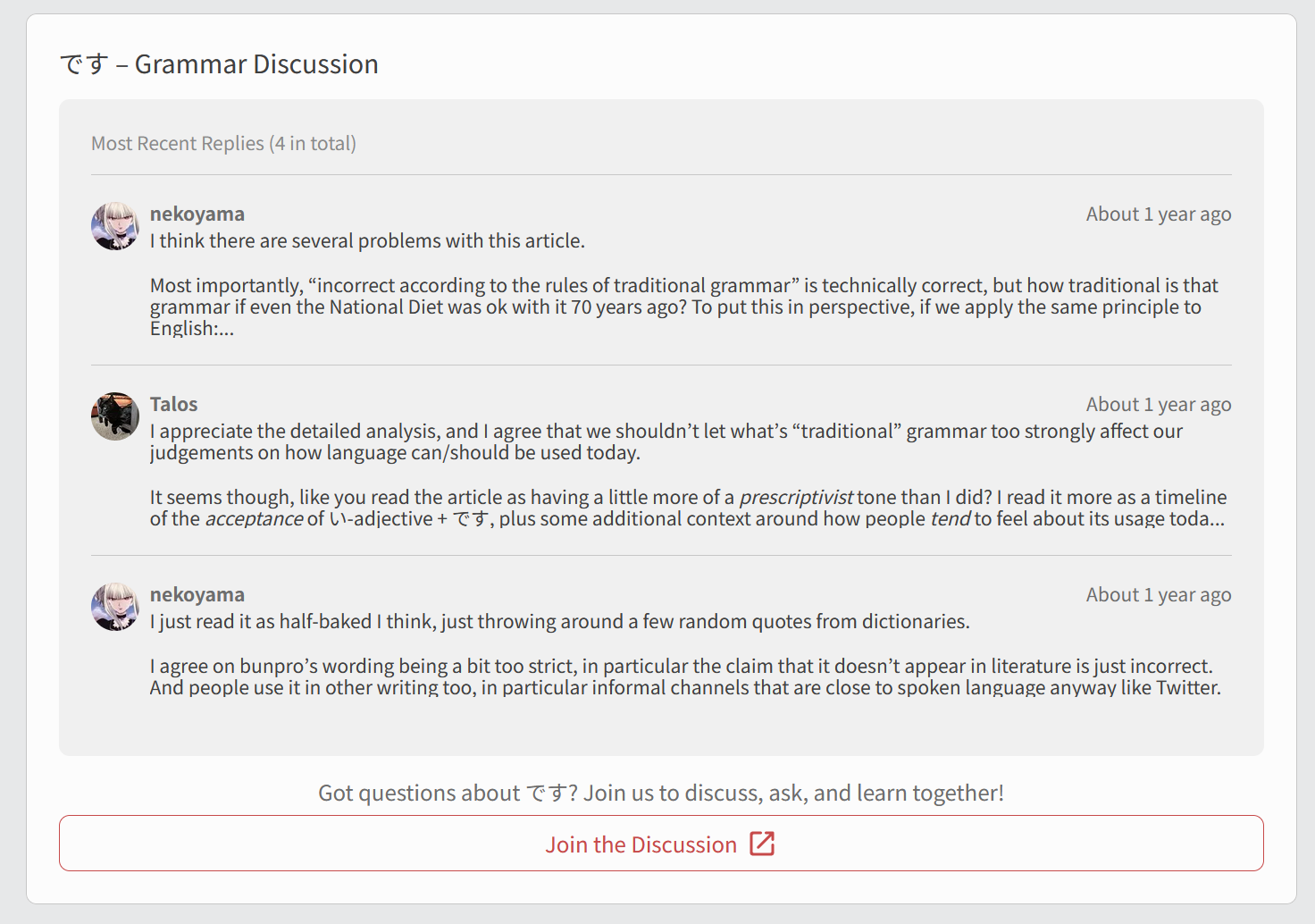

Community Preview

The Ask button has evolved to the Community Discussion section!
You’ll now be able to see the latest posts in the forums for each Grammar Point, as seen here.


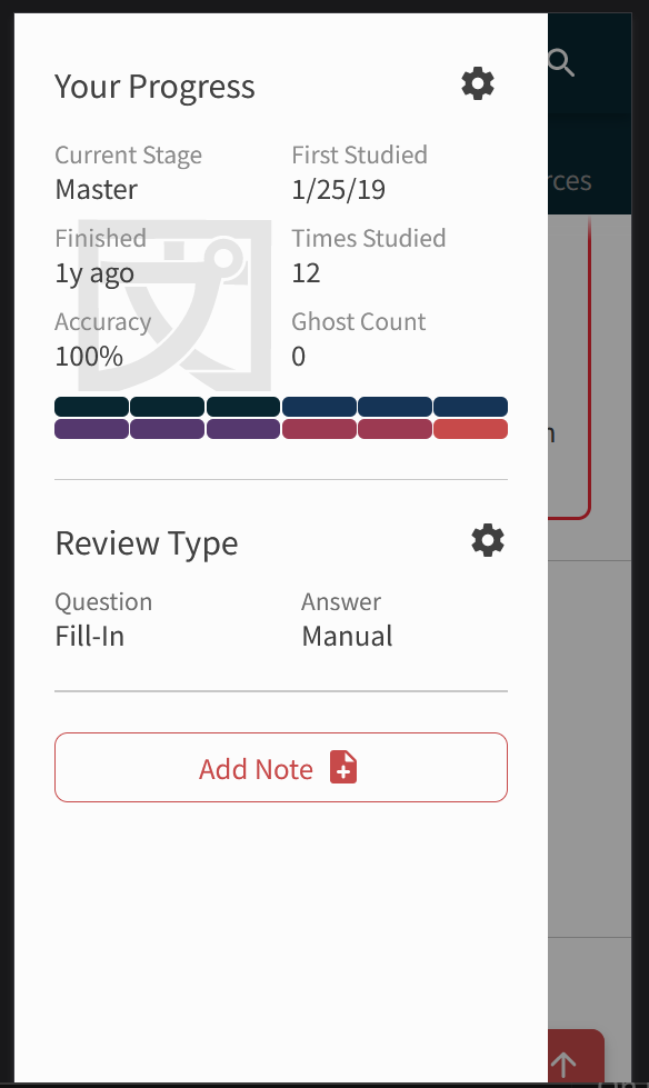
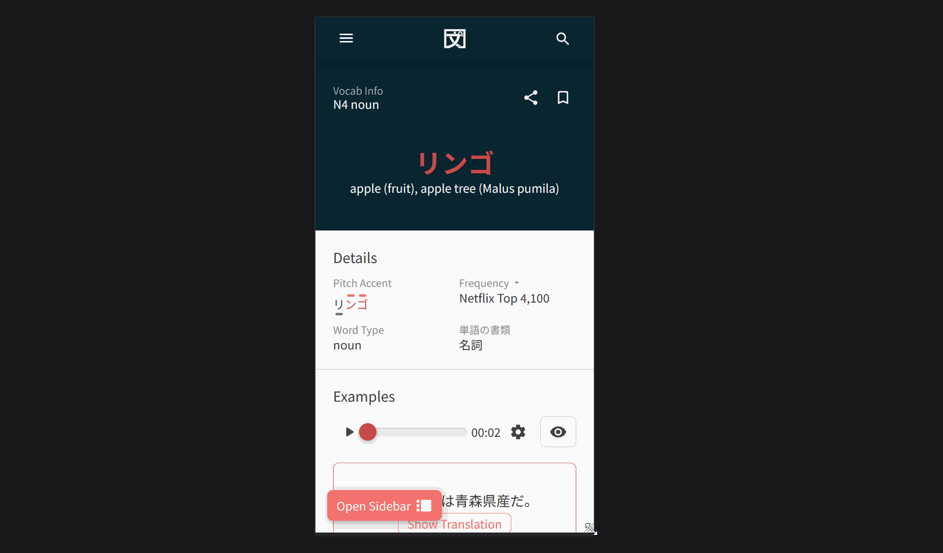
A More Responsive Design

When opened on a mobile device, the Grammar/Vocab Page Layout will now be displayed as a full-width design. This allows us to use the space much more efficiently, compressing items less and making them easier to read. Check it out:

4

Also, if you’re on a small laptop, the Sidebar will also compress itself a little to make sure you can still use it!


And a couple of extras!

You’ll see smaller changes and improvements in this release too. Keep your eyes peeled for them! :eyes: In this post we’ve just highlighted the main updates.


:bowing_man: Thank you everyone!

This update was made possible thanks to our incredible community and team.

Every suggestion, critique, and word of encouragement is carefully read, considered and deeply appreciated. If you have any feedback regarding the changes mentioned in this update, please let us know below!

We truly thank you, and hope this update helps you reach your learning goals! :bowing_man:

Thank you for reading this far, and remember, do your reviews!
Until next time. :sunglasses:

89 Likes

Wow! :star_struck:
I just started a review a minute after this was posted and was positively shook by the new page design!
Really love the notes section dead-space removal and the community preview is a brilliant addition!

Thanks for all the hard work, it’s definitely appreciated.

8 Likes

I think I can get used to it :wink: Thanks!

8 Likes

thanks for all the hardwork you guys put into the updates! i love bunpro!

5 Likes

Wow, this is well thought out. I spent some time farting around with the new layout and I am impressed with the structure and level of importance put into it. Having the side bar be collapsible and turn into a modal for mobile users is a great idea too.

I do have some questions however: In the “Review Type” box, when you click on the gear, it shows types of questions and answers available to select, but, on my computer anyway,I have to scroll down to see the rest of the answers section. Why can’t everything be displayed so there’s the Questions on the left side, Answers on the right side, with the save button on the bottom, or perhaps have it save automatically?

Second question: Is the “Open in a new tab” button a little too big for its importance? Usually I control click by default if I want to view a tab separately. So I am a bit confused by its prominence especially considering its placement being next to notes.

Edit, I noticed when you have the smallest version of the site, the “audio player” bar is still visible. Wouldn’t just having the play button be sufficient enough? I can’t imagine anyone using the bar on a device small enough, as it would be a pain in the butt to place it where you want.

3 Likes

Ghost-kun is cute!


Btw, when I scroll down to the Details/Examples/Resources, go to another tab or window and then back the tab with the reviews, the page automatically scrolls up to the top. Is that intended behaviour? Can I turn it off?

11 Likes

Yeah, I noticed that too, maybe mark the sections off with a fragment identifier in the URL so that when you move in a webpage and refresh, it moves you to that location. Seems like a simple fix.

3 Likes

Hi, are we able to collapse the side bar?

It now seems to be the focus of the page, I appreciate the buttons but its distracting when trying to learn new grammar points, especially as two of the buttons are actually very bright. At first I thought the page was bugged, and quickly checked here and saw it was intentional. The side bar now takes up 1/3 of the page with blank space

16 Likes

Great update! Thank you for all your hard work. :clap: 
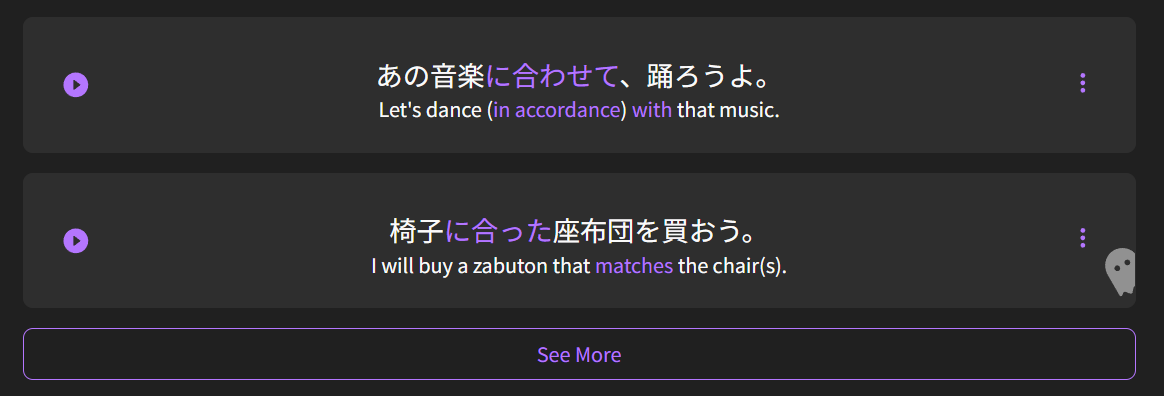
The revised layout functions a lot more smoothly. :100: I especially like being able to “add to review” without scrolling all the way down the page.

4 Likes

I agree. The sidebar is a bit distracting. It’d be great if we could collapse it - or even nicer to also have the option to move it to the right edge of the screen. I generally prefer the left edge of my screen for reading so it’s a bummer to have that whole left edge occupied and have the content I’m reading pushed to the right.

I appreciate the updates though! Keep it up.

13 Likes

Fantastic update!

2 Likes

Personally I am okay with it, and I think having a little toggle would be ideal, as simply making the browser smaller would give you that behavior.

But it would be cool if we used the blank space to see the notes you put in, and if you collapse the side bar, the notes would still be visible and moved to the main screen.

2 Likes

How do I get rid of this terrible white tinting effect at the bottom of the this? I just want the background one color, does anyone know?

4 Likes

とても素敵です! 特に、これ! お疲れ様でした。

3 Likes

It looks very good, but definetely should be on the right side of the page. When learning, the focus should be on learning, and most of the people read from left to right, so it’s a bit distracting.

8 Likes

Hi there! Thanks for the feedback~

This has been fixed, and is now a much lighter gradient in Dark mode.

4 Likes

Woops… when I click on any grammer point I now get this:

3 Likes

One of our service providers had an outage.
Should be fixed now! Thanks for the report :bowing_man:

4 Likes

Yes, works again :slight_smile:

4 Likes

Using my first post on this.
I want to start with a positive because this’ll all sound pretty negative (and I genuinely do like Bunpro and appreciate what you’re doing), so:
I really like having everything on one page with quick links to scroll down. Makes it easy to jump around the page and makes the flow of learning grammar more naturally involve the listening exercises. Plus, a quick look at common questions and clarifications is more than welcome. I am also happy about the ease with which we can change SRS level. That’s a welcome feature, although one I doubt I’ll be using it very often.

However, I’m less happy about the following:

  • The sidebar should be collapsible. If I’m on a grammar page, I’m there to study the grammar first and foremost. The sidebar takes up 33% of the page space, but is not 33% of my interest.
  • The information held within the sidebar is interesting, but not often useful. I think it’d be better if Notes were housed in the Sidebar (I’d say instead of the current information, but perhaps there could be a tab to switch). This way we can refer to our Notes when reading details further down on the page, doing listening practice or reading other user’s comments without having to click the “To Notes” button and scrolling back down afterwards. Along with this, writing a note shouldn’t pull you to the top of the page to write it. I want to see the thing that I’m writing my Note about.
  • Additionally, I think Structure and Details should be together and towards the top of the page (or in a Sidebar tab). These have always been a good way to summarise a grammar point that you’re mostly familiar with and I believe they both used to be towards the top of the page for easy reference.

Always happy to see Bunpro getting updates, but for me this update has felt more like a step to the side than a step forward.

7 Likes