
That’s true … maybe some people Wanit; Kanit still be considered as a possibility? 
2 Likes
Are there plans on opening the theme engine for custom themes? I’d make myself a Nord option
2 Likes
Hi there, the colors are nice and I like the separators on the Progression Bar but their placement confuses me.
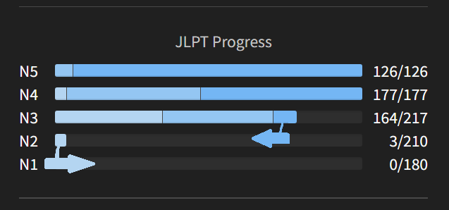
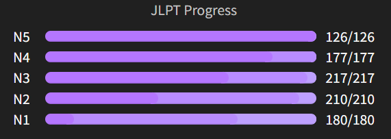
The light bar will grow (to a maximum of 210 for N2 or 217 for N3) from left to right. Which makes sense. But then within a bar (164 for N3 atm for me for example), the higher level are on the right and will then grow from the maximum to the minimum? Which means from right to the left?
I feel there’s like two arrow pushing in contradictary trajectories. Because ultimately it means you progress first from left to right until its maximum then you try to progress from right to left because you want to make it ‘higher rank’. However since I don’t have everything maxed out, it makes a little bit of zig-zag in terms of reading between Nx.
Obviously not a big issue since the point is more doing my grammar correctly than caring in itself about those littles bars but the reading is confusing. Making it all going from left to right (as it was before the update) makes the reading more even.
That’s my tidbit, if there’s a more logical reason of doing it that way or if I just misunderstood it, I’ll happily follow it.
Cheers.
4 Likes
I like the bar separators 
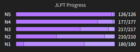
I was going to comment on this too. I agree that the colors should “progress” towards the right side, not to the left.
4 Likes
Both of you are absolutely right, this was an oversight on my part! I’ll see that it is fixed, thank you for your feedback! 
4 Likes
The bar separators are far less aesthetically pleasing and don’t look anywhere near as pro as the the previous soft rounded look imho. Are they necessary given you can hover over to pull up the exact numbers?
More of a compliment to how smooth they looked before than a criticism!
4 Likes
Just regarding this, I noticed you can find a graph which suits on the “Profile” page:
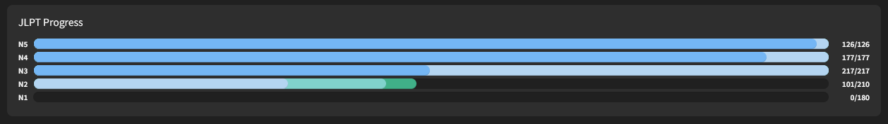
For comparison with the graph on the dashboard:
3 Likes
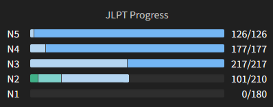
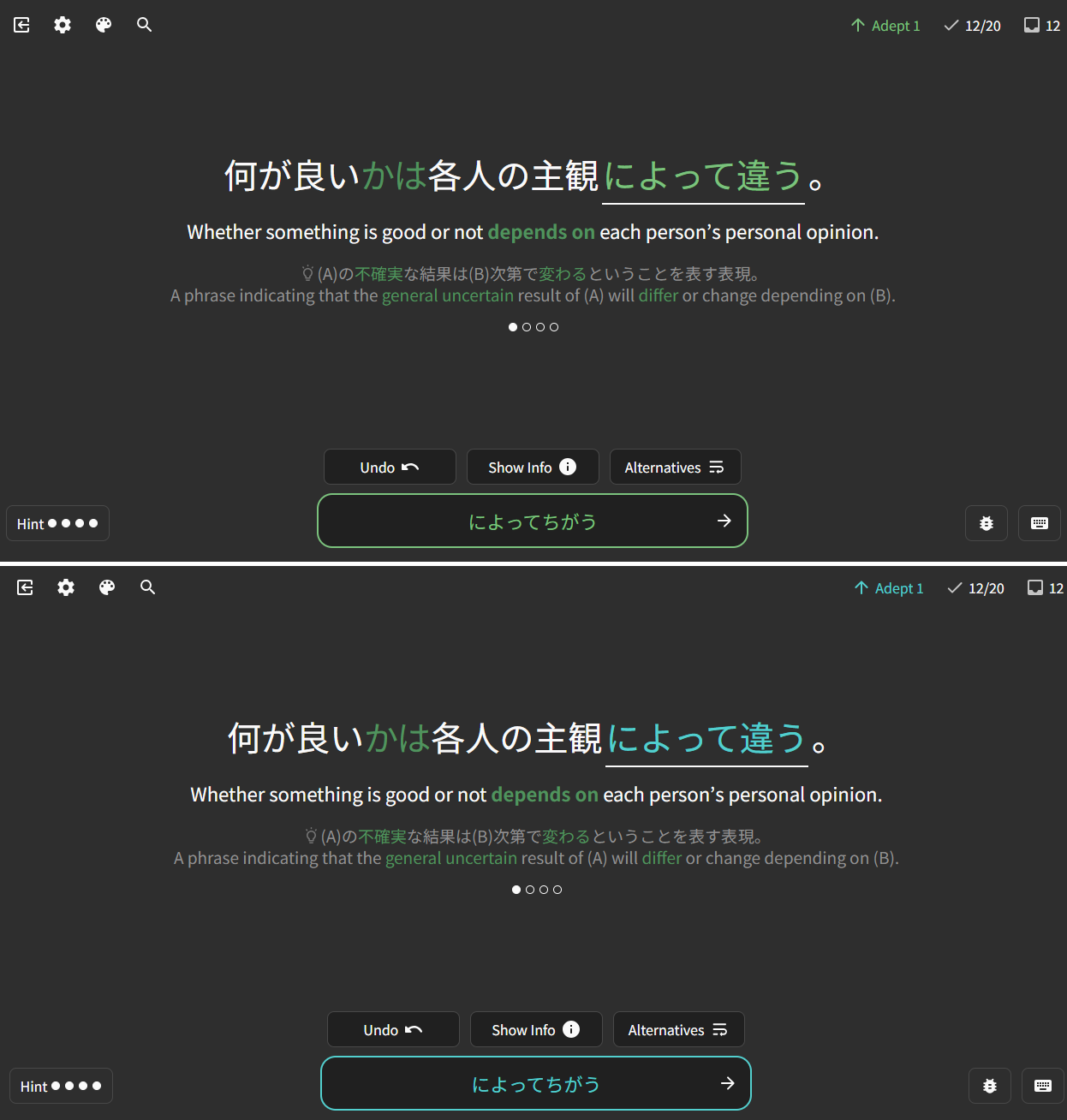
I think the readability is much better now with the bar separators. Previously, it wasn’t easy to see what area I could hover over, especially for my N5 and N4 as shown below.
Before:
After:
6 Likes
The separators look great! I’ve been using the “Green” style now. Bunpro continues to kick ass 
5 Likes
I have some feedback, but first let me dish out some praise 
I opened my dashboard this morning and it just hit me again at how cool the dashboard looks. It feels like I’m opening command central to practice some Japanese and it’s awesome!
Also, I really like the new color selector, way cool!
I also want to voice a hope I have for the color options.
I like how when you get an answer right in Bunpro, there’s a happy green glow. And when you get an answer wrong, it is made clear through the red glow.
I like dark mode because it’s easy on the eyes. Warm colors are also easier on the eyes (lower wavelength), so I was excited at the last color update.
However, when I tried the new themes, I realized that using the red and green modes made it so that when I got an answer right or wrong, it didn’t stand out very well, making the feedback to my answer a bit less immediately clear.
That left me with two options that would work for me, blue and purple. I ended up just sticking with blue because the purple was just a bit more intense on the eyes (higher wavelength).
I saw several requests for a yellow / orange theme, and I was pumped to see that it may actually come to pass!
But the warm theme that ended up coming out was yellow / red, which means that when I get an answer wrong it doesn’t really stand out against the theme, but instead blends into the theme.
I did pick something that works for me for now. I chose the green / yellow theme, but with the colorblind option turned on so that correct answers would stand out better from the green of the theme.
Pic below to see the difference:
TL;DR: I still hope to see a yellow / orange theme so that there can be a warm, dark theme where the greens and reds of the correct and incorrect answers still stand out 
Thank you Bunpro team for all the amazing things you are doing!!
8 Likes
All the new themes look great !!!
…
And broke the iOS app ! 
(All get is a blank screen, no matter which theme I try, with the newest Test Flight app…)
4 Likes

Worked a charm ! Thank you !
5 Likes
Thank you for the kind words and thorough feedback!
There’s actually been some talks internally about removing accent colors from the reviews experience. This would solve the accent red being confused with a wrong answer, accent green being confused with a right answer issue. Still just talked about rather than worked on.
What are your thoughts on this approach?
3 Likes
To misquote Boromir: one does not simply remove accent colors 
Haha
I guess my question is what would you mean by this? Changing them all back to default blue?
I think you would lose the unity of the theme in doing so.
Here’s a possible approach:
Instead, what if you just changed the colors for right and wrong within each theme?
For instance, both green and blue are typically interpreted as positive colors. Maybe in the green theme, blue is used to show that an answer is correct.
Also, yellow, orange, and red are typically interpreted as warning colors. Maybe in the red theme play with using orange to mark answers as incorrect.
(still crossing my fingers for a yellow / orange theme  )
)
3 Likes
Might it be possible to have the bar separators as a togglable option? I was just a real big fan of how they looked before! 
I literally used to enjoy just looking at the dashboard cos of how smooth everything was
4 Likes
Okay so with all these new themes and color updates, I now have a huge problem…I cant decide which theme to use  I’ve switched it up a billion times already
So I was thinking, what if your theme changed randomly or in sequence each time you visted the main page or refreshed? Seperatly for dark/light of course. Would that be doable and not super work intensive, to have a “random/rotating theme” ?
Just an idea  I have no idea how much work that would take, or if it can be done so I’ll understand if you decide against it. Just thought I’d share my late night thoughts
4 Likes
Mulberry theme is such a vibe
I really love the hue shift and the new separators are this tiny touch that adds a lot to legibility. Props!
3 Likes
LOVE this idea! And it could even be expanded!
An assigned color for each day of the week!
or
New color for each month!
or, even better,
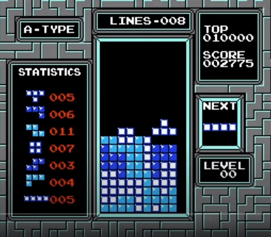
New color each time you reach a new level! It would be like NES Tetris and it would be so rewarding 
3 Likes