Dashboard 2.0 Beta

Hover is better. But I like to split reviews. So, for me, the edge case is “do it all”. And I loved my two button :grinning: A solution would be a setting to choose the default for the new button: Grammar, vocab or all. If I just press it, it would go to the one in the setting but still showing all options on hover.

Thank you for all your effort.

1 Like

Dm’ed!

@veritas_nz any idea of why my dashboard is displaying weird?

Might be something funny of my account settings since other users reported being displayed fine with Firefox

I’m having the same issue :confused: Firefox 116.0

1 Like

Yes, I just found out it’s something that just started happening on 116.0.

I picked up a device I use mainly for reading with ttsu.app , and had an older version of Firefox, it was fine before updating on 115.2 and 115.3, but I started getting the weird duck graphs after 116.0

Having the old review button back with split reviews off fixes the dropdown issue for me (I still wish we had a 24 hour forecast option!). I see that you’d like to get rid of that long term though. For the new button, I think it’s kind of weird that the text goes one place but the text’s padding goes somewhere else.

I think the text area (including to the left, top, and bottom edge of the button) should go to your “default” reviews, while only the right most section where the dropdown arrow (including to the top, bottom, and right edges) goes to the dropdown. I don’t use the vocab feature, so I’m fine with that default being “all reviews” for me, but maybe people would like it to remember what review type they opened last if they use multiple types.

1 Like

Also happening since the 116 upgrade. I checked the release notes and only thing that sticks out is the support for the “q” unit on SVGs (and presumably Path2D, which uses the same definition), but I don’t know if BunPro uses either of those for rendering onto the canvas for charts.

Also happening on dashboard 1.0, for what it’s worth

2 Likes

@Megumin @araigoshi @andersmkruke
Thanks for finding the cause of this bug. That saves me a looooot of time!
The graph library we use is a third-party one so we have no control over the implementation of the visuals. I can’t think of a way we’re gonna be able to fix this internally without switching to a different graph library :thinking:

So unfortunately for this one we’re gonna have to just ask you to revert your Firefox version until they implement a fix on their end.

@araigoshi

I think the text area (including to the left, top, and bottom edge of the button) should go to your “default” reviews, while only the right most section where the dropdown arrow (including to the top, bottom, and right edges) goes to the dropdown.

We actually had it like this for a while, but it was really easy to mis-click the arrow when you’re trying to open the drop-down. We thought it would be a lot safer to make the reviews button that takes you to a different page smaller, and make the much safer drop-down open action (which is safer) cover a larger surface area (hope that makes sense).

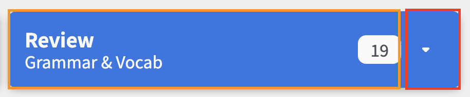
I’m not quite following how it would be hard to click in that previous iteration, unless literally just the arrow was the clickable area, like so:

image

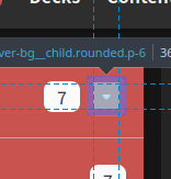
Whereas I’m suggesting a clickable area more like this for the dropdown (the purple area is also clickable, that’s just firefox highlighting padding vs content boxes):

image

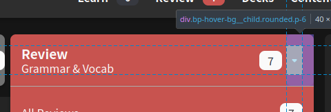
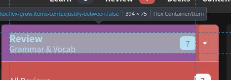
In this example I made a couple of changes to accomplish that in the browser dev tools. I removed the padding on the button, put the top, left, bottom on the left div inside the button instead, and used flex box to center the actual arrow icon within its container (while giving that container the right padding). This also leaves the active area for the rest of the button as:

image

3 Likes

Sadly this is not an option I’m really happy with as this has potential security reasons.
Haven’t checked the full changelog, but I can’t really imagine a scenario where this is a good idea nowadays.

Fortunately is not a breaking functionality problem, otherwise I’d either try another browser until it’s fixed or most likely put the thing on vacation mode and call it a day until it was sorted.

I’ll keep living with the weird bird shaped graphs for a while.

2 Likes

One more time! Another attempt at nailing the UX (Part 2 – Electric Boogaloo)

The changes:

  1. Dropdown now opens on click again
  2. Updated the click-able area to be the following area:
    • Red for dropdown, Orange for All Reviews
    • @araigoshi Thought we had already tried this, but turns out it was only ever the arrow itself that was clickable! Good suggestion


Gonna tag all the users who previously gave feedback on the new dropdown, please let me know what you think with this new update! :bowing_man:

3 Likes

The graphs now show fine on Firefox 116 (at least for me)

2 Likes

What does hover mean for people using an iPad?

2 Likes

Yeah, the latest iteration works for me, thanks!

2 Likes

I’ll check out the changes - been on holiday for the past week, sounds like you’ve made some good progress.

1 Like

Hover means click on mobile devices!
It also counts as a click too… kind of both at the same time.

Makes for an interesting challenge UX challenge usually :thinking:

Can we please get an option to make hourly forecasts the default? Or does that already exist and I’m just blind?
The first thing I do every morning after opening Bunpro is switching to hourly, because knowing when the next review will be is a lot more useful than knowing how many reviews I’ll have in 6 days.
(Obviously not a HUGE deal, just a minor annoyance)

1 Like

Yup! There is a setting for that – can be found here

Locking this thread.

Please send all feedback to the new, post-release thread!

よろしくお願いします :bowing_man:

2 Likes