Dashboard 2.0 is now in Beta!
The next piece of the puzzle as we move towards the new system – the Dashboard!
 How to Enable
-
If you haven’t already, Opt In under “Bunpro Beta” settings.
-
Enable “Dashboard 2.0” Beta.
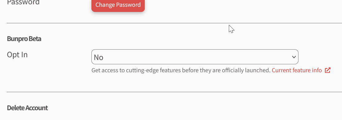
NOTE: If you do not want to use the Beta Dashboard permanently, but still want to check it out, you can access it directly here
 Purpose
We’re transitioning the Dashboard to a new system, similar to the Reviews 2.0 update.
This new system is designed and coded from scratch and is significantly faster.
The page load speed and page transition time from other pages onto new Dashboard is now instant and should hopefully make the the Bunpro Loop™ of going between the Dashboard/Review/Summary pages feel a lot smoother.
As with Reviews 2.0 Beta, we’ll release this feature for user feedback before the official launch. The testing period will be shorter than Review 2.0’s Beta since there aren’t many changes from Dashboard 1.0.
 What’s changed
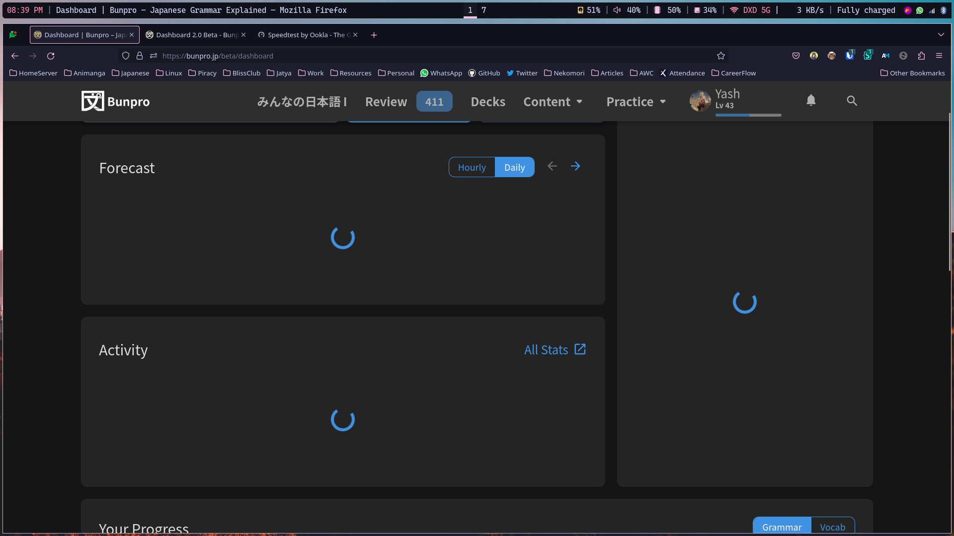
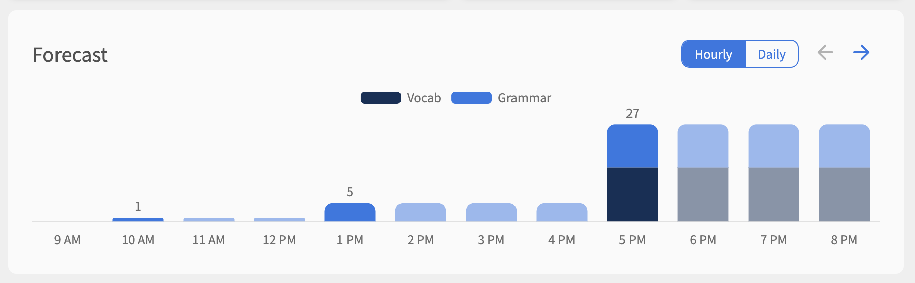
Forecast Graph
Probably the biggest change to the current forecast graph, we have decided to make the graph always cumulative.
-
It will now show each bar (representing an hour/day) as the cumulative total of those that came before it – any that are unchanged versus the previous hour/day will be faded out.
-
This will allow you to see exactly how many reviews there will be at a specific time.
-
You can also use the arrow buttons to switch between the first and second 12-hours or week.
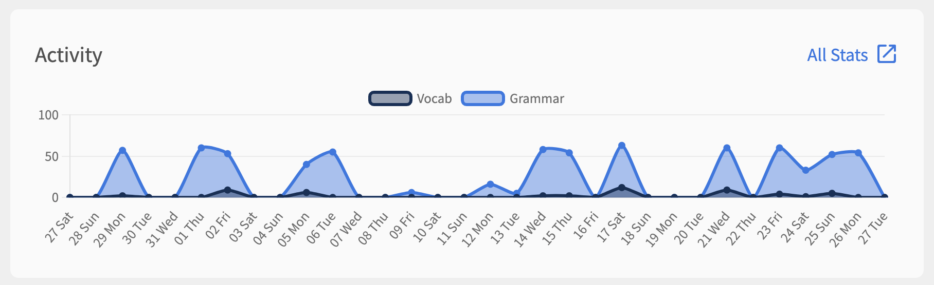
Activity Graph
-
Grammar and Vocab data is now stacked on top of each other
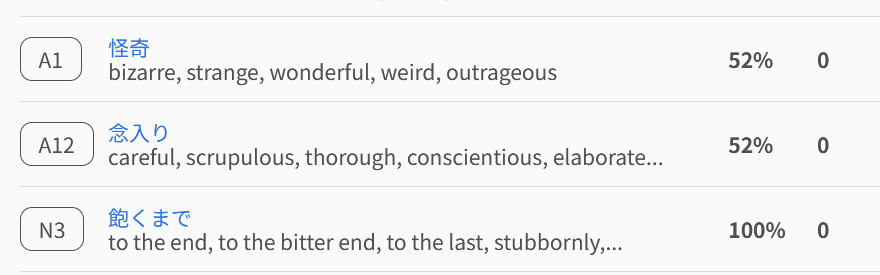
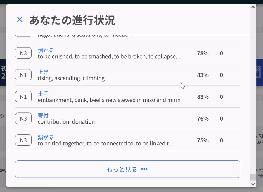
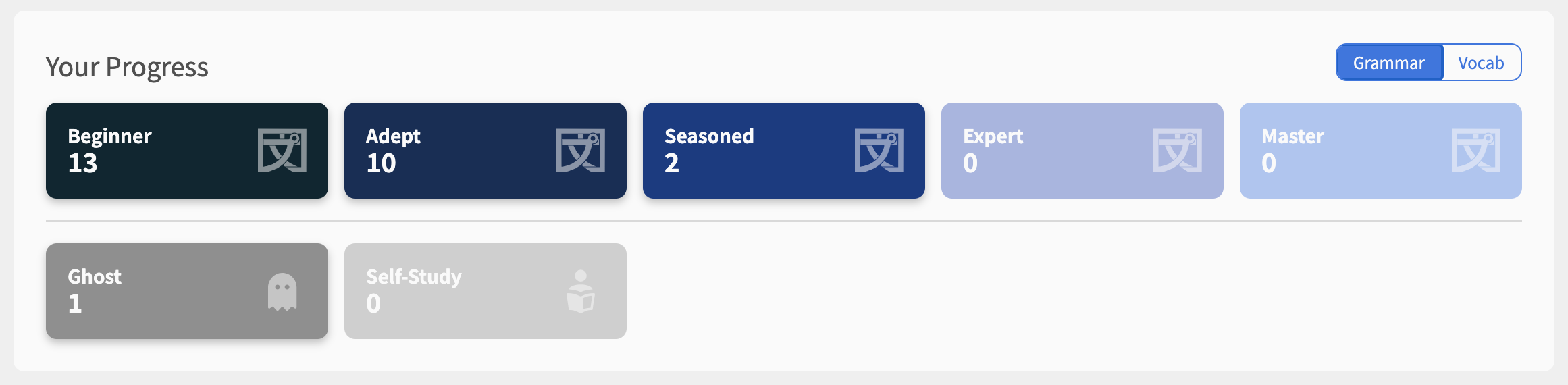
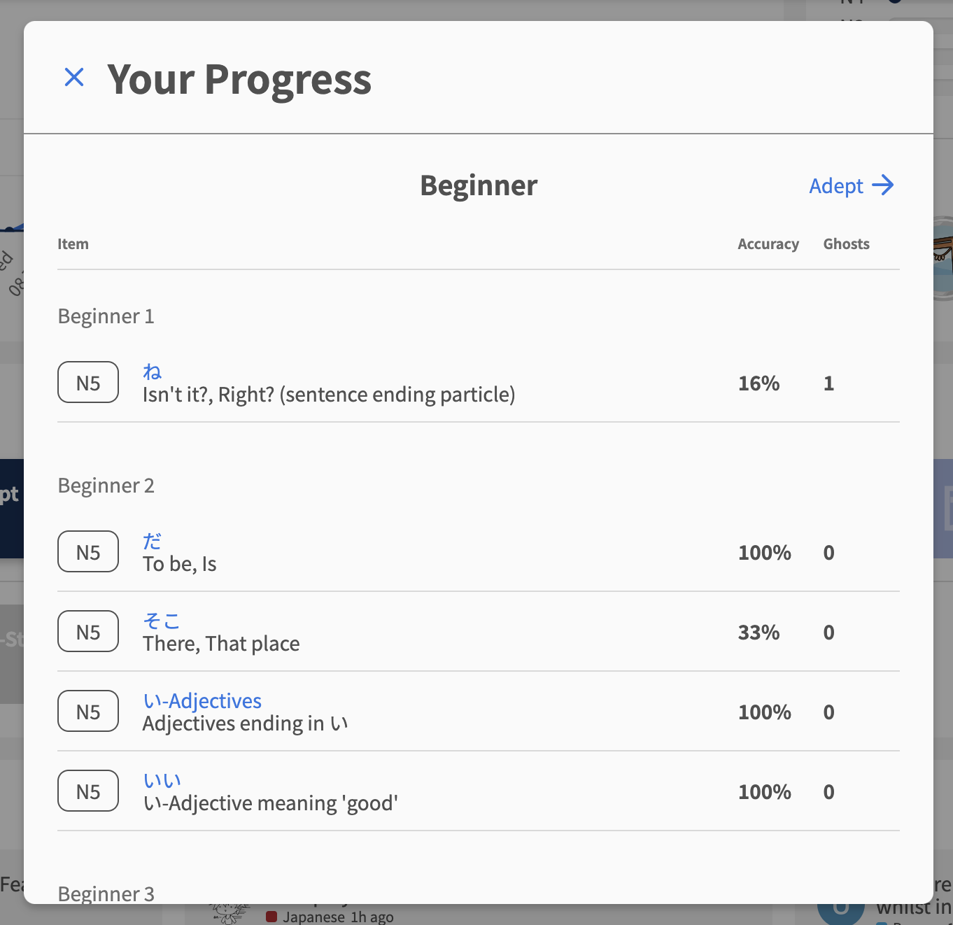
SRS Progress Section
-
New and improved SRS Progress tiles and popout!
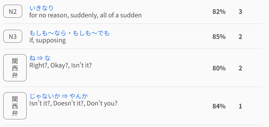
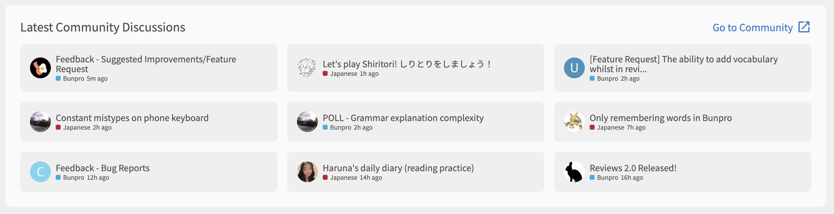
Latest Community Discussions
A slightly more colorful and informative Community section
-
It now shows the post category and the profile picture of the last user to post on that topic
 Feedback
We have been working hard at this new version of the Dashboard, but like anything, things can always be improved.
As you use these new Dashboard, we would love to hear anything and everything about your experience. We intend to keep building and releasing updates to keep things moving in the right direction based on feedback, so as always, any thoughts/comments would be much appreciated! 
Feel free to DM me (veritas_nz) directly with any feedback, or reply directly in this thread.
Anyway… that’s basically it! I said not much has changed… 
Thanks as always for your support, and happy studying!