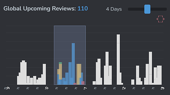
Dashboard 2.0 Beta

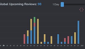
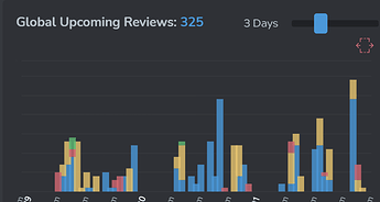
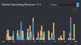
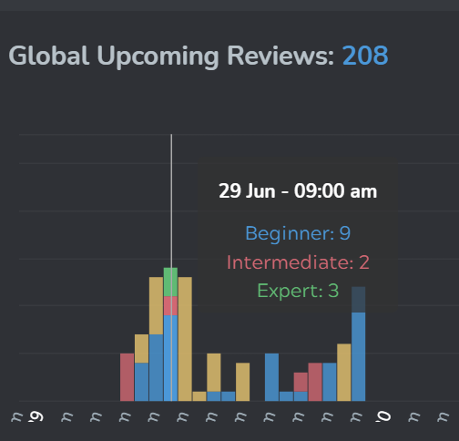
don’t really understand the cumulative reviews… so if we do nothing we have more and more reviews…well duh of course…but what if we do our reviews and want to see the next day and next day…

maybe I’m missing something but it’s just confusing taking away the individual daily reviews (keeping cumulative is fine - but w/o the individual days…not sure I understand)

not sure what it needs but it needs some tweaking somehow (I do like the totals at the top - helpful)…but I know I don’t have 60+ reviews coming up…

5 Likes

I really like the new dashboard, especially the community discussion “graph”.

However I also experience issues with the activity graph (loading endlessly).
I get the following errors in the console:

image

The failed POST could actually be resolved by turning off my ad blocker (uBlock Origin).
This also solved another error message I discovered going to the settings page

image

Thank you very much for the update, keep up the great work!

2 Likes

Hey look! I’m in a screen shot! I must be famous now!!

But seriously, I’m liking the direction of this.
One thing I would like is to have bookmarked decks on the main dashboard too.
That way, you don’t have to go into a separate page if you want to learn whatever it is you have bookmarked.

Also, I think someone else may have mentioned it, but when first opening up BP on my browser, it shows the original dashboard. I have to refresh for the beta dashboard to be active.

3 Likes

From the cumulative review, it’s “easy” to know how many review you will have that specific day :wink: You just need to subtract the amount of review of the previous day

Today you have = 9 reviews
Tomorrow you have : 22-9 = 13 reviews
The 28th you have : 45-22 = 23 reviews
The 29th you have : 57-45 = 12 reviews
The 30th you have : 59-57 = 2 reviews
The 1st you have : 62-59 = 3 reviews
The 2nd you have : 65-62 = 3 reviews

1 Like

Sorry for the double post …

I love the new dashboard, it looks great :wink: But I kinda agree, the cumulative review don’t really make much sense. The daily reviews are useful if we do our review everyday, but the cumulative review are only useful if we do our reviews once every few days.

The majority of us probably do our review everyday, and I feel like showing the cumulative reviews is more oriented to non-regular users.
I feel like instead of saying “You will have 5 reviews Saturday” the graph shows like “If you don’t do your review, you will be punished with 60 reviews Saturday”. Positive reinforcement is always better :smiley:

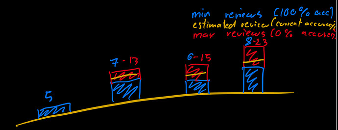
Small suggestion (because I’m crazy about statistics ?), a min-max number of reviews could be amazing :smiley: I would love a graph showing the minimum number of reviews we can have (if we do them all correctly) and the max number of reviews we can have (if we fail them all)

4 Likes

New dashboard looks cool!

I’m wondering why the color order was flipped though?
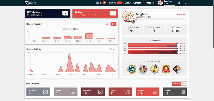
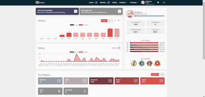
Old:
image

New:
image

3 Likes

Another thing I’d like to comment on, because there’s one thing I liked better with the old dashboard. On the old one, I’m having bunpro set to 80% zoom in order to get this nice overall view with the stats at the bottom of the page:

I do this because I like comparing the stats before and after having done reviews. Fits well when the text size is 16x. With the new dashboard I can’t balance the zoom and text size to get the view I had before. If I zoom out to 67% I can see it all, but the text becomes too small for me and there’s a lot of empty space on the sides:

Is it possible to adjust the layout to make it similar to how it was before?

4 Likes

Sorry ya’ll for the late replies! Been a busy few days :sweat_smile:


@nellyneko There is going to be a color/contrast update coming pretty soon that should hopefully fix these issues with the faded graph and Dark mode.


@nellyneko @I-k-d
For the difference of Reviews between two times (the ‘(3 new)’ logic you mentioned), I’ll see what I can. Kind of limited on space here, especially on mobile


@S_S At this time, on/for mobile graphs, I think I’ll increase the heights of the graphs to make things a little easier to tap. Also mentioned you in a comment further below too ↓


@Pablunpro @HotAirGun @Atheon
The Activity graph bug should now be fixed!


@Herendil Are you referring to us un-stacking the bar-graph?
As in, putting Grammar and Vocab next to eachother?


@HotAirGun Good finds as always! Will work on all the things you mentioned.

The “Dashboard 2.0” setting replaces the link under the Bunpro logo for the beta/non-beta dashboard link regardless of Start Page setting

This has been fixed! Good catch


@Yash Items taking a long time to load is likely a server balancing issue.
We need to eventually take some time out to work on performance/load-balancing stuff.
Let us know if it ever becomes a frequent problem.


@indutny Thanks for the positive feedback!
Are you able to elaborate on the Ghost thing? Are you referring to the bar graph at the bottom?


@Kioshen Thanks for the feedback.
Will reduce the number of items on the X-axis. The Y-axis count is chosen dynamically so there are always only 2 labels on it.
I might split the Activity graph into first 2 weeks and last 2 weeks – much like how the arrow-buttons work with the Forecast graph. Might help balance it a bit. This will also help out on mobile @S_S


@araigoshi

  1. The themeing issue in Dark mode should be improved with an upcoming contrast update
  2. We’re working on performance improvements for this! Will let you know when they’re out

@BaconAndEggies
For Bookmarked Decks on the Dashboard – we’re currently working on something similar to this.
But a bigger revamp for Decks is on our roadmap.

Are you potentially clicking on a browser bookmark that is set to bunpro.jp/dashboard and not bunpro.jp/beta/dashboard? If so, setting it to just bunpro.jp/ should automatically redirect you to the right one


@Schuylerca @JCalandr
As for the dramatic switch to Cumulative-only – we weren’t sure how this would be received.
An option to switch between Individual/Cumulative graphs might be in order (this is how we had it initially)
Your prototype/drawing @JCalandr is also something we toyed around with, but found it to be much too complicated for bar graphs that have hundreds of items.


@Redglare I’m also wondering why the color order was flipped! :man_facepalming:
Will fix that now!
Comparing stats before and after Reviews (I’m assuming you keep the page open in separate tabs?) will no longer work as now the Dashboard automatically updates!

11 Likes

I prefer the old one too

2 Likes

Are you able to elaborate on the Ghost thing? Are you referring to the bar graph at the bottom?

Yeah, I used to be able to click “Ghosts” and see a breakdown of my ghosts by SRS level. If I had a bunch on the last level - then it’d be easier to take on new grammar because this ghosts are probably going to disappear soon.

3 Likes

My “Recent Badges” don’t seem to be in the correct order of recentness.

Edit: tagging @veritas_nz as this issue still persists. Thanks!

4 Likes

Not against cumulative (or any stats for that matter)…but I just didn’t see (maybe I didn’t understand) how it would be useful…
unless statistics are useful they are only lies anyway :wink:

Can’t really criticize it too much because I don’t have any suggestions (other than putting it back the old way) to make it better at the moment…but I have faith that the dev team will come up with something overall workable and better.

I find it very useful, especially overnight.

Like, when I wake up, I’ll have 68 reviews to do, for example.

Rather than, at 1am, I’ll get 4 reviews to do, then at 2am, I’ll get a further 7 reviews to do, then at 4am, I’ll then get another 14 reviews to do, then at 5am, I’ll get … you get the picture.

However, ideally, I would like to be able to see both cumulative and the previous version too … maybe asking too much :sweat_smile:

1 Like

no offense but it’s confusing… KISS is my preference…

one thing that could be done (probably not with the plot axis/orientations as they are)
but list out the reviews by hour and a cumulative total next to it… then you get the best of both worlds…but I’ll just leave the new dashboard off for now…

actually really happy the dashboard was separated out of the beta since I tend to leave all the beta features on … overall the devs do listen and actively care about us… it’s refreshing!

@veritas_nz not to steal but maybe give some ideas…my favorite was an old wk userscript that’s long gone for me…but kitsun does it this way (still not ideal) but it’s more manageable maybe it will give you some ideas to play with… (apologies this computer cuts off the dates/hours at the bottom but you’ll get the idea)…

you can drill down just by holding over a bar

image

and if you want totals/cumulative
click the bracket and drag

realize that bp is a bit different in that bp has vocab and grammar (I don’t use the vocab)…but lots of different ways to show stats…maybe this will help generate some new useful ideas… it’s in no way perfect…im stuck with only 7 days often wish I could go 2 weeks sometimes 3… but anyway…

looking forward to seeing what bp finally ends up with

Thank you very much. I’m afraid it keeps on turning, though.

Is there anything I should do, maybe clearing the caché?

1 Like

None taken.
Equally, no offence, but I find the graphs you’ve posted way more confusing than what I consider to be the simpler graphs on Dashboard 2.0, so each to their own :slight_smile:

2 Likes

Sweet! :grin:

Yes, I always do this when I’ve finished doing reviews (on Wanikani and jpdb too).

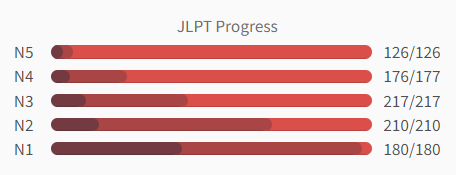
:worried: Oh man, I mean, that’s cool as a feature, don’t get me wrong, but personally I like refreshing the page manually. I like checking how the jlpt progress bars are moving before and after a session, as well as the number of grammar point in each SRS level category. Like, “did I master any grammar points this time? How many? Did the other numbers change in any way?” and that’s easy to spot by switching between the tabs.

Do you think it would be possible to show a before/after of the SRS progress and jlpt bars in the summary instead? :thinking: Maybe as a separate tab so not to clutter the main summary page.

1 Like

No, it isn’t :man_shrugging:

1 Like

@HotAirGun
Thanks for your replies. Investigating the bug now! Thought it was fixed but it’s not.

@Atheon
I’m guessing this applies to you too!

Sit tight we’re on it :fire_engine:

3 Likes

Oh, there’s a longstanding bug that this thing ignores Start Page settings too. If Start Page is set to Profile, it’d be nice to redirect to the Profile page.