Dashboard 2.0 Beta

I haven’t been following this thread much but is there a reason why there aren’t just two review buttons (one for vocab, one for grammar) which just becomes one button if you have the setting on to do reviews together? Equally, why not multiple buttons for studying from different decks?

Speaking of which, I would like to suggest to be able to have a custom deck/queue/turn bookmarked grammar into a deck you can study from. Maybe you can already do this and I missed it.

2 Likes

@veritas_nz

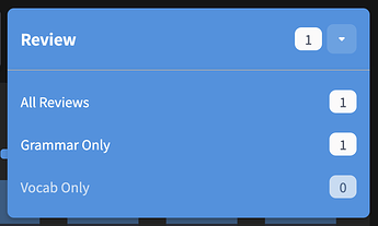
Similar to what @bunnypro said - I definitely prefered it when the vocab and grammar were separate buttons as I usually only reviewed either vocab or grammar at a time, the dropdown is currently an additional click as well as hiding the number of current reviews for each.

Having said that I like the redesign so far, this is probably the only change where I prefered it as it was.

3 Likes

Agreed - everything else looks great and definitely much improving over time! :+1:

2 Likes

Indeed it does!

2 Likes

If you are actually in London, you are utc+1 right now I think.

1 Like

Yeah, that’s correct - actually I’m in BST (+01:00). I assume Bunpro accounts for this and automatically adds the +01:00 when set to the London UTC zone which is the one I’ve been using:

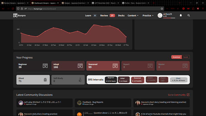
Having some easily accessible chart that shows what SRS intervals take how long would be nice rather than having to check the forum every time. i mocked up (in ms paint lol) something in the blank space after the ghost/self study reviews, but another good place it could go is underneath recent badges (just some places with some empty space to fill). (i dont know how this would work with the website’s size scaling though)

1 Like

I personally think it would look a bit odd, I think I would enjoy getting the info during reviews though (on top of telling me what tier the entry is going to be after I succeed/fail, tell me when I’ll next review the entry).

1 Like

yeah it doesnt have to be there i just would like it to be somewhere easily accessible

1 Like

Dashboard 2.0 Pre-release Update #1

Dashboard 2.0 is getting near ready to be released!


Hotkeys

Added hotkeys to the Learn/Reviews buttons.

  • Press L to go to Learn
    • Opens the Decks dropdown if multiple Decks active – from here, you can press:
      • 1 to go to the Primary Deck
      • 2 to go to the Secondary Deck
  • Press R to open the Review dropdown
    • From here, you can press:
      • 1 to go to All Reviews (if has Reviews)
      • 2 to go to Grammar Reviews (if has Reviews)
      • 3 to go to Vocab Reviews (if has Reviews)

We will eventually add display for hotkeys so you know what they are on each page.
This is currently in discussion


Minor Features


Fixes

  • The issue with the Activity graph showing weird stats when set to Japanese should now be fixed

As mentioned, Dashboard 2.0 is getting really close to release!
Any further feedback still be much appreciated.

Happy studying! :cowboy_hat_face:

8 Likes

The dashboard looks a bit broken on firefox.

Also I’m not a fan of having to do the drop-down to do select all reviews (Specially when I’m not using the Vocab bit at all). Not sure if it’s also a glitch of firefox.

2 Likes

I miss the Split review buttons. Selecting from a dropdown menu introduces a friction that I think my ADHD brain finds too hard. I guess I can create a shortcut for jumping straight to grammar reviews (I don’t like that either, but it’s better for me).

2 Likes

for what its worth im on firefox and not experiencing that so maybe version specific (?)

I’m using the latest version, so maybe is something of my profile triggering it.

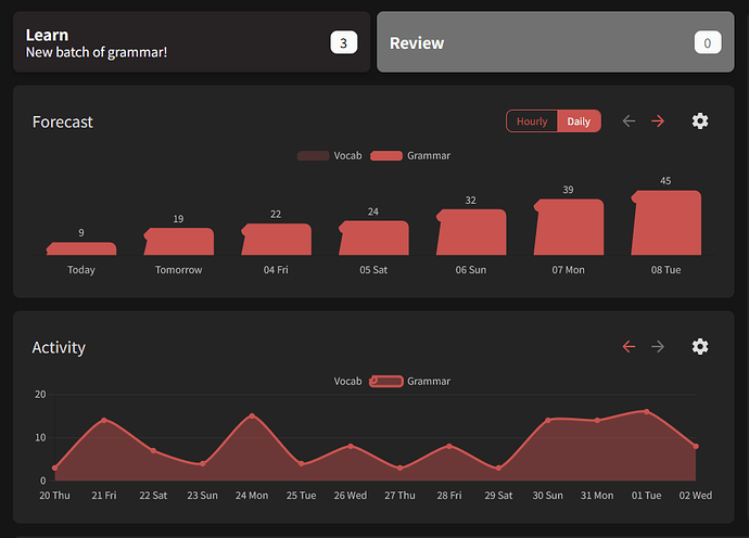
I’ve just opted out of the dashboard beta for now, mainly due to the lack of a 24 hour forecast at the hourly level and the mandatory dropdown for selecting reviews compared to the old dashboard.

Interestingly, this only happened for me today (I see others talking about having a dropdown all week?), I guess because I have no vocab reviews due to the Wanikani import.

1 Like

I can’t say I love having to use a dropdown to select my reviews when I don’t use the vocab feature so I don’t need it to be split. I know I can go straight to reviews by selecting reviews from the top bar (which also has my wondering why the behaviour is different there - shouldn’t it be consistent?). It isn’t the end of the world but I can’t really see a reason why anyone would prefer it over having a single button.

1 Like

maybe if you click on the left 3/4 ish of the button you just go straight to all reviews and if you click on the right end of the button you go to the drop down menu

2 Likes

Please simplify the Reviews button by making it a 1-click action instead of the current 2-click design.

The act of beginning reviews is one of the most common action users perform on your product. The new 2-click design adds unnecessary friction to this essential process. Fortunately, there’s a simple solution:

Change the clickable area to only include the down arrow . This corresponds to the less frequently chosen options and is in line with the button’s Information Architecture (IA). The design already includes adequate padding, ensuring that the clickable area remains appropriately sized.

3 Likes

Huh, I would agree that dropdown thing is weird.

:100:

@veritas_nz Also didn’t you by any chance forget to fix forecast graph’s 14th day stat bug I reported ten days ago?
Looks like it always counts only midnight reviews instead all those guys throughout the day, causing 14th day almost always have 0 reviews.

1 Like

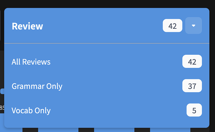
Reviews Dropdown update

We’ve heard ya’ll didn’t like the implementation of the new Review dropdown, so we’re attempting one last attempt at nailing the UX for it.

The changes:

  1. Menu now opens on hover as opposed to opening on click (to reduce total click count)
    • This hover-able is displayed as the red square in the image
  2. You can now jump straight to doing All Reviews by clicking the area displayed in the orange square
  3. Changing the Split Reviews to Off setting now reverts you back to the old Review All button
    • (See the 2nd image)


As mentioned, we’re trying to nail this button as it will allow as to extend it in the future when we implement a Decks overhaul we’re planning.

If people really hate it though, we might just revert it back to how it was.

Gonna tag all the users who previously gave feedback on the new dropdown, please let me know what you think with this new update! :bowing_man:

@bunnypro @CursedKitsune @ThePurpleOrange @Megumin @pjorge @araigoshi @badcity (welcome back) @HotAirGun

5 Likes