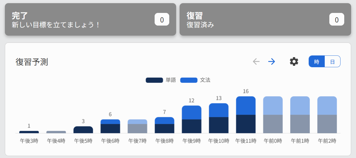
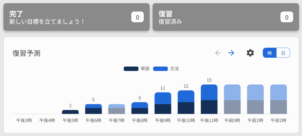
I like the new delimiters on the JLPT progress chart:
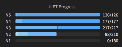
Looks less rounded and smooth, but it’s more useful and easier to understand your progress 
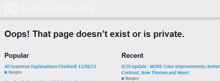
Incidentally, I think I might just have seen a thread about it:

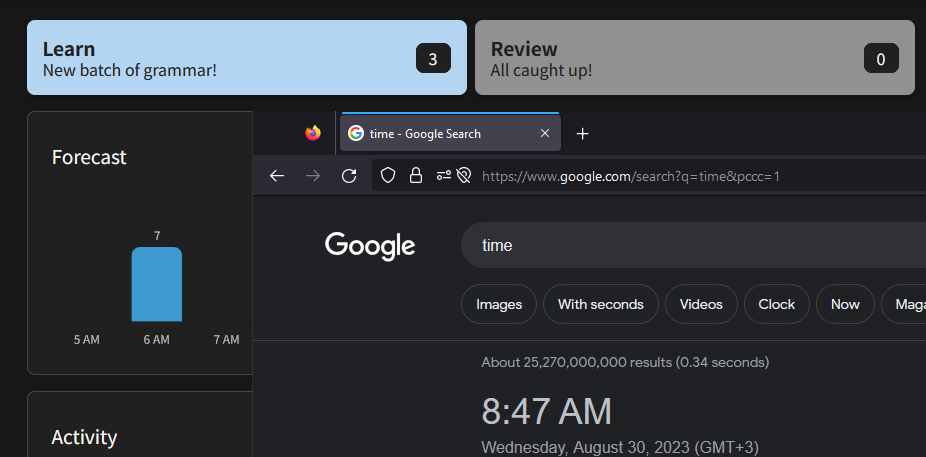
But when I click on that, I get the following, where I also noticed it’s a little hard to read “Bunpro Community” at the top. Possibly something to do with using dark mode?


 Dashboard 2.0 Post Release Updates
  Fixes
Fixes