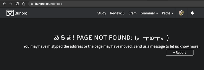
When I click “continue” after studying, it takes me to https://bunpro.jp/undefined instead of the next 3 grammar points. (I reported this with the report button as well, but it doesn’t hurt to post here!)
Does it happen in the app or on the web version of the site?
The web version! I’m using Google Chrome, if it matters.
Sometimes the number of remaining reviews continues to go past zero and becomes negative. I think this happens when more reviews become available during a current review session.
It works now; many thanks!
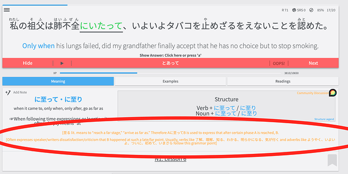
I noticed in the new version the grammar explanation text is in a yellow font. Is it possible
to change it back to the grey color it was before? The yellow is a little bit difficult to read.
@Lyrith @blacktide The error page when continuing should now be fixed with the latest patch. Please let me know if you continue to experience it.
@phronaeus Thank you for the feedback. I will look into this. Was it grey? I feel like it has always been orange but we did adjust the css so it could have been changed.
Thank you for all your hard work!! 
I’m not the person who originally mentioned this, and I don’t know if it was ever gray, but they’re right that it’s a bit harsh on the eyes between the color and the size of the text, so I’d support changing the color even if it isn’t a bug, personally.
Clicking “continue” works as it should now, I just tested it. Thank you for the fix!
I don’t have any old screenshots that show it being grey, but I know it definitely wasn’t the bright orange color that it is currently. The new orange color is difficult to read and at the very least would prefer it to be a darker shade if you guys really want it to stay orange.
I don’t want to sound nitpicky, but it does make study sessions more unpleasant if reading the grammar explanations requires me to strain my eyes.
Could it be that the grammar search is broken? If I search for 向け, I only get 向き as a result.
Just thought I’d mention that this issue still exists.

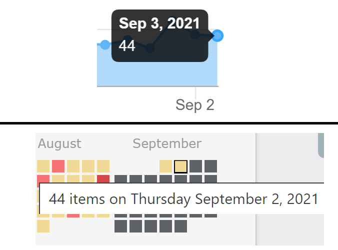
Hey! Unfortunately it is an issue with the heatmap library we use and doesn’t have a good solution. We will need to change what we use sometime in the future to fix it.
@feat.outsider We appreciate the appreciation 

@phronaeus @Lyrith The color has been adjusted to be a more legible color. @Daru and I discussed it and maybe with the change from a darker background on the light theme the new lighter color for tiles, the color no longer had the same contrast. Please let us know your feedback on the new color. It isn’t set in stone and with the new designs @Daru is working on, addressing the color issues is one of our priorities.
@matt_in_mito Sorry for the delay. It has been fixed.
@airblaster I just tried and the search seems to be working fine, I got 向け when searching for it.
Ah I see! I was typing in 向け rather than muke. You are correct though that it doesn’t bring it up when it should. I will look into it!
I checked it, and the new darker shade of orange is much easier to read. I appreciate your team’s responsiveness on this!
I think my reports aren’t going through anymore. I reported a few sentences over the past few days (don’t remember which ones…) and I just checked whether there was any response and don’t see any of them listed in the “Your Feedback” window.


