Feedback - General

Thank you for your reply, that really does clarify things.

Is there any possibility of feature in the future that allows us to add sentences that are not tied to grammar points on BP? Right now I’m just adding all my sentences under「だ」so it’s just easier but I wish I could make grammar points with their own info and everything. Though in my case they’re just temporary since it’s N1 stuff.

4 Likes

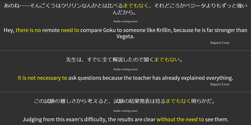
I think the review sentences are too varied. For example:

There is no XX need to
vs
It is not necessary to
vs
Without the need to

Every single one of these sentences are different grammatical meanings for the same single grammar point, which is までもなく “there is no need to”. I know it’s to show that there’s a variety of ways to understand までもなく, and the translators’ attempts to show natural English grammar. But, that variety should not be used in reviews at all.

Reading grammatical variations for one grammar point during reviews as a default muddles the meaning and makes it harder to know if you even understand what it’s supposed to be.

It’s good that the site tells you that you can think of it in different ways. But when teaching is limited to flashcard style learning, the flashcard changing its context grammar when you’re learning only one grammar point means it’s harder to get a base understanding.

If you have 3 different flashcards where one shows a picture of russet potatoes, a picture of sweet potatoes, and a picture of french fries, but the target word is just “potato,” then it can be frustrating to a student who is just trying to learn the word “potato.” It’s a big variation and expects too much too soon.

2 Likes

Hey and welcome on community forums :smiley:

The translation has been changed and is more consistent now :+1:

Thank you for the feedback!

1 Like

I am confused. I thought that more variations is a good thing. I would hate for all review sentences to be similar.

7 Likes

I agree with this, because languages (especially ones as different as English/Japanese) hardly ever map to each other with a 1:1 match. Associating a grammar point with a single, rigid English translation just sets us up for confusion when we encounter the Japanese grammar being used more loosely than the lone English translation allows for.

The only times I’d advocate for less variety is A) needlessly (overly) wordy English, or B) on grammar points with similar (overlapping) translations; in these cases, I think it’s ideal to try to retain even the littlest distinctions between them as best we can, rather than simply thinking, “oh yeah, grammar points A, B, C and D all say the same thing.” (This type of vague understanding leads to us choosing between them almost at complete random when we attempt to speak/type/write Japanese ourselves.)

 
The example brought up here arguably falls under A), but I just wanted to warn against oversimplifying things.

4 Likes

I think it was case of A), so @bleet was absolutely right :slight_smile:

4 Likes

My post was probably written strangely, but I didn’t mean “delete the variety or never show it”. I just proposed that the review English sentences, the stuff you’re testing yourself on, reflect the most accurate representation of the grammar every time.

Most people using this platform are arguably adult students learning on their own time, and know that translations are not 1:1. But as a teacher of a language, it makes it harder on a student learning a concept for the first time when giving them an unnecessary amount of variations that change the basic grammar/definition.

I feel that bunpro is a tool made and used by those who translate, already know Japanese natively, or learn on their own, but not necessarily made by teachers of language. So maybe my concerns don’t matter or reflect the general user base.

Since Bunpro allows users to choose any study style they like, I think the best solution for me is to let a user choose their own review sentences and omit ones that don’t translate well or fit well, or allow them to rewrite sentences.

2 Likes

image

Didn’t see this before, and it’s pretty neat!

7 Likes

Isn’t using の at the end of a question kinda feminine? Would using んだ be better here?

1 Like

HI, the sound level between sentences changes. Sometimes the sound becomes too high. It is a minor thing but it can be annoying while doing long reviews. Great job otherwise.

3 Likes

Anki has a setting “Next day starts at X hours past midnight”. Would it be possible to implement it in Bunpro? I’m a night owl, I often study at night. And I’ve lost my streak once again because I didn’t make it before midnight (1 minute late…).

2 Likes

This is already implemented, actually; you can choose which timezone to calculate streaks by.

1 Like

I was playing with it, but the timezone seems like a very general settings. Not knowing the Bunpro internals I cannot be sure what it can potentially affect. The descriptions says it is the streak, but also the stats - I would rather to leave them alone.

1 Like

Well, if you want a few hours after midnight to belong to the previous day rather than the new day, then stats will be affected, because items that you’ve done after midnight will suddenly belong to the previous day, not the new day. So I’m not sure how you want your change to work if changing the time zone isn’t a good option.

When you change time zone it recalibrates your streak for that time zone, so a review that on your old time zone fell after midnight, might now be before midnight and therefore change what day it fell on.

How is that different from Anki’s mode? I would assume that behind the scenes that setting does something similar, either shifting when “midnight” is (aka when one day switches to another) or changing the timezone to match in the background so your new “midnight” corresponds with a certain timezone’s midnight (first option is more likely in my opinion).

I will submit I don’t know if that is all that the time zone setting does on BP, but I think that is all it does currently.

1 Like

I would rather have it simple. As far as Anki is concerned and as far as I now (however I can be wrong, because I didn’t look into the source code) all that “a new day” does is “refiling” a new cards queue (there’s a configurable new cards per day limit in Anki, so - in short - after you’re done for a day to get a new study material you have to wait until whatever you’ve set in the “Next day starts at X hours past midnight” setting). The stats are independent: if you study at 1am on Tuesday that’s what you’ll see in the stats (even if you set that “your Tuesday” should start 4am). I imagine a similar setting in Bunpro would just keep an eye on the streak.

Buy not affecting the statistic I mean not affecting them at all: I don’t want to mess with the hours (if I study 8pm let it be 8pm in Bunpro - and that can happen only with a proper timezone set) and I also don’t want to mess with the days (if I study 1 am on Thuesday let it be Tuesday in the stats - even if I set “a new day setting” to 4am). Let’s leave the stats alone - all my bragging is just about the streak.

Currently the stats in Bunpro just include days and not the time (for example: what time of the day you usually study). But I suspect Bunpro is collecting data about our every reviewed grammar (most SRS systems work that way). So if in the future the stats page gets enhanced it won’t be accurate if we play with timezones just to save our streaks.

3 Likes

I’m certain I’ve heard this in conversation and appears there are differences between questions and explanatory for gender tendencies. Here are the quotes from GTJ:

The sentence would be expressed like so:
(1) 今は忙しい 。- The thing is that (I’m) busy now.

This sounds very soft and feminine. In fact, adult males will almost always add a declarative 「だ」 unless they want to sound cute for some reason.
(2) 今は忙しい のだ 。- The thing is that (I’m) busy now.

However, since the declarative 「だ」 cannot be used in a question, the same 「の」 in questions do not carry a feminine tone at all and is used by both males and females.
(3) 今は忙しい ?- Is it that (you) are busy now? (gender-neutral)

5 Likes

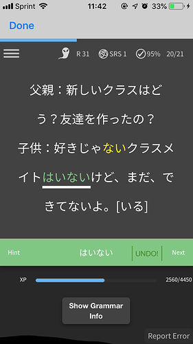
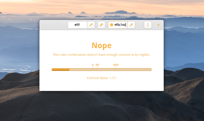
I don’t know if this has been brought up before, but the yellow color that’s used in some places really should be changed. In fact, I would almost go as far as to say it has to be changed. I many times find myself skipping over the hint text in study sessions just because it’s too hard to read it with the little contrast it has. Since people like pictures, here are some pictures:


If your OS has a blue light filter feature, try it with the highest intensity and tell me if you can easily read that text.


Here I’m using an app that checks for contrast between colors. To be considered accessible, you should at the very least reach WCAG AA with AAA obviously being the best. If you don’t, you risk excluding not only people with visual impairments but also other people that are simply viewing your website in somewhat poorer conditions. It should also go without saying, but after a certain point, you start excluding everyone who isn’t boosting the contrast in some way. I would arguably say this is beyond that point.

I hope this is convincing enough as I really like bunpro for the most part but this little detail continues to bug me to no end. Hopefully this was also the right thread to post this :sweat_smile:

7 Likes

Hey and welcome on community forums :slight_smile:

You have a fair point!
I will pass the idea to the development team!

Cheers,

4 Likes

@ellie Thank you for your feedback! It’s hard to find a good color that stands out well enough to be legible, but also not so much that it is distracting. This is especially true on a white background. We think that the orange works really well on dark mode (have you tried it?), but it can be a little hard to read on the modern theme, especially if you use something to cut blue light. If we changed the orange to the same teal that we use to define context and mark speakers in a conversation, would that be better?


We were thinking that it might be too close to the blue that we use for the highlighting on modern. What do you think?

4 Likes

Hey thanks for the quick replies you two!

I think the teal definitely is a huge improvement although your concern with not standing out too much is also very much a problem. This is just my opinion, but I think such a problem indicated not so much a color problem, but rather a structure problem. If you intend for the description text not to distract, then it should be put in a location where it isn’t distracting. Since the text is centered in the current design compared to all other elements in the same container, my feeling is that it is important in its current form and therefore should deserve some attention.

If only the color is to be changed however, I would recommend purple as it doesn’t seem to be used currently and pretty much always has good contrast on white backgrounds. Regarding the dark theme, while I do like some blue light filtering, I prefer light themes on my computer (except for in my terminal).

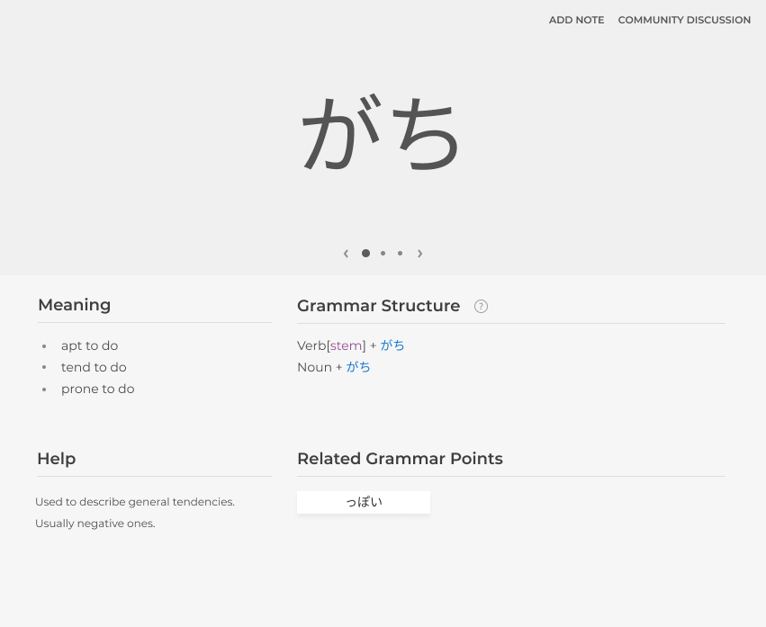
Also, just for fun, I decided to try designing my version of a study page and here’s what I came up with:

I did borrow quite a few elements from WaniKani but I think it turned out pretty well considering I made it in like less than 30 minutes :stuck_out_tongue: The main thing I aimed for was more structure than the current design and also to streamline the process of looking through a grammar point. I obviously didn’t cover everything the current Bunpro design covers but it was a fun thing to do nonetheless :smile:

7 Likes