Feedback - General

Wasn’t sure where to put this or if this was mentioned, but the Genki 1 deck for the 3rd edition uses some different vocab/kanji with the same sounds, which I can see is an easy mistake. So far what I see should be changed is:

あつい = 厚い[thick] change to 暑い[hot]
せんたく= 選択[selection] change to 洗濯[washing]
はる=張る[paste] change to 春[spring]

Thanks a lot for these decks, this helps a lot with my studies.

1 Like

Phrasing - Sometimes when entering an answer that is similar to what is correct, but not right, the yellow text that appears can sometimes be unclear. When you use the word “this grammar point” followed by explanations, it can sometimes be unclear if you are referring to my grammar point or the one you want me to enter. I usually assume it is the answer grammar point you are referring to.

It’s a bit of a nitpick, but it would help if you used more specific phrasings as “what you wrote”, “the answer we are looking for” etc.

It would also clear up some explanations where you are comparing two synonymous grammar points as it also can be a bit fuzzy as to which one you are referring to at times.

I do not have any concrete examples at hand but maybe you understand what I’m trying to get at.

I’ll try to update if I find any good examples.

1 Like

@Jake
Negative review count? :eyes:

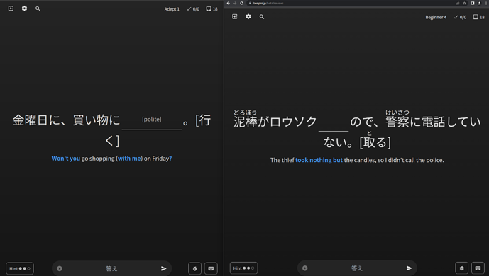
Not sure where the best place to post this is, but the background gradient on the /beta/reviews page isn’t dithered on Firefox (due to a bug), leading to distracting banding. I posted a screenshot comparing firefox and chrome but it doesn’t really do it justice how bad it is compared to other browsers on some screens.

Is there any chance the background could fall-back to something not affected by Firefox’s poor gradient implementation here? Other than that, the page is very pretty.

1 Like

image

The English translation here should probably be “The tea is becoming cold.”

(Also, I am told that it is more natural to use the verb 冷める for food/drink/something that naturally cools down to room temp but with no context I guess the sentence works for the sake of learning the grammar point)

image

This Japanese sentence is grammatically incorrect. おきに requires a counter and can’t be placed directly after a verb like this according to people I have asked and also the very lesson that this example sentence is in.


These grammar points are identical (barring one using ずに) but are in different N-levels. I personally think they could be the same lesson but even if they are to remain two seperate lessons then it probably makes sense to have them taught one after the other and not in different N-levels.

It is probably the wrong thread, but I didn’t find a better one.
Here’s a very minor issue: the hint says “precise timeframe” but the sentence is more about time-space than time:

1 Like

I just started using the vocabulary function in Bunpro. I was surprised to see that a lot of them had pitch accent information which is great. However, on the review screen, this doesn’t show unless you expand the explanation again. Would it be possible to show the visual for the pitch always on vocabulary cards? It would be great to say this out loud each time I do a review to reinforce my memory of the pitch. Only seeing it once during the learning process is hard to remember.

TL;DR Always show the pitch on vocab card reviews. :pray:

5 Likes

Just dropping some general feedback that some of the new voice lines, examples the new older woman voice and nasally younger woman voice, have heavy compression on the audio that makes it sound like an AI voice. Not sure if it is, but I don’t like it and would enjoy the option to preference which voices get used for reviews vs completely random.

4 Likes

Piggybacking on this, I loved the clear, female voice that sentence audio playback had until one or two days ago. I don’t know what happened, but now 90% of the playback audio is from a different voice, which sounds muffled, perhaps even AI generated. What happened? The quality drop is insane to me.

4 Likes

Is there any work being done on performance? It feels the site has continued to trend slower over time, to the point that it can be quite painful to use at times.