Not sure if this thread is only about the reviews feature, but I just tried a lesson that ended with a quiz using the new UI. That felt really smooth and polished, but after answering all the questions correctly it loops back to the first question instead of finishing the lesson. The new grammar points did not get added to my review queue either.
Hi there!
Thanks for the bug report.
Got a few questions to ask, so I’ll send you a DM about this!
Any hint as to when this will drop?
Looks like I started Bunpro at the right time, so many new features being announced lol. Looking forward to seeing the 2023 developments!
Hopefully end of next week. 
It is at the top of the list now.
Sorry it has gotten a bit delayed 
I saw this briefly before the thread went live and posted a response in the General feedback yesterday, but the gradient on the background of the beta reviews does not get dithered in Firefox and leads to some really weird banding. It almost looks like window blinds on my monitor.
Otherwise it looks really pretty!
Looks great!
Really like it, and super looking forwards to Vocab soon, especially if it includes N3 or that will be coming soon 
I seem to be autoscrolling down to the grammar point every time after submitting an answer - not sure if this is intended. I guess it’s probably because I have grammar points on auto-expand on answer, just to save clicking a button every time before scrolling down to it only in case of need. It looks cool that it autoscrolls, but I prefer having a look through the alternative answers, then just go on to the next review in the majority of cases, but still have the grammar point ready and available to scroll down to just in case of need / for reference.
Incidentally, love the way the alternative answers are set up now so you can see how many alternatives there, and the hints too!
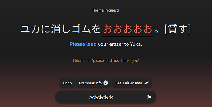
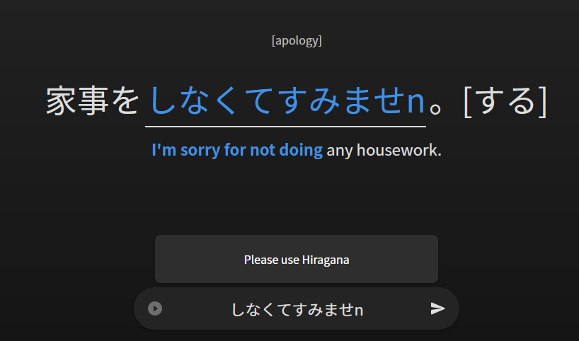
I’ve also noticed the hints which appear when you submit a slightly “off” answer stay on the screen even when submitting a different answer, which might cause some confusion:
Some nonsense put in to demonstrate the point 
Btw, for “Reader”, a suggestion to call it an “Infopoint” 
After enabling this beta, the review link in the header goes to the beta but the big review button still opens the “old” review page.
For me too.
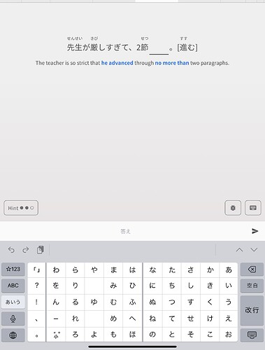
In Safari on my iPad, this review requires me to scroll do see the whole content.
It is without scroll if I hide the keyboard but then I of course can’t enter any answers.
I think that’s intended for now during beta.
It helps those who do vocab reviews still be able to access them.
Are the keyboard shortcuts working for you guys? I keep hitting “A” and “Space” out of habit but nothing happens.
Otherwise, the new design is beautiful ! 
Thank you for this update!
Really like the UX! Just not a big fan of the background gradient, but I thinks that’s just not my cup of tea. 
One thing though: After I typed in a corect answer and hit enter, the page will jump-scroll to the grammar section. I don’t know if this is a wanted behavior but I wish to deactivate this in the settings if possible and just scroll down if I want or if I press the shortcut.
Keep up the great work!
The keyboard shortcuts are working for me!
Try using this link:
That worked thanks.
- Issue : Split Review still redirecting to Old page.
This is the best approach IMO, just add a Keyboard shortcut to it & it will be great.
Colors feel great, It’s nice that they are softer gradients and just not solid colors in the face. Looks cool IMO.
I would say, depends on design that you guys are going with, But in general, Any extra informative text (like Grammar Info) looks good on a sidebar, but a CTA button might make more sense in center as a modal.
Gotta say, the new Reviews feature looks very slick!
One problem though:
It appears that all my answers are rated incorrect, regardless if they actually were correct.
This is evident by only the right number next to the checkmark ever increasing.
Additionally, if I try to end the session, it asks me to wrap up pending items.
Doing so will then result in an endless loop, because the system thinks my answers are all wrong haha.
This happened on mobile in Chrome, not sure if that matters though.
EDIT: I just noticed that all my reviewed items also have had their SRS stage dropped by 1 because they were “wrong”, oof.


