I’ve been thinking this one over for some time because I wasn’t sure of the ideal implementation (and apologies if this is on the docket/already discussed), but I had a thought when it comes to app (and possibly the web experience?)
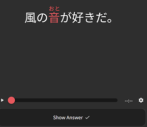
Right now I have the app text size set to max, as it helps me identify/read the kana/kanji better (especially any furigana), but that sometimes makes the interface elements/english text awkwardly large, and even at max the vocab review elements can be sort of awkwardly small in the middle of the screen.
My thought was this - would it be possible to add some more sizing options to the app? A few that spring to mind could be:
- Japanese/Example Text Size: does what it sounds like - adjusts japanese characters independently of english text/UI elements. In a perfect world (for me, anyway), this would have options to make this type of text larger than the current sizing options do, by some number of steps
- Furigana Size: adjusts the size of furigana
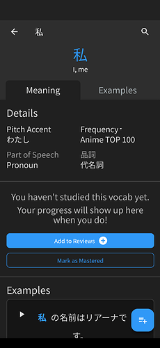
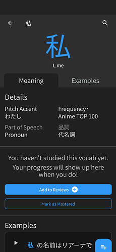
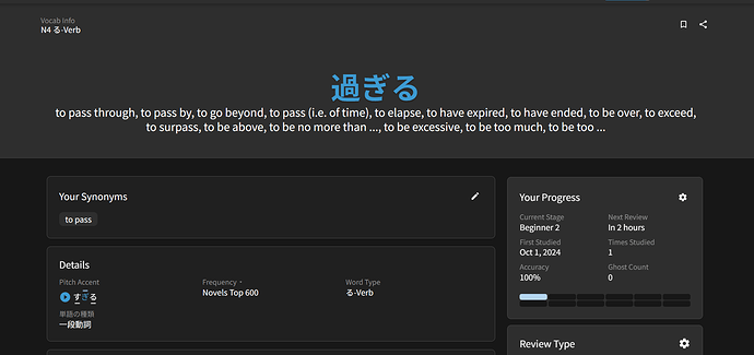
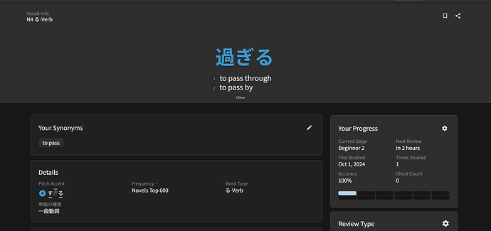
- Not sure of the best way to word this, but something like “auto-size review content” where something shorter (like a single kanji) would stretch to take up more space on the review screen. before/after mockup attached:
^original
^mockup
^with longer material i’m not sure how this would play with line breaking, but it feels like a nice option for shorter stuff at least.
Would love to know what the team thinks about these ideas - I think decoupling these different font options would really level up the app experience!

