Feedback - Suggested Improvements/Feature Request

I think it’d be cool if the vocab reviews also contributed to the stats page.
I’d love to know how I’m doing on those across the board!

3 Likes

I am thinking of a feature that would be the opposite of the new SRS strictness feature (that lets you set a stronger level down).

I’d like to make the level up slower. So I level up only once I have answered correctly twice.
I am not a fan of the current SRS balance as I always wish the adept level phases were longer especially as they are the point where the stuff starts to get really memorized, at least for me, so I thought this would help in that regard

I think the effect would be very different to the SRS strictness feature as it is also tough yet less punishing.

2 Likes

Discussed this internally.
It might more just be a case of converting the current sentences so that they can be tested using the Fill-in-the-blank (Cloze) question-type.

Basically, the question is:
“If all Vocab had Cloze sentences, would people still use the English-input questions?”

If some people still found it really beneficial, we could also include the example sentence system that you mentioned.

Excellent point!
The navbar used to exist on this page, but it no longer does.
Will add a second “Return” button here 🙇‍♂️

1 Like

It might also be worth asking if people like bidirectional testing, 英和+和英, like kamesame.com. For now, spending a few extra taps is okay.

1 Like

It might also be worth asking if people like bidirectional testing

Yeah definitely something worth considering for completeness.

It would be very helpful to be able to create ghosts for vocabulary!

First of all there are some vocabs I can’t seem to remember and I would like to repeat them more often.
Second - a lot of vocab has lot’s of different meanings - so I learn one meaning and then on adept 3 suddenly a totally different meaning is asked and I have no clue.
So I think it would be great if I just could add specific example sentences into ghosts to learn all the meanings from the beginning.

4 Likes

Especially since this is first and foremost a grammar site/app, I would like to suggest replacing some of the current “vocab” items with their corresponding “grammar” points, like this one:

Incidentally, I really like the “reading”/“flashcard”/“manual input” symbols that are appearing next to items in decks!

1 Like

I also really like the search feature for vocab and grammar!
Just some of the items that appear seem to be broken links to content no longer available, e.g. these two (which appear in romaji) just return errors:

1 Like

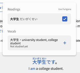
Could there be a feature to link words in reviews to vocab?

Example:
I click a word in the review.

It will be nice to have the definition and maybe a link to the word already in Bunpro vocab.

3 Likes

This feature already exists!

Unfortunately though each word in the text needs to manually be linked to the Vocab/Grammar that it’s referring to.

We’re currently trying to automate this process, but it’s taking a lot longer than we originally thought.

2 Likes

Vocab Review Enhancements (Reading mode)

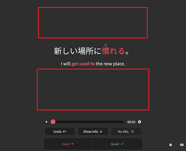
There is currently a lot of unused space at the top and the bottom.

1. Is it possible to display the pitch accent at the top?

Pitch information is already available in the vocab.
I could use “Show Info”, but it would be nice to have the pitch accent displayed so that I can do a quick check without having to navigate to it.


2. Is it possible to display vocab notes at the bottom?

For example, I might have written a custom mnemonic and would like to see it.
I could use “Show Info”, but it would be nice to have the information displayed immediately.

3 Likes

I’ve been thinking this one over for some time because I wasn’t sure of the ideal implementation (and apologies if this is on the docket/already discussed), but I had a thought when it comes to app (and possibly the web experience?)

Right now I have the app text size set to max, as it helps me identify/read the kana/kanji better (especially any furigana), but that sometimes makes the interface elements/english text awkwardly large, and even at max the vocab review elements can be sort of awkwardly small in the middle of the screen.

My thought was this - would it be possible to add some more sizing options to the app? A few that spring to mind could be:

  • Japanese/Example Text Size: does what it sounds like - adjusts japanese characters independently of english text/UI elements. In a perfect world (for me, anyway), this would have options to make this type of text larger than the current sizing options do, by some number of steps
  • Furigana Size: adjusts the size of furigana
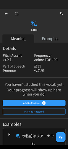
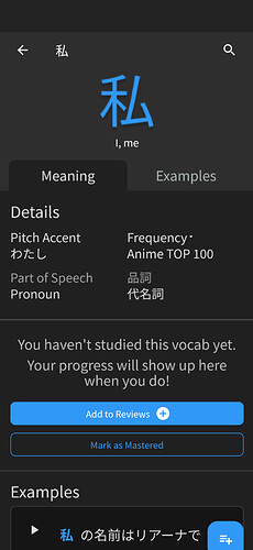
  • Not sure of the best way to word this, but something like “auto-size review content” where something shorter (like a single kanji) would stretch to take up more space on the review screen. before/after mockup attached:

    ^original

    ^mockup

^with longer material i’m not sure how this would play with line breaking, but it feels like a nice option for shorter stuff at least.

Would love to know what the team thinks about these ideas - I think decoupling these different font options would really level up the app experience!

4 Likes

I know this has probably been suggested 100x before, but the feedback when inputting a similar/valid grammar structure that isn’t what Bunpro is looking for is really lacking.

“Could you try another way of conjugating this structure?” “How about a grammar pattern that is a bit more polite?” “How about a similar grammar structure…”- do these mean that the input makes sense, but bunpro is looking for something else? or that the input was unnatural and requires another input to be natural? :thinking:

Also some grammar points don’t even provide a message, just ‘incorrect’, when you use a listed synonym on the grammar point itself. Like using に関して instead of を巡って. Which leaves me confused until I give up and just check the answer.

And worst of all is the “Let’s try a different grammar pattern with a stronger/weaker nuance.” which I have no idea what this is trying to tell me :thinking:

Some messages do include that your answer is good like “Nice guess! This is perfectly acceptable. blah blah” which is very helpful. Ideally these kind of messages would be more often.

I’m also aware of people recommending moving away from text input - for the grammar points where the hint text makes sense, and there isn’t a ton of synonymous, I think text input works very well and makes the grammar easy to remember.

At least, allow us to add our own hint text.

Anyways, still a good app. Thanks.

4 Likes

When answering a study question with a response other than one being looked for, there are 2 kinds of responses. One that marks the answer as wrong, and one that prompts a hint like the ones you’ve mentioned. If a response prompts a hint and is not marked as incorrect, it means one of the following:

  1. the answer was an acceptable alternative, just not one we were looking for;
  2. the answer is grammatically okay, but carries a different nuance or is used in a different situation;
  3. the answer that was input was close enough in that it’s deemed an understandable mistake (this is typically for smaller typo related answers).

When you see hints that mention nuance or different scenarios/politness, it’s typically because similar grammar exists, but some are more appropriate than others in those situations.

The other hints you mentioned such as ‘Nice guess! …’ are pretty much just for responses that can fit in 1-to-1 and don’t have an impact on nuance, but just weren’t the exact answer being looked for.

All of the alternate hints are hand-done so while we try our best to cover what we think are the most common mistakes, there are instances where we miss something, and that’s where all the feedback we get from users comes into play.

All of this being said, we are currently looking at the hint system attached to the alternate answers system and will possibly be adjusting what’s considered an ‘alternate’ vs ‘incorrect’ answer in the future to try and be less vague overall. So this may change in the future. Of course we’ll always do our best to keep everyone in the community in the know when such large changes are implemented.

4 Likes

Not sure if this has already been reported or not, but in the Account settings:

  • General / 一般 | Tab
  • Dashboard / ダッシュボード | Section

The description for hiding the community tab has an additional を in it when the language is set to Japanese.

It currently reads as:
「コミュニティディスカッションを隠す」

While it should be:
「コミュニティディスカッションを隠す」

Screenshot:

2 Likes

Numbers should have hoverable furigana displayed over them. It’s really useful as a beginner who may forget if the 6 is supposed to be read as “roku”, “muttsu”, etc. Or special readings like 20 years old being “hatachi”.

5 Likes

In the app I have furigana off by default, but I can tap words to show the readings.

The only quirk is that after I reveal the answer, tapping the words no longer has any effect. I have to undo the reveal in order to check the readings.

Can this be fixed on the app?

Thanks Bunpro team for your amazing work.

2 Likes

an option to put any vocab/grammar deck entirely on hold
(not the learn feature but the overall SRS)

I am currently on the last sprint to JLPT in a couple month, I wish I could temporarily turn off higher levels that take me way too much time for this short term goal were they are not needed.
Of course I want to get back to them later, so reseting is not an option either.

In such a situation you want to free as much time as possible for other ressources as well, my bunpro reviews limit that.

2 Likes

Cram - Add To List

I’m surprised that this isn’t mentioned often. In the Cram feature, there’s an “Add to List - Coming Soon” bit where, presumably, we’d be able to create lists of things to cram together.

I happened to be looking for just such a feature recently, as there are a few grammar points that I keep getting mixed up and I feel I’d benefit greatly from being able to cram them together to help set them straight in my head.

Right now, I have to remember all the related grammar points and search for them all to create such a cram session. If I could just create lists for them, it’d be far easier to jump into the Cram feature from there. Even better if there’s a way to “Add To List” from the grammar point itself. (For example, maybe I have a list of “if” grammar points, or a list of grammar points containing “から”. Upon learning a new one, I could add it to one or more of my lists to ensure the example sentences are included when I next cram that particular list.)

If I’m not mistaken, it looks like the placeholder was added all the way back in late 2022, with the Cram 2.0 Beta. Is the “Add to List” feature still being worked on?

2 Likes